I’ve been blogging a long time – almost 6 years to be exact.
Over this half decade, our home has changed, evolved, and become a place that is filled with meaning + reflects who we are & where we’ve been. And along the way, there hasn’t been a single surface that’s gone untouched – sometimes twice (or more).
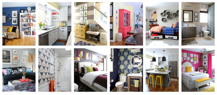
Since it’s been several years (and a whole lotta projects + room renovations later), I thought it was time to share an updated HOUSE TOUR of our humble abode!
Last year was a big year with so many updates. We tackled the kids/hall bath, the living room, and THE KITCHEN, which completely changed the look and feel of our home.
Let’s get to it. Grab a cup of something-good.
WELCOME
Come on in.
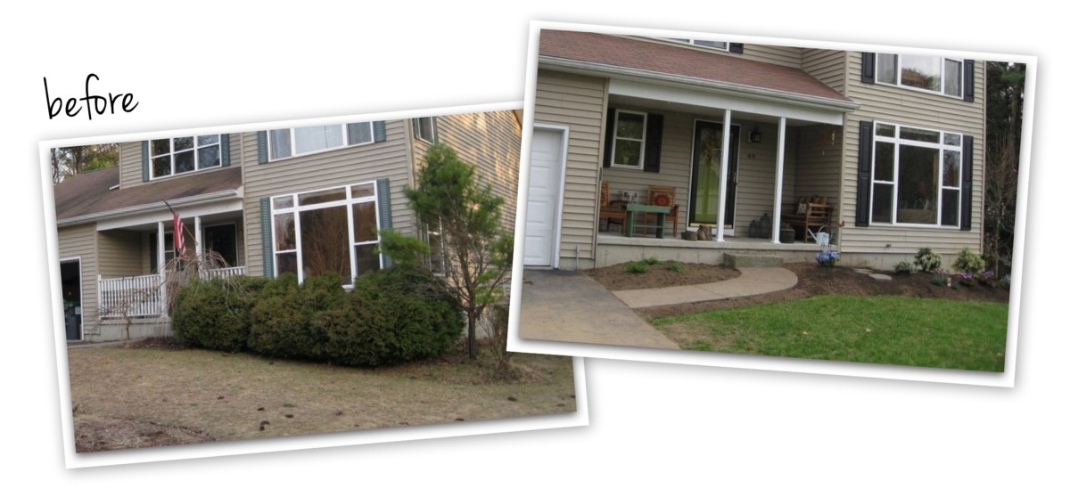
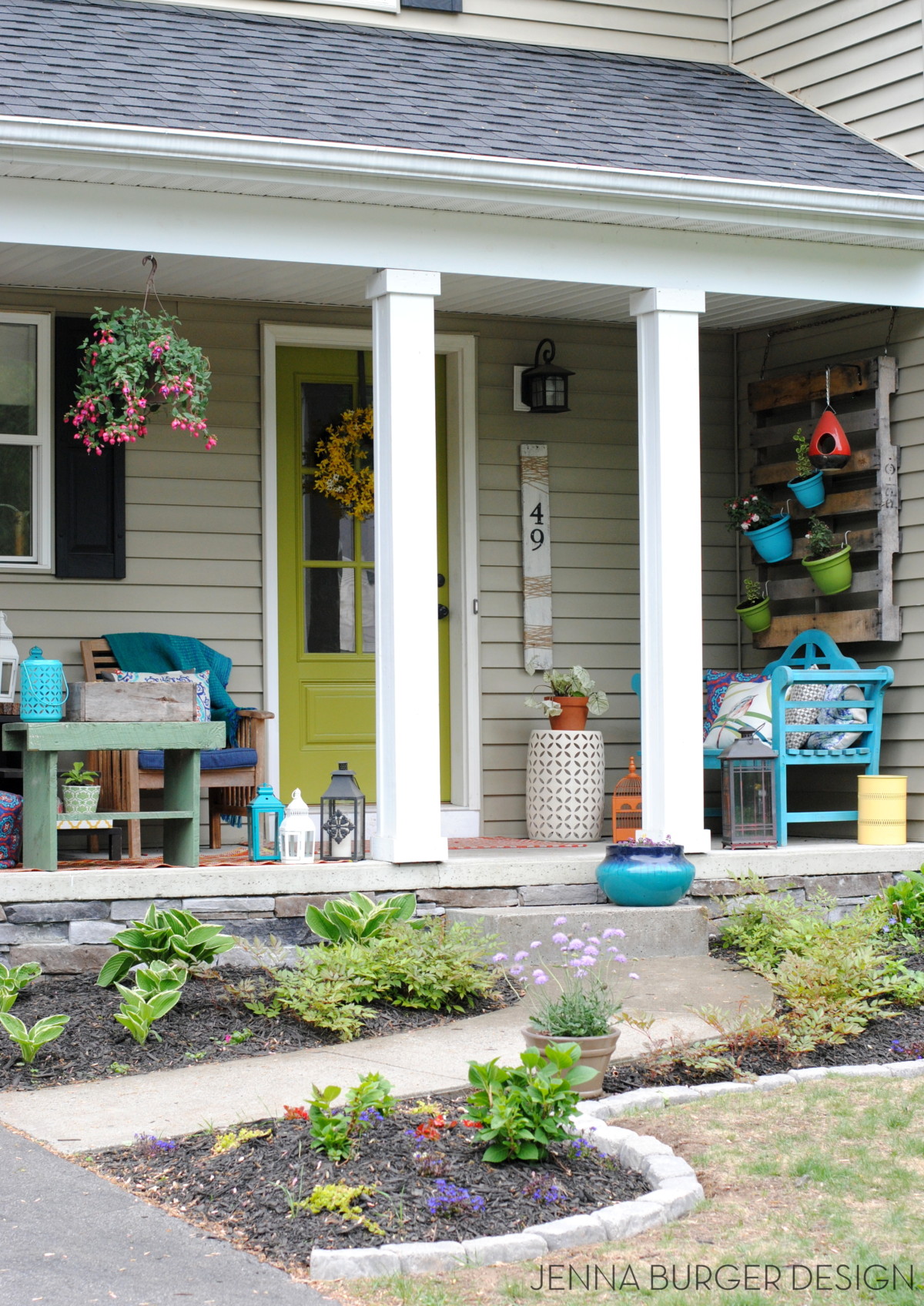
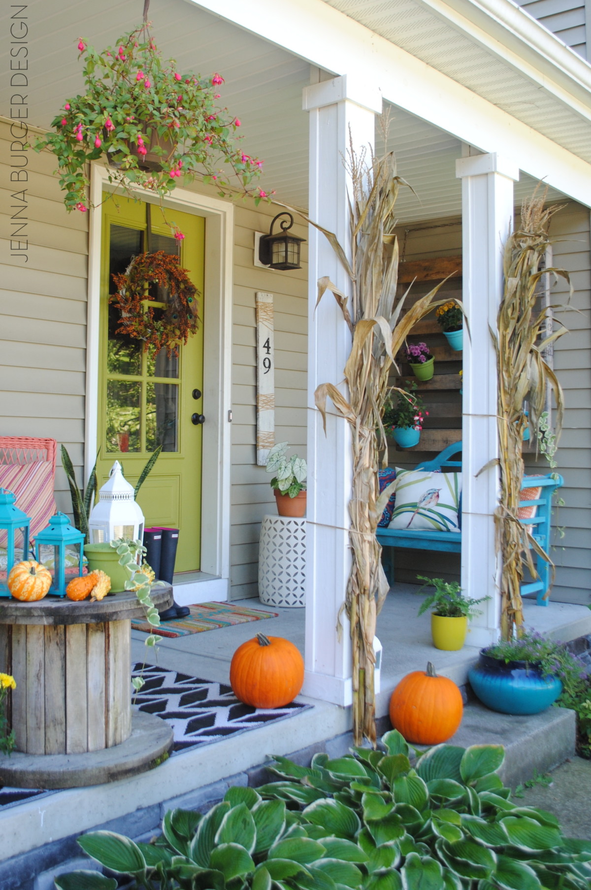
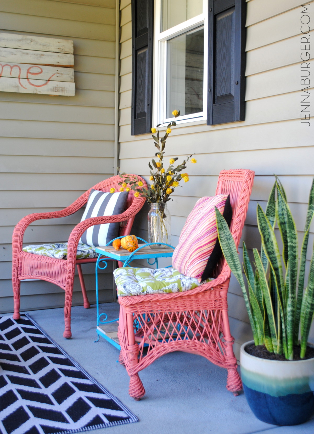
The entrance way to a home, is what I believe, sets the tone for what’s to come, so it’s such a delight to surround our home in nature’s beauty.
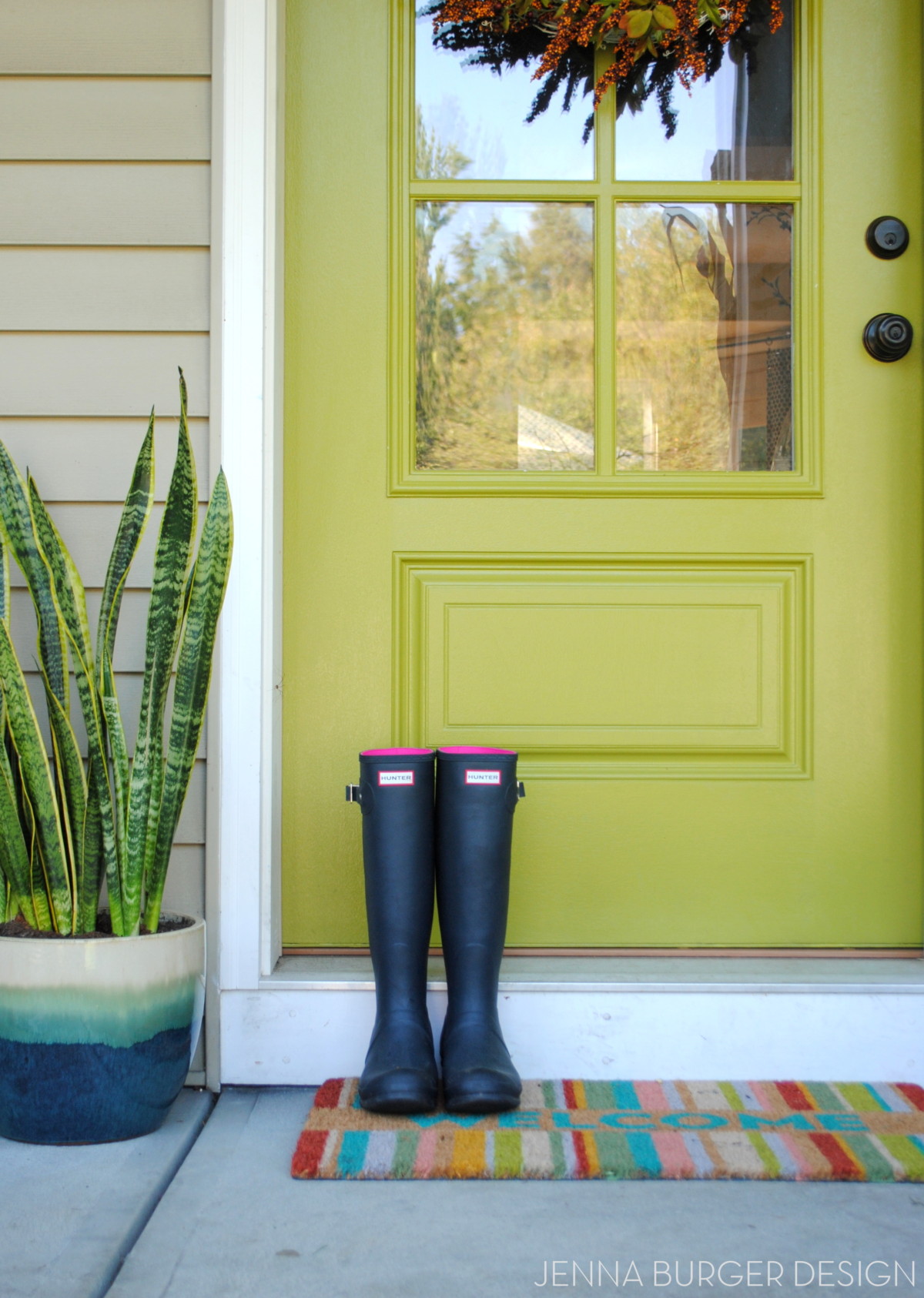
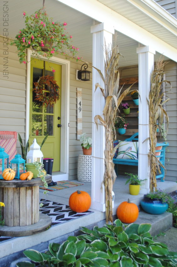
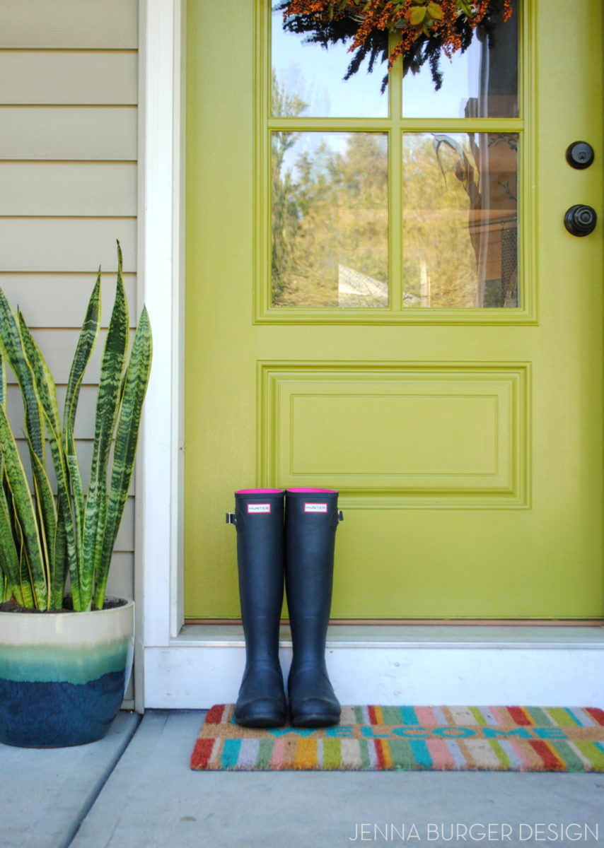
The entry into our home has been a labor of love (and at times, hate) for many years. From the earlier days of a rickety railing and overgrown shrubs, to the current days beautifully landscaped + open and colorful front porch, this is what we call our entryway…


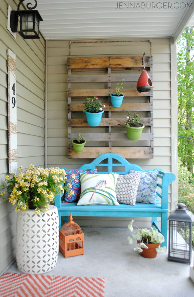
Winter, Spring, Summer, FALL… our front porch is filled with seasonal favorites.

EXTERIOR POSTS
Creating a garden edge using stone
Adding a stone veneer base to the foundation wall
DIY: vertical pallet garden
Choosing + Painting the front door
Spring + Summer Porch 2015
Fall Front Porch… with COLOR!
step inside…
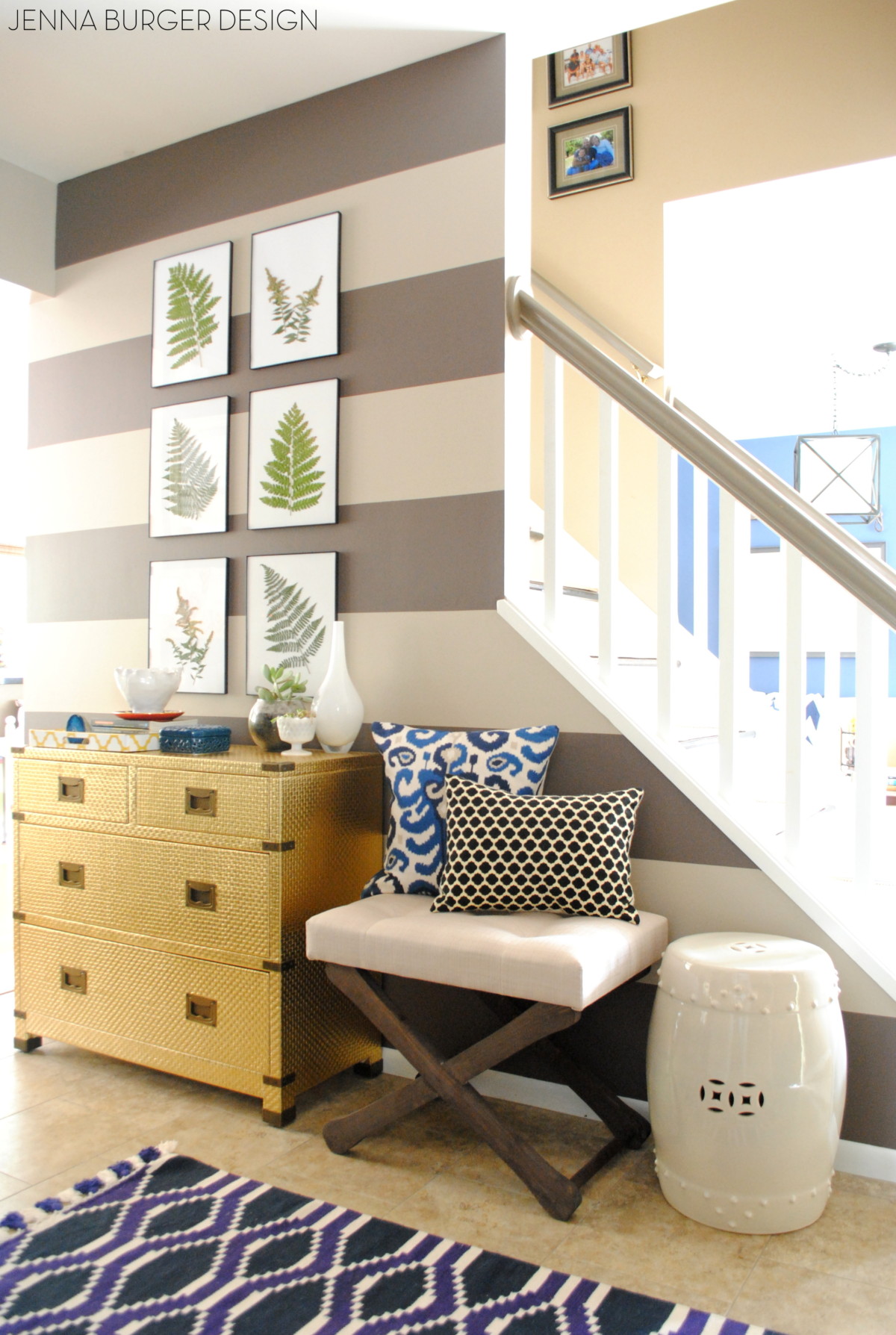
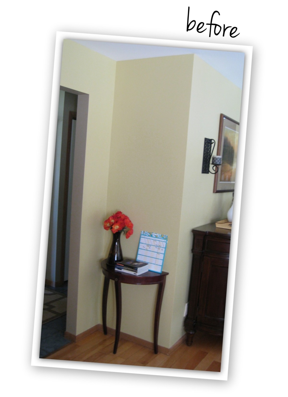
FOYER
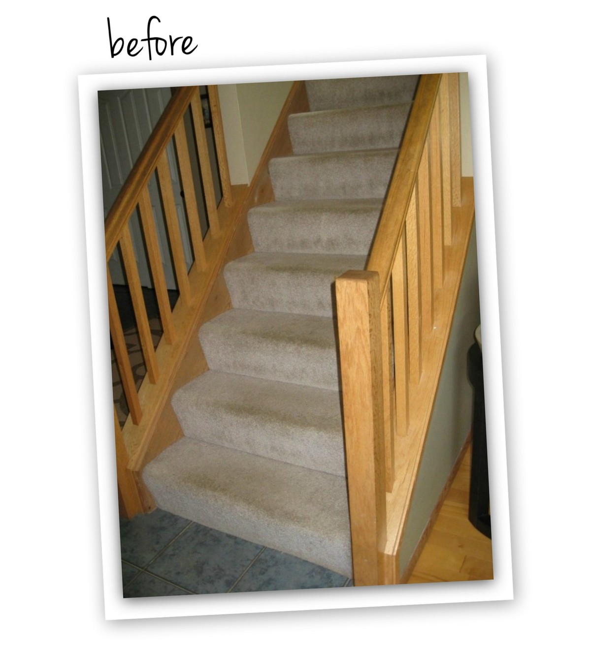
A few years back this foyer received quite the transformation. From an entire new staircase to new flooring to the gorgeous stripes on the wall (the wall used to be stenciled), the foyer sets the aesthetic of my classic eclectic design style where I believe, all things should have meaning.


FOYER POSTS
Foyer Reveal
Painting perfect stripes on the wall
New greige wall color
Removing carpet from stairs
Filling homes & staining treads
Staircase Reveal
Stenciled Wall
How to install a luxury vinyl floor
DIY Fern Art
The foyer isn’t overly large, but I’ve really tried to maximize on space since it’s the hub of coming & going.
In the small area behind the front door, I transformed the unused wall by adding hooks to hang everyday coats and bookbags. This tiny spot has been a game-changer!
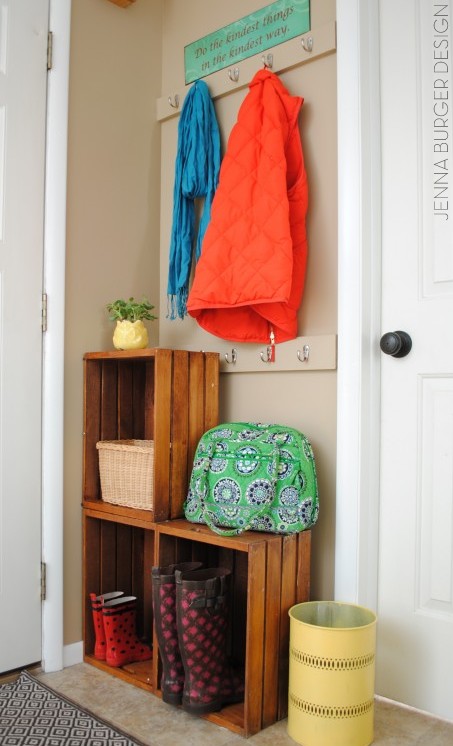
Post: An easy upgrade for a small space
POWDER ROOM
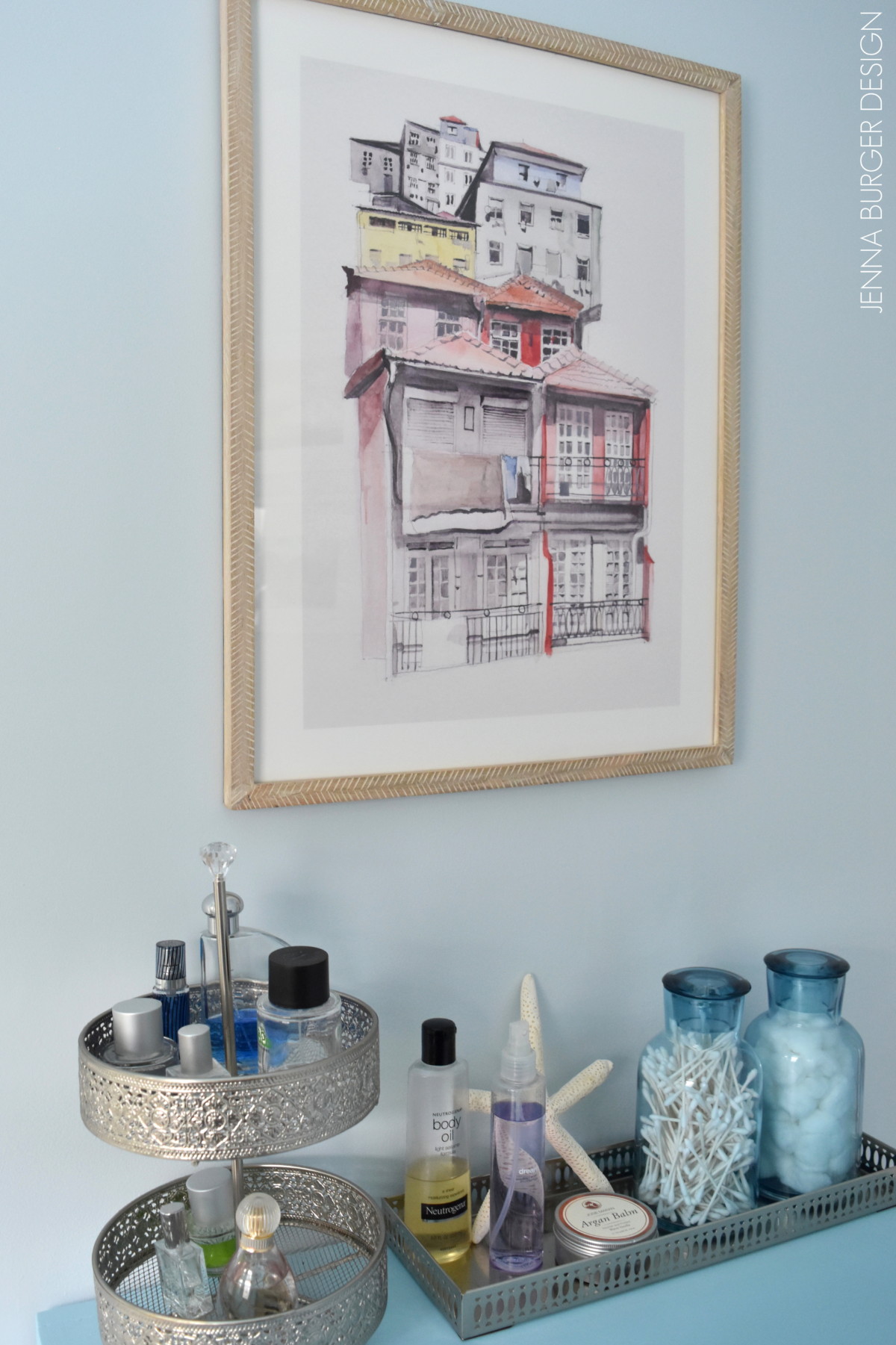
Next to this entry nook in the foyer is the powder room. The neutral greige walls of the foyer are the perfect transition to this big + bold bathroom with a vibrant Amy Butler wallpaper as the focal point. This room might just be my favorite of all…
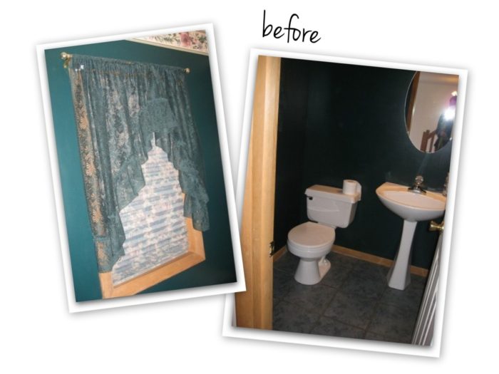
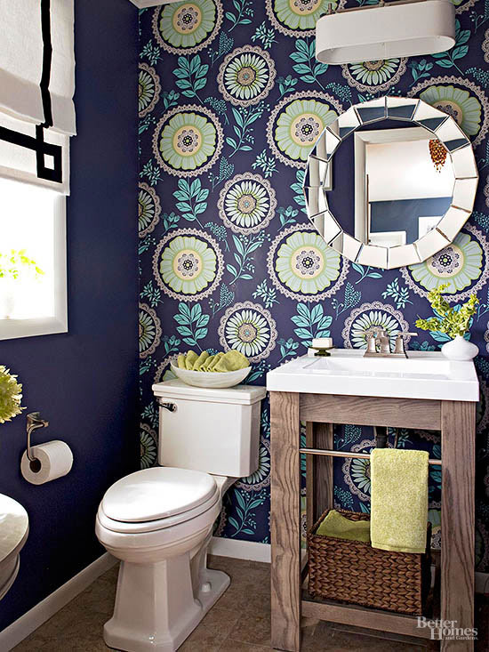
This quaint, but dynamic space was photographed and featured in many Better Homes and Gardens magazines over the years. The credit for this photo goes to them… their photo is so much better than mine…
POWDER ROOM POSTS
Powder Room: Plan of Action
Repairing the walls + hanging the wallpaper
Powder Room Reveal
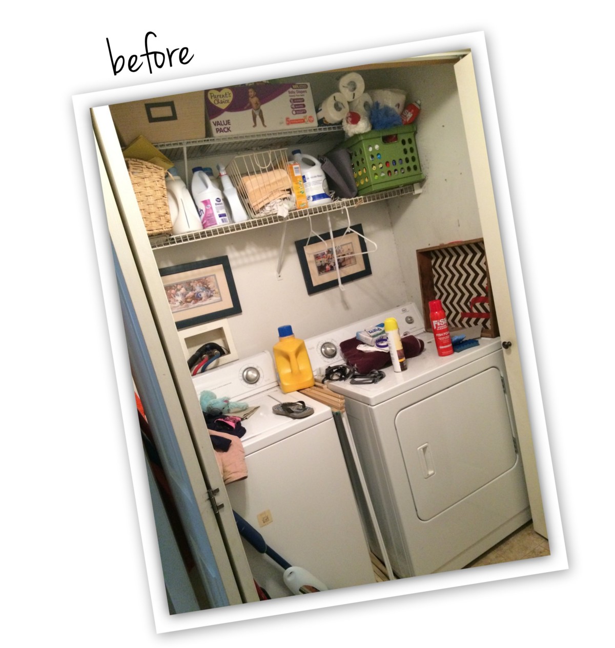
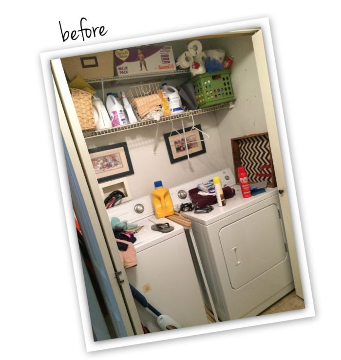
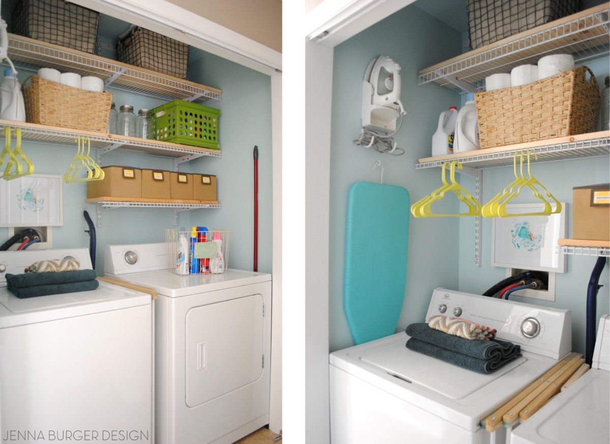
LAUNDRY ROOM “CLOSET”
Also off of the foyer (I told you it’s a small space with a lot of purpose!) is the laundry room. Well I should say CLOSET. A few years back the teeny space got a remodel which included removing the doors, painting the walls a robins egg blue, and organizing the shelves with baskets + bins. Here is the result…
Is it my dream space to do laundry? Certainly not, but it’s much nicer now!
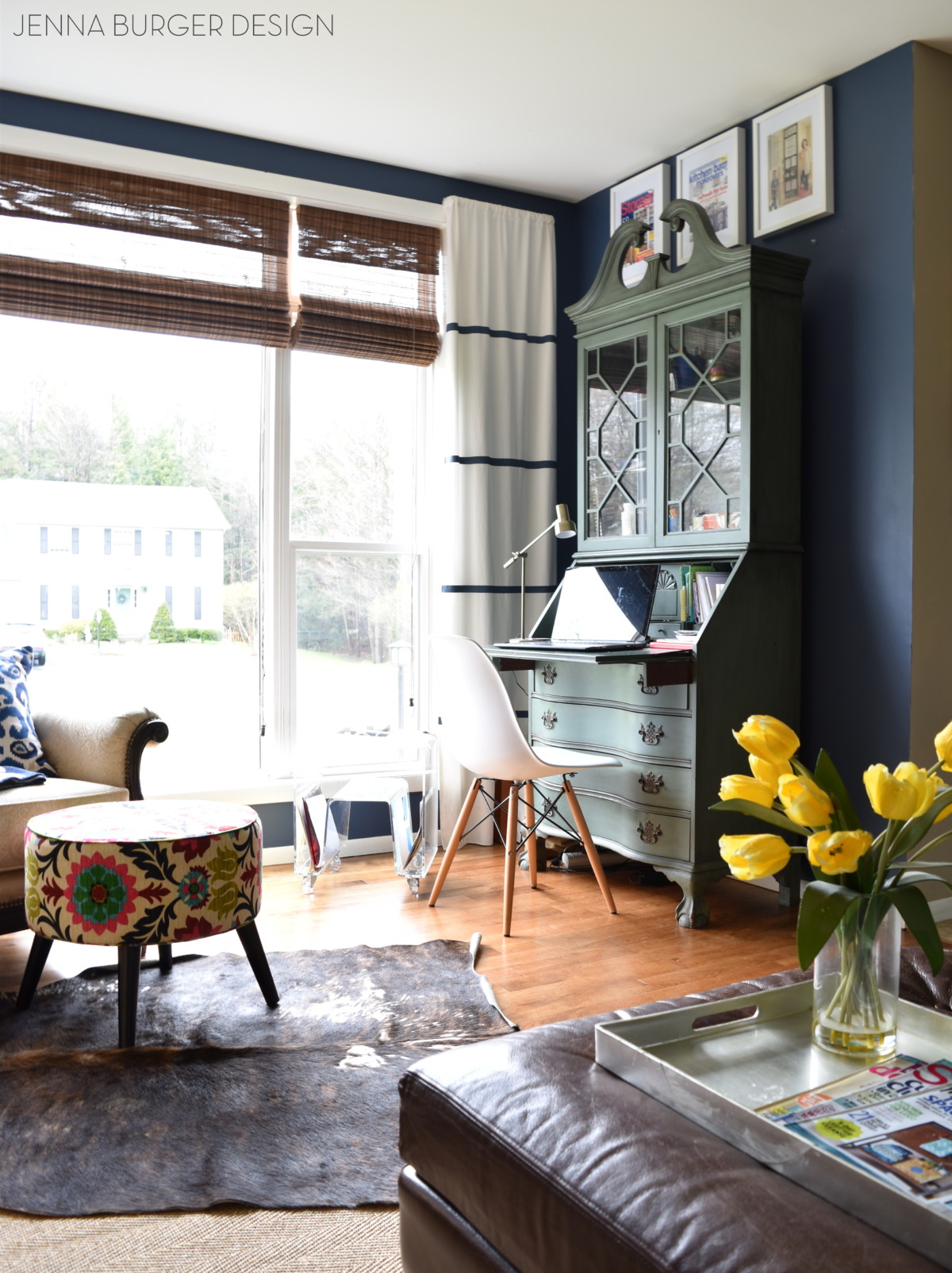
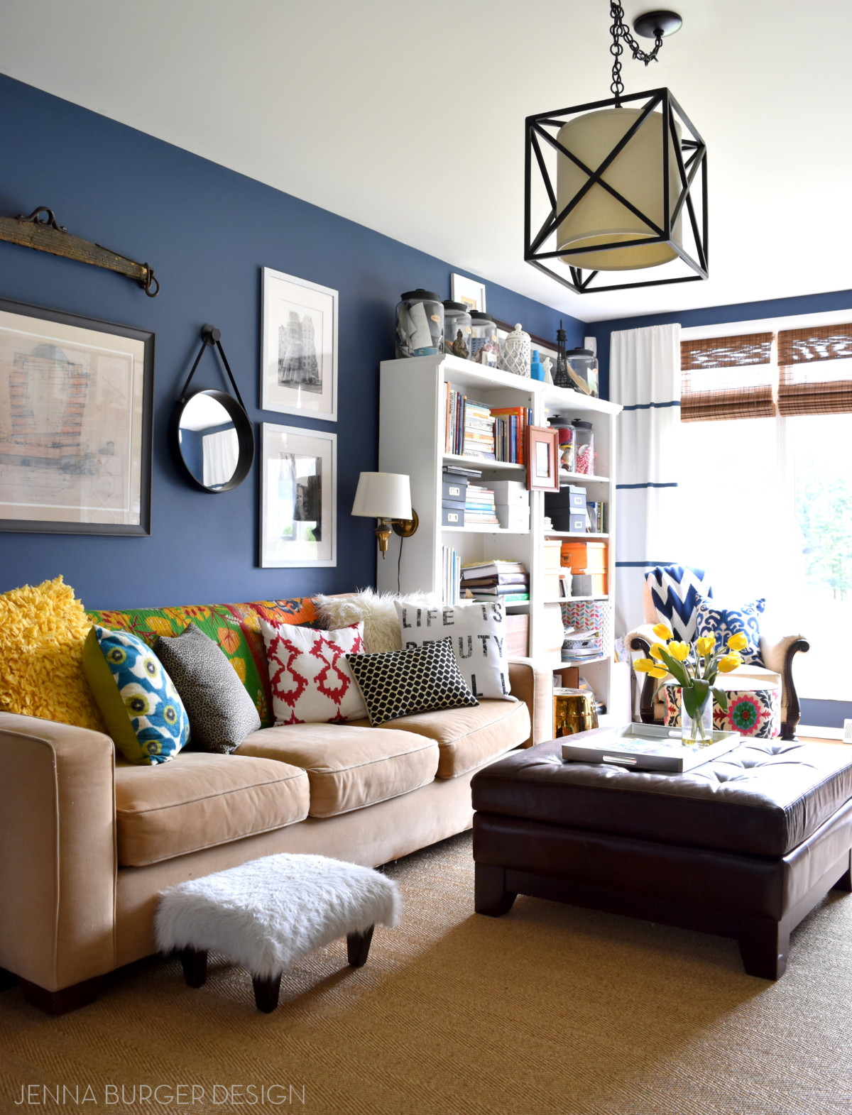
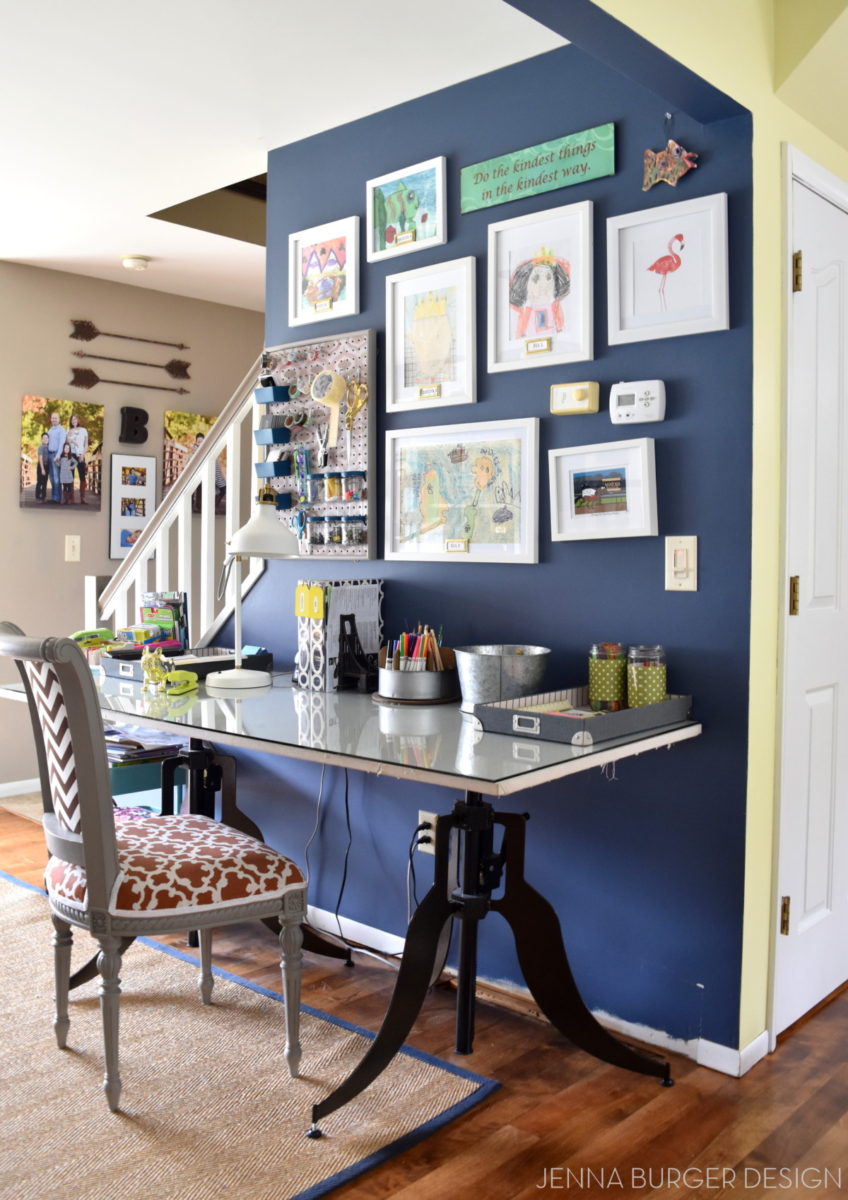
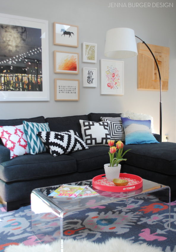
OFFICE / FAMILY ROOM
When entering into the foyer from the front porch, to the right is the office / family room. Another space that has greatly evolved over the years.

A few years back it was photographed and featured on the cover of Better Homes and Gardens Storage Magazine. It was a huge highlight and honor. This multi-use room has had a few updates + furniture moves, but for the most part it has remained the same.
It’s such an inspirational space, which I’m so thankful for since it’s where I spend the most time (other than the kitchen ).


My forever favorite kids art wall. I love adorning the walls of our home with the kids artwork.
OFFICE / FAMILY ROOM POSTS
How to paint laminate shelving
How to style a shelves
My favorite navy wall colors
How to hem & paint stripes on curtains using paint
How to make a GIANT inspiration board
Home Office / Family Room reveal
DIY: Modern to industrial style coffee table
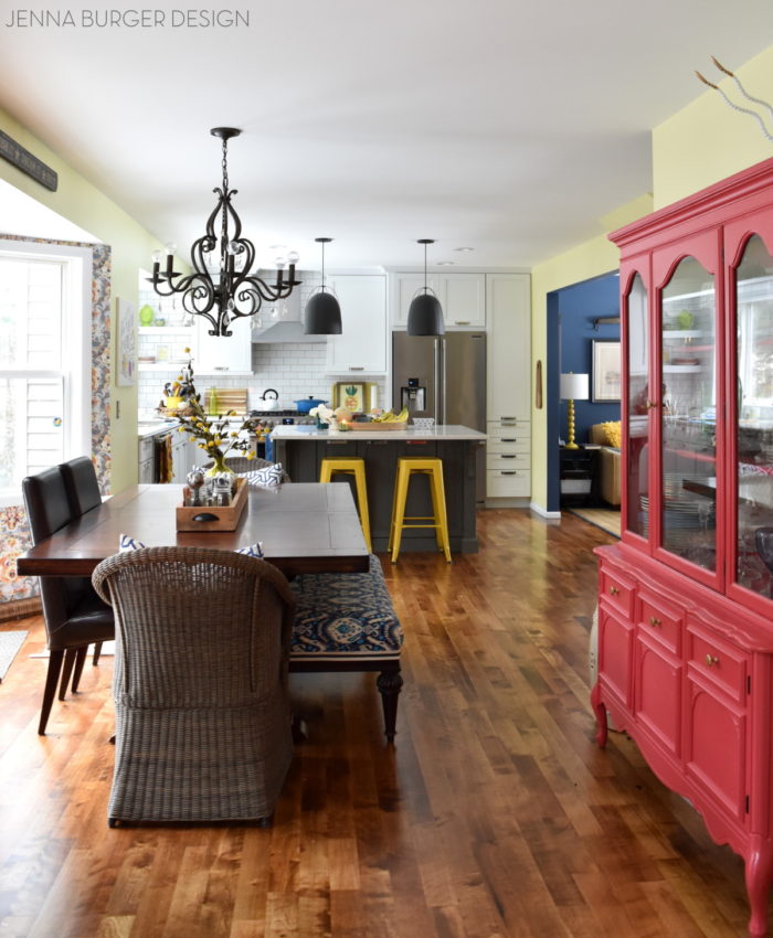
A view from the office / family room into the newly renovated kitchen…

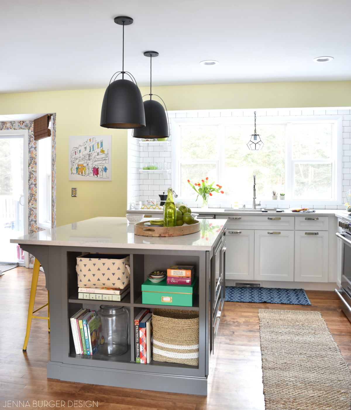
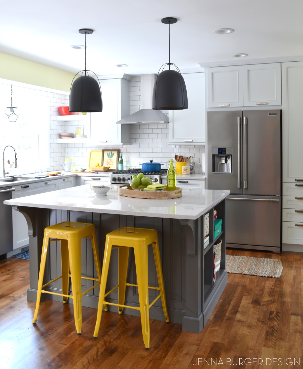
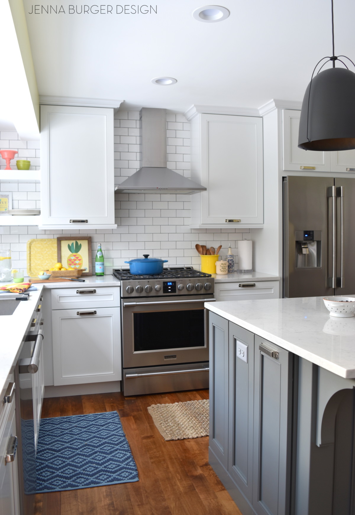
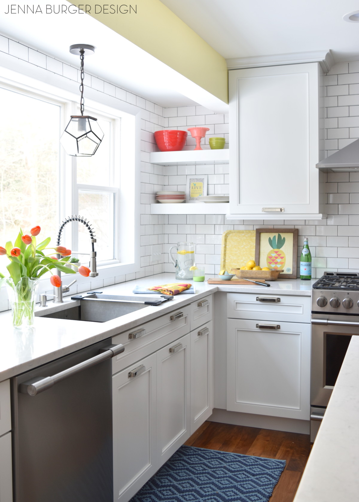
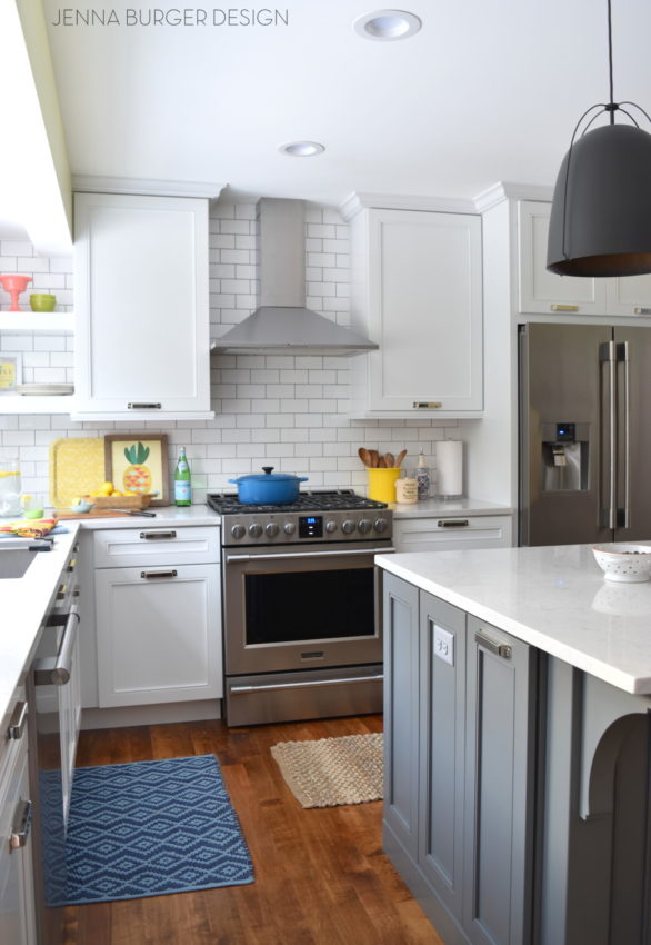
KITCHEN
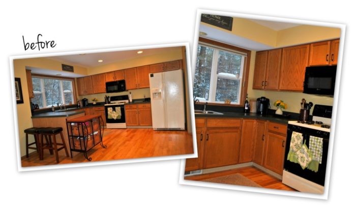
Speaking of kitchen, this is the most recently renovated room in the house. And since the transformation, I truly feel that our home is complete. It finally reflects our aesthetic + style. The remodel process wasn’t easy. At times it felt like forever and was even a bit painful at moments, but 100000% worth it. If you are going to update a room in your home, it has to be the kitchen.


KITCHEN POSTS
Wonderful White Kitchen Inspiration
Kitchen Remodel: Before + Plan of Action
Demo Day: Steps for Demolishing the Kitchen
Kitchen Progress: Staining Hardwood Floors
The Cabinets Arrive + Get Installed
Natural Quartz Countertops in the Kitchen
10 Countertop Materials to Consider for the Kitchen
Subway Tile Installation + Choosing the RIGHT Subway
Kitchen Backsplash Tile Options + Inspiration
Choosing a Paint Color + Wallpaper for the Kitchen and Dining Room
Kitchen Renovation: The Appliances
Dissecting the Details
Kitchen Renovation: REVEAL + RESOURCES
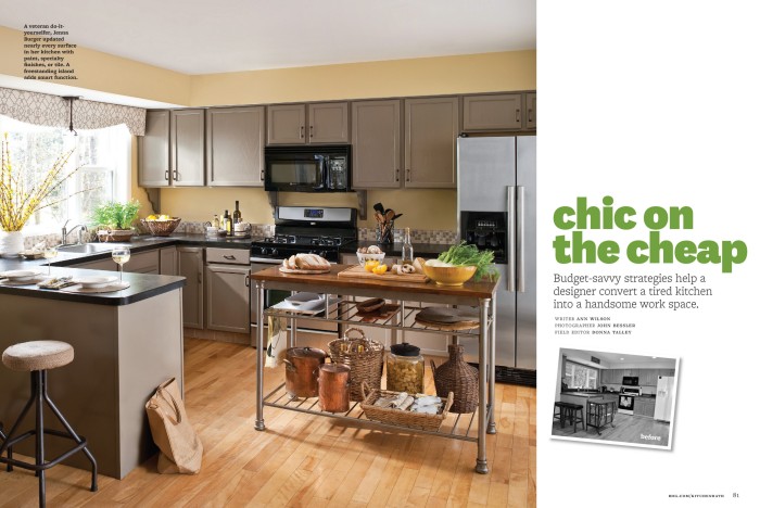
Before the full gut of this kitchen, we remodeled it DIY-style in 2011. Here is the result + the associated posts.
2011 DO-IT-YOURSELF KITCHEN MAKEOVER

Featured in Better Homes and Gardens KBMO magazine a few years back:
DIY KITCHEN POSTS
Countertop transformation
Painting the cabinets
Custom tile backsplash
Faux support brackets
Kitchen reveal
Simple window upgrade
Change a recessed light to decorative light
In the space between our kitchen, foyer, and dining room is where I have my central command center. A.K.A…. the little niche that keeps us on track daily so we know where we’re going & when.

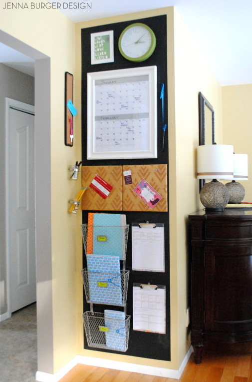
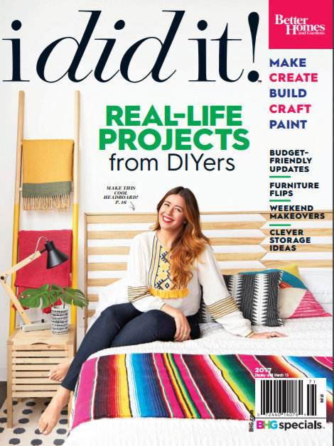
If you’ve been following my blog for the past several years, you might remember that my kids + I were featured in the I DID IT section of Better Homes and Gardens. It was such an amazing + thrilling experience. Looking back the kiddos were so young…

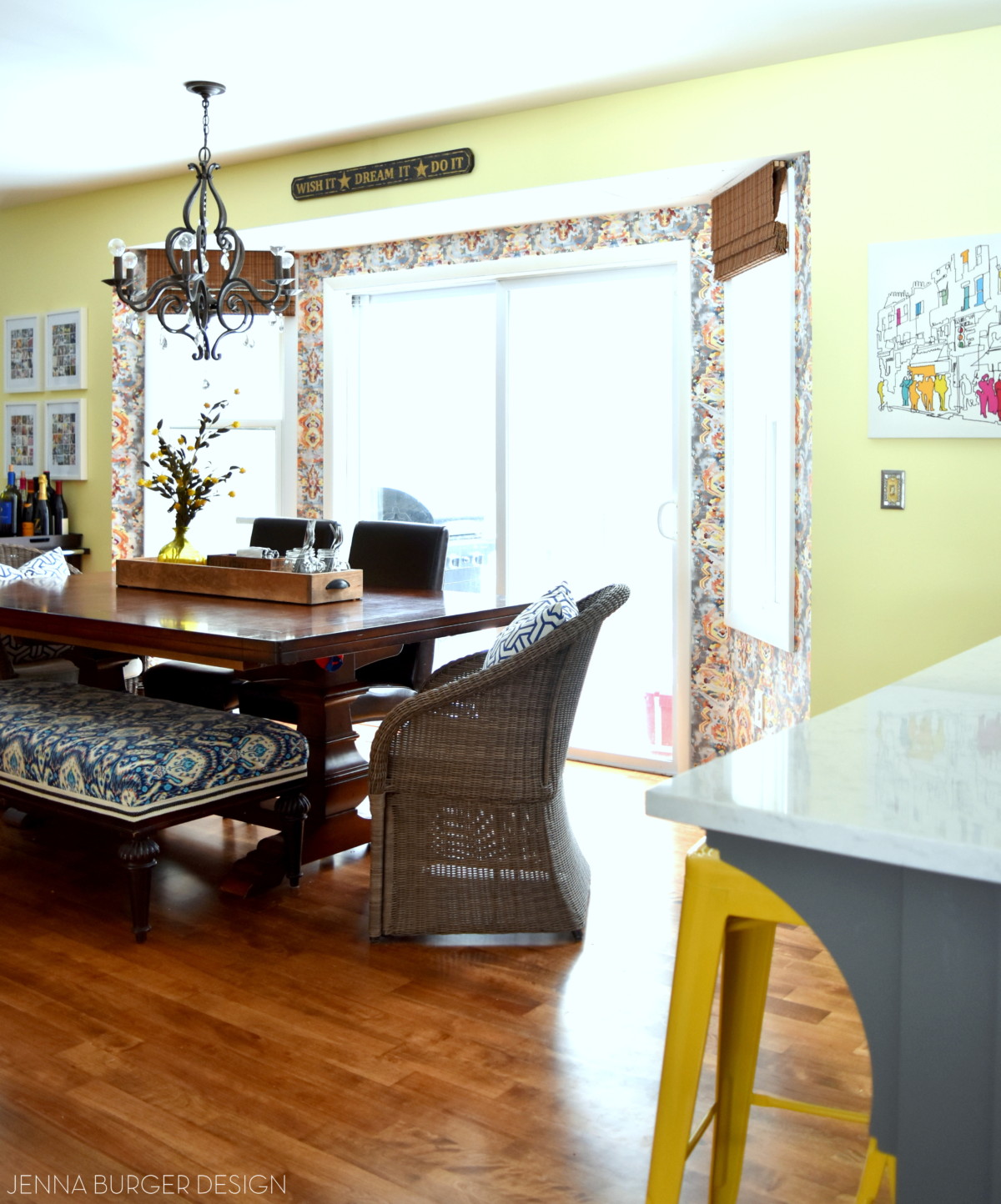
DINING ROOM
From the kitchen is the dining room / breakfast room / we-eat-all-our-meals-here room
If you were to walk straight through the foyer, you’d enter into this space as well. With our open concept floor plan there really is no separation from space to space; I love the bright and airy feel of flowing rooms.
Navy was a color that I started to introduce a few years back and from the looks of the dining room, and obviously my office (pictures above), you can see that I just adore the deep hue, which over the recent years I’ve paired with raspberry colors. The dining room has a large bay area (which I recently wallpaper) with two side windows and a sliding glass door that leads to our deck. Super easy access to the outdoors. We love being outside once the weather warms up (I can’t wait)!

Post: Before & After China Cabinet Makeover
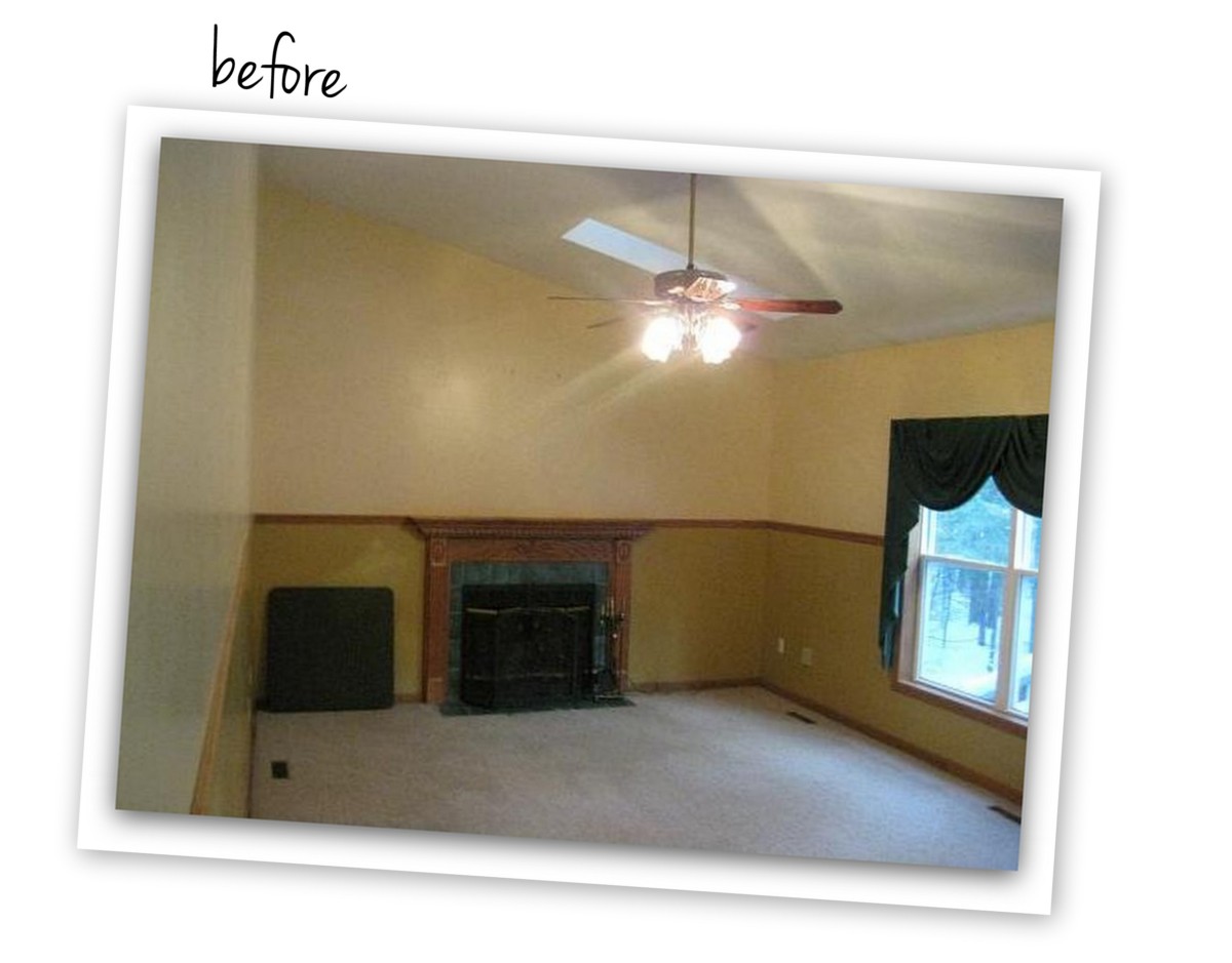
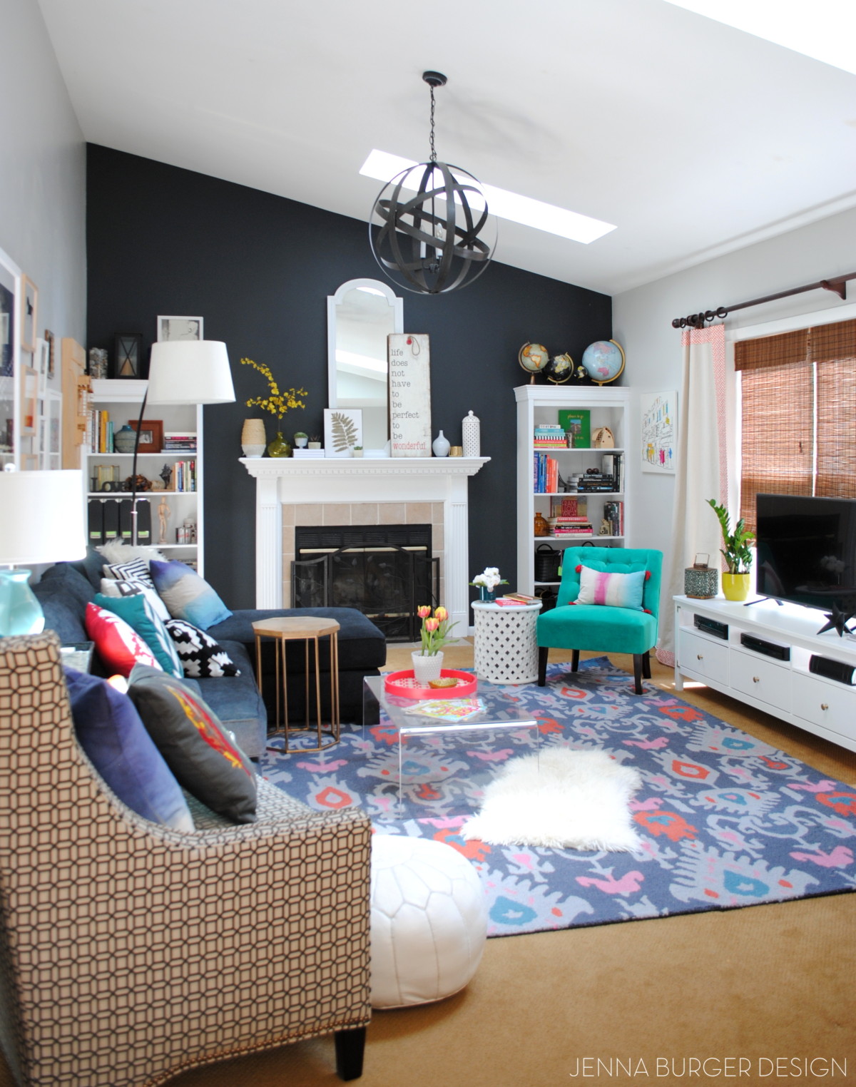
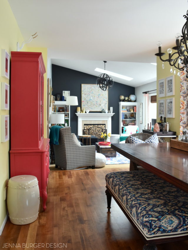
LIVING ROOM
Having one open space, makes our home feel so much larger than it really is.
Continuing from the dining room, there is one step down into the living room. Because of the vaulted ceilings with skylights, this space always feels so light + bright. When the time came last year to give this room a revamp, I knew it could handle + needed a dynamic dark color. Everyone thought I was crazy for choosing a black paint color, but once it was complete and the lighter layers were brought in, the space resulted exactly how I envisioned.


This is our everyday, hang out space and it’s such a delight to melt into after a long days work!
LIVING ROOM POSTS
Living Room Makeover: Plan of action
How to make a laminate bookshelf into a built-in
DIY Dropcloth window panels
Planning + creating an art wall
Top paint colors for black walls
Tiling the fireplace surround
So that’s basically it for the first floor. Come on upstairs.
into the master bedroom.
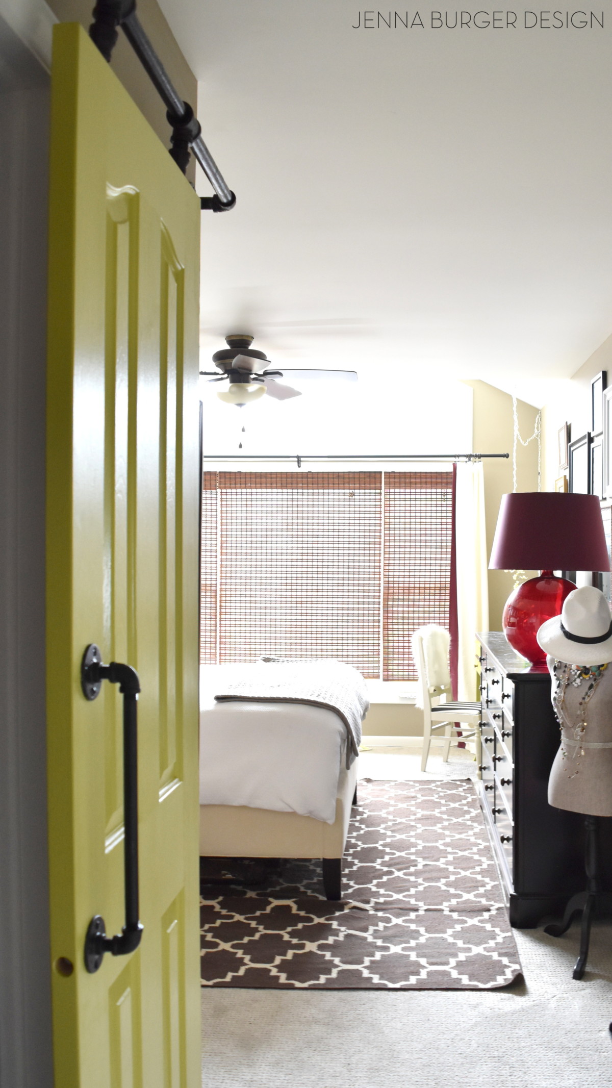
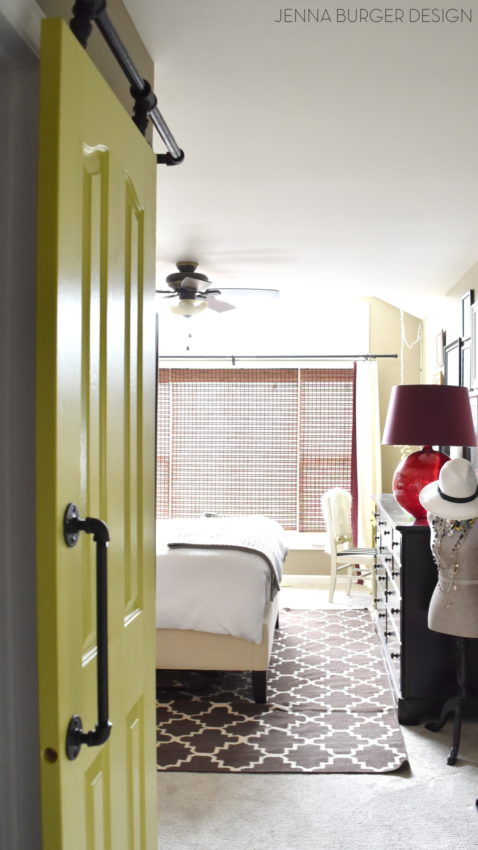
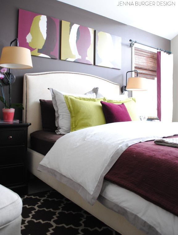
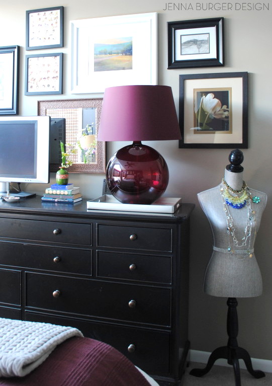
MASTER BEDROOM
A space that has forever been in transition (and is still a work in progress). Somehow this room gets neglected often and even though it looks pulled together here, it rarely looks like this (I’m so bad at taking the time to make our bed). Just like my office, this space has a huge amount of light filtering through. The windows are amazing.
The aesthetic in this room is more serene than the rest of the house. Comparably to the other spaces, it seemed less dramatic, until a few years back when I added pops of citrine + plum! The space is still very serene and has an overall quiet palette of whites, but pops of color bring in the added dimension and depth it needed to pop.
MASTER BEDROOM POSTS
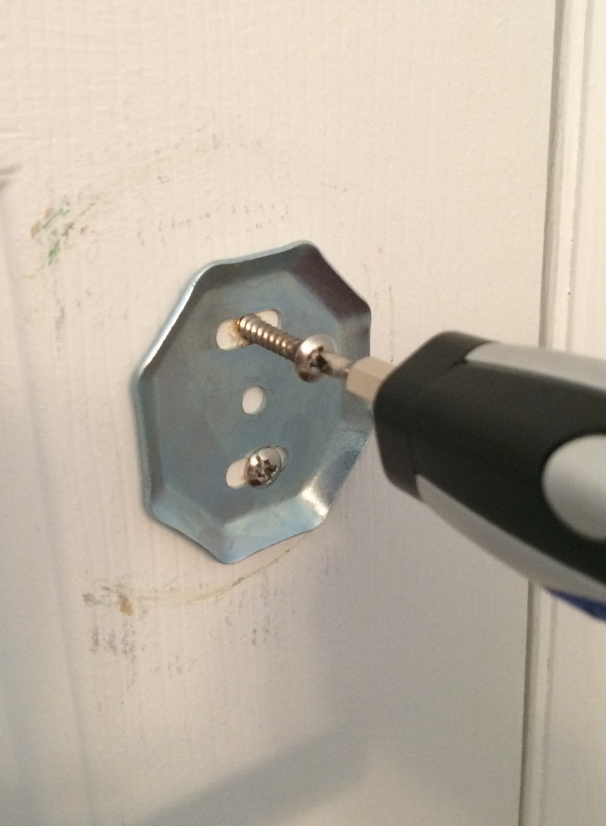
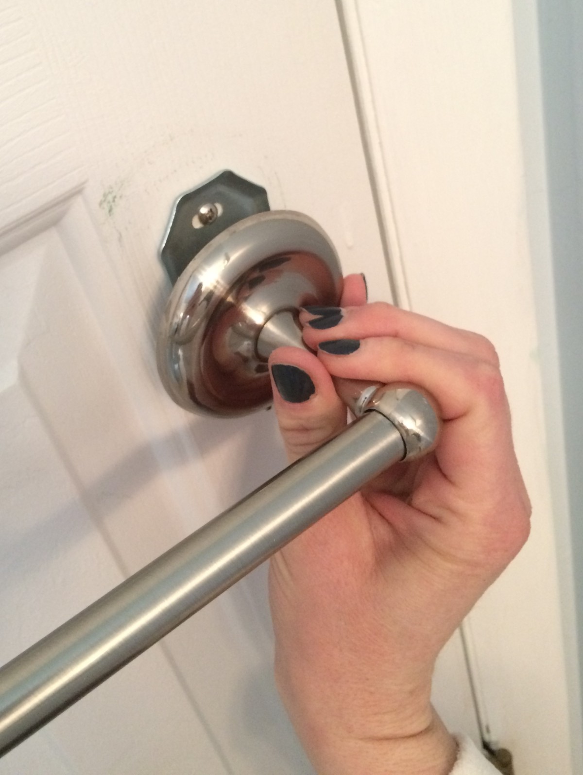
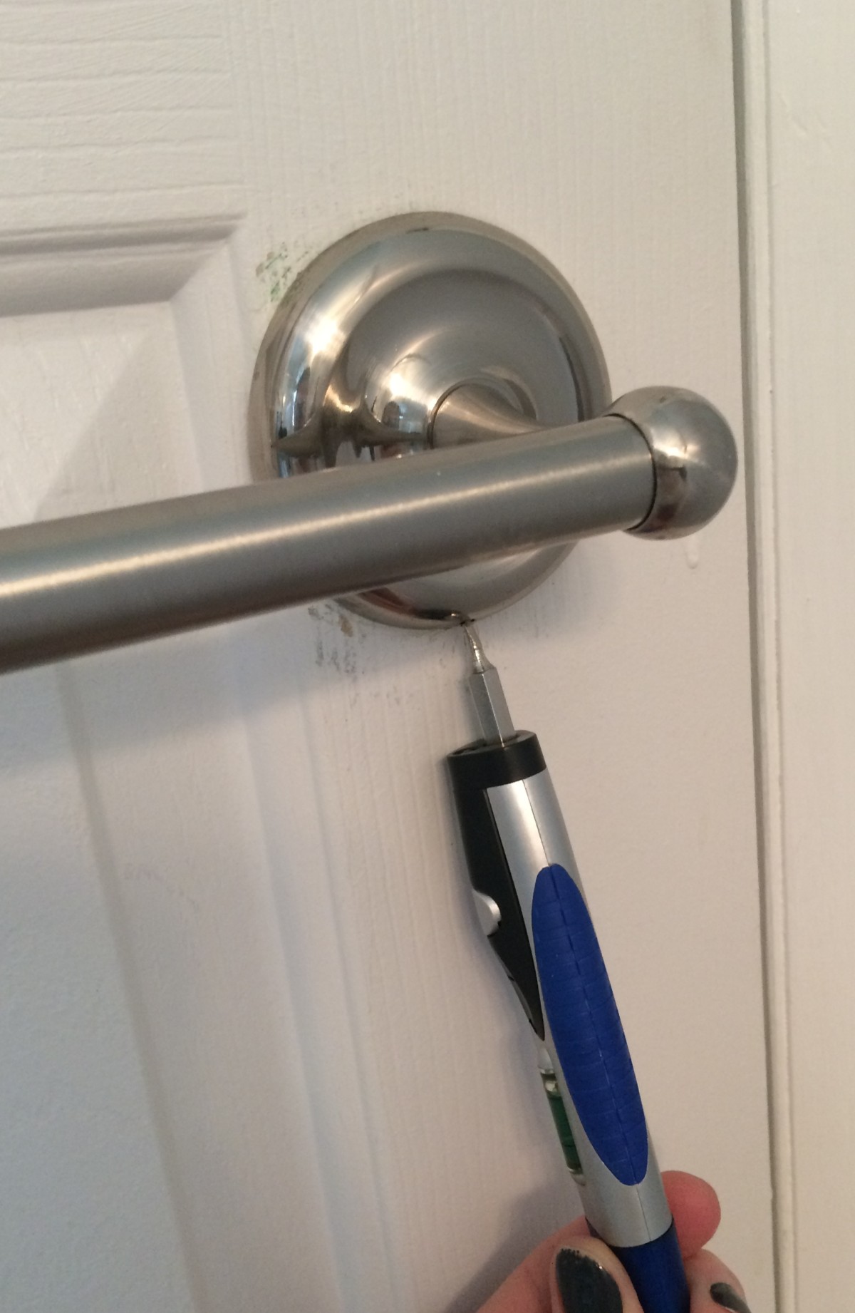
DIY Rolling door hardware using plumbing pipe
How to make a simple lined curtain (from previous space)
Master Reveal {2014 revamp}
Master Makeover: Plan of Attack
The Dark Side: Choosing a Contrasting Paint Color
Ideas for Breaking Up Matching Furniture
Customizing Store Bought Curtain Panels
How-To Make a Pendant Fixture
Desk Makeover using Make-Your-Own Chalk Finish Paint
Picture Gallery Wall
DIY: Jewelry Holder
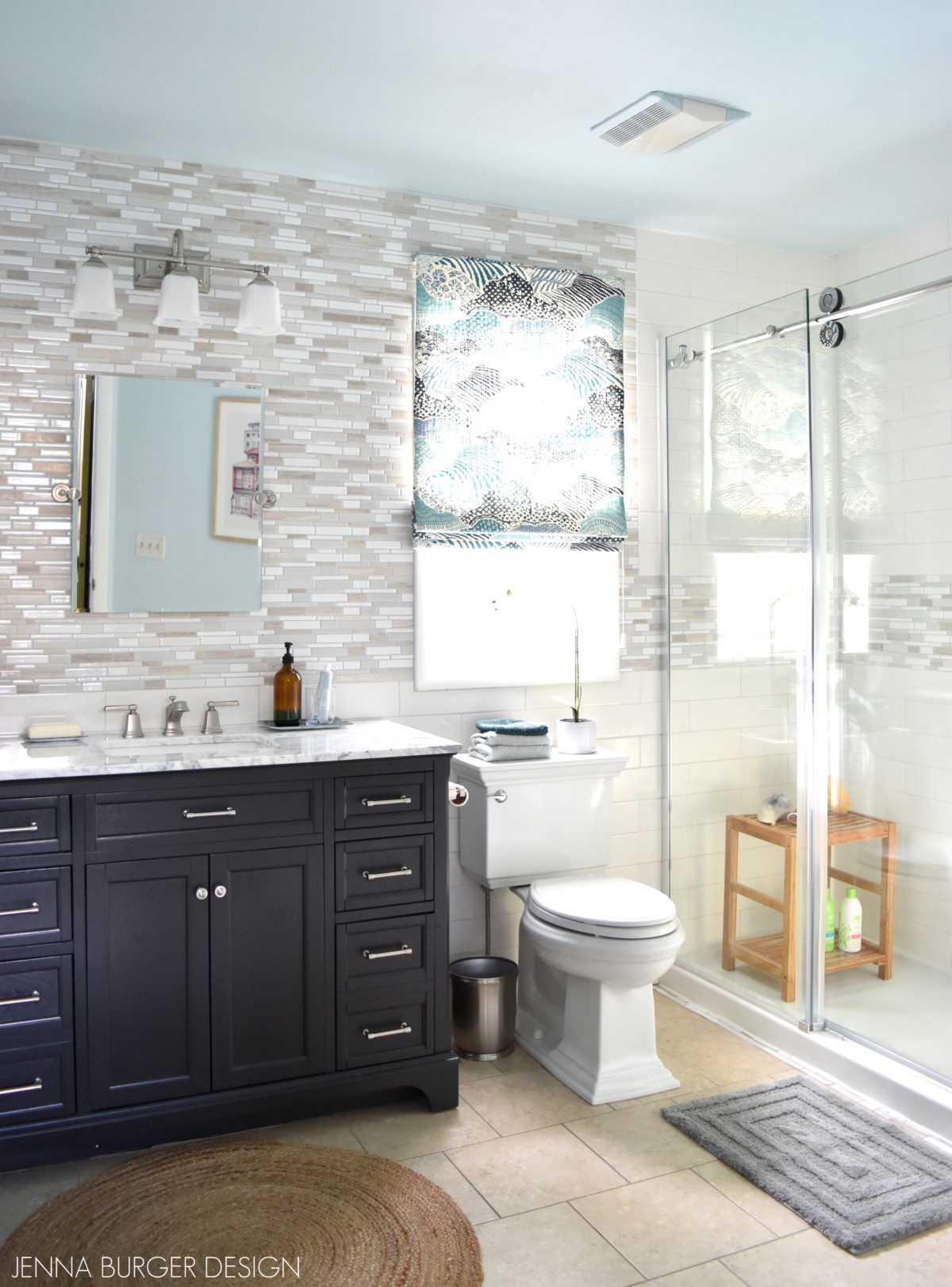
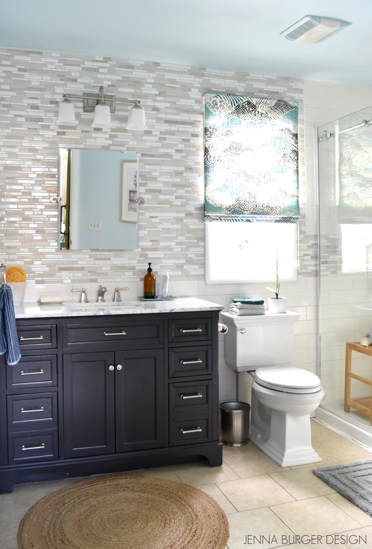
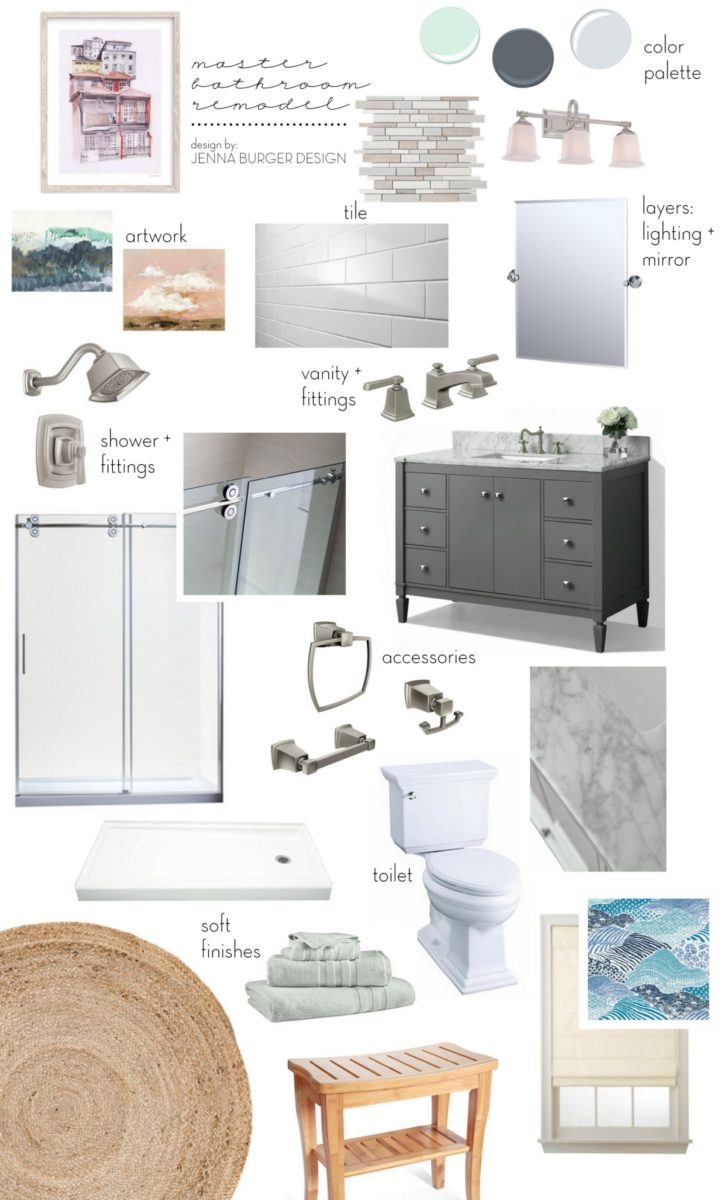
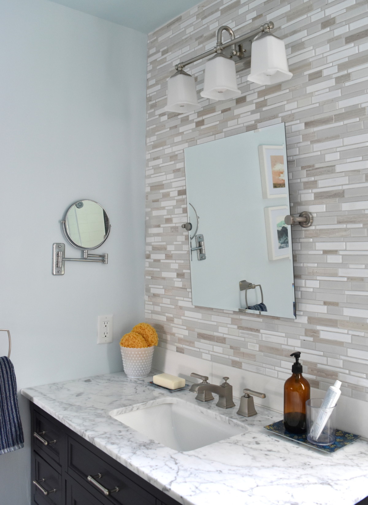
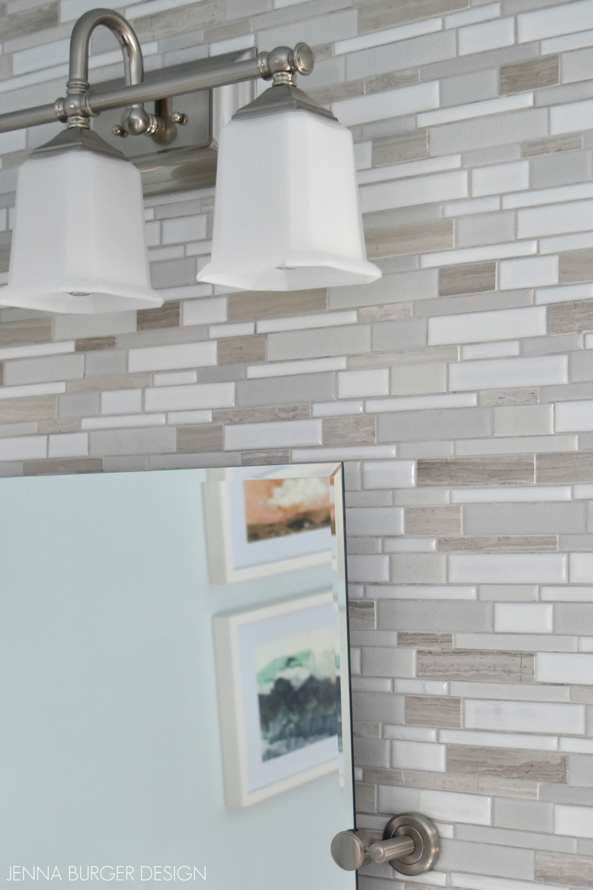
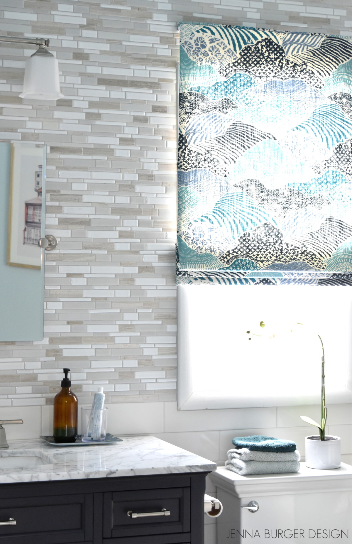
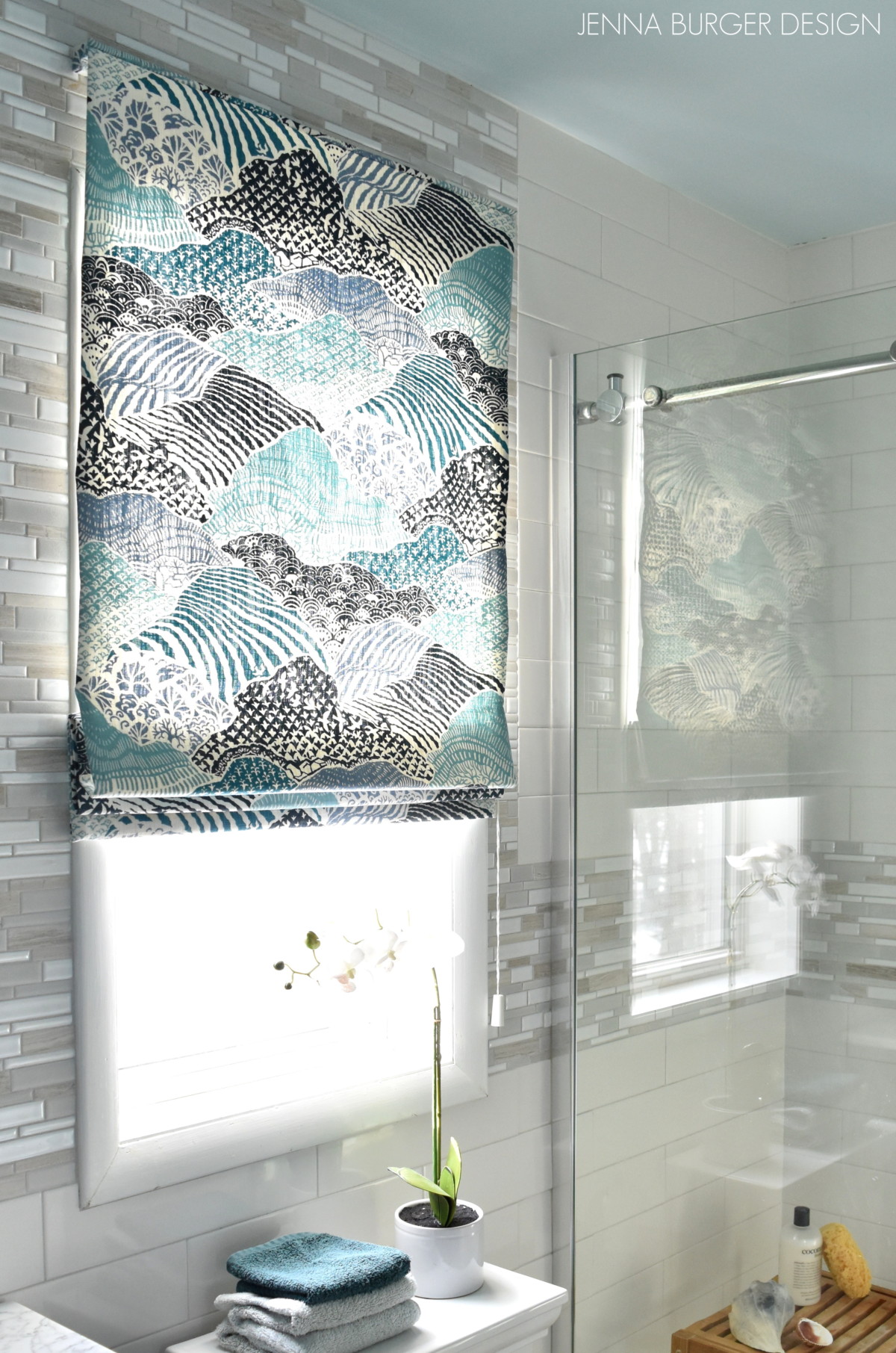
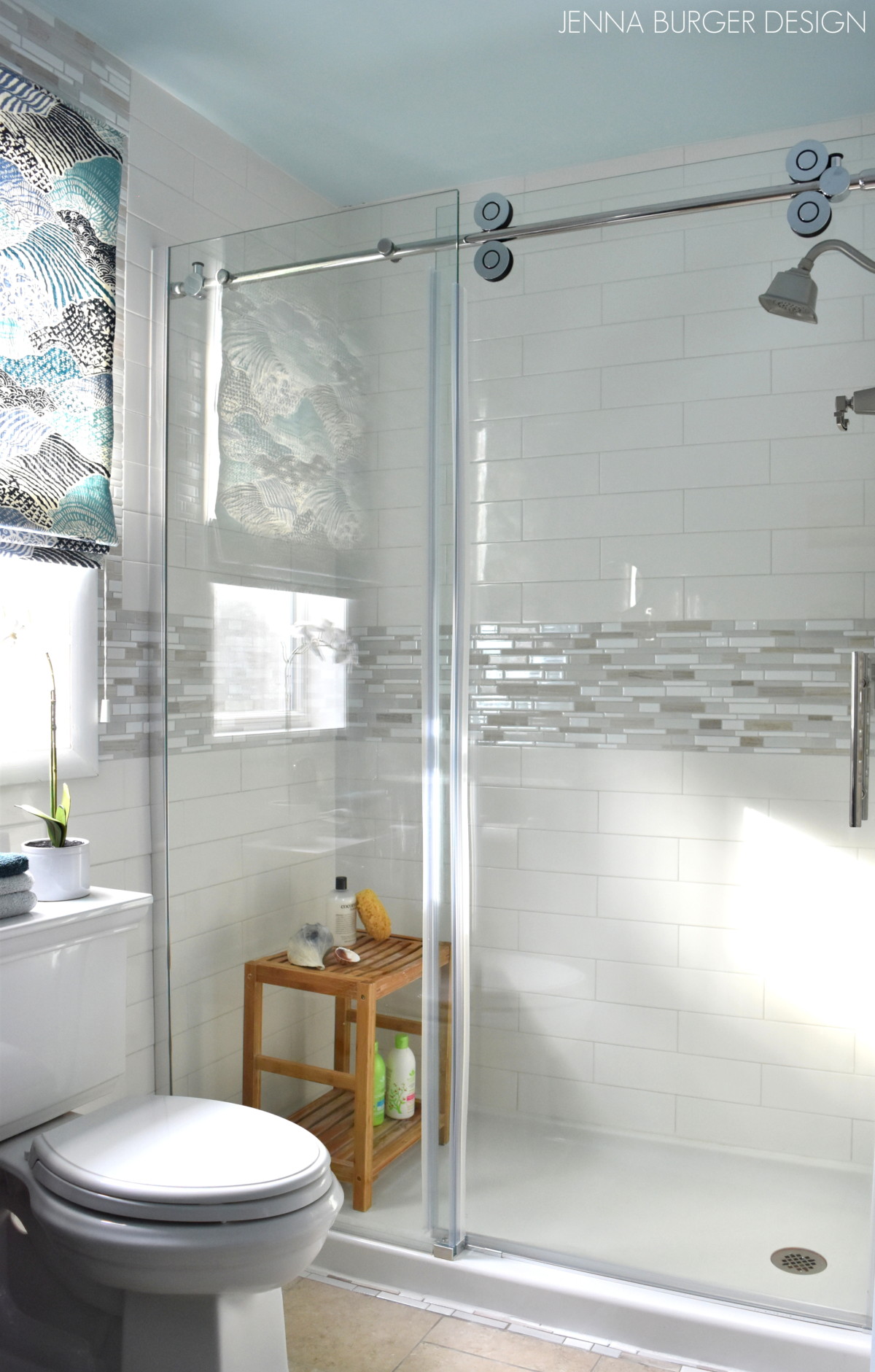
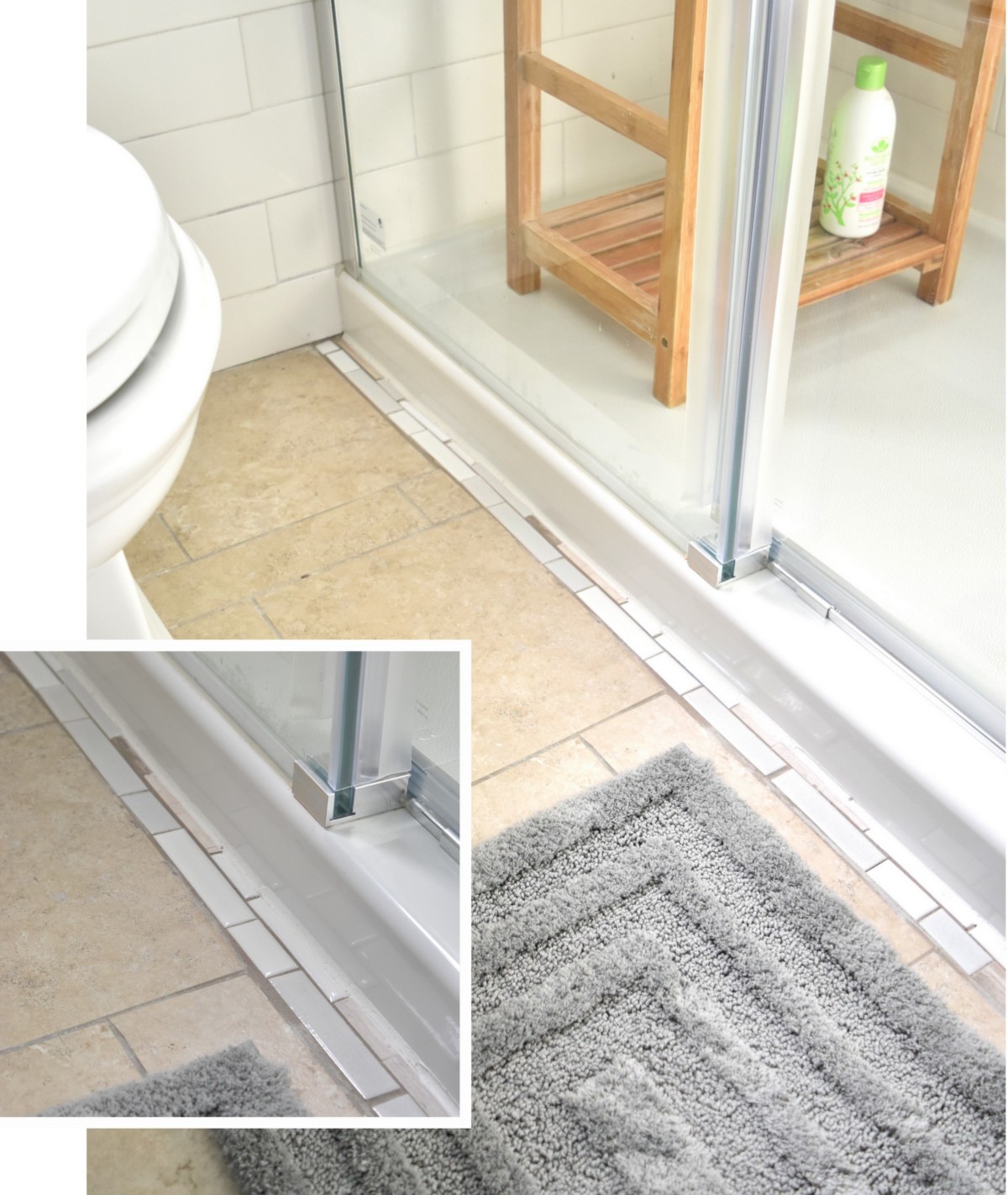
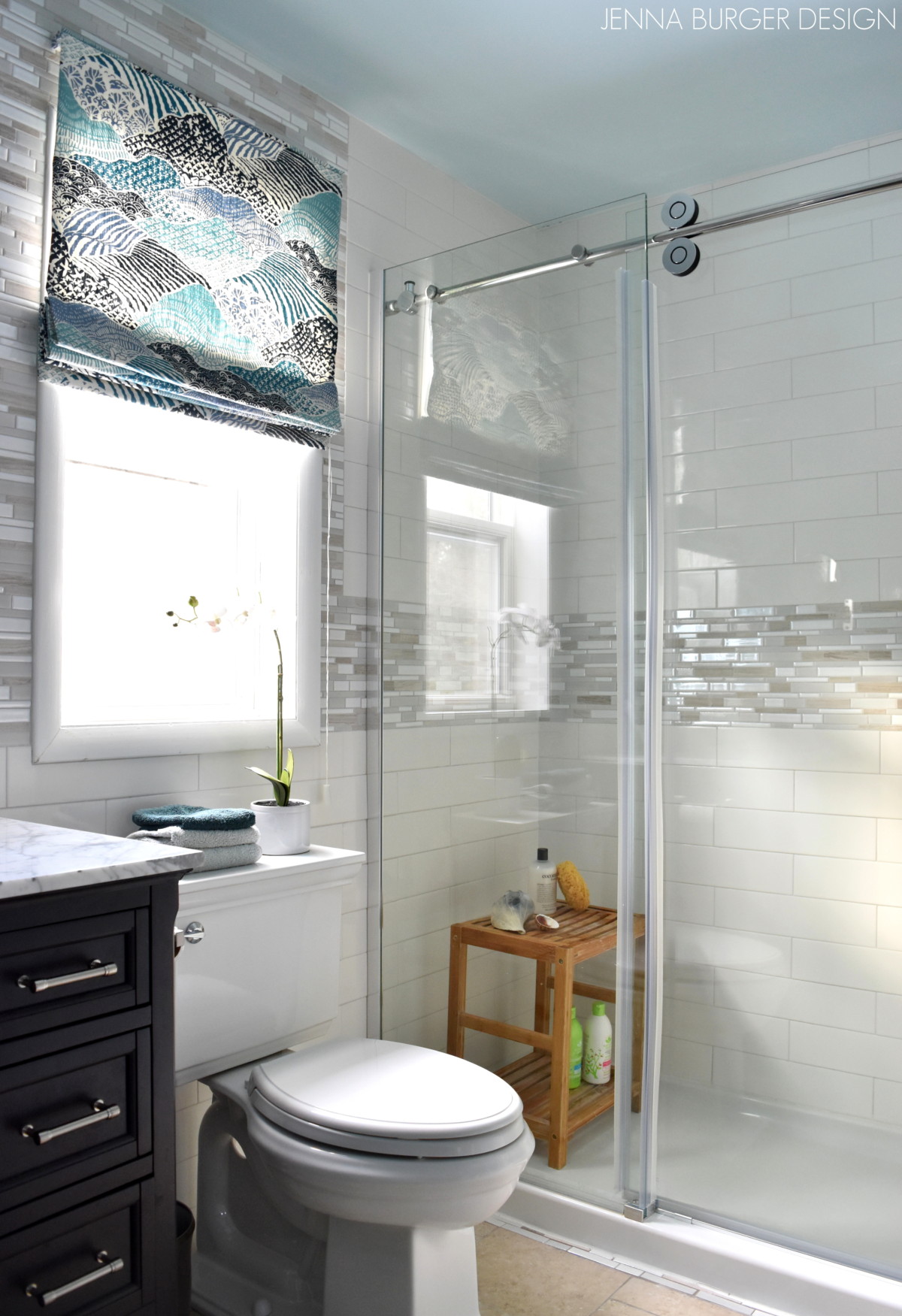
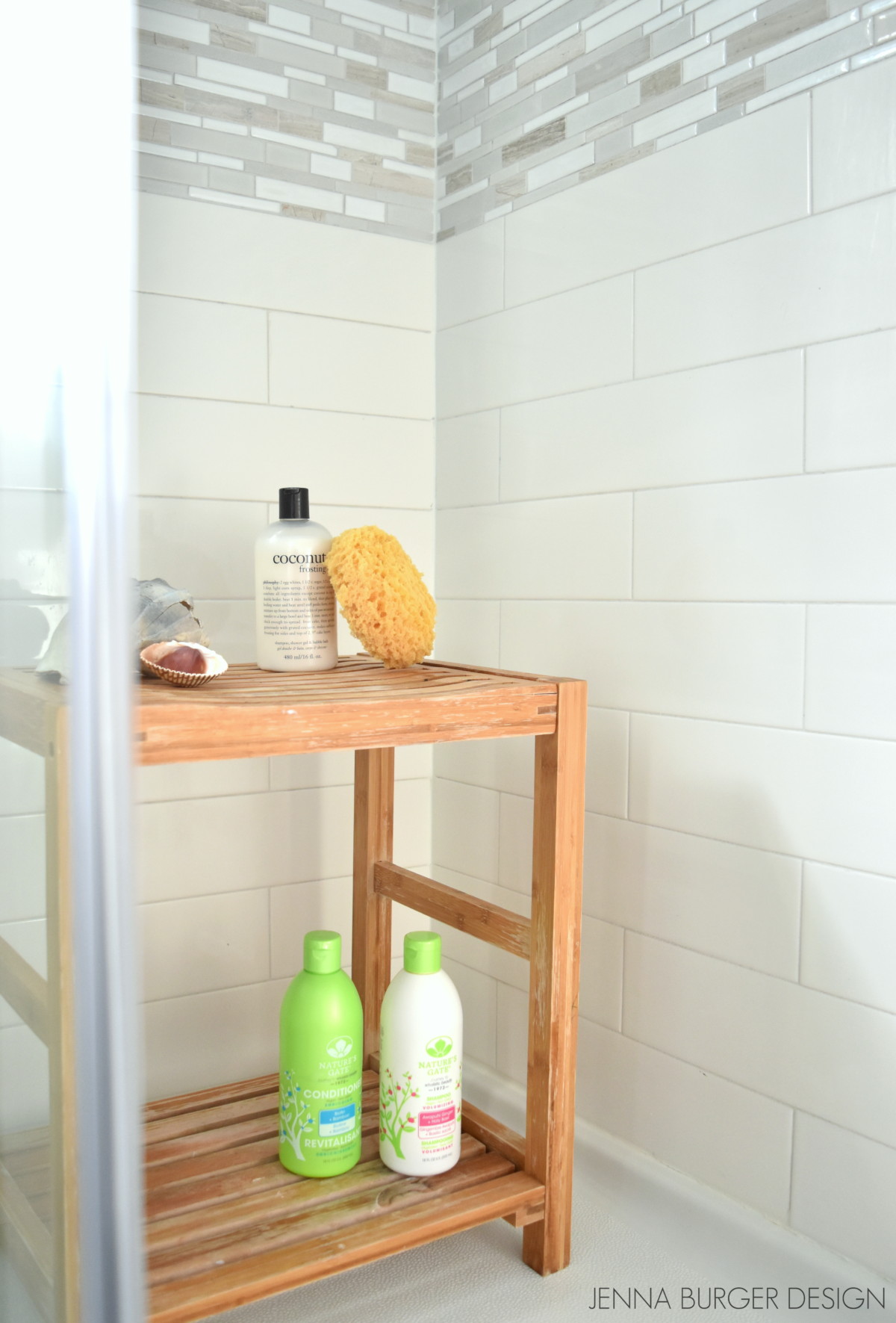
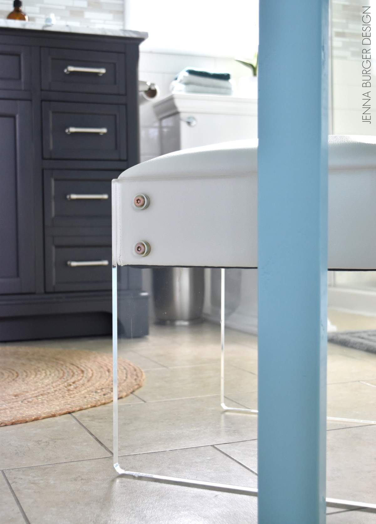
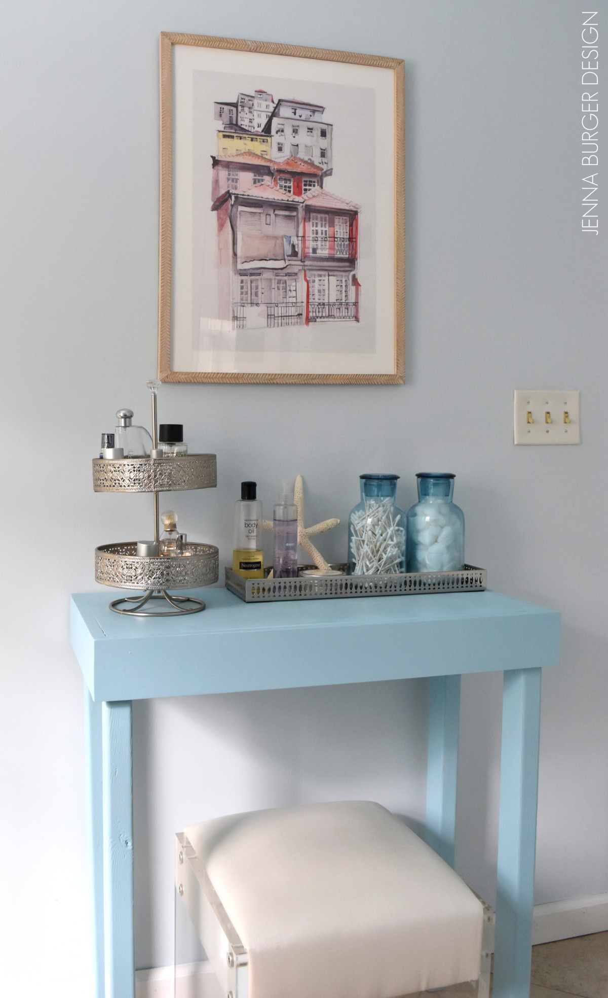
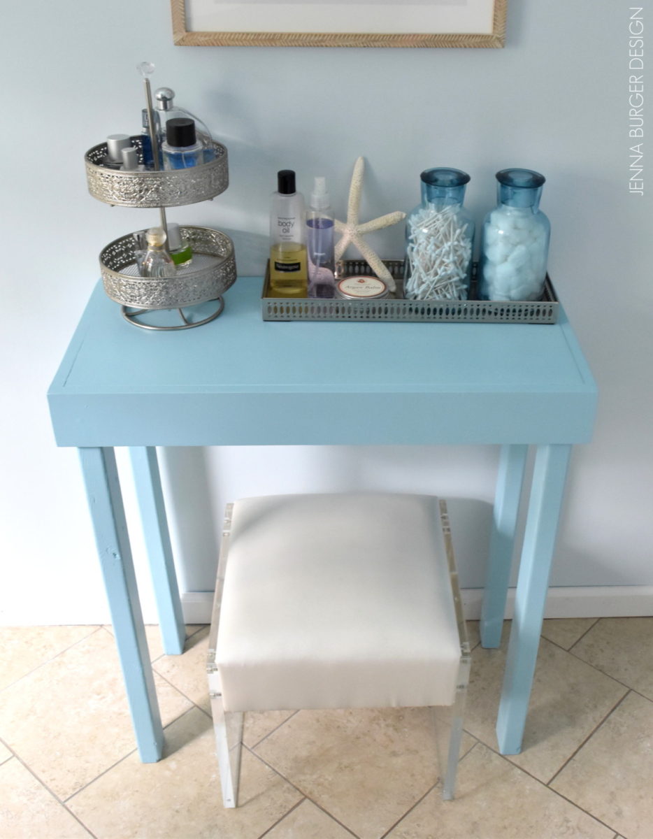
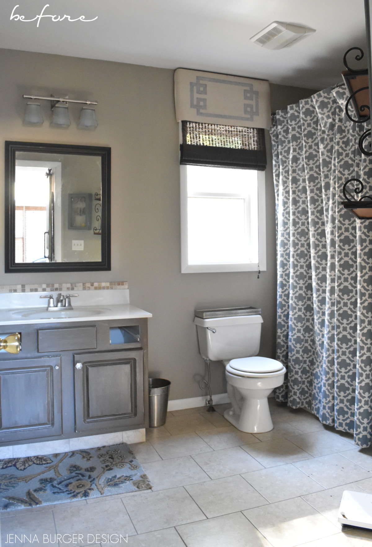
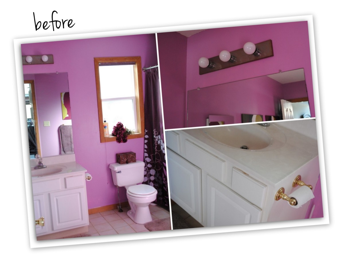
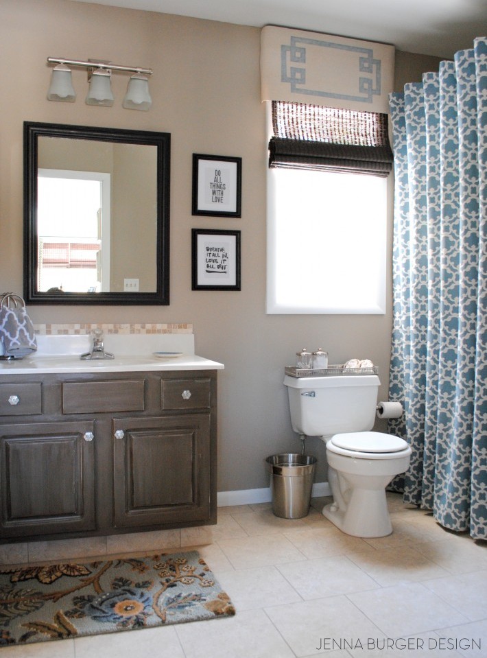
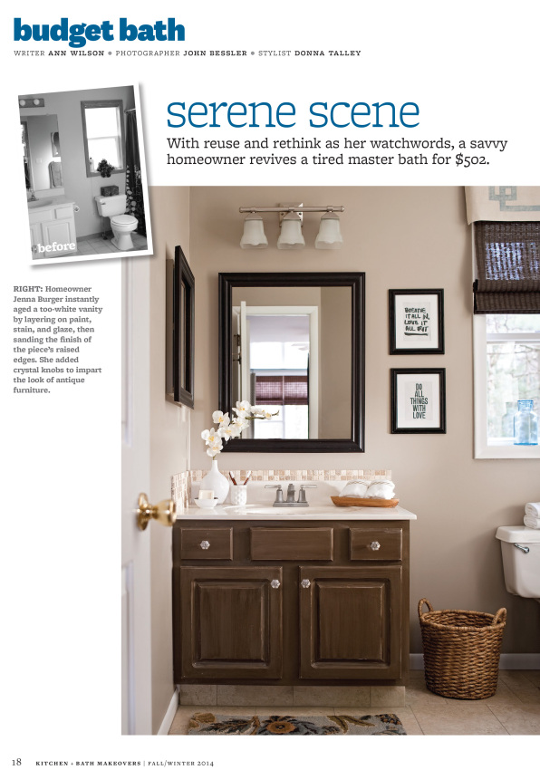
MASTER BATHROOM
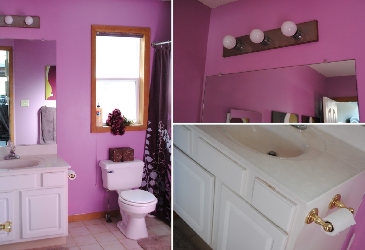
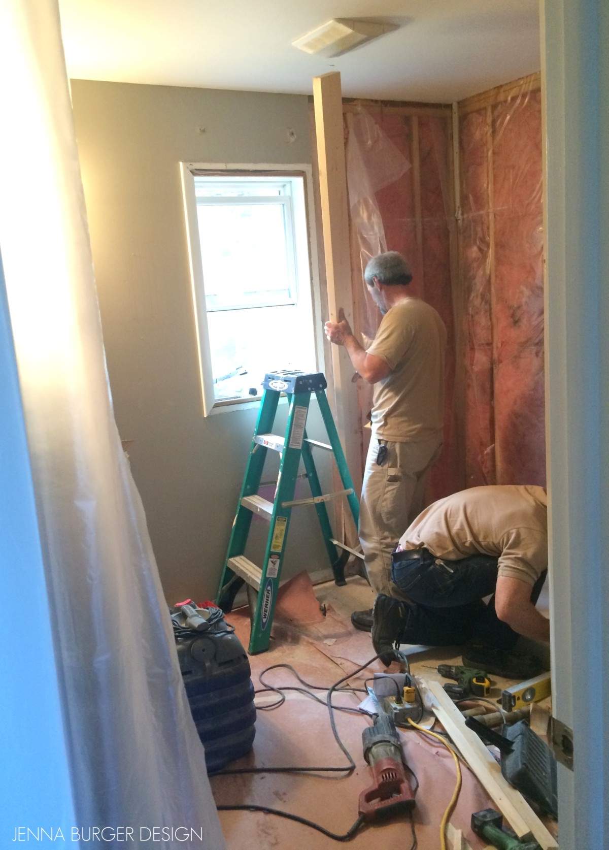
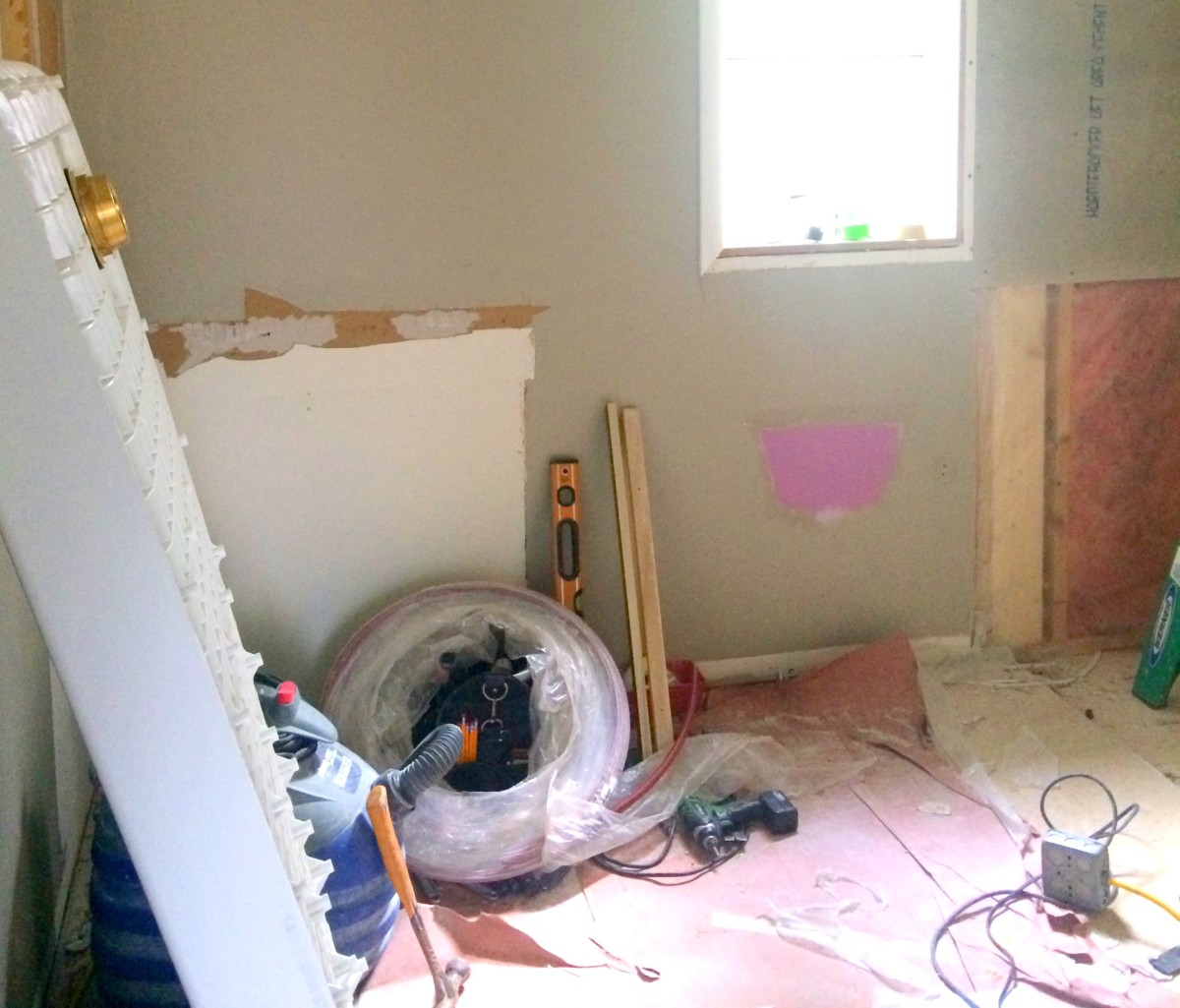
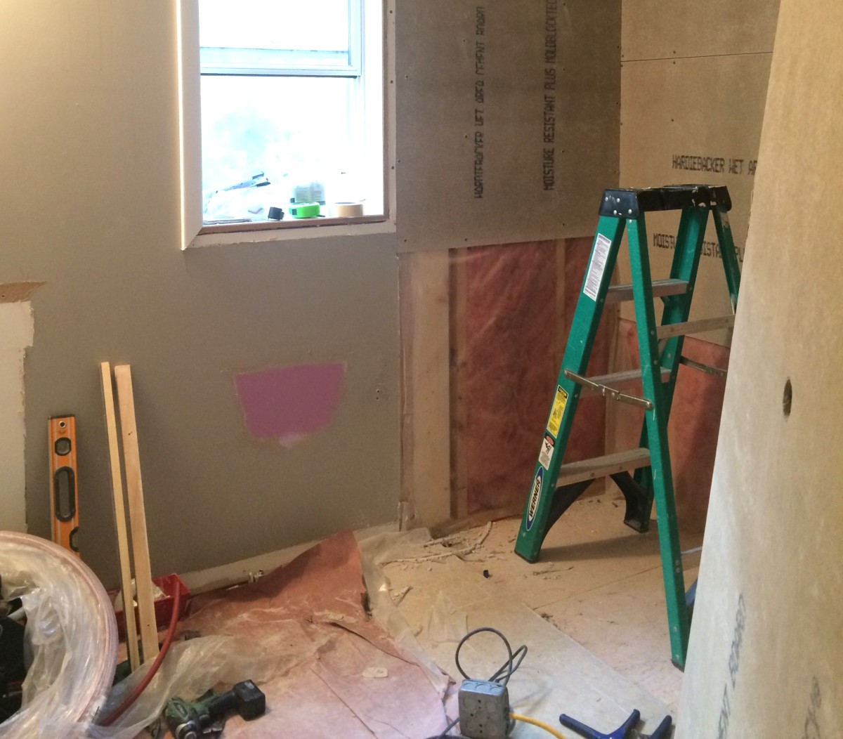
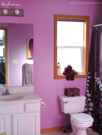
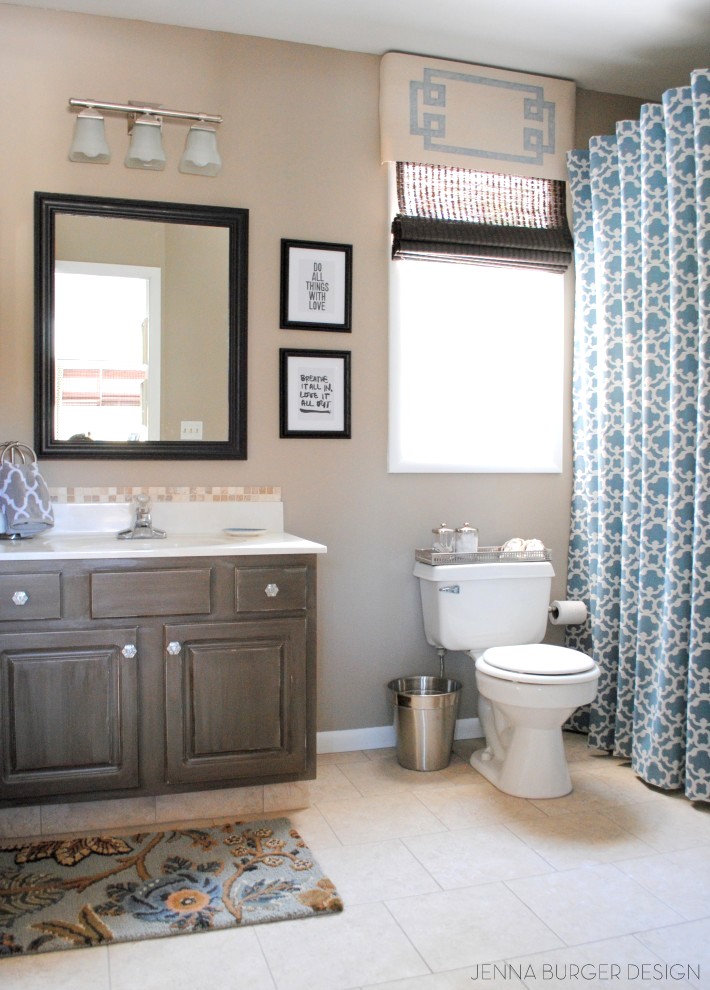
And then there is the bathroom. If you want to see a horrid looking bathroom, you have got to check out the before!! You’ll be frightened. And to think back and remember that it took us over a year before we even started to redo it, just simply scares me. Anyway, similar to the bedroom, the master bathroom is another quiet space accented with shades of blue. From the before color, you’ll know why this hue was chosen.
Similar to most of the spaces in my home, the master bathroom was a full-on DIY endeavour. From the cabinet to the floor to the mirror to the shower curtain, this space was entirely transformed using my two hands (and a bit of the Misters, gotta give him credit. He’s my can you help me? sâvior)!


MASTER BATHROOM POSTS
Horrid to heavenly master bathroom reveal
How to glaze a cabinet using stain
How to make a shower curtain using a curtain panel
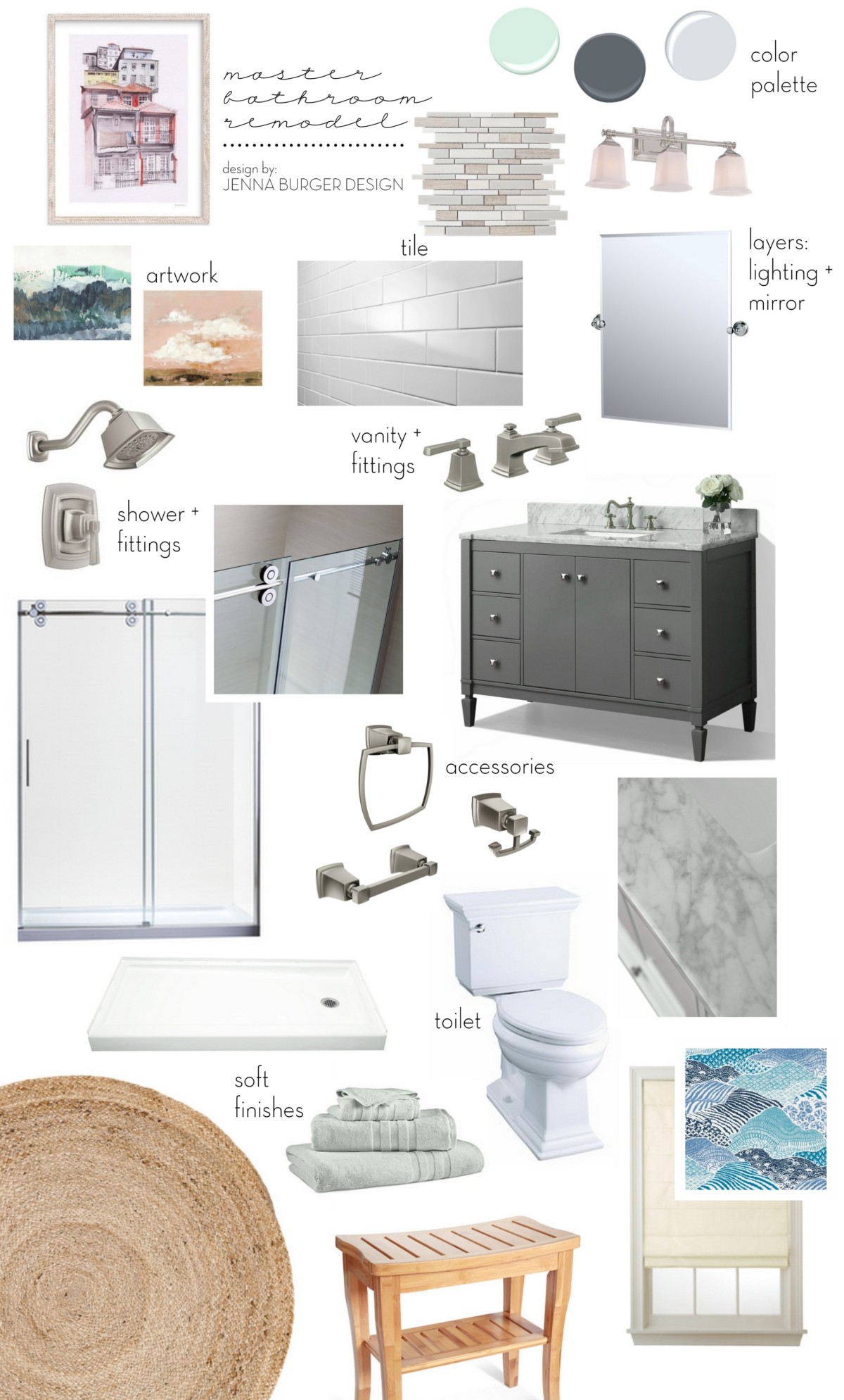
(psst… this room might be getting a remodel next)
Another room that was featured in Better Homes and Gardens KBMO magazine.
Onto my kids spaces
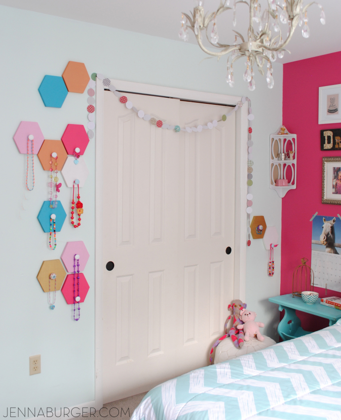
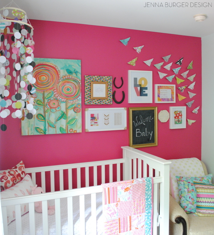
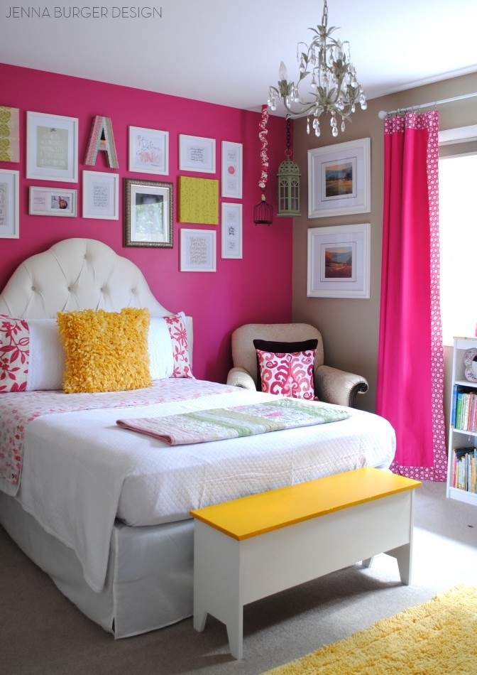
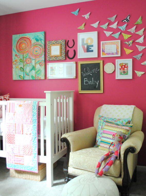
GIRLS ROOM
The room that my 2 daughters share has had quite the transformation over the years starting as a nursery, then getting revamped to a big girl room with a 3-in-1 play tent. Once baby #3 (our littlest lady) came along, a new wall color was added and changes were made to accommodate a nursery nook.
This is kind of how it looks today minus that the beige wall which was recently revamped with a new mint-colored hue

This nursery nook won’t look like this for too much longer as our littlest lady is approaching 2. WHAT? How can it be?!

GIRLS ROOM POSTS
Washi tape initial craft
How to add decorative trim to curtains (for cheap)
DIY: 3-in-1 Play Tent
Nursery to big girl room reveal
Nursery nook
Handmade nursery mobile
Honeycomb hooks
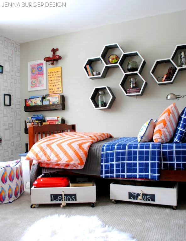
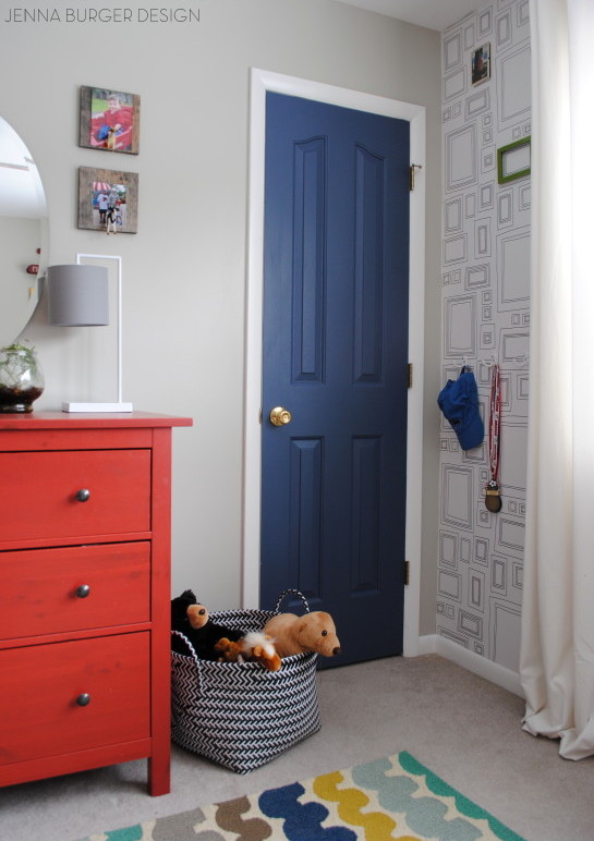
BOY BEDROOM
And now to my little guys room (who is 10 – what?!)
His room has had many evolutions over the years since we moved in when he was 4 and now he’s 10.
At one time he had bunkbeds, but we took them apart to make two twin beds. Since we don’t have a guest room, having an extra bed was nice, but it was rarely used so in his current revamped room, he only has one twin bed. His before room, which is an untraditional blue-for-boy was a fun and creative space. So many of you loved the stripes on the wall…

2013 BOY BEDROOM
How to paint stripes
Skateboard shelves
How to make pallet shelves
Painted two-tone desk + Tips on painting furniture
A few years back, we revamped his room again with a light gray wall color + a fun picture frame wallpaper + cool wall decor.
BOY BEDROOM POSTS
Ideas for a shared kids room (when we thought our kids were going to share a space)
How-To hang wallpaper like a PRO!
New Leaning Shelves: Decorating with leaning + ladder shelves
DIY: Rolling underbed toy storage crates
DIY: Honeycomb Shelves
DIY: Pallet Book Holders
Boy Bedroom Reveal
Last but not least…
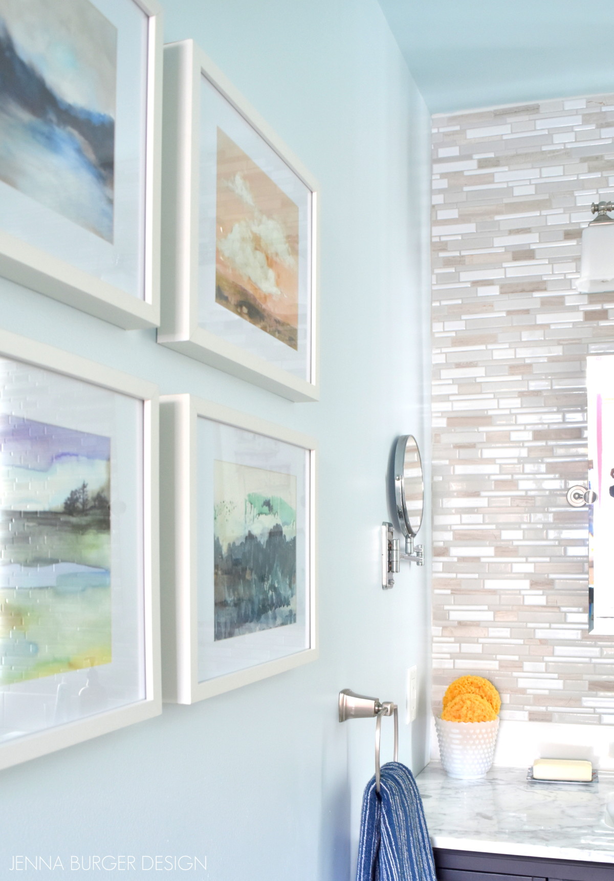
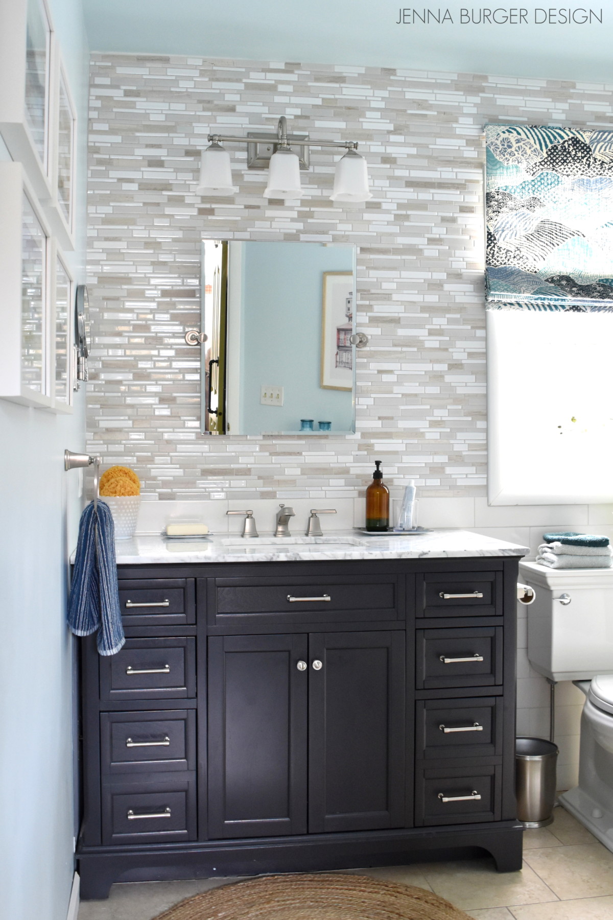
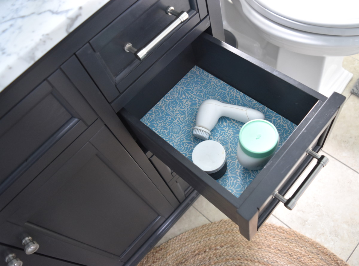
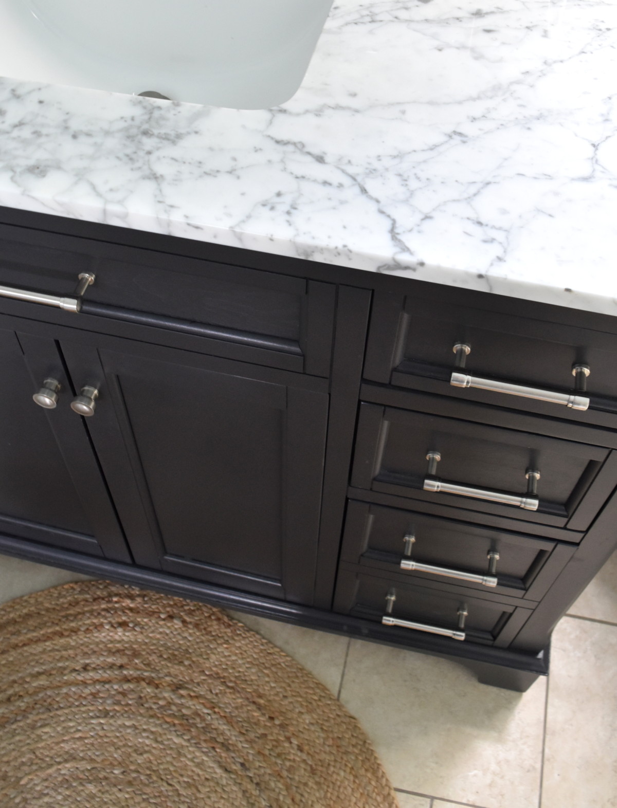
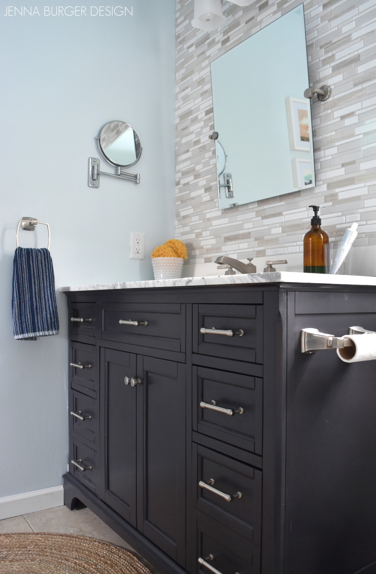
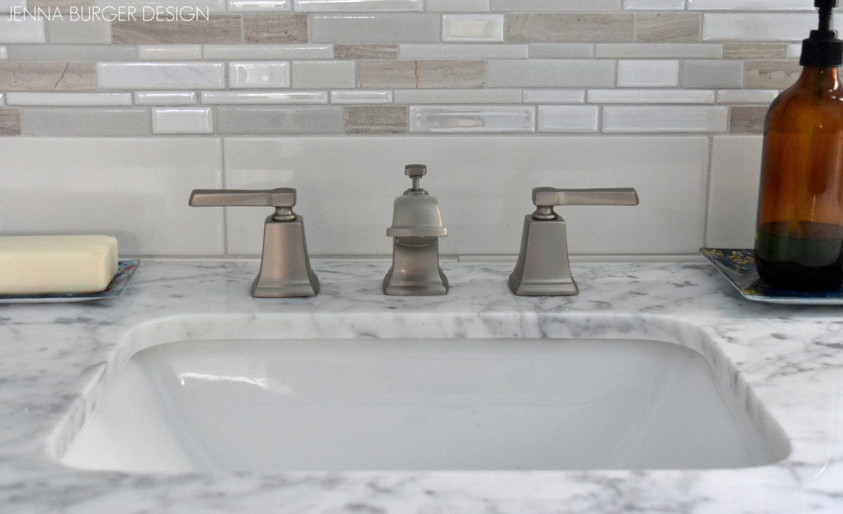
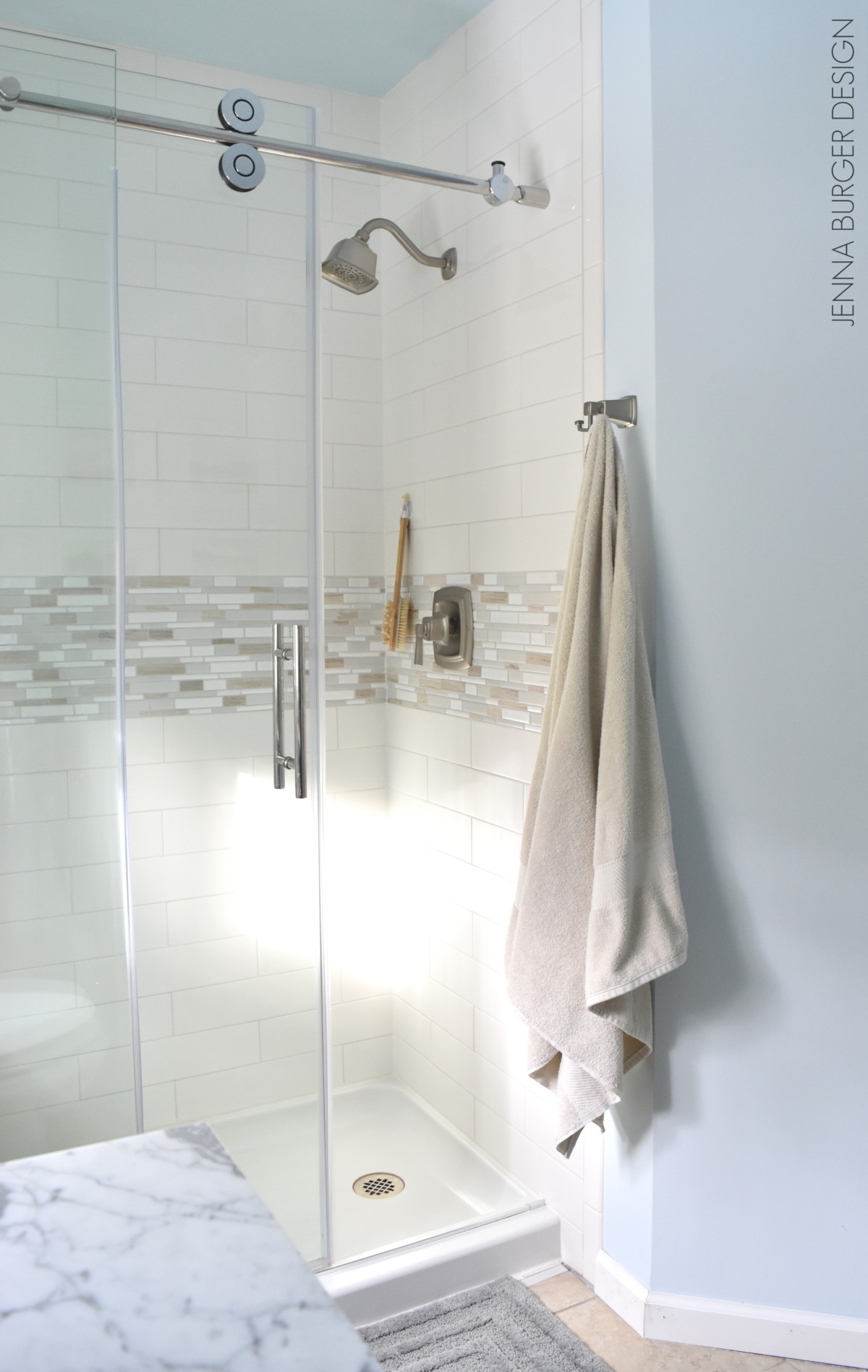
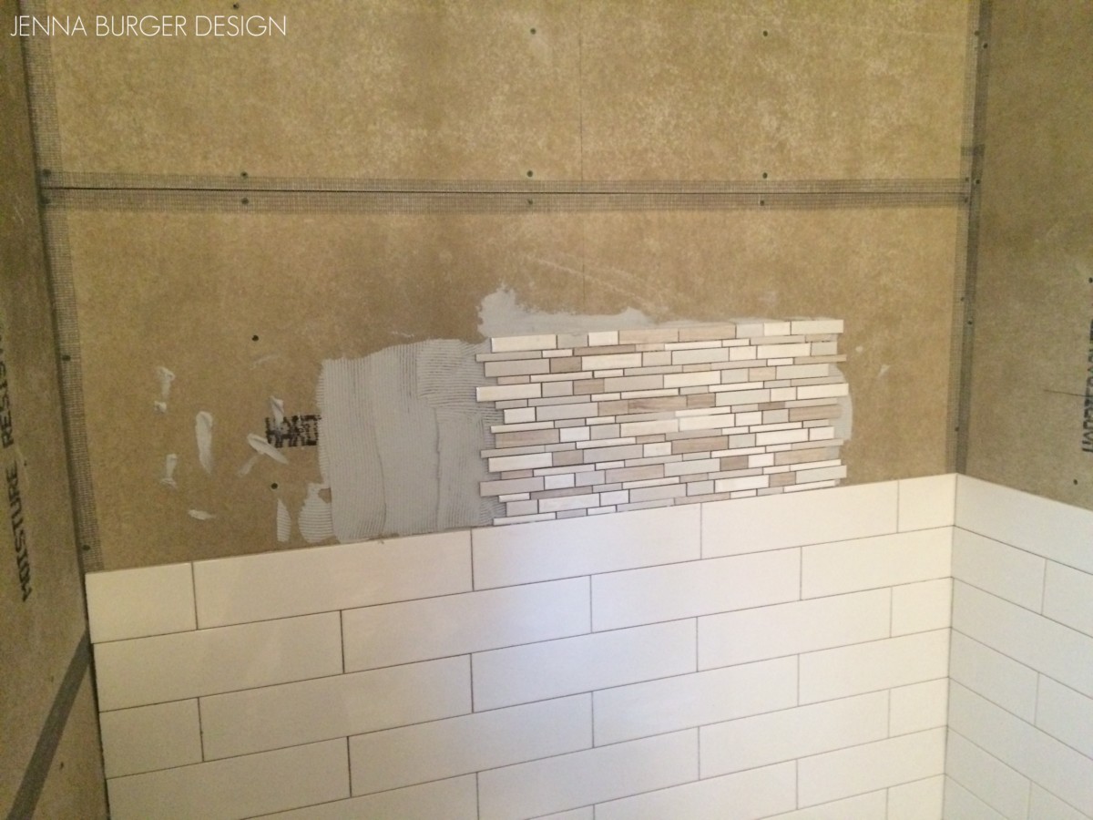
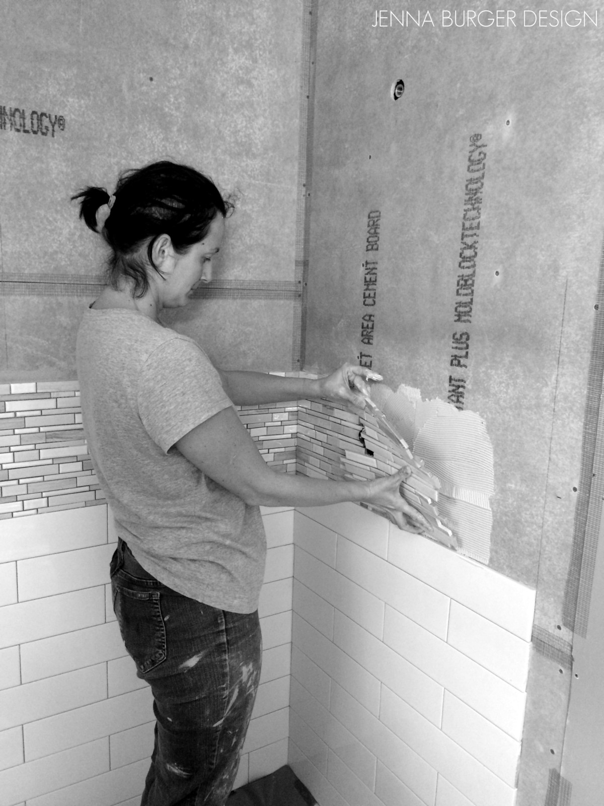
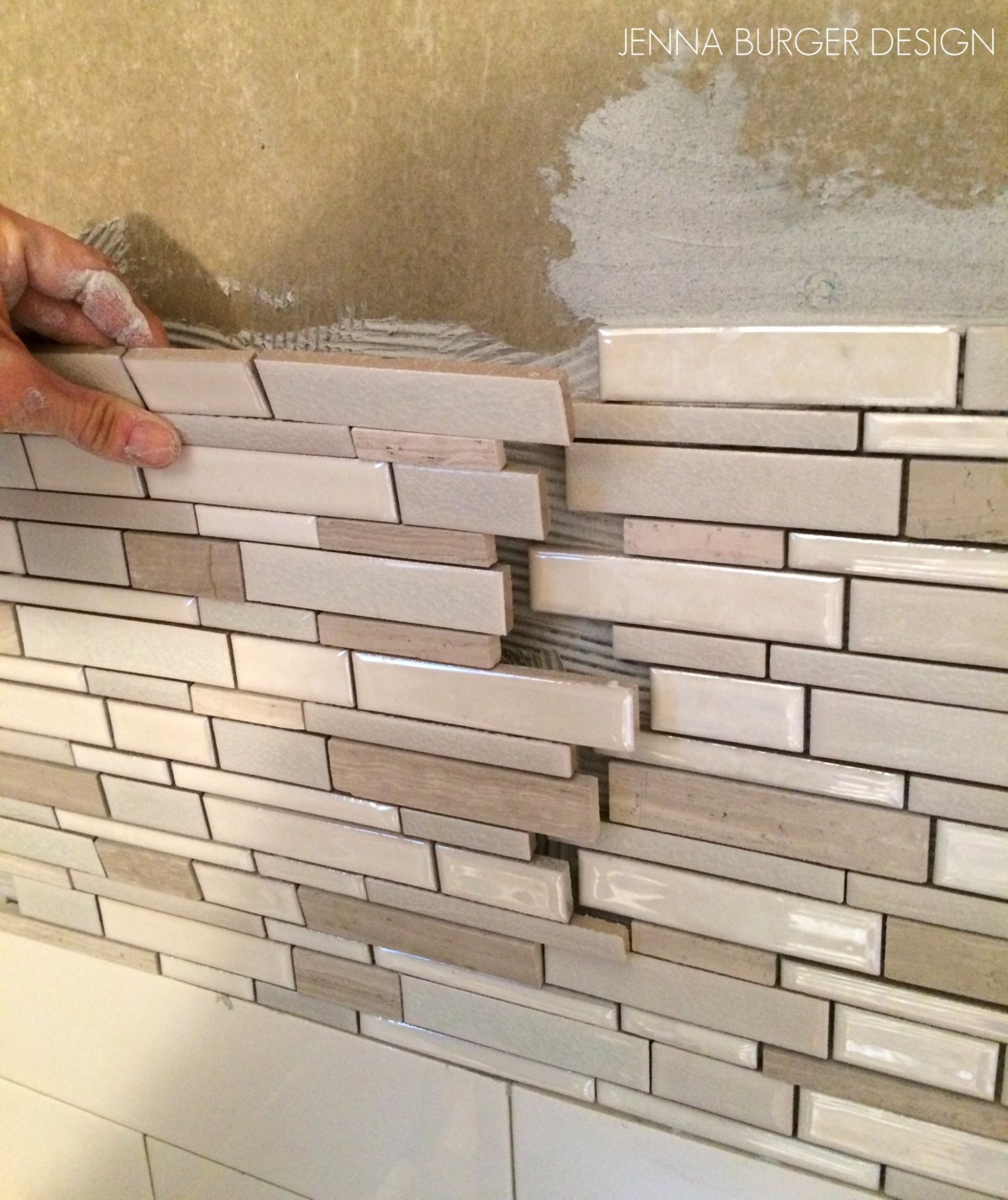
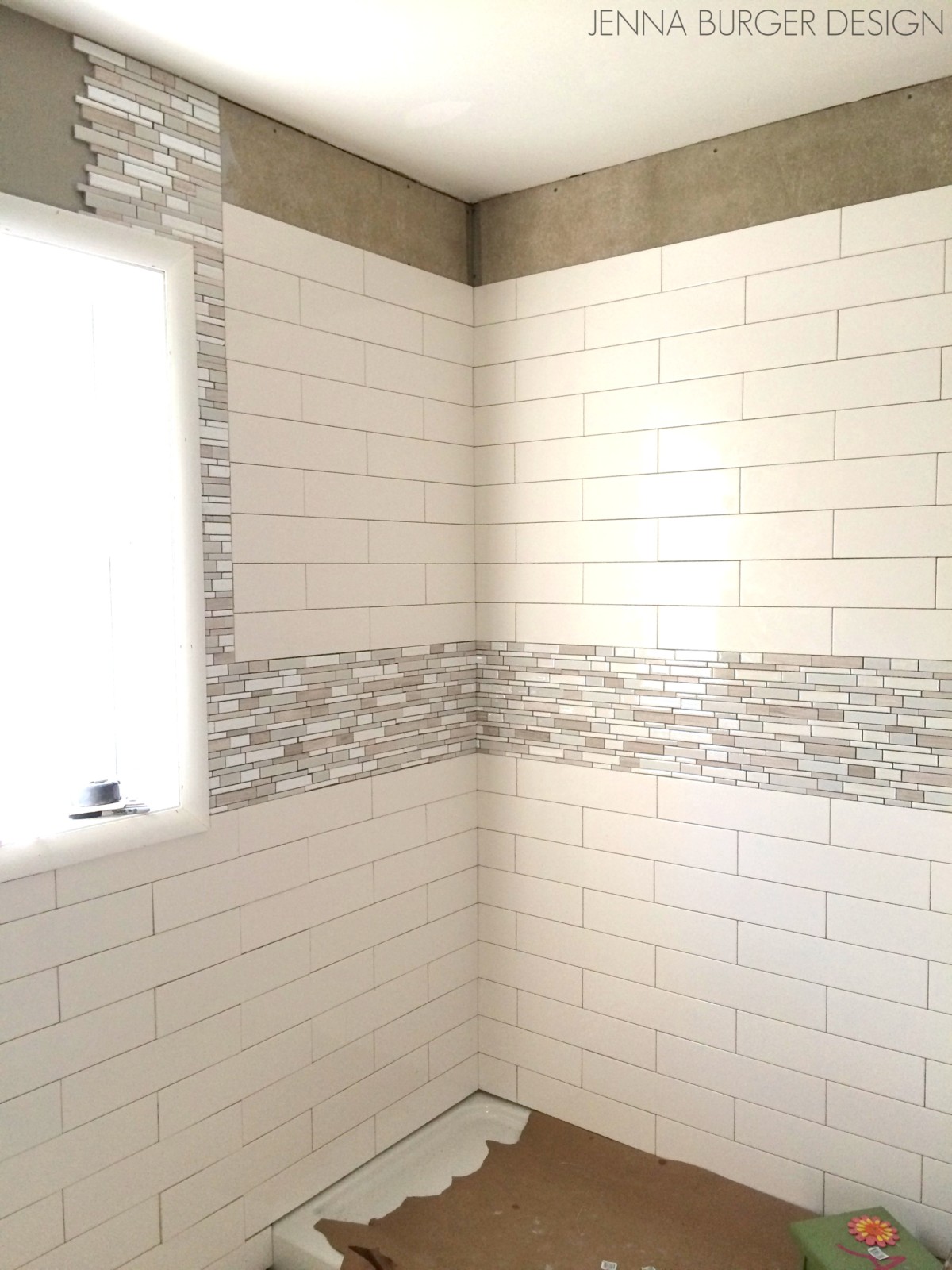
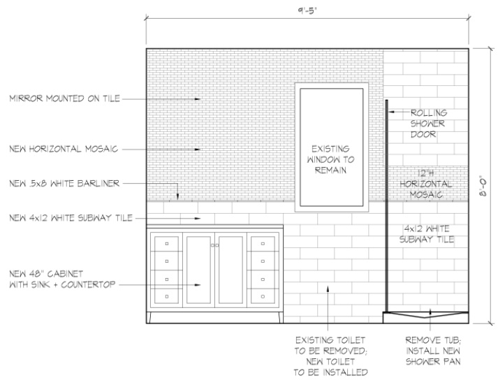
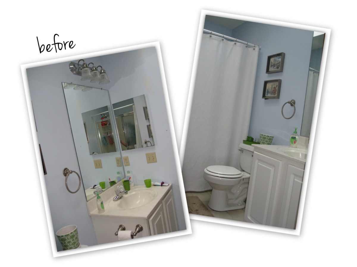
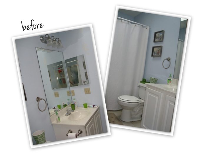
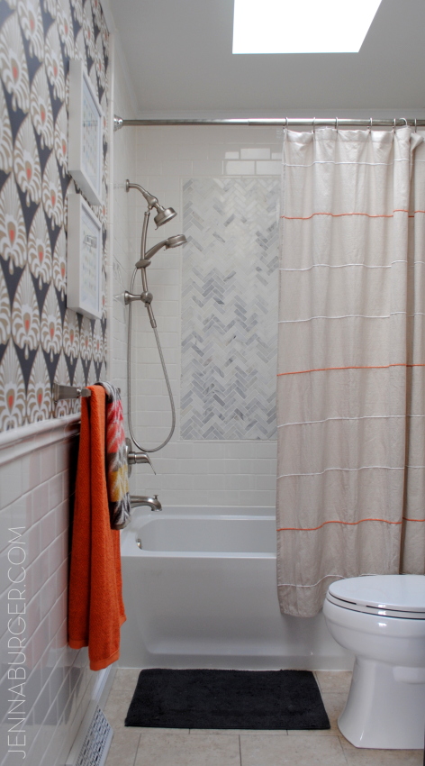
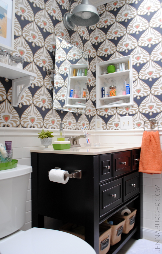
HALL / KIDS BATHROOM
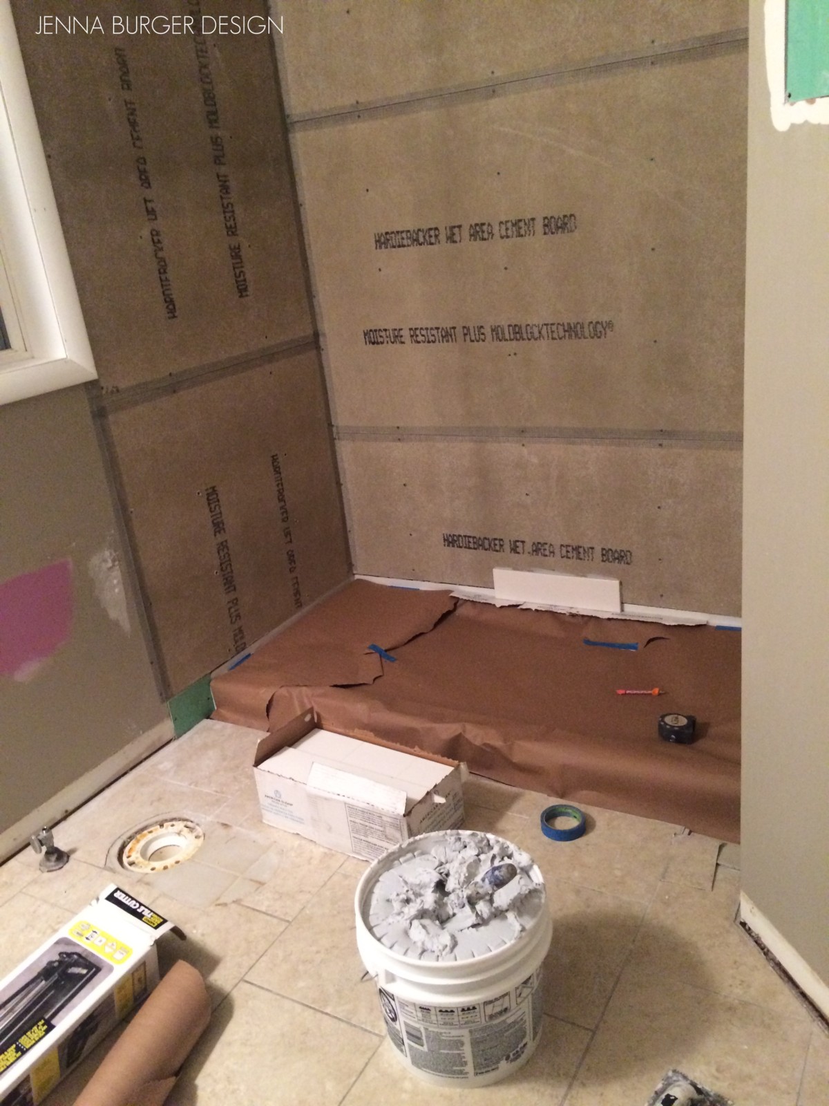
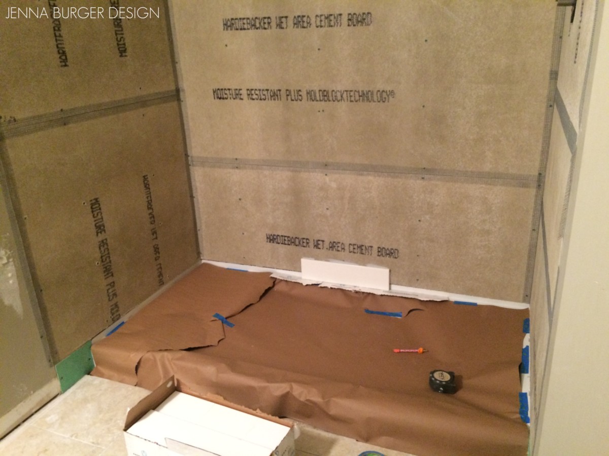
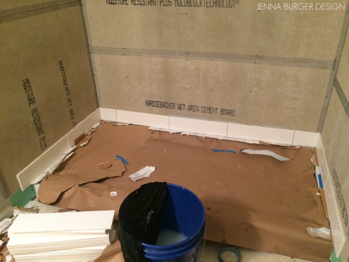
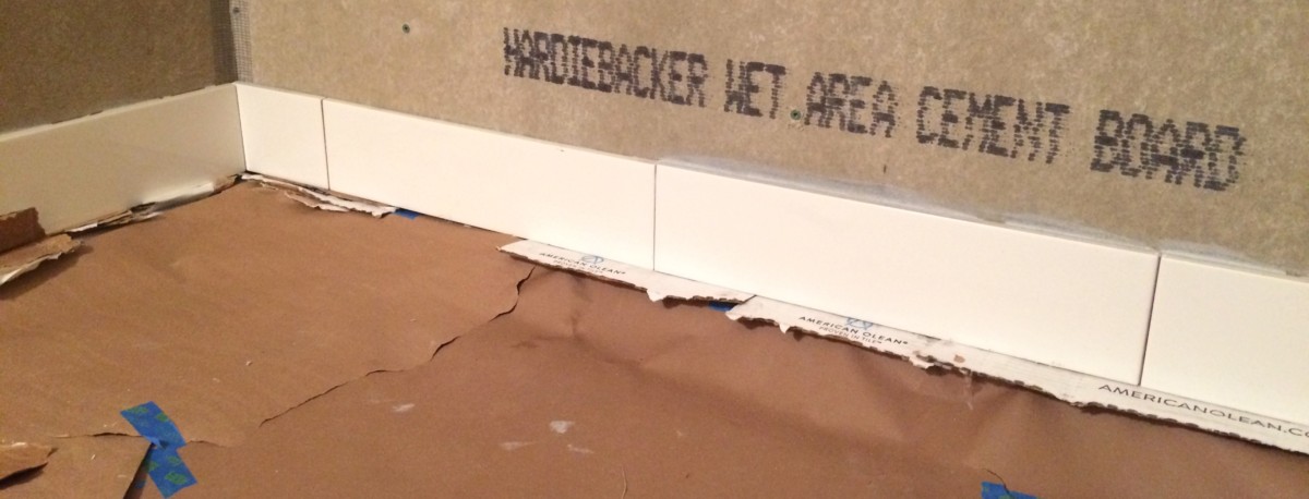
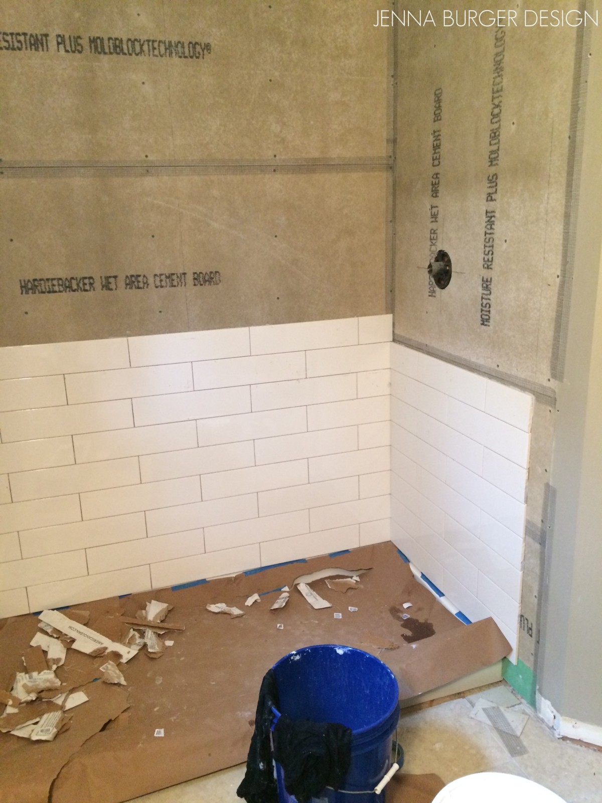
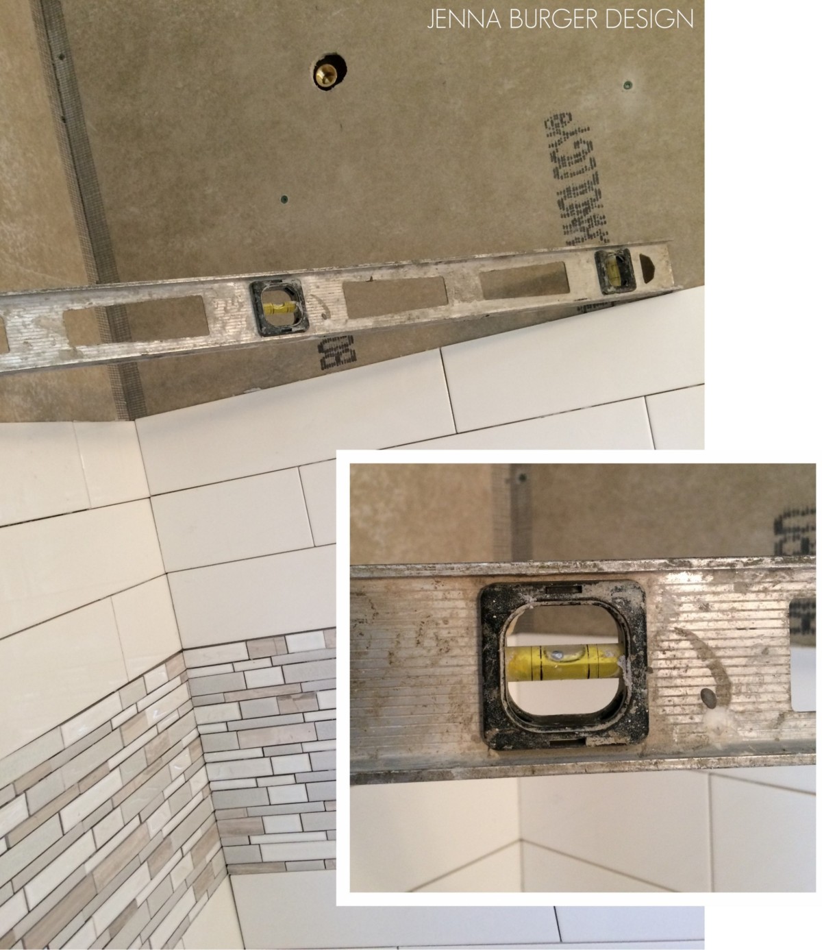
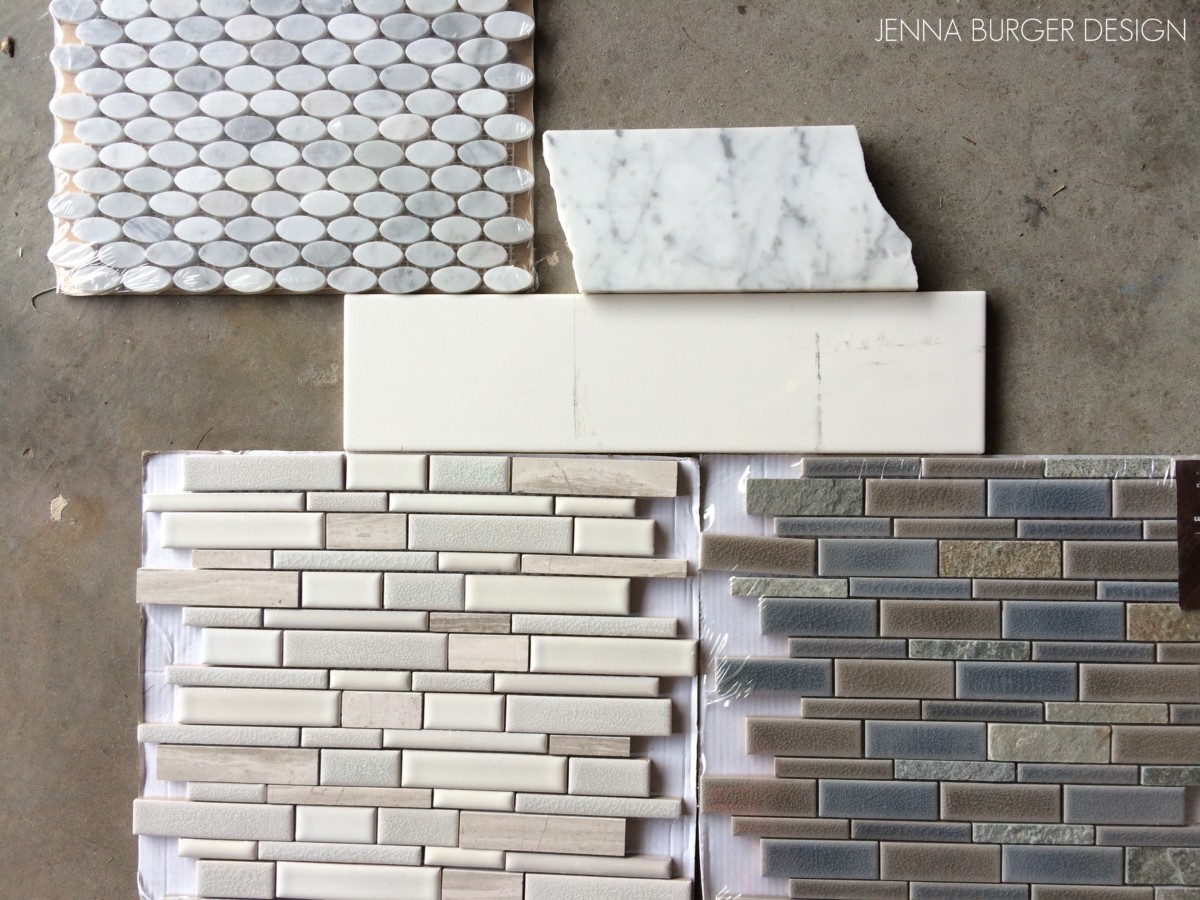
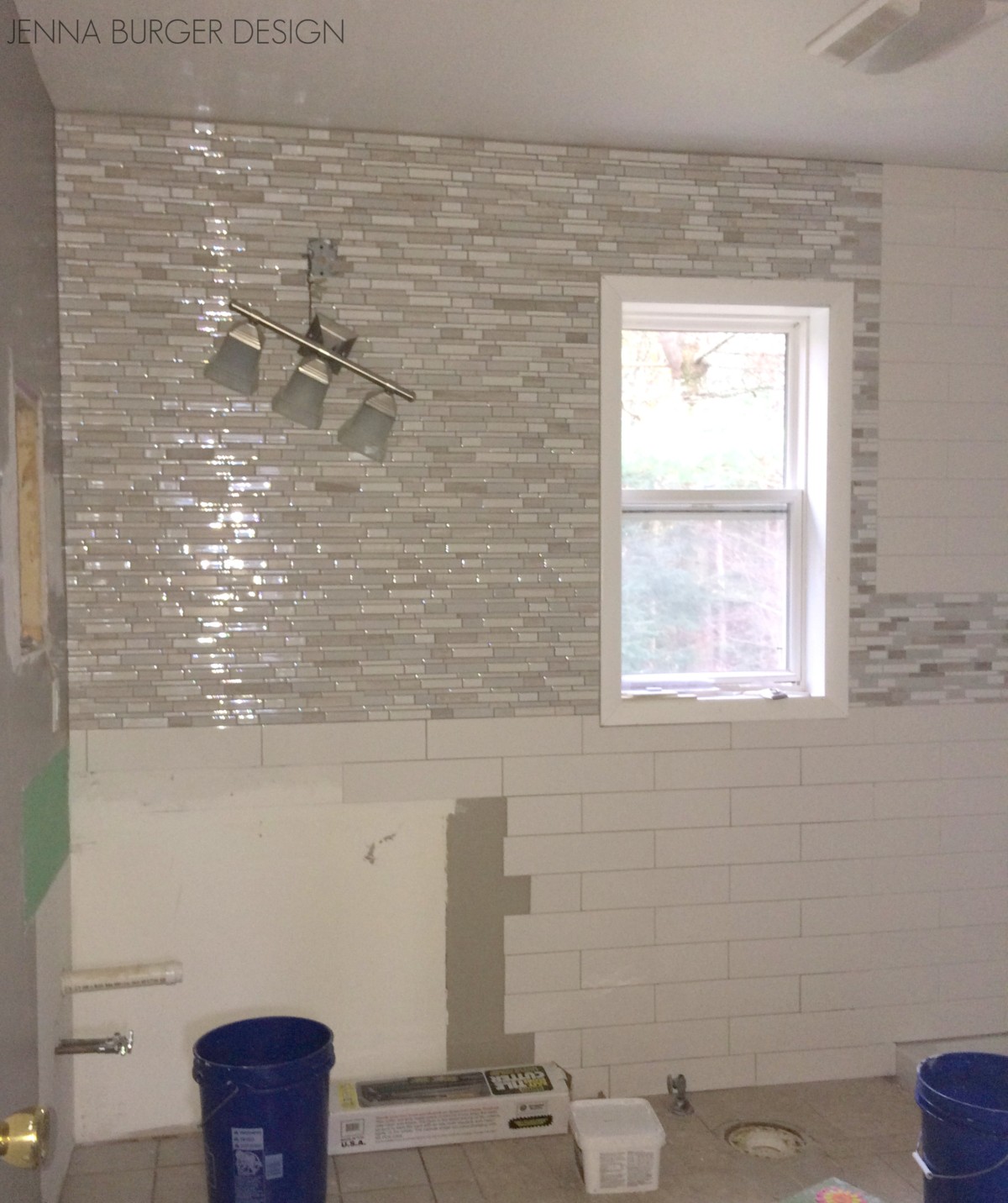
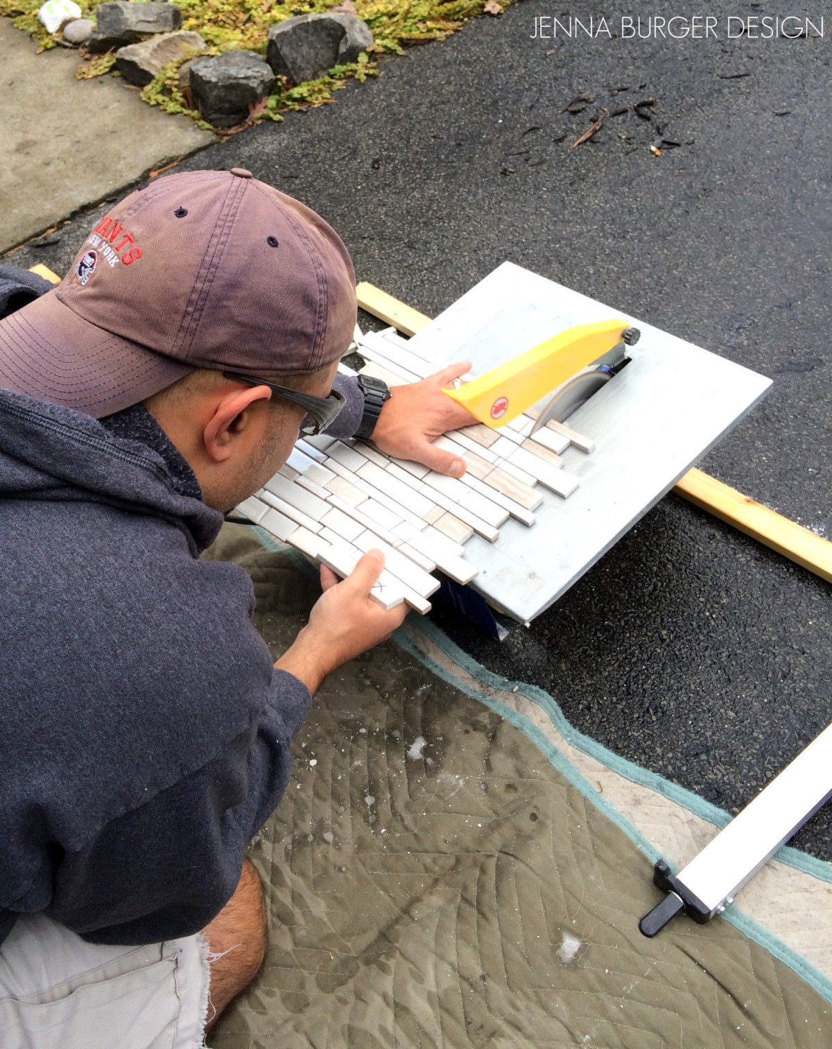
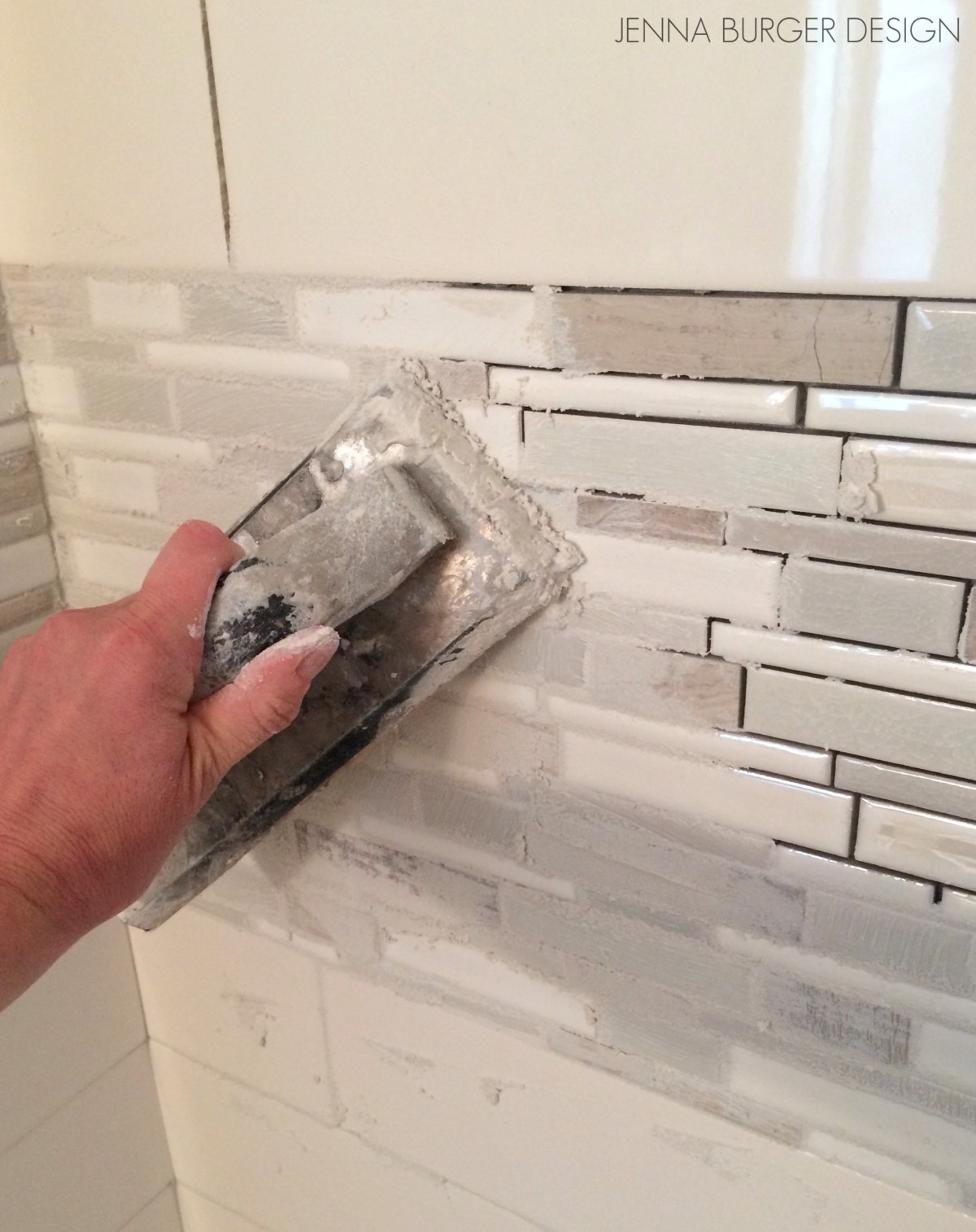
This bathroom revamp was my biggest + most-challenging DIY to date because it involved hardwork + manpower (actually more like willpower) + plumbing, which made for a big job! This is the result…
Posts associated with the hall bath
Plan of Action
Demo: Removal + Installation of the Tub & Walls
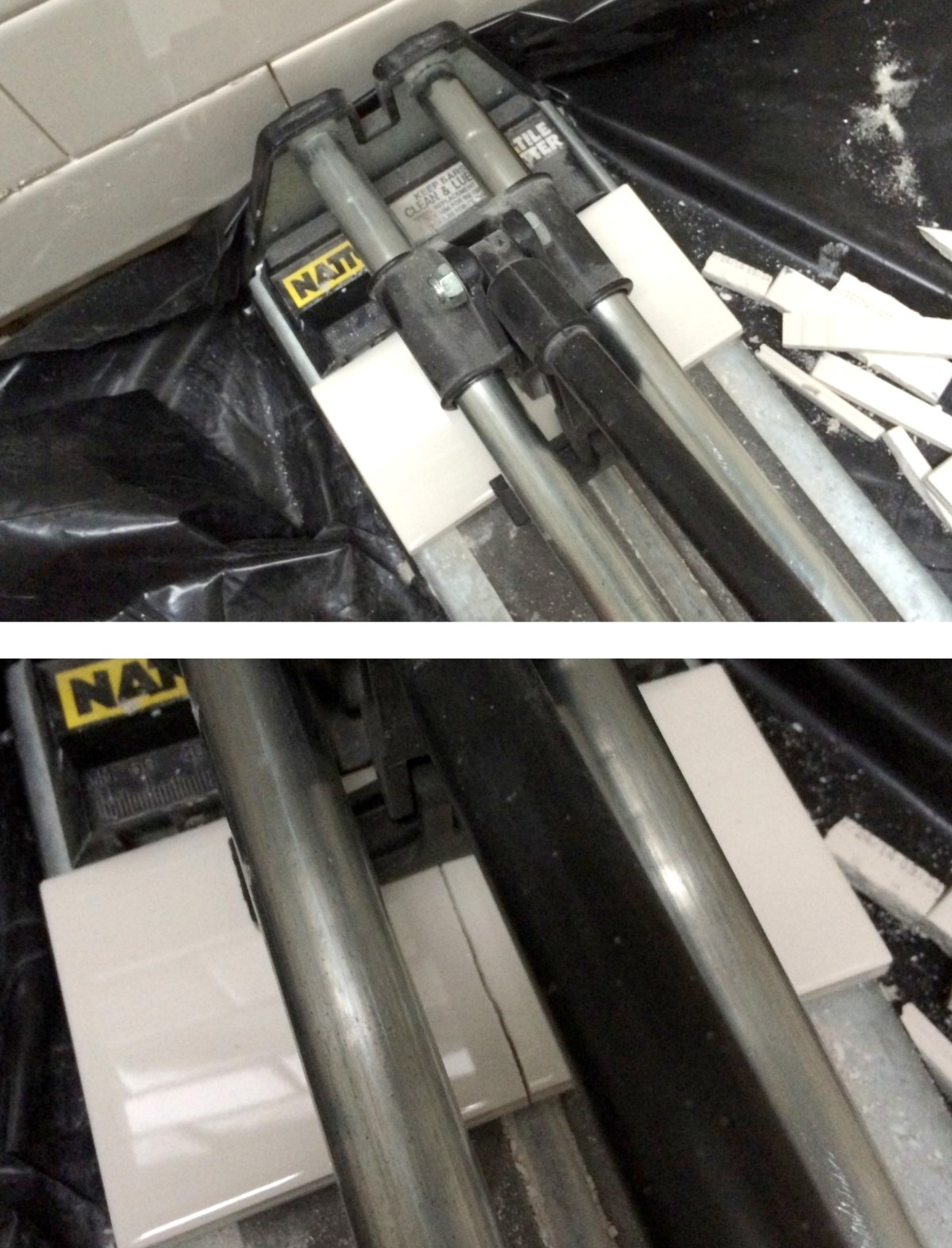
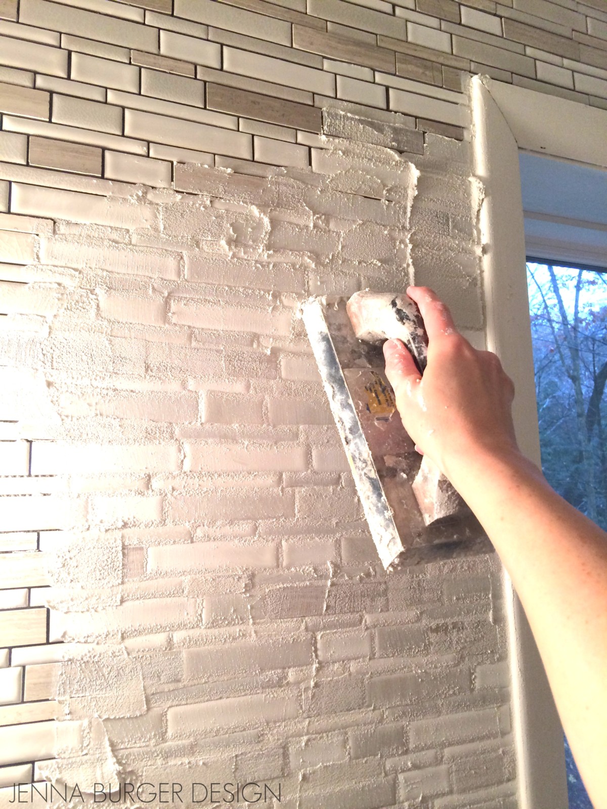
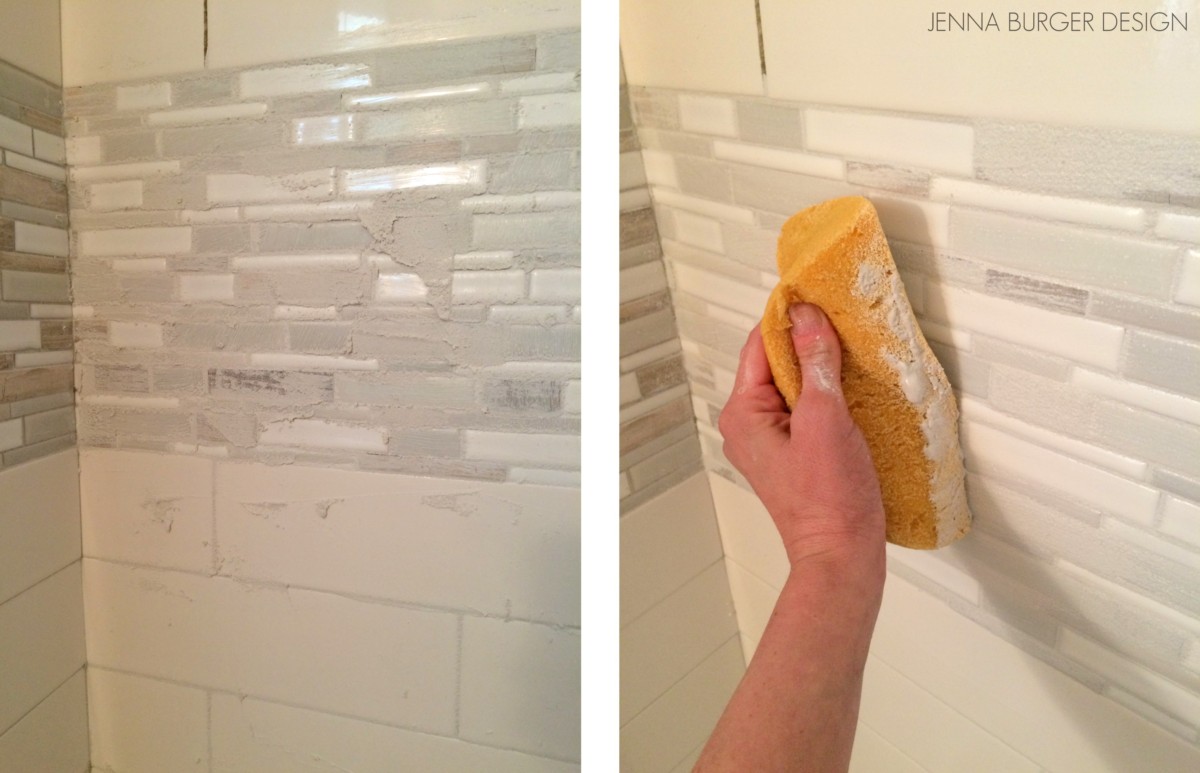
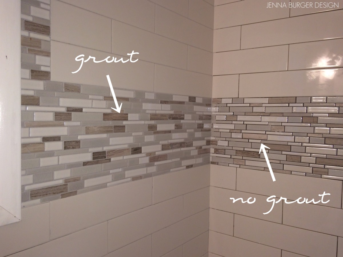
How-To Tile + Grout the Bathroom Walls
Installing Wallpaper
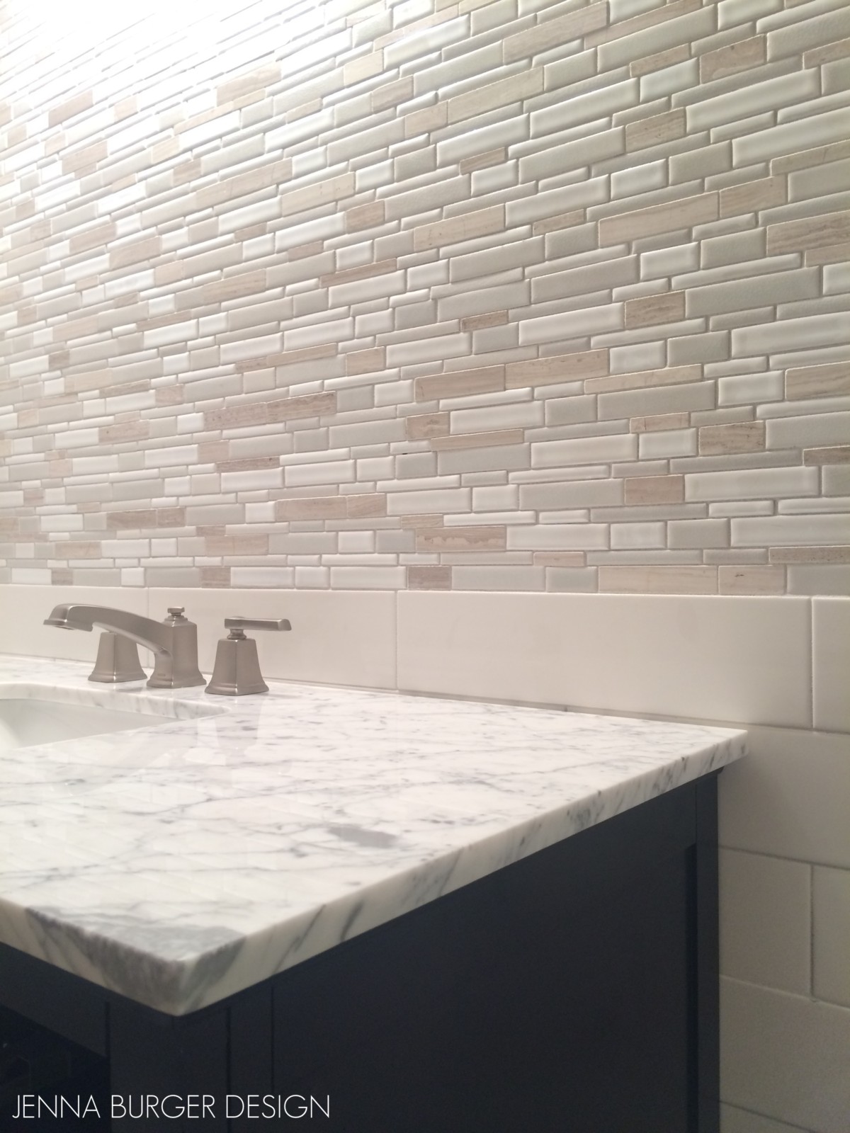
Adding a Tile Accent Border
Creating a Tiled Niche
We’re not done yet…
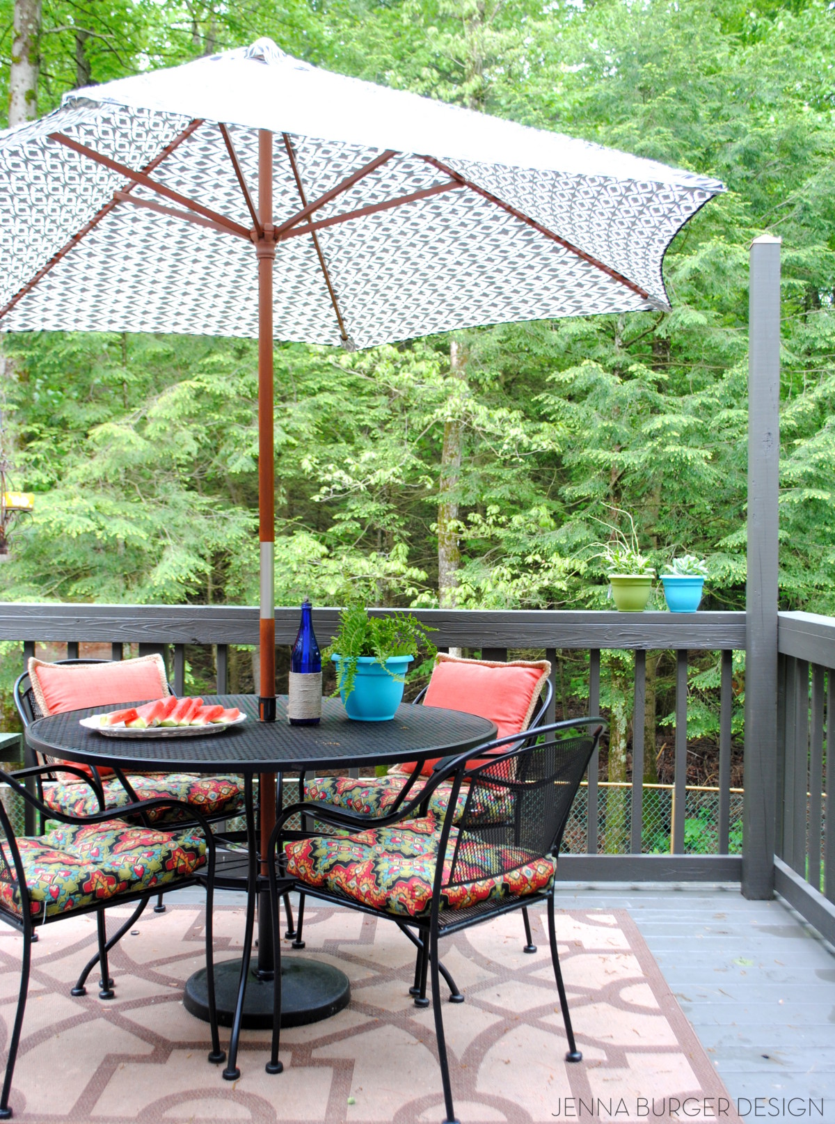
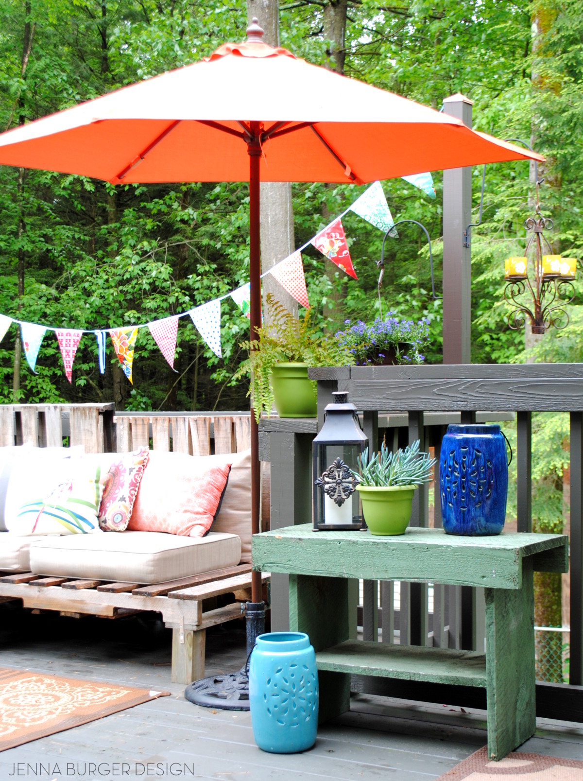
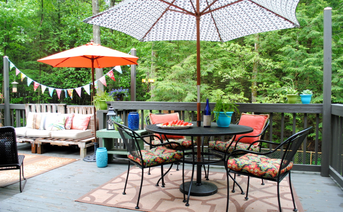
BACK DECK
Over the years, we not only touched every nook + cranny on the inside, but we’ve also revamped much of the outdoors.
Join me on the deck where an oasis has been created to lounge and enjoy the warm days of Spring + Summer.


DECK POSTS
An outdoor deck for outdoor living
DIY Pallet Sofa
How to stain a deck
Aside from our front porch + back deck, we have one more outdoor spot where we like to relax and lounge…
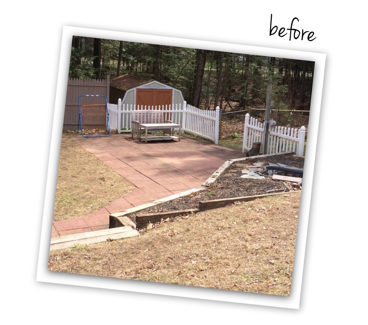
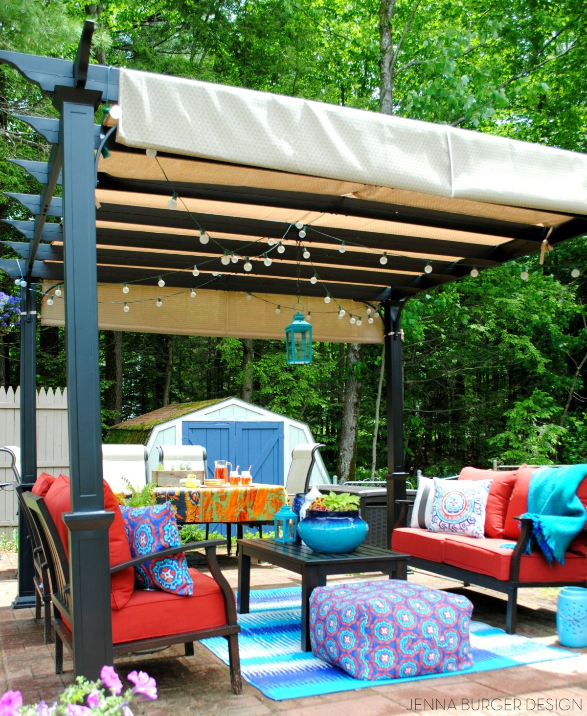
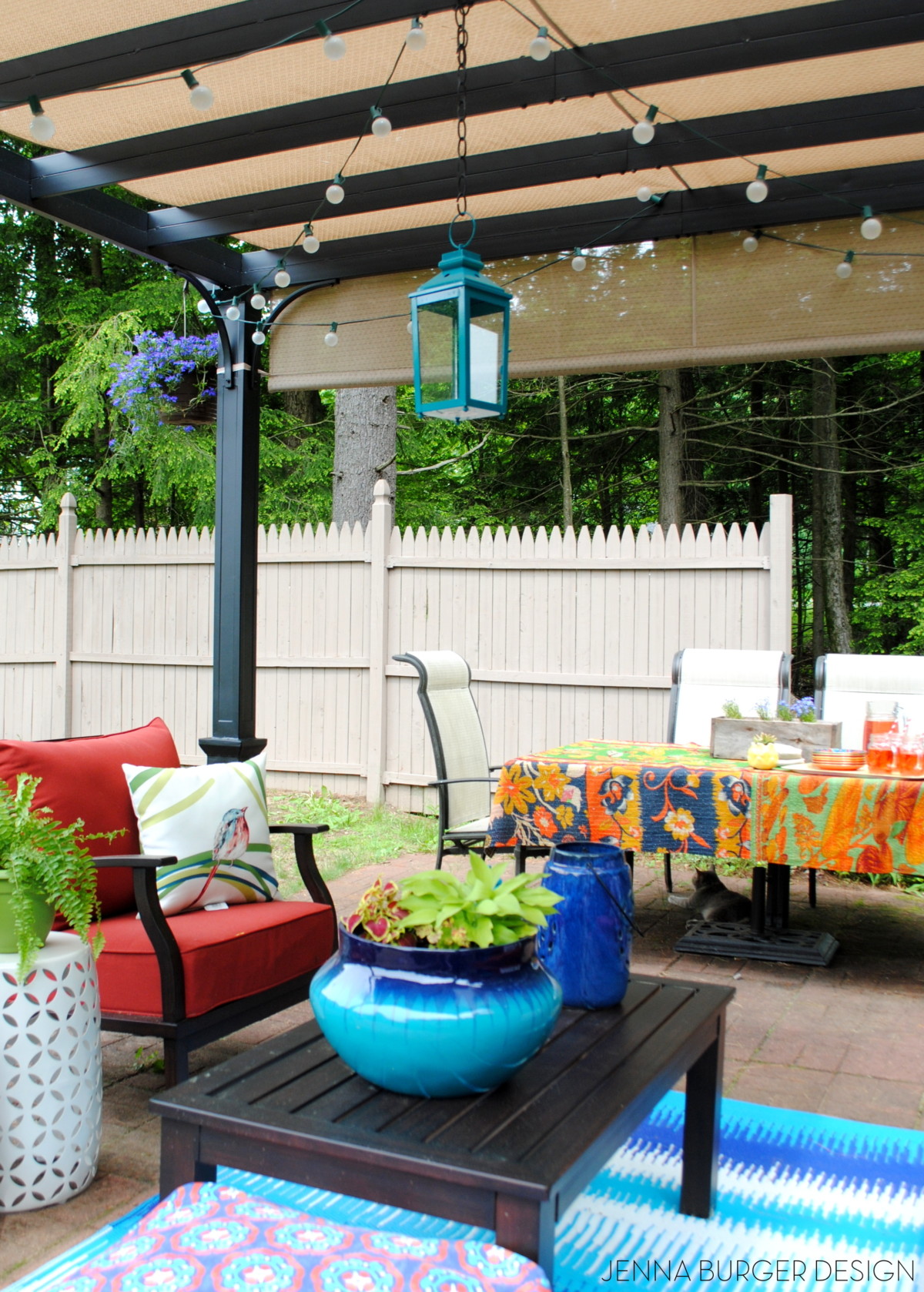
PATIO
… our patio paradise. This area of the yard was a horror show when we moved in. With a lot of TLC and years of attention, we’ve used the base of what was there and transformed it into an inviting oasis that we always envisioned and now can truly enjoy.


Post: Before & After Patio Paradise

And that’s a wrap. That’s our home. I hope I didn’t loose you in one of the rooms.
What a treasure it’s been to walk down memory lane and reminisce on all the projects + rooms we’ve revamped to make our own!
Thanks for taking the tour with me. What’s your favorite space? Hmmm… I’ll have to give some thought to which mine is.