Month: February 2012

Master Bathroom Makeover: Part 2

I’ve been living and breathing this master bathroom makeover.

Result? There’s been little time for anything else.

I’ve been making progress, and as of last night, the floor is complete {huge sigh of relief}…  And I’m in major pain today – It stinks getting old!

Sorry for the lack of posts or inspiration this week.  I love sharing new DIY projects (I have a few ready to reveal next week) or decorating tips, but this week’s focus is on the progress of the bathroom and the steps that I’ve been taking along the way.  It’s almost like a reality show, but instead on my blog and NOT start to finish in 30 minutes like on TV.  This week’s posts are a little different than usual, but hopefully you’re still inspired in some way.

  • Maybe these makeover progress posts will show you how a space can come together in a short period of time.
  • Maybe you’ll realize how a bathroom makeover can be done on a tight budget.
  • Maybe you’ve learned some tips or ideas that can be implemented in your own home.
  • Or maybe you’re just simply sitting back, reading the progress posts, and chuckling about the horrid color of the original bathroom.

Whichever it is that keeps you coming back each day, I strive to inspire with everything that I write.  Anyway, let’s move on with the progress that I’ve made thus far…

If you missed the before pictures, here they are again…

SCARY!

Last weekend, my husband and I tackled the painting by covering up that horrid pink/purple color.  After one coat of primer and two coats of paint, that horrendous color is now officially covered {happy}. Then throughout the day on Monday and yesterday, I was able to work on and finish the new tile floor.  I chose to use luxury vinyl groutable tile, so the process was the same as when I laid my parents foyer floor. What a huge difference!  The tile has a beautiful cream tone with touches or taupe and gray.  It’s very similar to a botticino natural stone and when laid and grouted, looks exactly like ceramic tile.

Here’s a closer look.

The existing floor was in good condition, other than the way it looked, so I felt comfortable putting the new tile directly on top.  If you decide to use groutable vinyl tile, you may need to remove the existing floor before laying the new tile.  (I’m sharing the steps that I took, but am not making a recommendation for your space one way or the other).  The funky yellow “stuff”, a.k.a. glue, on the cabinet is from the vinyl strip that I removed, which you will see in the next image is now covered with tile as well, to create a tile toe kick.

After the kiddos were in bed last evening, I grouted the floor. What a difference, right?

Now that the “bones” are complete, the layers can be added.  Still to come…

Until next time when I plan to make the final reveal…  {commercial break} I hope you’ll come back to see.  Now let me get back to work!

Master Bathroom Makeover: Part 1

If you follow SAS Interiors on Facebook and Twitter (if you don’t, please do), you may have saw a few postings that I wrote mentioning that I finally decided to give my master bathroom a makeover.  And when I say finally, I mean FINALLY!  This is the only room in the entire house that hasn’t been touched since we moved in and it’s horrendous…  Until NOW.

Over the weekend, we (meaning the mister and I) finally took the plunge and gave this much-needed space a revamp.  I really wish that I could say in two days we finished the entire space, but that would be a big-white-lie. Bummer!  I went into this thinking it would be easy-peasy – we’ll paint, hang a few pictures, and we’ll be done.  HAHA – NOT! (I never allow for enough time – big no no)

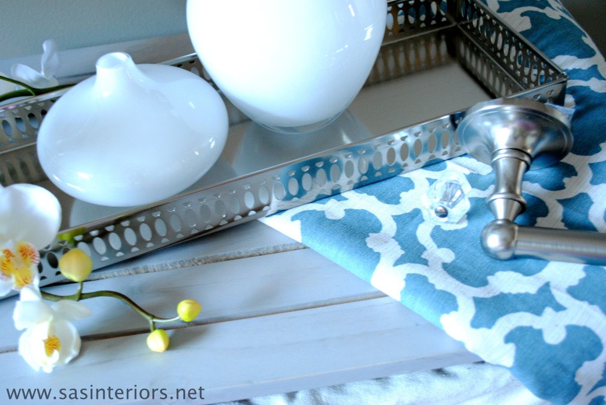
The before space was a bright pink/purple color (why would anyone have chosen that color?).  When I first thought about this space, I envisioned 3 S’s – soft, serene, and spa-like.  Since the bathroom adjoins to the bedroom, I really wanted the two spaces to flow from one to another, so many elements in the new bathroom are an extension of the bedroom.  Here’s a peak at some of the selections for the new space.

The backdrop, similar to the bedroom, is a soft gray / taupe color with an accent color of dusty blue, which will be seen in the shower curtain (actually not a real shower curtain, but instead two window panels) and accessories. Again, because I envisioned the space being an extension of the bedroom, I felt it important that they “read” as one.  The accent color in the bedroom is orange, so the blue for this space is a perfect compliment.

I’m truly looking forward to this space being complete, especially since it was one of my Home Goals for 2012.  Actually, when I shared the before picture in my post about my home goals for this year, one reader wrote:

If you need help on your bathroom, I am sure all your readers would be willing…I know you did the best you could with what you had, but wow! I think I would have made that the first to redo when I moved in….not trying to be mean, or anything, but who would pick those colors????? All I can say is wow…  – Cindy

Well Cindy is so right!  Have you seen the before? I feel scared just showing it to you.

There are alot of reasons that this space got neglected, but the main issue was our indecisiveness to do a complete overhaul with a full tearout or a DIY bathroom with new paint and updates.  In the end, because of other priorities at the moment, we decided on a do-it-yourself revamp.  It simply makes the most sense for us!

On the list is:

  • New paint for the walls (gray / taupe)
  • New paint on the mouldings (white)
  • New floor (groutable vinyl – similar to my mom’s floor)
  • New paint for the cabinet
  • New hardware
  • New mirror
  • New light fixture
  • New accessories
  • New window treatment

So basically it’s all new, except for the plumbing fixtures.

And the reason why this space wasn’t complete by the end of Day 2?  Take a look at these snags…

1. The existing towel bar was attached to the wall with HUGE anchors… a full sized person could have hung from them. When the Mister took them out (which he had to yank them from the wall), a huge hole was left!  UGH.

2. Next frustrating snag? The light fixture had no junction box.  Really??  How is that possible?

3. And the most time consuming part was all the spackling – the walls were a mess!

Well no more complaining about this UGLY space.  It’s now in the process of being transformed.  Tonight’s task?  A new floor!  Wish me luck 😉

Have have remodeled a space in your home recently?  Have you made any updates to a bathroom in your home?

How To Achieve a Well Styled Bookcase

There is truly nothing like a well styled bookcase filled with books, accessories, collectibles, and photos that add warmth, intrigue, and uniqueness to a space.  I’ve been doing some styling lately for a few clients, and it’s been so enjoyable to start with a blank slate and build from the ground up by adding different elements and layers to create an engaging and interesting composition.

Whether built-in or freestanding, bookshelves can represent and showcase you and your families passions, interests, and hobbies.  They can make a bare wall go from blah-to-beautiful and make an overall space feel larger and taller.  No matter your budget, a well-styled bookcase can be achieved using random accessories from around your home, discount store finds, collectibles, and do-it-yourself creations.

The key to the overall look is how to pull the accessories together to create an aesthetically pleasing result, yet not add too much so it looks cluttered and not add too little so it appears bare.

So how do you achieve a well styled bookcase?
And how do you create an aesthetically pleasing result?

Let’s take a tour of some amazingly well styled bookcases and dissect ~

This is one of the BEST styled bookcases that I’ve ever seen – by Jennifer of Dimples and Tangles.  It has the perfect balance of books, accessories, collectibles, and pictures. The overall setting is engaging, intriguing, and has just the RIGHT amount – not too much, but not too little.

The key to good balance is layering from front to back and adding elements at varying heights. For instance, let’s take the bottom shelf…  The tray is propped up and leaning on the back of the bookcase.  Layered in front of it, is a horizontal pile of books with a filled bowl on top.  An appropriate balance of books and accessories has been achieved and the differing elements are of varying sizes.

The other interesting part of this bookcase is that two of the shelves on the right side were removed, which allowed for taller accessories to be added.  A tray has been turned into art by adding the ‘&’ symbol and hung at the back of the bookcase.  Layered in front is a slightly turned birdcage, a photo, and a small accessory.  Then behind that is a small pile of books with a slender, yet tall lamp – all creating a balanced composition.

In all, this small space has so much interest! Let’s pick apart another example ~This bookcase styled by Cassie of Hi Sugarplum is another awesome example of how to achieve a well styled bookcase.  Instead of leaving the backs of the bookcase white, a fabric back with a small geometric patten was added, which gives an unexpected and unique pop.  Using the same layering technique that I mentioned before, Cassie has a good balance between books, accessories, and pictures.  There’s not too much or too little of any element.  By adding framed art to the bookcase surround, another layer has been added giving the overall bookcase even more depth than before!

Want to take a look at another example?

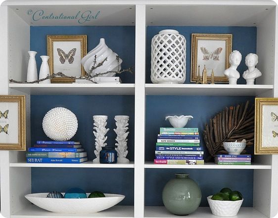
Another great example of a well styled bookcase is the wall-to-wall built-in by Kate of Centsational Girl.  After building this bookcase using 4 Ikea Billy bookcases, Kate used her amazing talents to accessorize the entire wall – WOW, what a task!

Instead of wallpapering the bookcase back like Cassie, Kate decided to paint them which allowed for books and accessories (ie: the white vases) to “speak”. Using a combination of horizontal and vertical layed books, Kate layered them with ceramic bowls, vases, diy creations, and personal momentos.  She also added framed art to the backs AND the fronts of the bookcase, which like Cassie’s composition, made the bookcase appear even deeper.

I think you get the picture by now, but here’s a quick recap on the key elements to achieve a well styled bookcase!

  1. Layer – Add elements to the back of the bookcase and continue it to the bookcase frame.
  2. Add Varying Heights – Incorporate elements with varying heights.  Display smaller accessories in front and graduate to taller and larger pieces behind.
  3. Mix it up – Display a mixture of books, accessories, collectibles, DIY creations, and photos
  4. Books Become Art – Books are beautiful.  From their color to their typography, books are truly art, so let them tell a story.  Display them horizontally and vertically, by color, or by subject.

Here are a few more of my favorite well styled bookcases.

White walls and a white bookcase, allow books and accessories to pop – via BHG

The dark painted bookcase back allows for the books and accessories to “have a voice” – via YHL

Even if you have alot of books, alternate their position between laying horizontal and vertical, then add accessories throughout – via The Art of Doing Stuff

A good balance between books, accessories, and photos is key to achieving a well styled bookcase – via Cottage and Vine

This bookcase has a good mixture of accessories at varying heights – via I Suwannee

Books become art!  This well styled bookcase has some leaning books against a high pile behind to show their beautiful covers.  Accessories are added to give scale and break up the monotony – via Lonny Mag

I’ve always loved this bookcase composition and shared it in a previous about creating a dazzling display. This white bookcase was dressed up with the addition of grasscloth wallpaper at the bookcase back.  It adds an unexpected touch to a typical built-in – via Cottage and Vine

The beauty of this bookcase display is the common thread of color in the books and the accessories.  The hues of gold, white, and varying shades of blue create a cohesive composition – via HGTV

This backless bookcase allows for the vibrant wall color to pop through the color coordinated books – via Style at Home

Creating a well styled bookcase can be tricky and a challenge for some, but with practice and patience a beautiful display can be achieved.  If you have no idea where to begin- no problem!  I love styling bookcases, fireplace mantels, tops of cabinetry, and truly any place in the home.  Read more about my Interior Design Services and Contact ME – I’ll be glad to help no matter where you live.

What do you display on your bookshelves?  Do you find it difficult to know where to begin and what to display?
DIY: How To Paint Stripes and Product Review of U-Stripe It

Not too long ago I wrote an article for Build Direct on adding stripes into your decor.  Ever since, I’ve had the longing urge to add stripes SOMEPLACE in my home.  I recently made some new pillows for my family room and chose a fabric with stripes, but that wasn’t enough.  I truly envisioned making a bold statement, but just wasn’t sure where.  Until…

…I decided to makeover my son’s room which was a home goal of mine for 2012.  It was the perfect spot to make dramatic focal wall with STRIPES!

We started off by taking apart his bunkbeds (which you can see in this post), so he now has two twin beds in his room. We removed the train table, which he was getting a little too old for (his words, not mine) and in the midst of furniture rearranging to create my new office space, I gave him one of the desks that I was no longer using.  ‘This desk’ has been desperately waiting patiently for a makeover for a LONG TIME and now that it finally has a home, it’s time. {sigh}

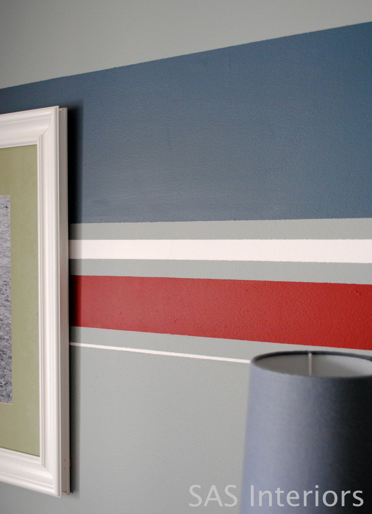
Thankfully to my generous friends at U-Stripe It, they made my life alot easier to tackle my idea for adding stripes to the wall.  Because the wall was already painted (Benjamin Moore – Puritan Gray), I was able to jump right in and start painting the stripes.  For fun stripes, I used denim blue, rustic deep red, and crisp wintry white. There was no rhyme or reason to my stripe layout, but before I started, I sketched this quick drawing as a vision for what I wanted to create.

From U-Stripe It, I received everything I needed to create my stripes, including their handy-dandy Paint Tool, a roll of 3M Painters tape, two levels, and 3M Command Mounting Strips.

Once I was ready to start my stripes, I added the mounting strip to the back of the U-Stripe It Paint Tool, positioned it horizontally on the wall, and locked it in place.

I then added the painters tape along the edges of the tool and continued it across the wall.

In about 30 minutes, I had completed making my stripes on the wall…

…And I was ready to paint. {WARNING: these pictures aren’t so pretty since I was painting fairly late in the evening once the kiddos were asleep.  And NO, I was NOT painting over my son’s head – he was fast asleep in another room}

Once the painting was complete, it was time to do the unveiling!

What a difference the room looks.  A simply added touch, truly makes for a huge impact.

Over the two beds will be black and white pictures of my little boy (which I still have to do).  I moved the vintage airplanes (which I purchased from Home Goods years ago) over the dresser instead of  over his head (not a good place if one ended up snapping off the fishing line and falling on his head during the night).  I also handmade a sign with his name and traits – this was probably the most difficult project I’ve ever created, but I kept with it and in the end, am really happy with the result. Lastly, the dresser he’s had for a few years and was purchased from Ikea.

There is still some work to be done on this room and I wouldn’t dare show you a picture of the current state that it’s in, but it’s coming along!

Stripes are such a fun and easy way to add some personality to a space. Have you painted stripes in your interiors?

Disclosure: I have a material connection because I received an item of nominal value from a company affiliated with a brand, topic and/or product that is mentioned herein, but all the content and opinions in this post are 100% mine!

Wedding Lyric Stencil Pillow

Good morning friends and Happy Valentine’s Day!

I want to share a little something with you today that I made for the mister for Vday.  I will start off by saying, I can’t take credit for this adorable project.  It was actually a DIY creation that was featured on Daily Do It Yourself and was originally created by Amanda of Wit & Whistle, so I won’t be sharing the whole tutorial here and instead you can hop over to her blog to see how to create one for yourself or a special someone.

Trying to be O So Romantic, I made this pillow using drop cloth material and stenciled words from our wedding song, I Cross My Heart by George Strait.

It’s such a beautiful song and I really wish I had room for all the lyrics, but the refrain was all that fit.  If you’ve never heard the song, here are the words and the video –

And the mister knows me so well!  He passed on chocolates and roses this year and instead got me what I really wanted…

What’s your wedding song? How will you be spending Valentine’s Day??  (Only clean responses please – hehe)

Traditional to Transitional Spoon Rack Revamp

As you know, I have a little obsession (well more than a little – little would be an understatement) with transforming and updating the decor around my home.  Most of the furniture or accessories though, have been of little or no value, which always makes me less apprehensive about jumping into a project.  If I mess up, who cares!  There are many pieces that I would love to change, but feel I don’t have the skill set (yet) and would be very upset if the result was NOT what I envisioned.

BUT, recently I took a (reluctant) leap of faith, and changed a special piece… my spoon rack, that houses my growing collection of spoons from our family trips and travels.  It’s a special piece and I was quite apprehensive about touching it, but I really was just tired of the traditional style with heavy black wood and red velvet fabric backing.  The style needed an update for my decor and I couldn’t look at it anymore without wanting to give it a lighter, simpler overhaul.

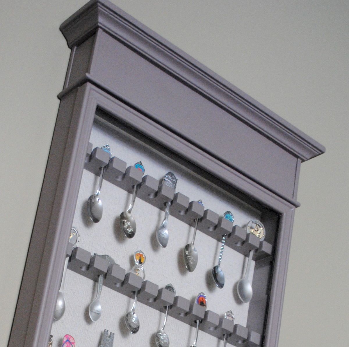
Well, here “she” is.  It was quite the process to get “her” to this point, but I have to say, I am quite satisfied.

I actually wrote about my spoon collection and my special spoon rack when I first started blogging.  It’s kind of dorky and a bit of a cliche to collect spoons, but other than my memories and pictures, the only tangible connection from our family trips are these spoons and they’re a pleasant reminder of the places we’ve been.

I purchased the spoon rack about 7 years ago from the Bombay Company, which I don’t think is even in business anymore.  At the time, the style went well with my aesthetic and I really liked how different this spoon rack looked compared to what was typical.  But recently, my style has been going more casual and less ornate, so a change was a must.

The before… And the after…

Thankfully, this year the Winter has been non-existent and a few weeks ago, the weather was so nice that I was able to work on this project outdoors.  I hadn’t planned on tackling the tranformation till Springtime, but when the opportunity allowed, I jumped on the chance!

I started off sanding all the surfaces with my orbital hand sander, as well as using sandpaper by hand to get in the nooks and crannies.

Then, I applied one coat of primer to all the surfaces to allow for a good base before painting.

All primed and ready to paint!

I was originally going to paint the spoon rack the same color as my kitchen cabinets, since my plan was to put the rack in the adjacent room, and the two spaces would tie together.  After giving it some thought, painting it would have been ALOT OF WORK.  So spray paint was the answer.  Thin, Slow, Even Strokes always leads to spray painting success!

My spray paint color of choice for this project? Thorny Brush in Satin (a taupe hue)

After completely spray painting the frame, I tackled the glass door.  This was a little trickier, but using painters tape around the edge and foil in the center, I was able to spray paint the outer edge without getting any paint on the glass. Once it was dry, I ripped off the tape (carefully, of course).

**CONFESSION** ~ I should have taken my own advice.  At first, I DIDN’T use foil for the center and after putting on the tape, just started spray painting.  SHAME, SHAME. Paint got on the glass.  THANKFULLY, I have a quick fix = Brillo and a sharp knife.  Using an abrasive brush or pad (like Brillo), gently scrub the paint off the glass, but steer clear of the edges.  For those tough parts, a sharp knife is perfect to scrape off the paint.

The last step to finish up this spoon rack overhaul was to change the fabric back.  Originally, I thought about using a bright color, then I thought about a fun and funky fabric, but in the end I wanted the spoons to “speak”, so decided on a quiet linen fabric.

What a change!  Once it was complete, I gave a HUGE *sigh* of relief!!  The spoons got to go back to their home.

It’s complete and hung on the wall {happy}!

Throughout the process, I quietly cursed a few times and bit my fingernails alot, but in the end, I am quite happy with the result!  I’m proud of myself for taking a chance on something that I was so unsure about.

Have you transformed or upcycled any projects recently?  Have you ever changed a piece of furniture or decor that you truly treasured? and if so, what was the result?

I link my projects to some of these parties: Skip to My Lou, Dittle Dattle, Between Naps on the Porch, Today’s Creative Blog, Stories of A to Z, All Things Heart & Home, Savvy Southern Style, House of Hepworths, Finding Fabulous, Creation Corner, The Shabby Nest, Tatertots and Jello, Thrifty Decor Chick, Under the Table & Dreaming