
Top Paint Colors for Black Walls + Painting a Black Wall in the Living Room

Black has been on the brain and here are my TOP PAINT COLORS FOR BLACK WALLS

TOP BLACK PAINT COLORS for any room in the home! Paint Color roundup by Jenna Burger Design, www.jennaburger.com

From bronchitis to a broken furnace to dealing with bitter below-zero temps, it has been a bustling few weeks.  But the biggest focus of my spare time around work & kids activities has been going BLACK in the living room.

Black is bold.  Black is neutral.  HOW TO MAKE BLACK WALLS WORK in every space of the home. I chose Valspar Black Heron for the living room fireplace wall and the color is a soft charcoal black! More @ www.jennaburger.com

A few weeks back, I mentioned my plan of action to completely change the living room upon selling almost all my furniture to a friend.  Even though they were material things and didn’t work for the space, I held on to them way too long.  Once the room was cleared out, I felt freed.  It was an interesting feeling to feel liberated by furniture.  Typically I give the advice to others to just let it go, but it ‘s easier said than done.  Anyway, part of the plan for changing the space was to paint the walls + the mantel.  Over the years as the paint hues around our home have evolved to more cooler tones, the living room space was one of the last to be updated.

Ever since choosing navy for my office (check out my favorite navy paint colors), I have had a passion for deep + dark hues with whites + lights layered in.  I’ve also been dying to paint a wall black.  Crazy sounding to some, yes, but it’s such a dramatic, fierce, and strong color (here are 23 inspirational spaces that black on the wall is awesome).  I knew black was finally going to get it’s moment in the new living room space of our humble abode.

By-Bye orange…

Black is bold.  Black is neutral.  HOW TO MAKE BLACK WALLS WORK in every space of the home. I chose Valspar Black Heron for the living room fireplace wall and the color is a soft charcoal black! More @ www.jennaburger.com

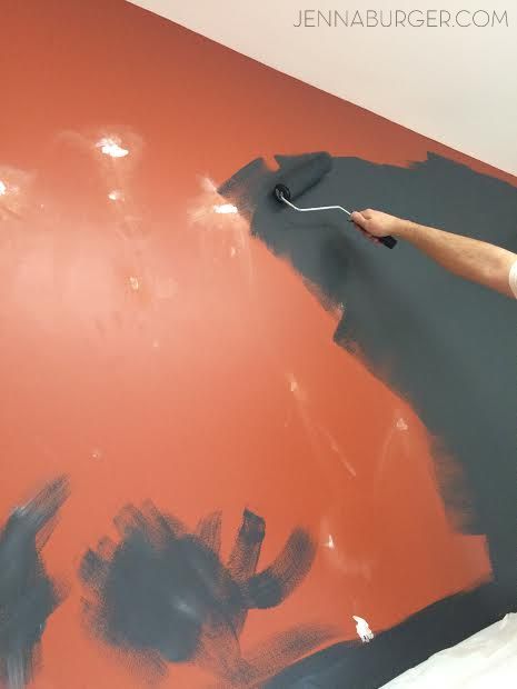
Hello Black! I know it looks blue in the pictures, but it’s black.

Black is bold.  Black is neutral.  HOW TO MAKE BLACK WALLS WORK in every space of the home. I chose Valspar Black Heron for the living room fireplace wall and the color is a soft charcoal black! More @ www.jennaburger.com

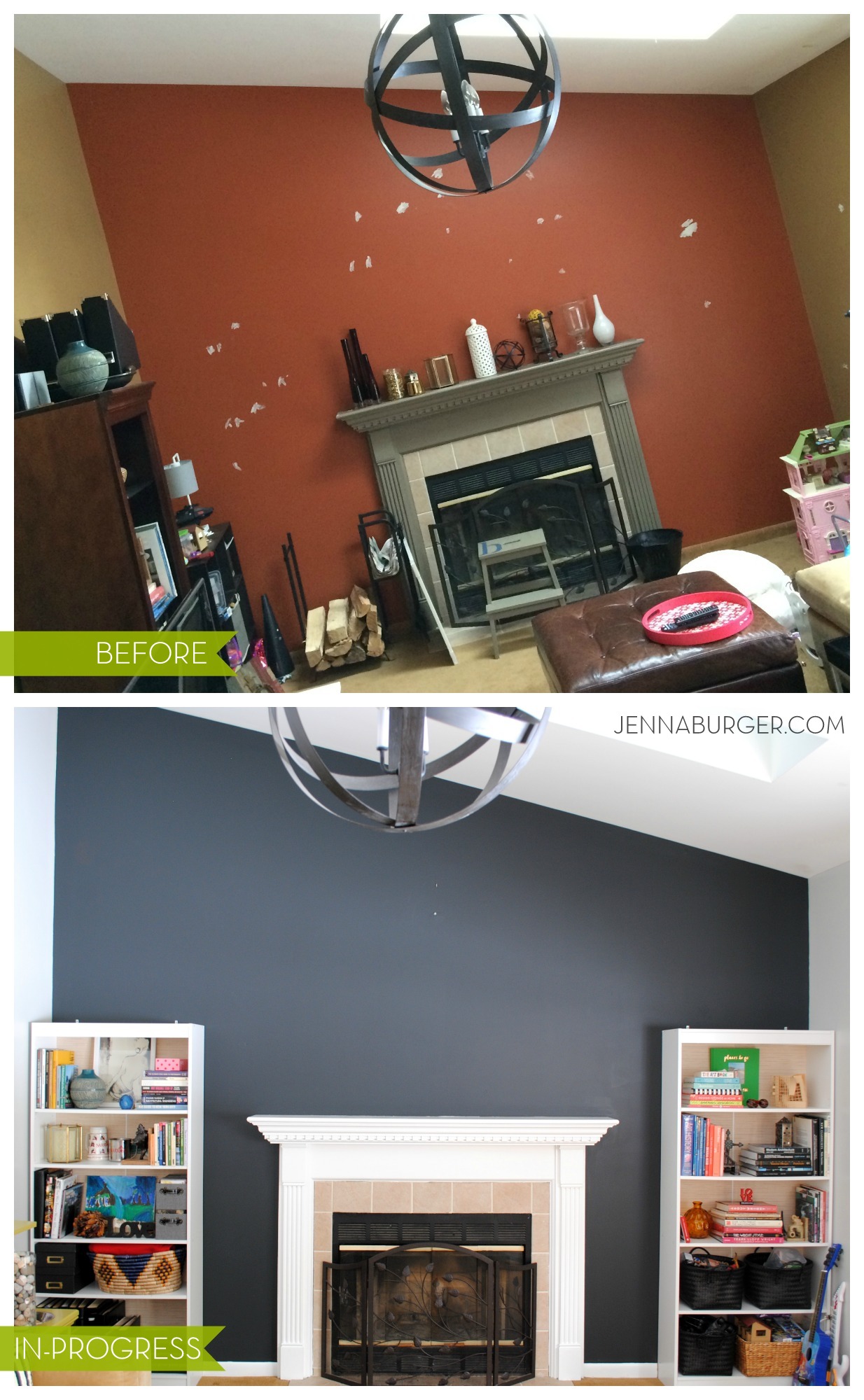
A before and after of the overall wall will give a better sense of the change in color…

Black is bold.  Black is neutral.  HOW TO MAKE BLACK WALLS WORK in every space of the home. I chose Valspar Black Heron for the living room fireplace wall and the color is a soft charcoal black! More @ www.jennaburger.com
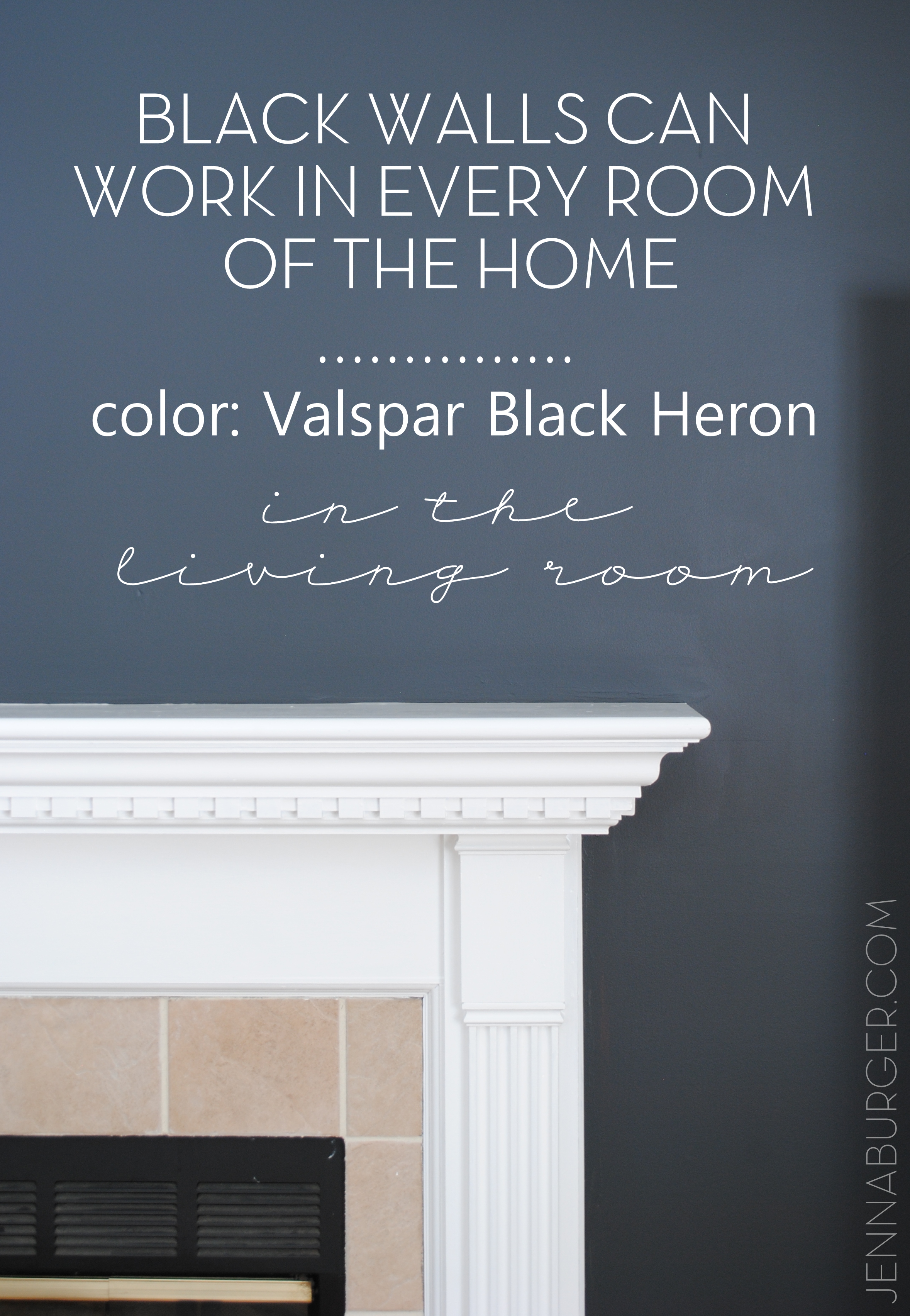
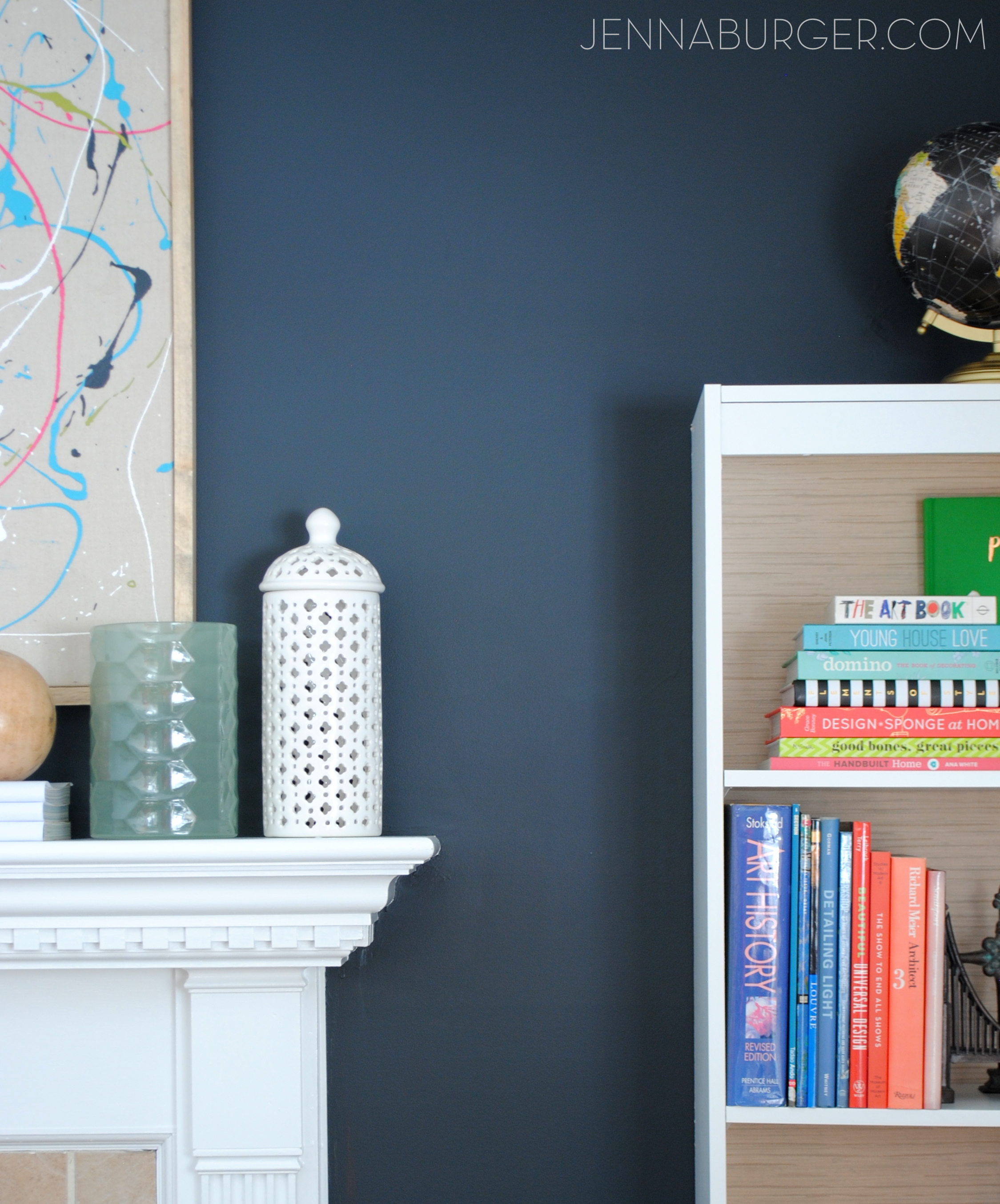
The color I chose for the fireplace wall is Valspar Black Heron and it’s a soft, charcoal black that in my opinion resembles the coloring of a chalkboard.  It has a slightly blue undertone and looks awesome with the other lighter hues I used in the room – Valspar Silver Thistle Down on the other walls and Valspar New Ream for the fireplace.

Even though the wall is darker now with the black paint color, the overall room feels so much larger.

With the in-progress picture above, you are seeing a sneak peek of what is to come.  Here are more details on what will be going on with this wall…

Black is bold.  Black is neutral.  HOW TO MAKE BLACK WALLS WORK in every space of the home. I chose Valspar Black Heron for the living room fireplace wall and the color is a soft charcoal black! More @ www.jennaburger.com

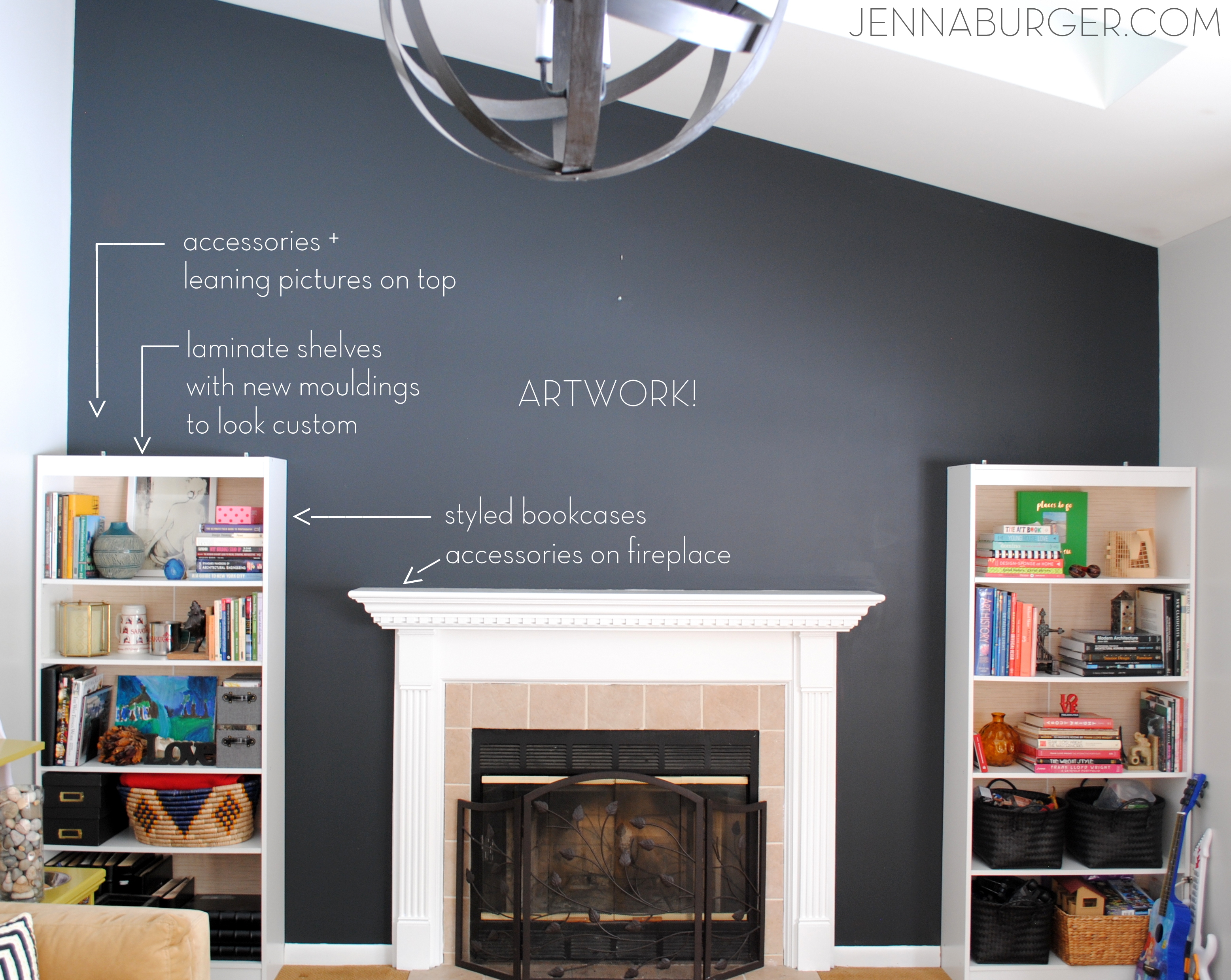
Moulding.  Accessories.  Layers.  A lot more is to come before this room is complete, but progress is being made starting with the fabulous, new black wall!

Choosing the Best Black

Black paint for walls is a great neutral choice other than the typical gray, taupe, or beige.  Black is bold, unexpected, and a beautiful hue to add white + lighter layers.

Like the array of white paint colors to choose from, there are just as many blacks and there are a few things to consider to deciding on the best black for you…

Tips for choosing the BEST BLACK paint color for your room!

3 factors to choosing how a black wall color will read in a space depends on:

1. the natural light filtering in during the day

2. the artificial light in the evening

3. the undertones of the paint color

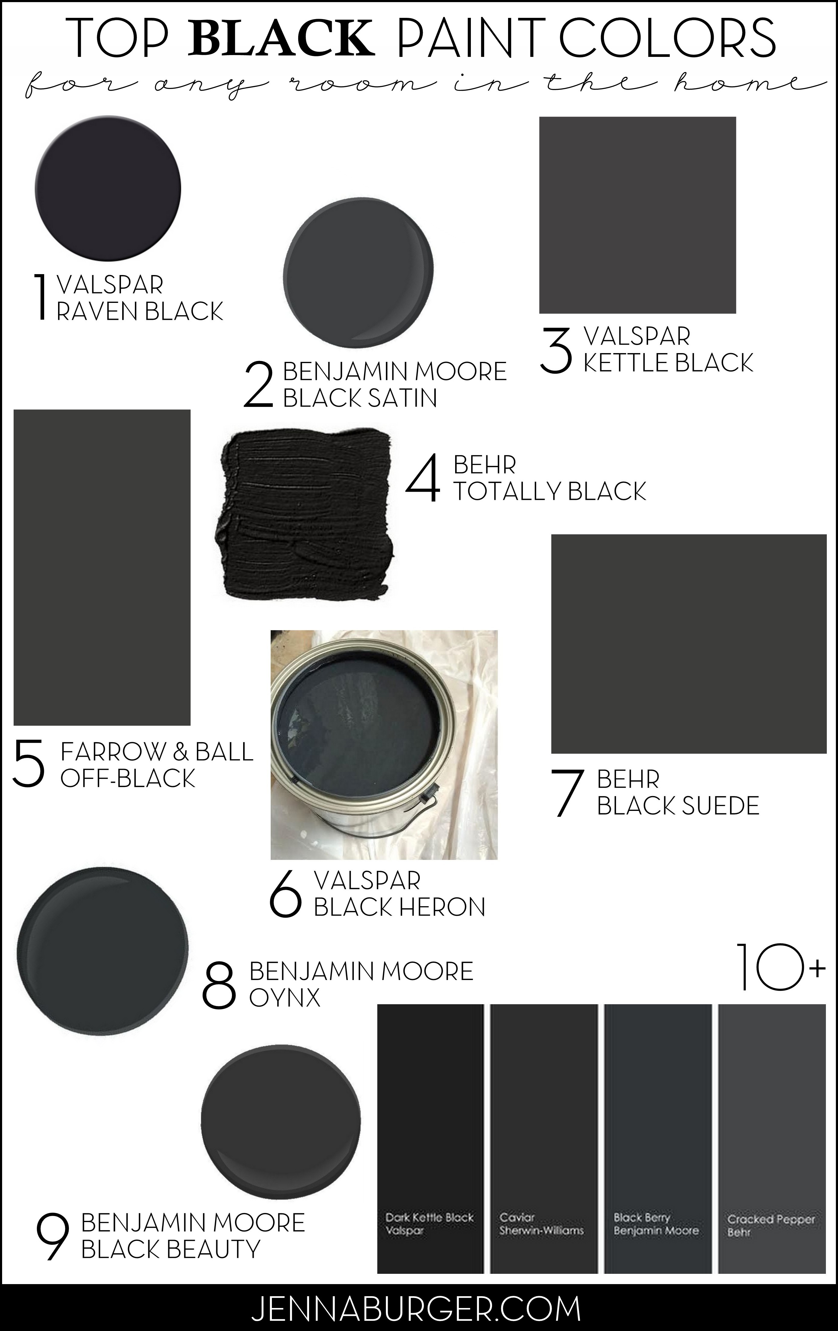
After looking at too-many-to-remember black paint colors, here are my favorites:

TOP BLACK PAINT COLORS for any room in the home! Paint Color roundup by Jenna Burger Design, www.jennaburger.com> 1 – Valspar Black Raven (a soft black with a slight blue undertone)
> 2 – Benjamin Moore Black Satin
> 3 – Valspar Kettle Black
> 4 – Behr Totally Black (a true black hue as seen in the boy room makeover by the Hunted Interior)
> 5 – Farrow & Ball Off-Black
> 6 – Valspar Black Heron (the color I chose)
> 7 – Benjamin Moore Black Suede
> 8 – Benjamin Moore Oynx
> 9 – Benjamin Moore Black Beauty (a warm black that works beautifully with stained wood as seen in the home of Making it Lovely)
> 10 – Valspar Dark Kettle Black (a deep black as seen in the bedroom makeover of Oh Happy Day)
> 11 – Sherwin Williams Caviar
> 12 – Benjamin Moore Black Berry
> 13 – Behr Cracked Pepper

You know you want to paint something black now…   So what black will you choose for your next painting project?! 

Dip Dyed Easter Eggs using Food Coloring

I am blown away by how many of you have read + pinned my Easter Egg post that I recently shared.  Over 100,000 so far and it’s only been a week & a half.  Since y’all loved my alternative idea for dying eggs, I have another fun + inexpensive + super easy way to create Easter Eggs that will give you a vibrant + unique result!

Create colorful EASTER EGGS using food coloring to get vibrant + vivid Dip-Dyed Easter Eggs. It's easy to do + KIDS will LOVE it. Read the tutorial now or Pin for Later!

I was inspired to create these dip-dyed eggs when flipping through the pages of the recent All You magazine that I picked up while shopping at Target.

The magazine has so many creative ideas for Easter egg dying that there will be no reason to ever buy a box again…

All You magazine is filled with so many great ideas for Easter Egg Dying!Use this $1 off coupon (while supplies last) to snag your own All You magazine on newsstands now!

Can I just say, the gold decorated eggs are killer.  I didn’t have a chance to get to the store to buy gold leafing (which I will be doing soon though), so instead used what I had on-hand and chose to try the dip-dyed decorating idea.  Food Coloring… most everyone has that in the cabinets and eggs are a staple in our house.

Supplies Needed:

  • Hard-boiled eggs
  • Boiling Water
  • Vinegar
  • Food Coloring
  • Paper Towels
  • Tongs or a Slotted Spoon

Create colorful EASTER EGGS using food coloring to get vibrant + vivid Dip-Dyed Easter Eggs. It's easy to do + KIDS will LOVE it. Read the tutorial now or Pin for Later!

To start off…

1. Put the eggs in a pot and fill the pot with cold water so it covers the eggs about 1-2″.

2. Once the eggs come to a full boil, remove the pot from the stove and cover for 12 minutes (so they create a hard-boiled egg).

Create colorful EASTER EGGS using food coloring to get vibrant + vivid Dip-Dyed Easter Eggs. It's easy to do + KIDS will LOVE it. Read the tutorial now or Pin for Later!

3. Carefully remove the eggs from the pot and let them stand for about 1-2 minutes (the eggs will be very hot, so be sure to use tongs when removing them from the pot).

Create colorful EASTER EGGS using food coloring to get vibrant + vivid Dip-Dyed Easter Eggs. It's easy to do + KIDS will LOVE it. Read the tutorial now or Pin for Later!

4. Once cooled, it’s time to make the magic dying formula

For each color, you’ll need this mixture:

  • 1/2 cup of boiling water
  • 1 tsp vinegar
  • 25 drops of food coloring

and mix together.

Magic Formula for Dip-Dyed Easter Eggs using Food Coloring!

Now here comes the fun part…

Egg 1

For the first egg, I chose to use 2 different colors (blue & yellow) and dip 1/3 of each side into the colorful mix.

1. Dip 1/3 of the egg into color 1 (blue)

2. About 60 seconds later (longer to achieve a darker color), remove the egg from the dye.  Let it air dry for a few minutes, then pat it with a paper towel.

3. Flip it around and dip 1/3 of the other side into color 2 (yellow). 60 seconds later, take it out, and you’re done!

Create colorful EASTER EGGS using food coloring to get vibrant + vivid Dip-Dyed Easter Eggs. It's easy to do + KIDS will LOVE it. Read the tutorial now or Pin for Later!The result…

Create colorful EASTER EGGS using food coloring to get vibrant + vivid Dip-Dyed Easter Eggs. It's easy to do + KIDS will LOVE it. Read the tutorial now or Pin for Later!

Egg 2

For the second egg, I created an ombre style (color fading from light to dark) egg.

1. Dip the entire egg into a color (red) and immediately remove.  Pat with a paper towel.

2. With your fingers or tongs, hold 3/4 of the egg into the dye for about 30 seconds, then lift out slightly so 1/2 the egg is in the dye.  Hold in place for 60 seconds.

3. To finish the ombre look, hold 1/4 of the egg in the color for a few more minutes to get the darkest hue.

Ombre Easter Egg: Create colorful EASTER EGGS using food coloring to get vibrant + vivid Dip-Dyed Easter Eggs. It's easy to do + KIDS will LOVE it. Read the tutorial now or Pin for Later!

Egg 3

To achieve a bold, deep color, I suggest using a few more drops of food coloring and leaving the egg in the dye for a few minutes.  I’ve tried this when using a box, and it never worked, but with the food coloring, I was able to get a really dark hue.  Take a look at these two…

  • This two-toned blue egg was created with a quick dip for one side, while the other was left in for about 5-7 minutes.

Create colorful EASTER EGGS using food coloring to get vibrant + vivid Dip-Dyed Easter Eggs. It's easy to do + KIDS will LOVE it. Read the tutorial now or Pin for Later!

  • This intense red egg was completely submerged in the food coloring dye for about 5-7 minutes.

Create colorful EASTER EGGS using food coloring to get vibrant + vivid Dip-Dyed Easter Eggs. It's easy to do + KIDS will LOVE it. Read the tutorial now or Pin for Later!

My little lady got involved in the process too…  It was fun. Not every egg turned out perfect, but that is the joy of it, right?!

I think our Easter eggs came out pretty good…

It was fun to mix colors, which then created new colors.  Some even created a plaid pattern.

Create colorful EASTER EGGS using food coloring to get vibrant + vivid Dip-Dyed Easter Eggs. It's easy to do + KIDS will LOVE it. Read the tutorial now or Pin for Later!

They are so colorful and so much more vivacious than the results from a typical box you can buy.

Create colorful EASTER EGGS using food coloring to get vibrant + vivid Dip-Dyed Easter Eggs. It's easy to do + KIDS will LOVE it. Read the tutorial now or Pin for Later!

Want to save this project and/or pin it for later use?  Here’s a quick graphic to remember the steps…

Create colorful EASTER EGGS using food coloring to get vibrant + vivid Dip-Dyed Easter Eggs. It's easy to do + KIDS will LOVE it. Read the tutorial now or Pin for Later!

Enjoy and Happy Easter Egg Decorating!

Want another great idea for egg decorating?  Try my melted crayon idea…

Decorating Eggs with Melted Crayons

Disclosure: This post is part of a social shopper marketing insight campaign with Pollinate Media Group and All You Magazine, but as always all opinions are 100% my own. #pmedia #lifeforless http://my-disclosur.es/OBsstV

Top Paint Picks for Navy Blue Walls

Yesterday I shared my Royal Blue Revelation and how I’ve been introducing this new-found hue into my home. I’m kinda psyched because not only is this color going to be an accent seen in accessories, but I plan on painting the front room a dark navy.  Yesterday I left you at the point of me knee-deep in color decisions, and today I’m sharing the final color choice, plus my Top Color Picks for Navy Blue Walls.

I’ve always had a thing for black spaces – they’re bold, dramatic, and striking – but I’m loving the navy hue just as much (and maybe even better)!  I’ve gathered some inspirational spaces that adorn the blue hue…

Deep blue striking walls with navy accents, photography by Emily Jenkins Followill.

Gorgeous Royal Blue Dining Room featured on House Beautiful.


Crisp white with navy blue is stunning.  The white decor pops off the dark complementing color (source unknown).

Navy paneling on the walls gives this office/den a cottage look featured on Lonny Mag.

Dark royal blue walls surround this bedroom oasis and I adore the wide striped blue and white rug, photographed by Roger Davies Photography.

A laundry room that I would never leave.  The white cabinets look amazing against the dark royal wall featured on House and Home.

Built-ins are often a shade of white (allowing them to pop off the wall), but the style displayed in this room match the walls – clever!  Love the regal, but inviting aesthetic by Ashley Whittaker.

Hello Bedroom that I would love-to-live-in!  There are so many reasons to adore this space by Brian Watford Interiors, but my favorite is the navy and white oversized nightstand, which is so sophisticated.

Thankfully I’m still in love with my taupe colored cabinets, otherwise this would be my new DIY project for summer.  Could you do navy blue cabinets in your kitchen? (source unknown)

Incredible spaces to die for, right?! So finally the time comes to reveal the final paint choice for my room.  The final color is…

photo by Julian Wass, image via House Beautiful

Boy, do I only wish I knew photoshop better to show you how this new blue hue would look in the room.  Any volunteers to help me out? If not, no worries, it will be done soon enough (I hope)!

Do you like my color choice?  What navy blue hue is your favorite?

Spring Mantel with Shades of Turquoise

Last week here in Upstate NY, the weather was amazing and I soaked up every bit of sun I could get. Now it’s a little chillier, but Spring and Summer will be here before ya know it! In the midst of the gorgeous weather, I took some time to put together my new Spring Mantel.

Over the past few months, I have been introducing more cooler colors than the warmer colors that I’ve lived with for many years. So my latest mantel creation has a whole lotta turquoise, which is a beautiful and dynamic compliment to the burnt orange focal wall.

Here it is… What do you think?

Turquoise is absolutely one of my favorite colors and from my past post, Totally Turquoise, many of you love it just as much!  It was kind of risky to have the mantel be dominant in one color and when planning it out in my head, I wasn’t sure if it was going to work.  I think by including a variety of different turquoise shades, the overall composition has alot of depth and intrigue, especially with the backdrop of the burnt orange wall.  Other textures and muted colors of browns were also added within to break up the monotony.

Here’s an in depth look …

Many of the pieces that make up my new Spring Mantel have been repurposed from around my home or picked up at local stores for very little.  The turquoise glass vase on the left is something new I bought a few weeks ago at TJ Maxx.  I had already had this turquoise-mantel-idea in my head and thought this would make a perfect addition – it was taller and I knew it’d make a great ‘anchor’ piece!  The glass mason jars which I found at an estate sale last year have been showcased on my mantel before and are filled with lentils and a votive candle. To the right is a tall glass jar filled with rocks from last years vacation to the beach.  I love displaying memories and these rocks are a beautiful and quiet shade of blue…  a perfect compliment to the other bold and vibrant colors.

One of my favorite upcycling things-to-do is paint old, used glass jars – tomato sauce jars, apple sauce jars, jelly jars, any jar will do! It’s so easy and unexpected.  In the Blue Label wood box stand two sauce jars that I added a little color to (it’s actually the leftover paint from my kids bathroom cabinet).  My mantels are always about layering, so in front of the wood box is a cute little turquoise pitcher and to the right is a lantern, both of which I purchased at Homegoods.

Of course, I had to add a touch of Easter decor within my Spring mantel.  I love this egg shaped Happy Easter sign that I’ve had for years (forget where I got it), but in a few weeks once the Holiday is over, it’ll be swapped out with a new Spring sign (not sure yet what it’ll be).

Continuing to the other side of the mantel, I added a sweet distressed turquoise ceramic bird feeder.  Originally intended for my daughter’s room, its so cute and fit perfectly amongst the like colors. To “anchor” the other end, I finished the mantel with two different sized bold turquoise lanterns that I purchased from Target.  They have some awesome colors this season like lime green, hot pink, and of course turquoise.

I also whipped up some fun new pillows with accents of turquoise.

Isn’t that owl fabric so cute?!  Love it with the brown and white chevron.

And this is how the entire room looks all pulled together for Spring.  It’s so different from last year’s quieter, frappe colors.

I think this is my favorite mantel design yet!  What do you think?

Do you love turquoise just as much as I do? 

DIY: How To Paint Stripes and Product Review of U-Stripe It

Not too long ago I wrote an article for Build Direct on adding stripes into your decor.  Ever since, I’ve had the longing urge to add stripes SOMEPLACE in my home.  I recently made some new pillows for my family room and chose a fabric with stripes, but that wasn’t enough.  I truly envisioned making a bold statement, but just wasn’t sure where.  Until…

…I decided to makeover my son’s room which was a home goal of mine for 2012.  It was the perfect spot to make dramatic focal wall with STRIPES!

We started off by taking apart his bunkbeds (which you can see in this post), so he now has two twin beds in his room. We removed the train table, which he was getting a little too old for (his words, not mine) and in the midst of furniture rearranging to create my new office space, I gave him one of the desks that I was no longer using.  ‘This desk’ has been desperately waiting patiently for a makeover for a LONG TIME and now that it finally has a home, it’s time. {sigh}

Thankfully to my generous friends at U-Stripe It, they made my life alot easier to tackle my idea for adding stripes to the wall.  Because the wall was already painted (Benjamin Moore – Puritan Gray), I was able to jump right in and start painting the stripes.  For fun stripes, I used denim blue, rustic deep red, and crisp wintry white. There was no rhyme or reason to my stripe layout, but before I started, I sketched this quick drawing as a vision for what I wanted to create.

From U-Stripe It, I received everything I needed to create my stripes, including their handy-dandy Paint Tool, a roll of 3M Painters tape, two levels, and 3M Command Mounting Strips.

Once I was ready to start my stripes, I added the mounting strip to the back of the U-Stripe It Paint Tool, positioned it horizontally on the wall, and locked it in place.

I then added the painters tape along the edges of the tool and continued it across the wall.

In about 30 minutes, I had completed making my stripes on the wall…

…And I was ready to paint. {WARNING: these pictures aren’t so pretty since I was painting fairly late in the evening once the kiddos were asleep.  And NO, I was NOT painting over my son’s head – he was fast asleep in another room}

Once the painting was complete, it was time to do the unveiling!

What a difference the room looks.  A simply added touch, truly makes for a huge impact.

Over the two beds will be black and white pictures of my little boy (which I still have to do).  I moved the vintage airplanes (which I purchased from Home Goods years ago) over the dresser instead of  over his head (not a good place if one ended up snapping off the fishing line and falling on his head during the night).  I also handmade a sign with his name and traits – this was probably the most difficult project I’ve ever created, but I kept with it and in the end, am really happy with the result. Lastly, the dresser he’s had for a few years and was purchased from Ikea.

There is still some work to be done on this room and I wouldn’t dare show you a picture of the current state that it’s in, but it’s coming along!

Stripes are such a fun and easy way to add some personality to a space. Have you painted stripes in your interiors?

Disclosure: I have a material connection because I received an item of nominal value from a company affiliated with a brand, topic and/or product that is mentioned herein, but all the content and opinions in this post are 100% mine!