
Tag: jenna burger interior design

Creating a Cohesive Color Palette

Creating a cohesive color palette throughout a room, or even a whole house, can be challenging.

Yes, certain colors work well together while others don’t, but the most important factor that makes – or breaks – a room / a whole home is balance.

With drama, needs calm.

With color, needs quiet.

With dark, needs light.

With a statement piece, needs minimal elements.

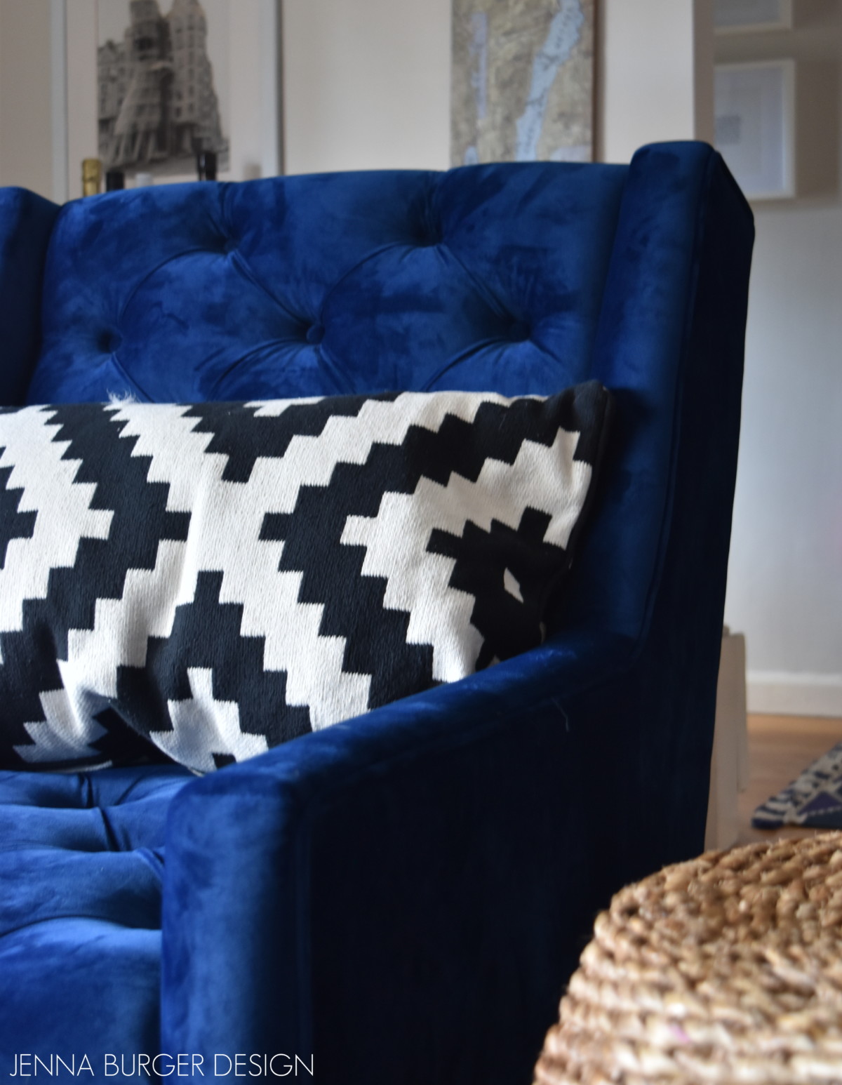
I’m a true believer to go all the way with unexpected + bold elements, but I also believe a balance needs to be achieved so a room feels inviting + comfortable.

Creating a Cohesive Color Palette throughout the home

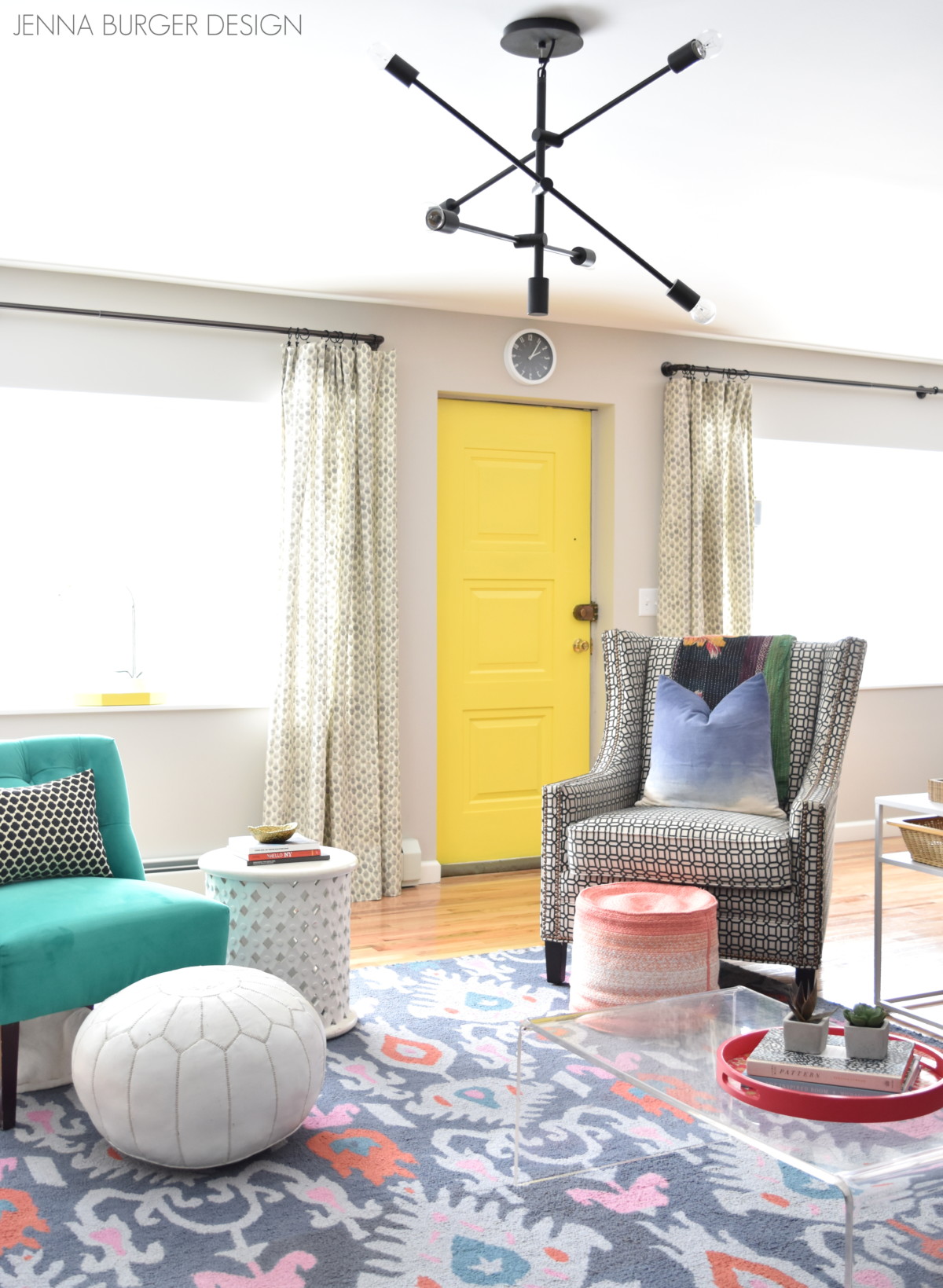
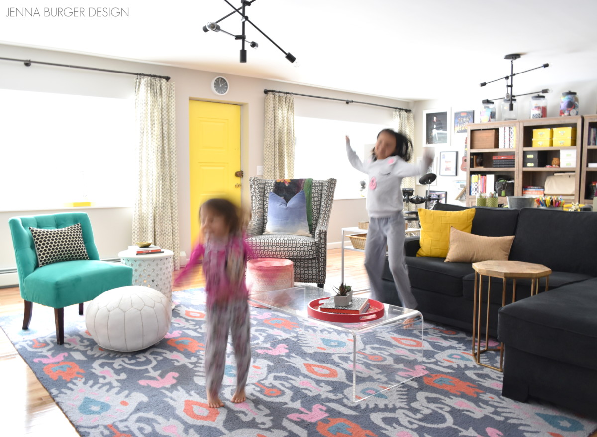
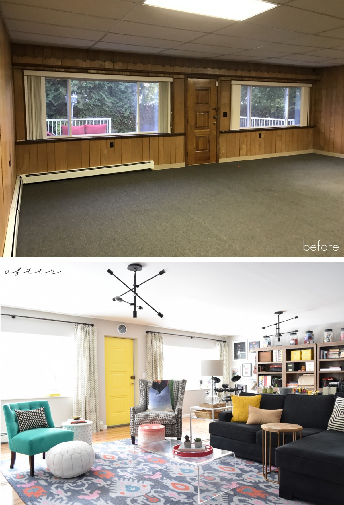
Last week, I shared the reveal of our newly renovated Pajama Lounge.  Yes, you heard right… we ditched the traditional family room and created a fun, relaxing, vibrant space where we lounge in our PJs.

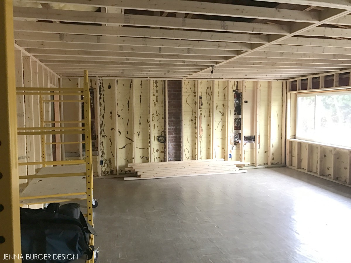
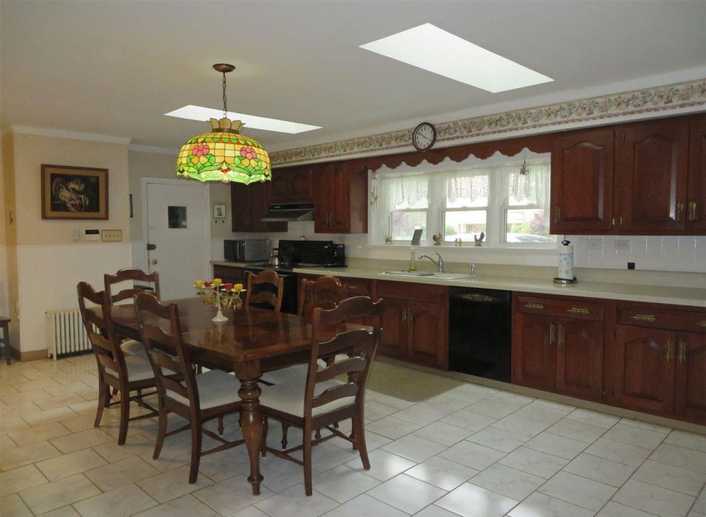
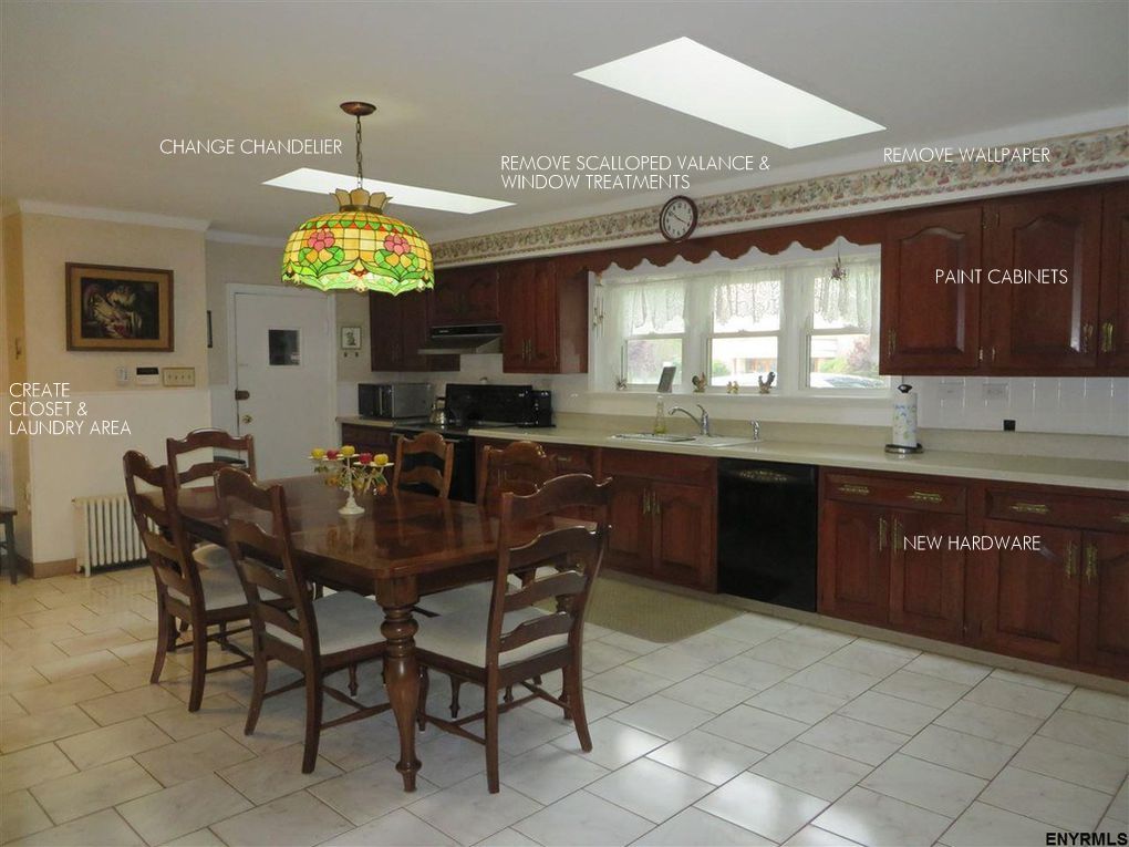
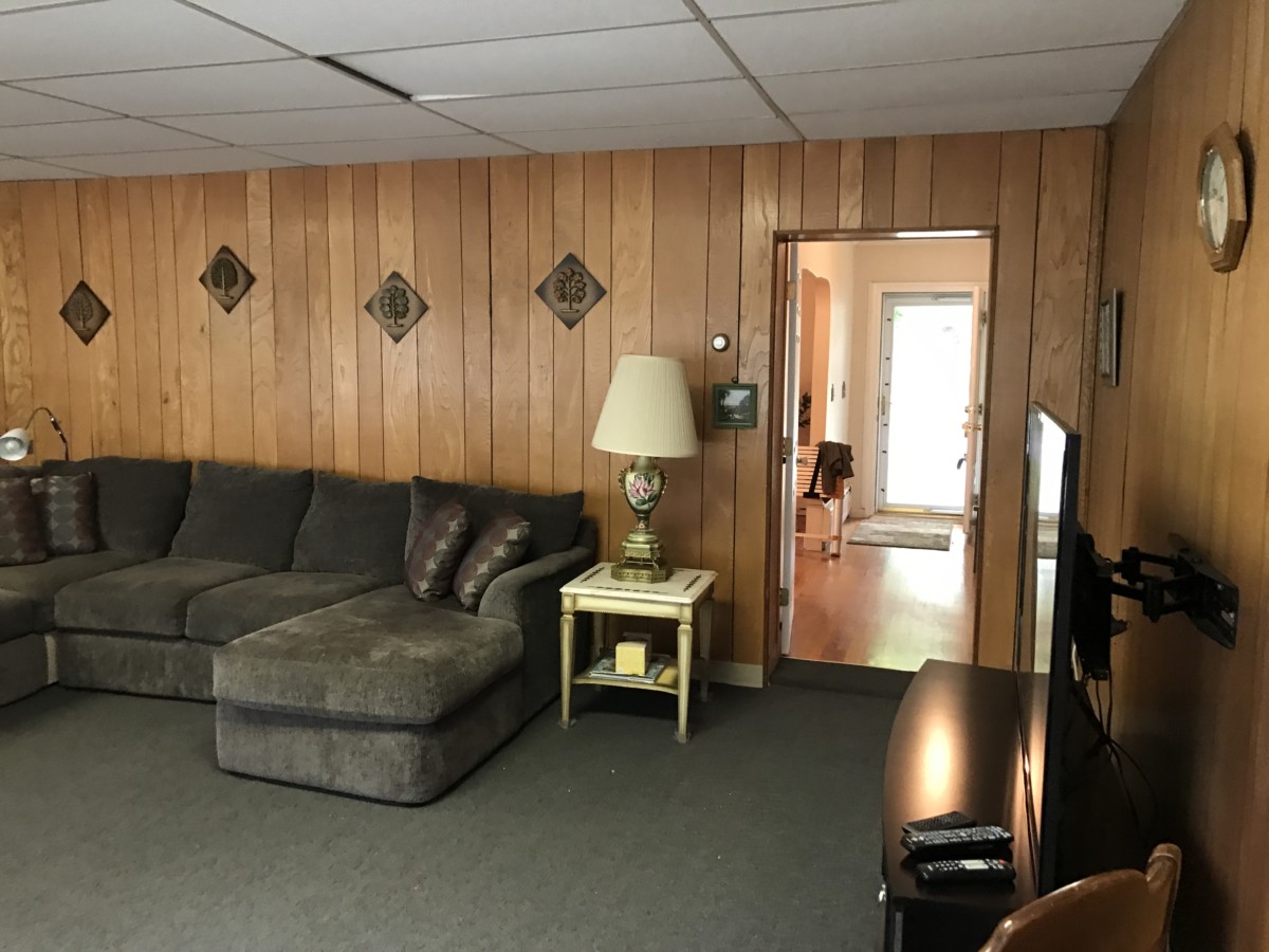
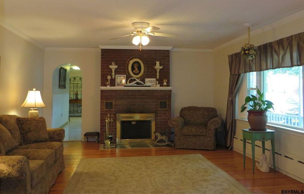
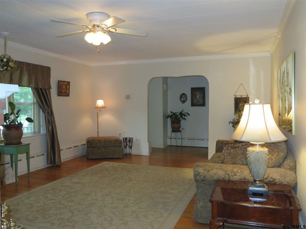
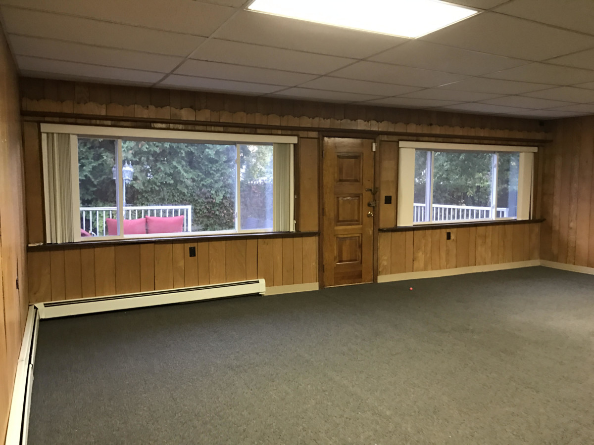
When we first stepped foot in the dark + dreary room during the open house, the sun was filtering through the large glass windows. Unfortunately we were quickly distracting by all the dark paneling, but I just had the feeling that when the space was transformed it would be flooded with sunshine.

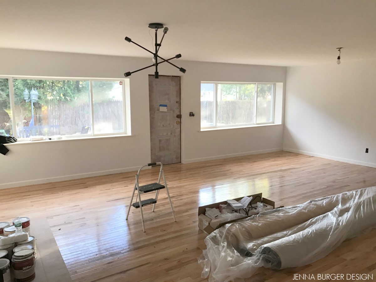
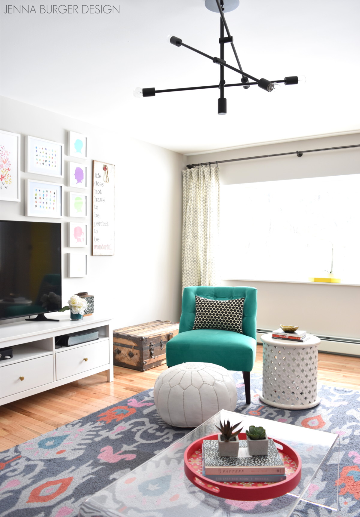
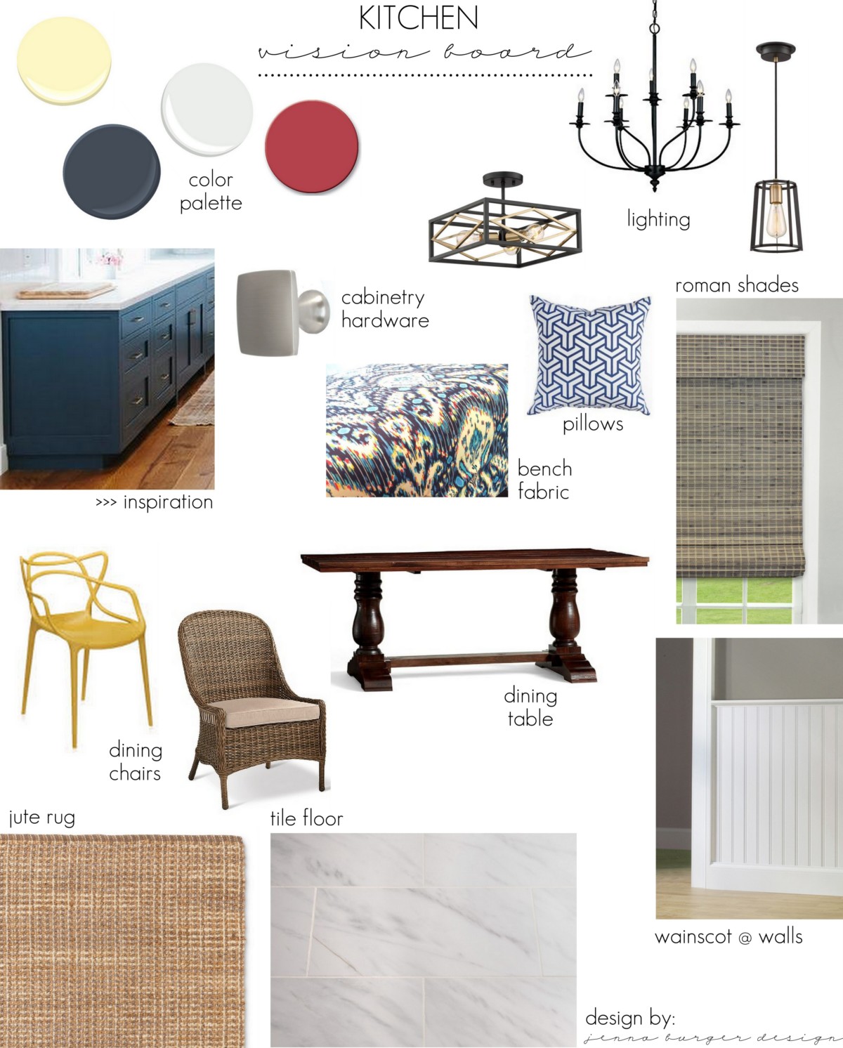
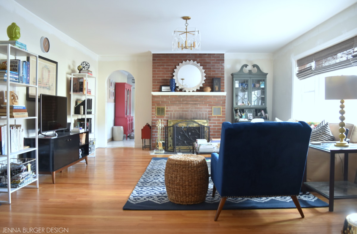
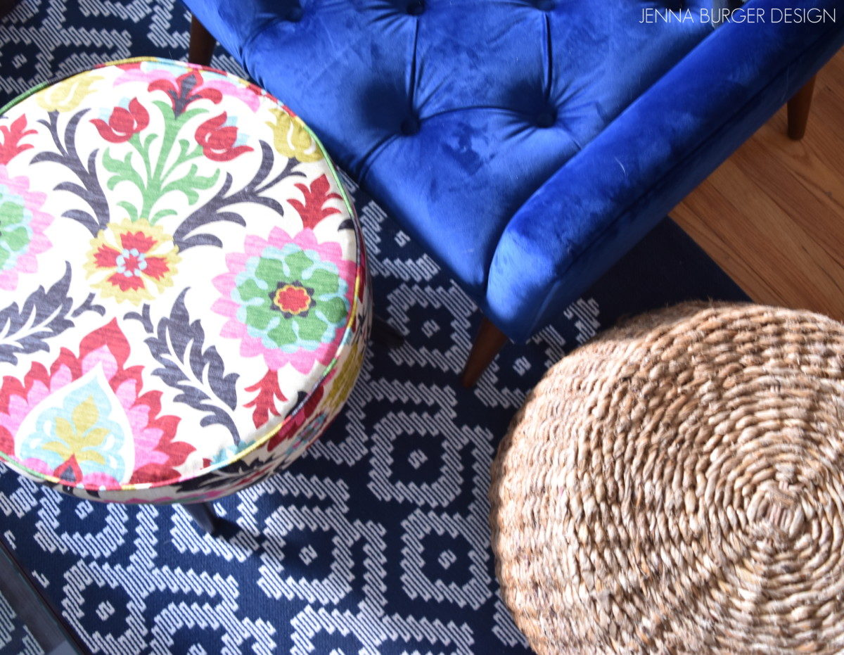
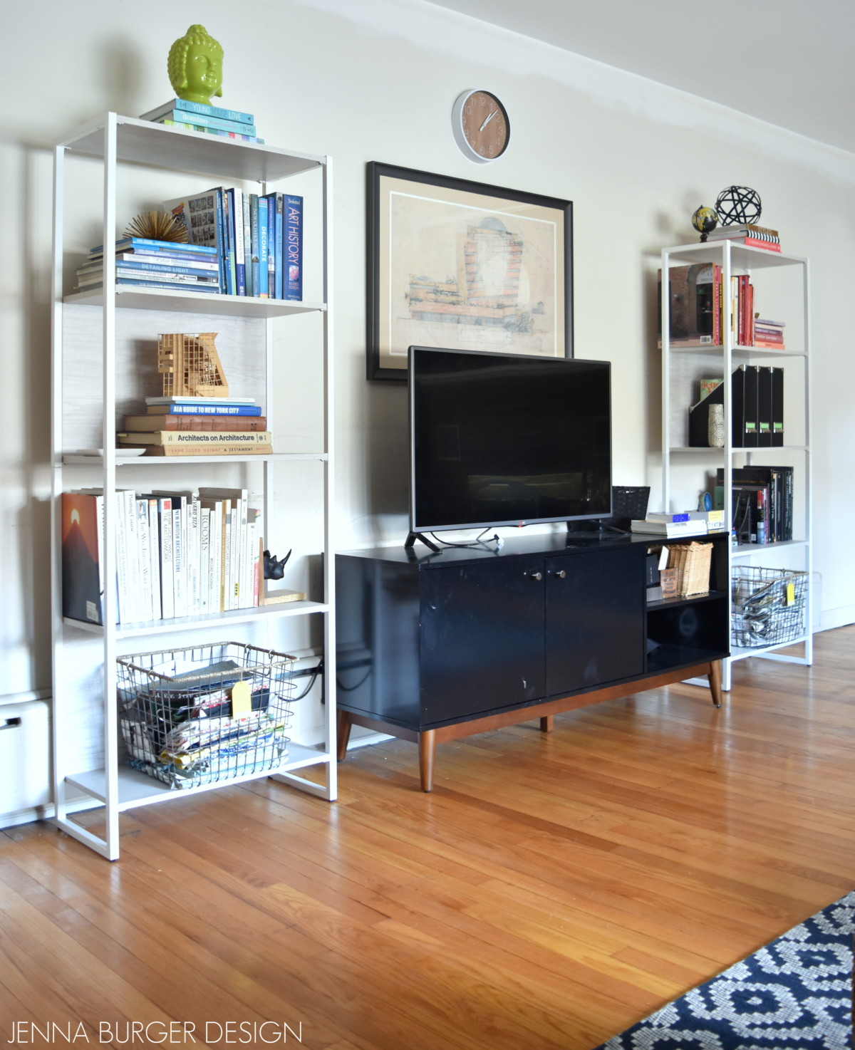
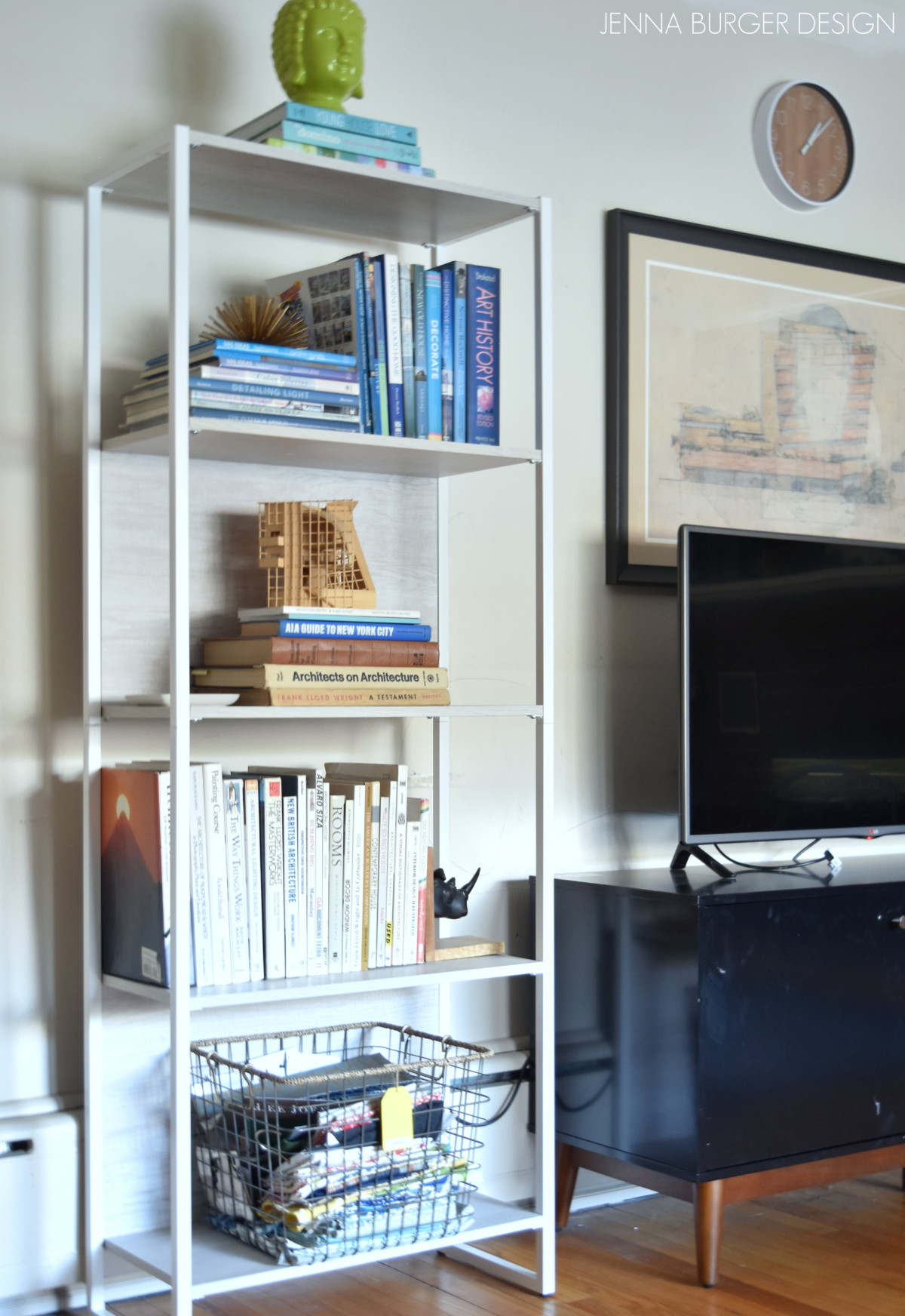
As the space took shape during the renovation, I envisioned introducing color but at the same time I kept coming back to my vision of wanting the room to feel light and bright. I knew the furniture for the space would be most of what was in our previous living room and since those elements were colorful and dynamic, I landed on a neutral backdrop that color could be layered on to.

This is how I knew balance would be brought to the space >>> Light colors for the backdrop with bold layers

Creating a Cohesive Color Palette throughout the home

As the space started to take shape, I’ll be honest, the room looked boring. It didn’t have the depth and vibrancy that reflects my style. I stuck with it and as I began to introduce the furniture and the layers of accessories, pillows, the rug, and all the elements, what I was envisioning started to result.

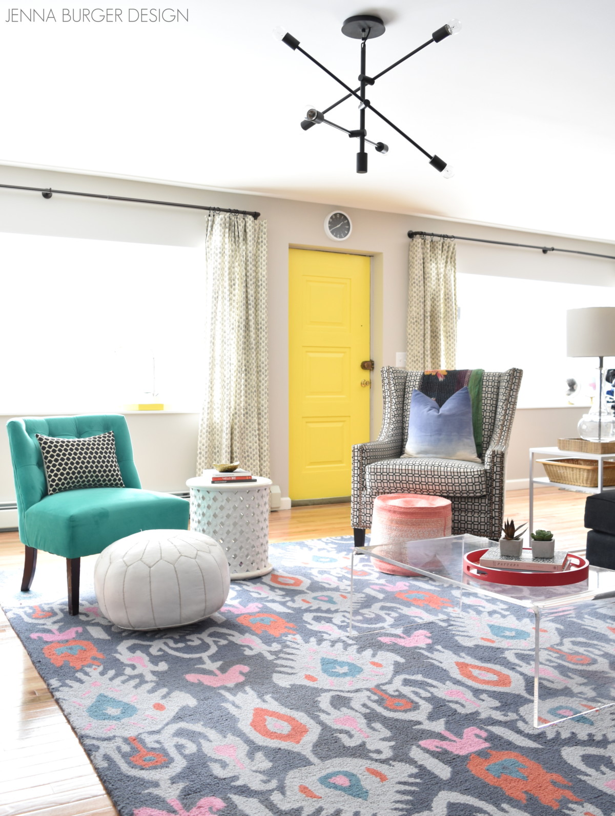
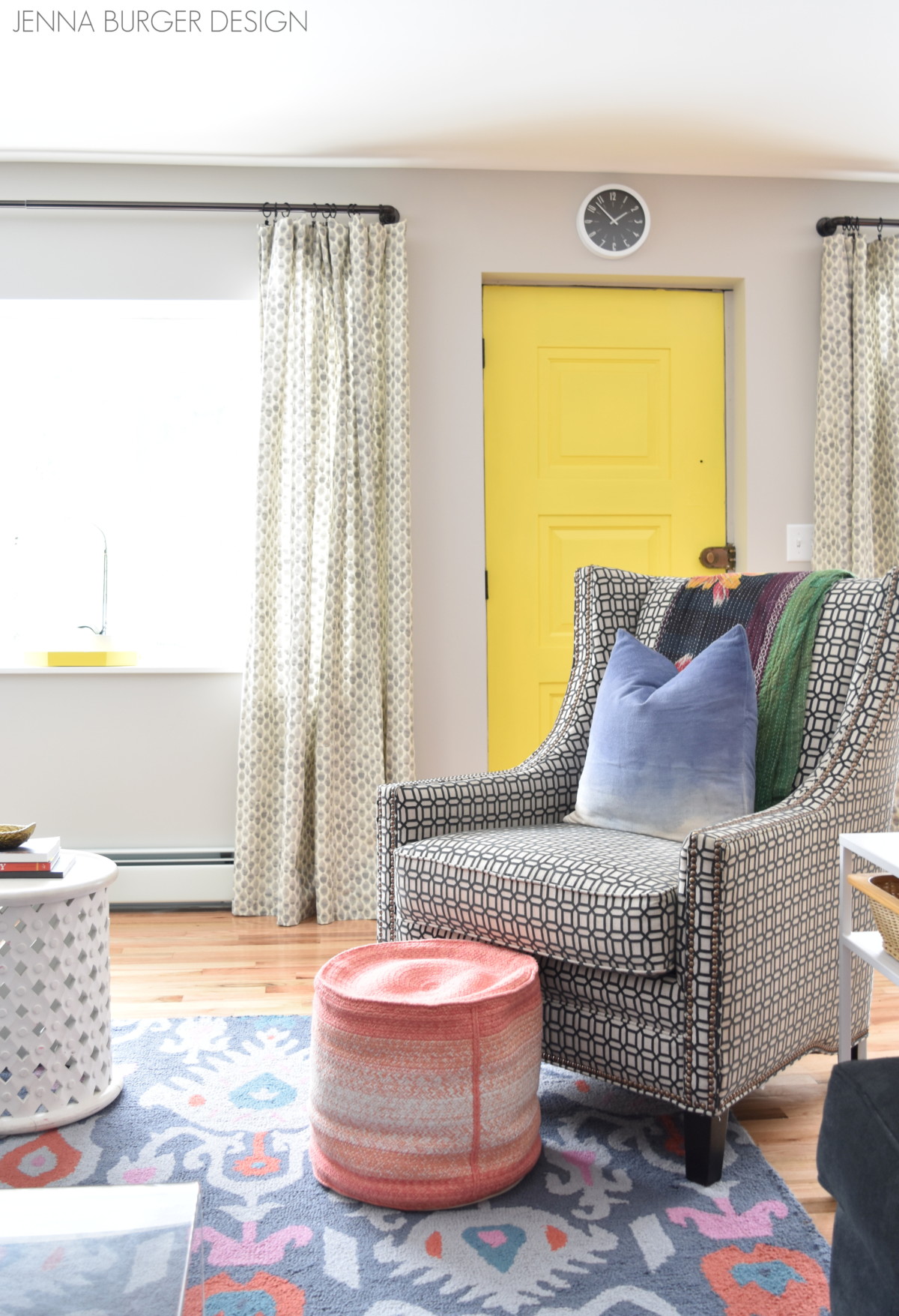
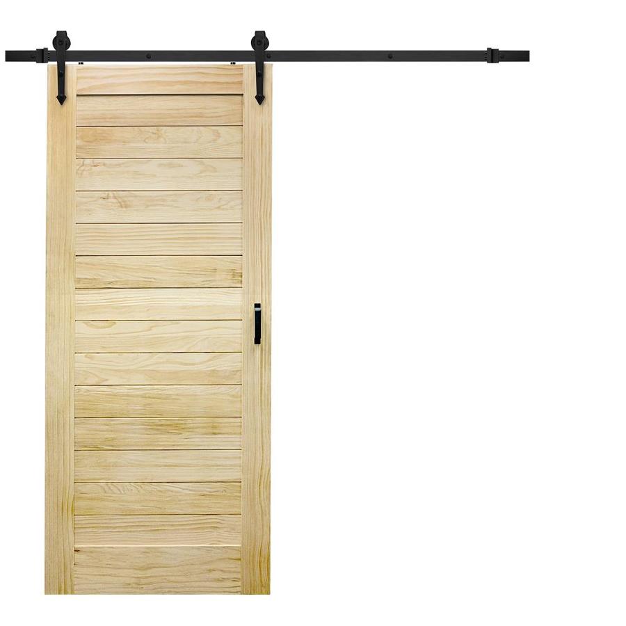
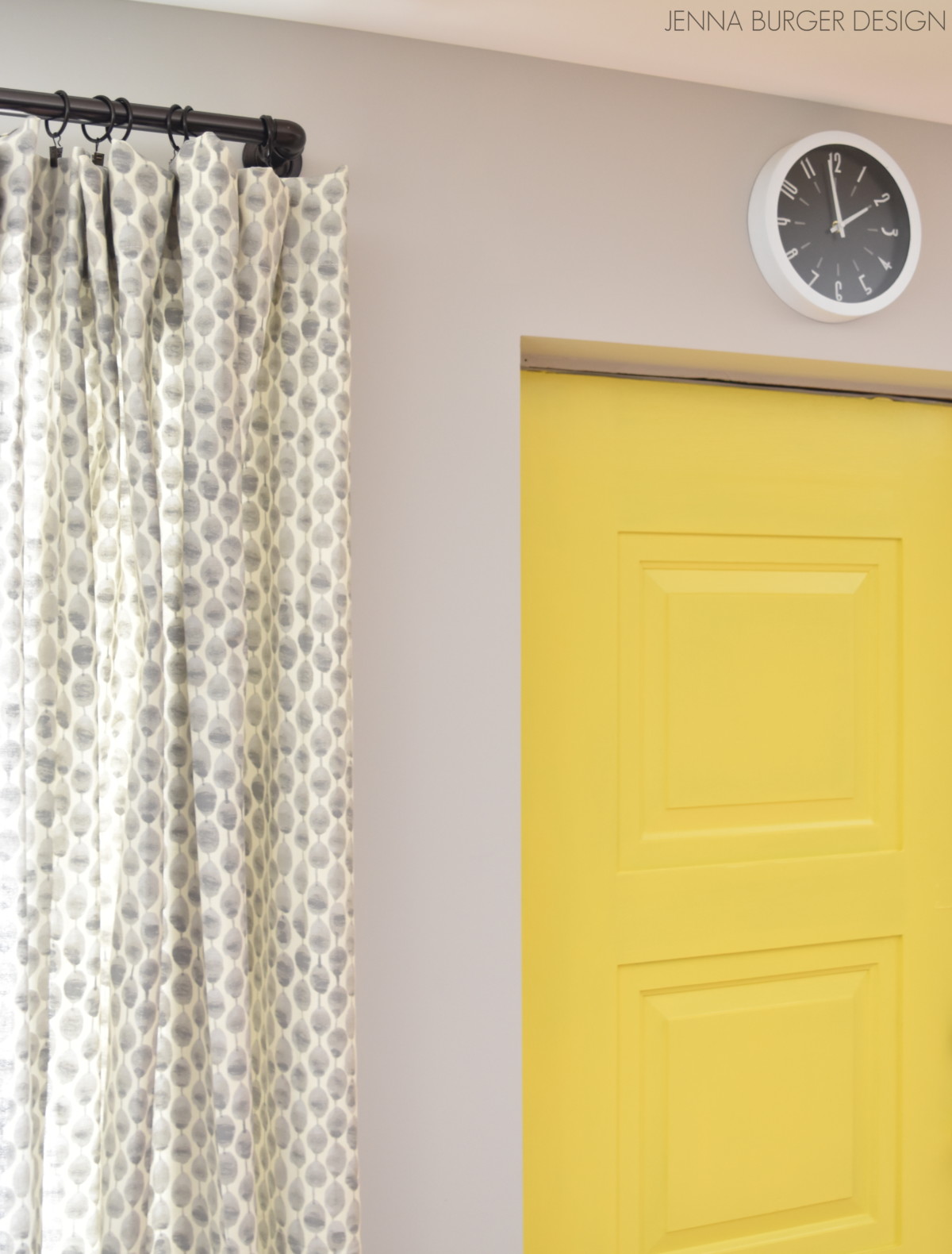
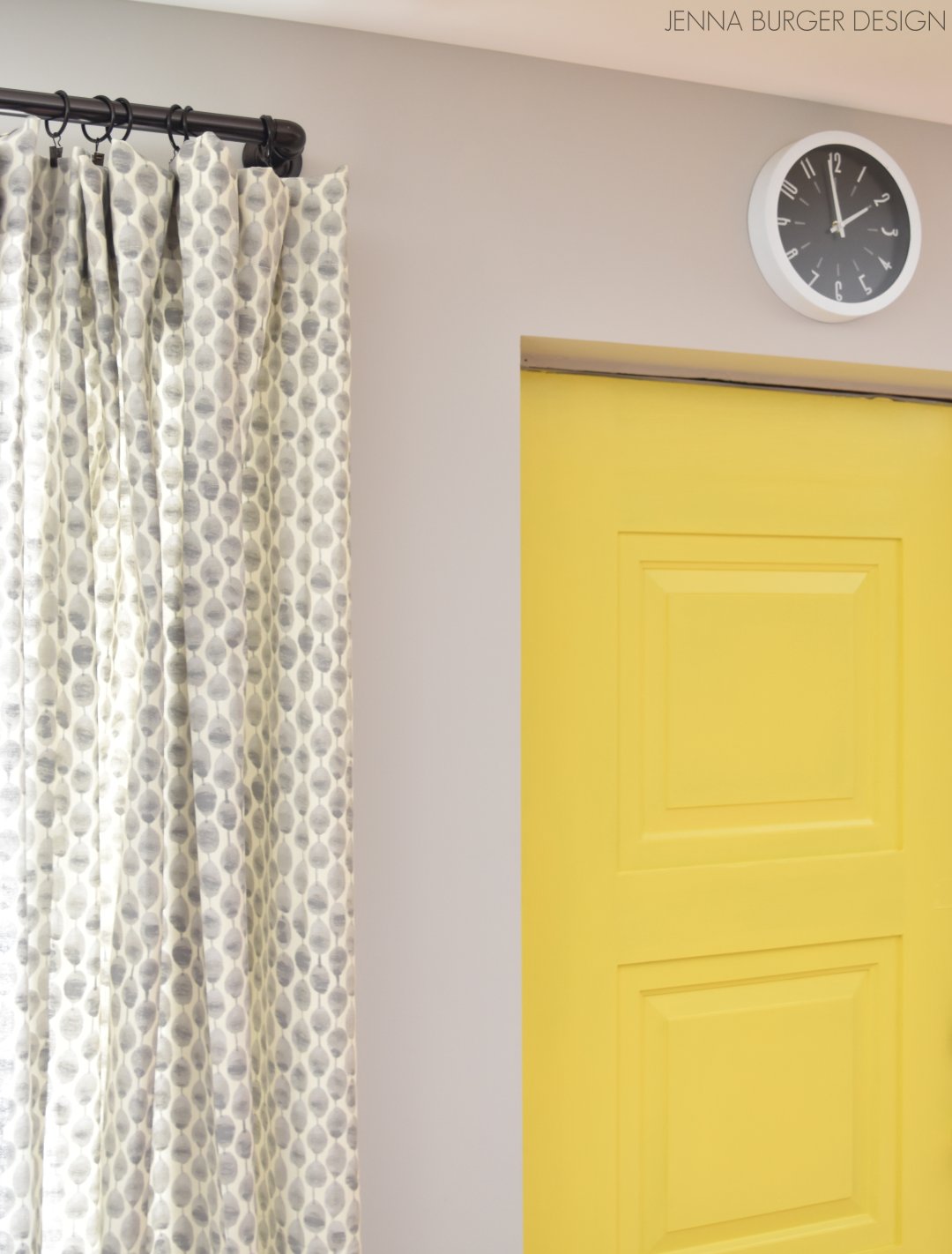
Then to really make the space pop, I decided to paint the existing wood door a vibrant, eye-popping yellow. Well that took the space to the next notch. That element alone took the room from interesting to unexpected and unique.

After priming the door with Kilz stainblocking primer…

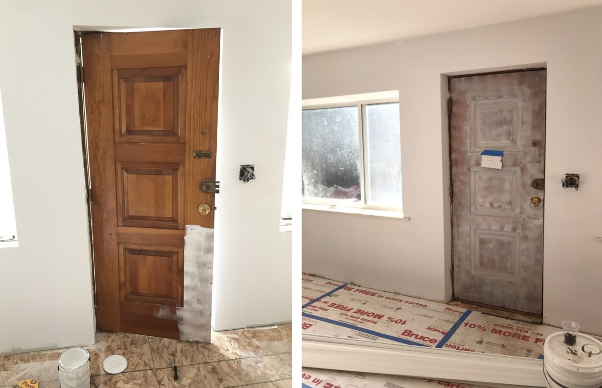
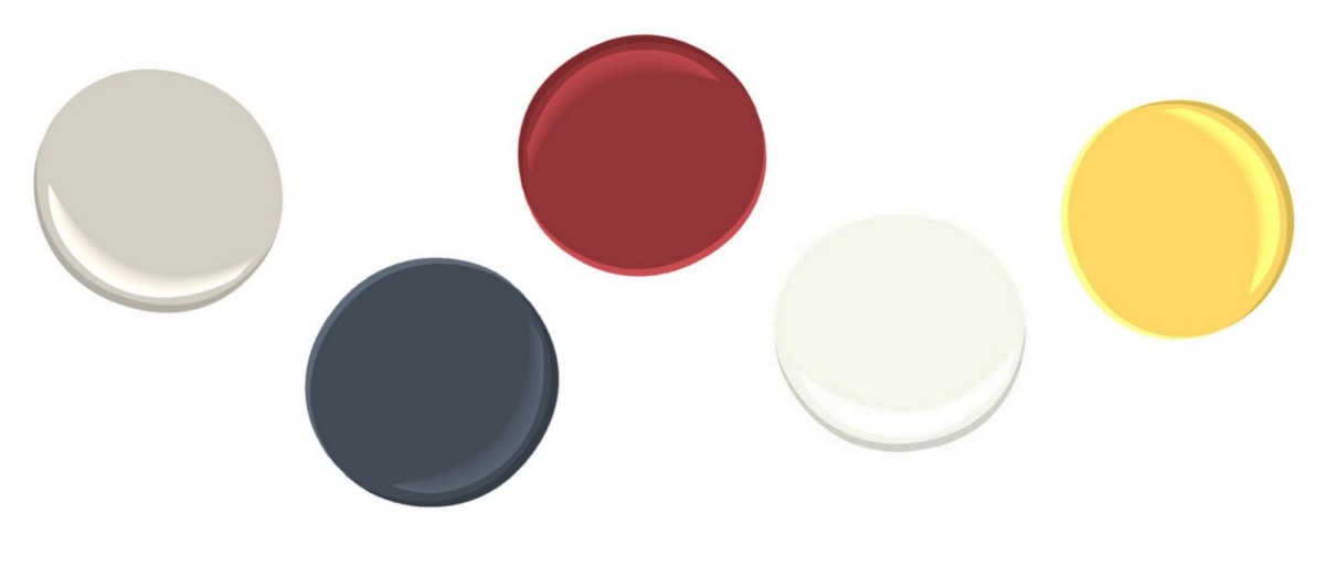
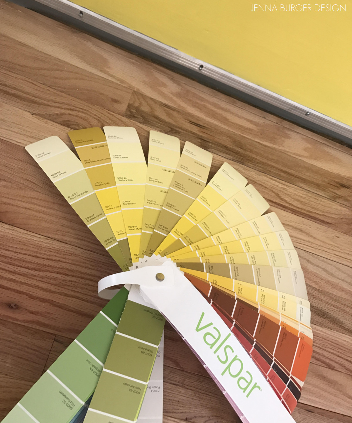
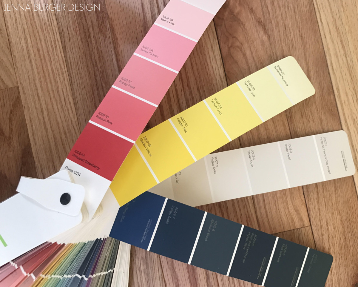
… I chose Valspar Lemon Curd for a splash of yellow.

Creating a Cohesive Color Palette throughout the home

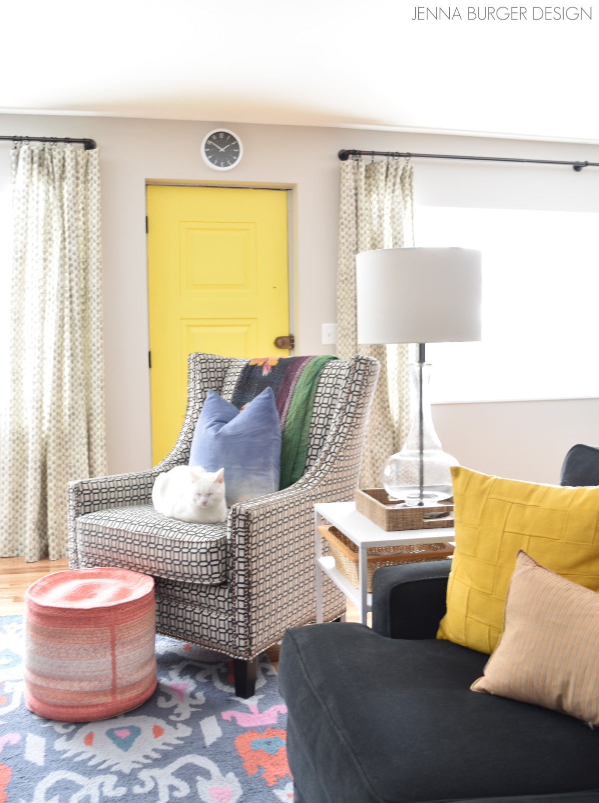
To make this dramatic color work, I brought in this bold yellow hue throughout the room in understated ways.

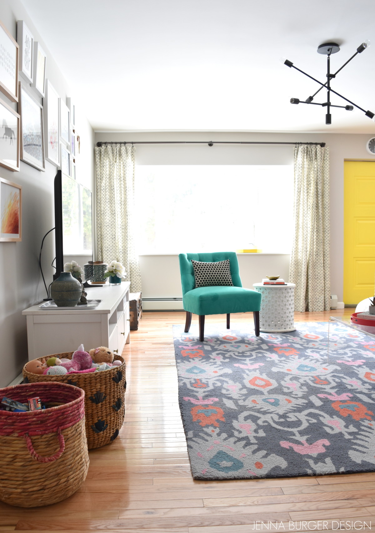
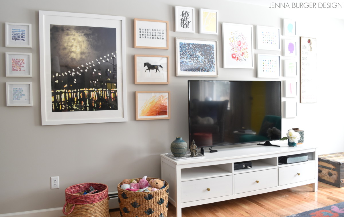
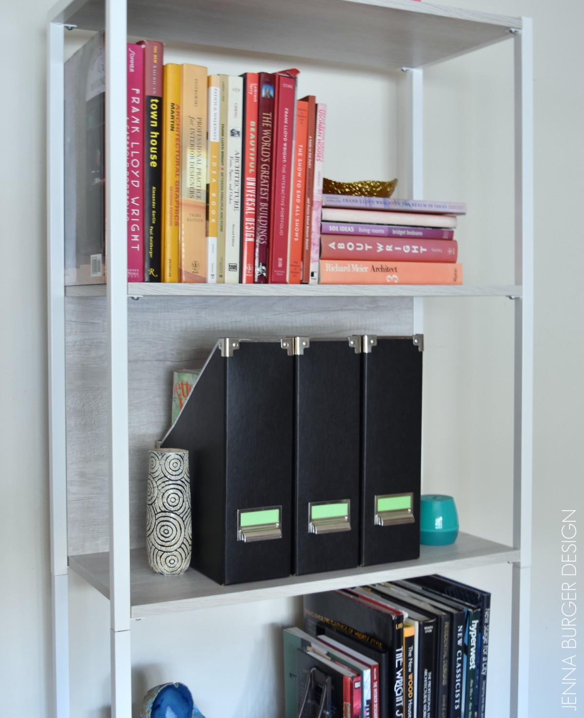
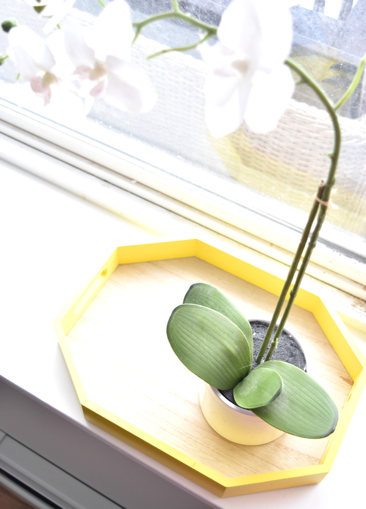
Aside from the door, there are a half-dozen other elements in the space that are the same yellow hue – 1. door / 2. pillow / 3. storage boxes on shelves / 4. tray / 5. side chairs (at desk, not shown)

Creating a Cohesive Color Palette throughout the home

Creating a Cohesive Color Palette throughout the home

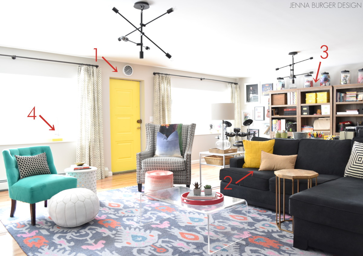
Introducing this eye-popping color in other elements creates cohesiveness throughout the space versus it being a ‘one-off’.  Yet, the yellow doesn’t dominate too much and take over.  In small doses is best.

Creating a Cohesive Color Palette throughout the home

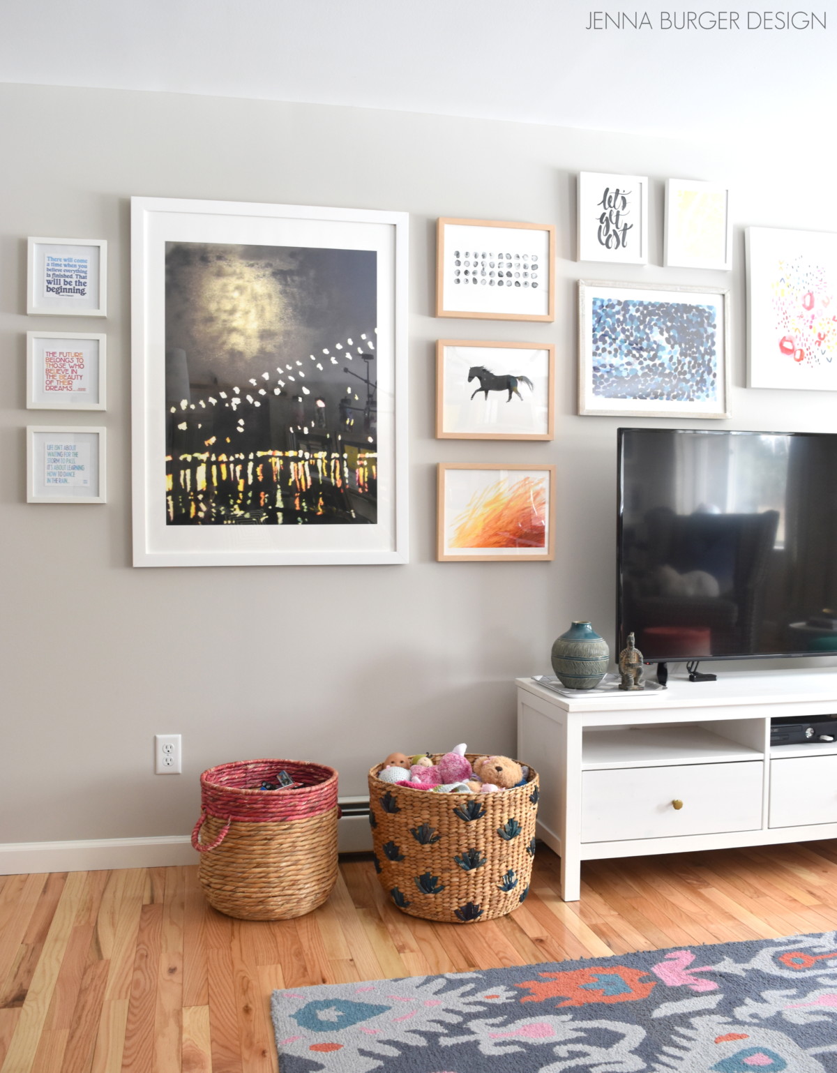
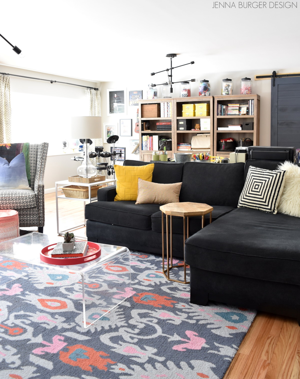
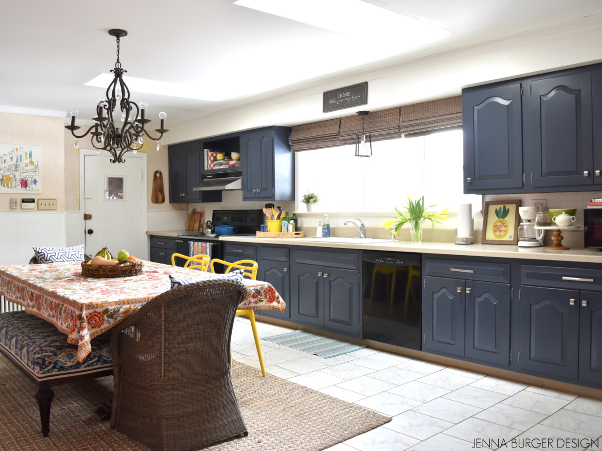
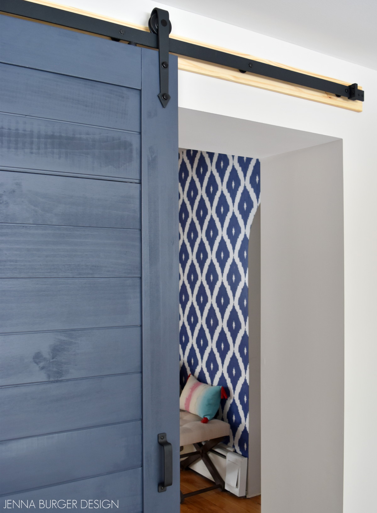
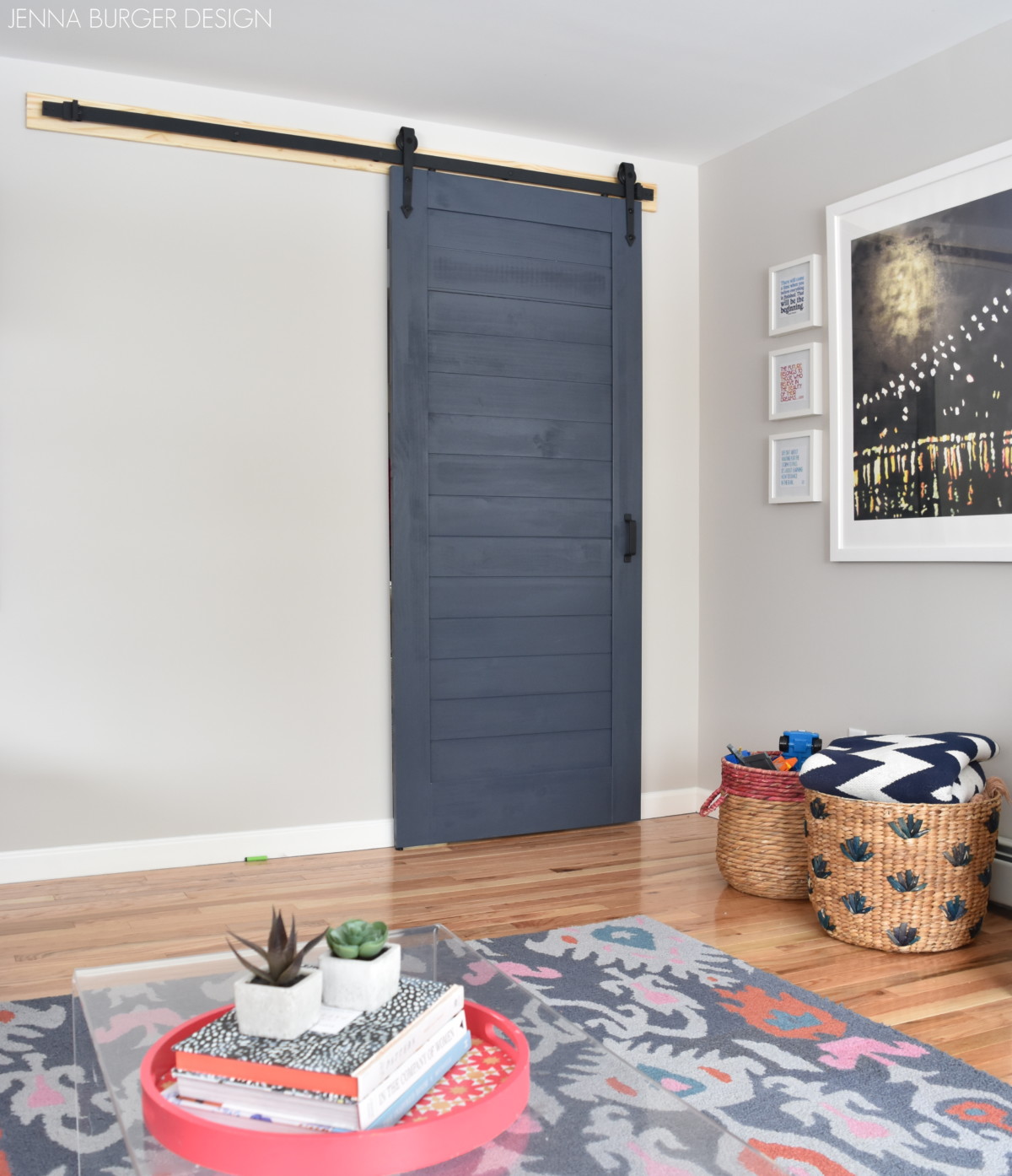
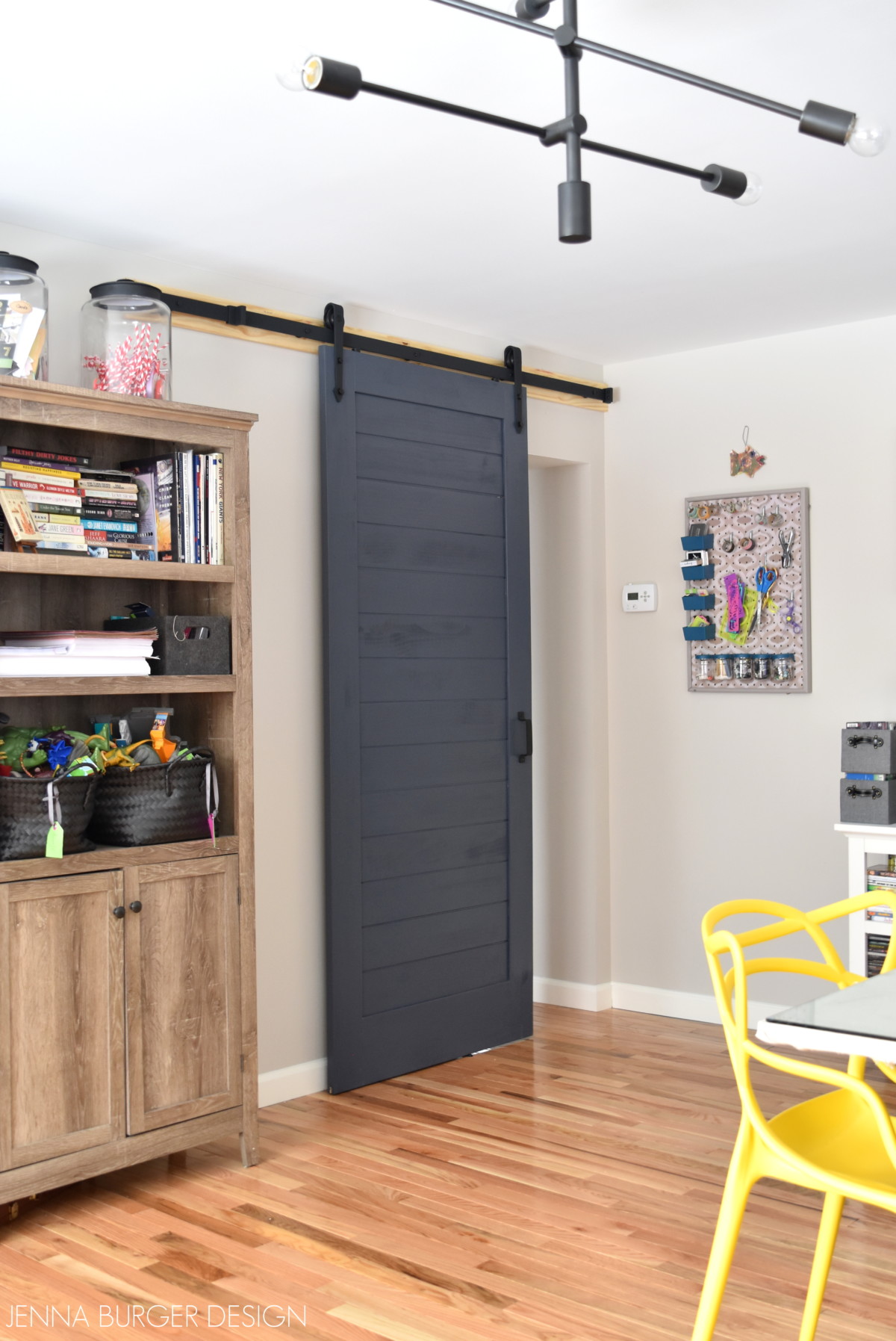
Another way our pajama lounge space works well is the balance of light and dark.

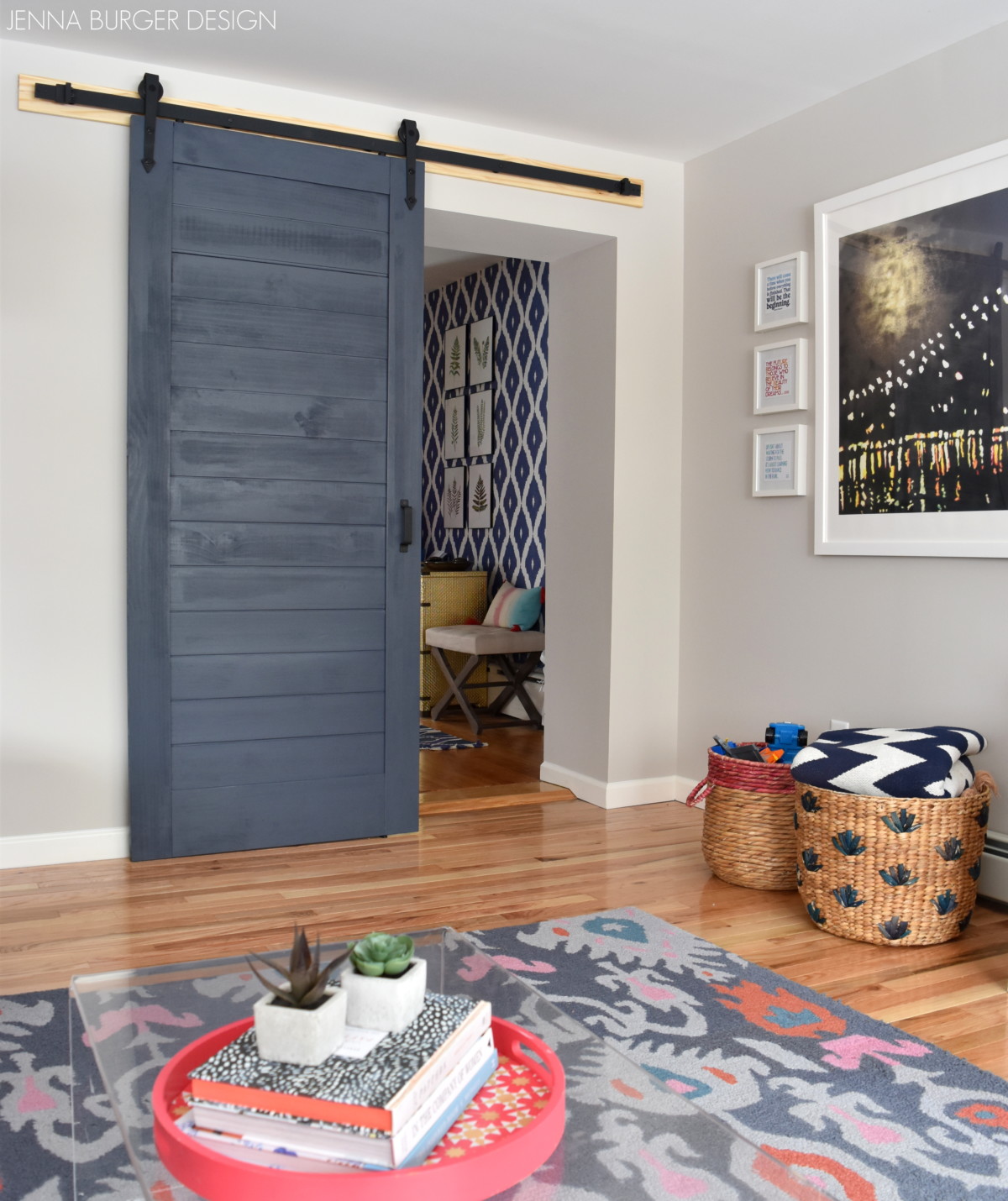
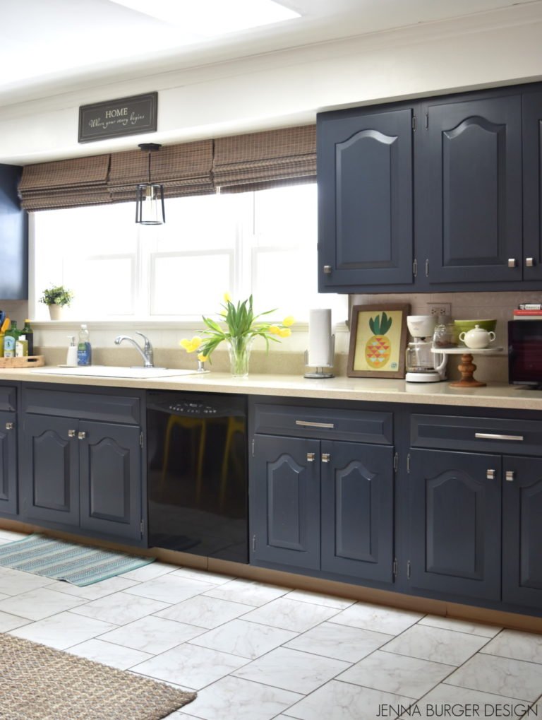
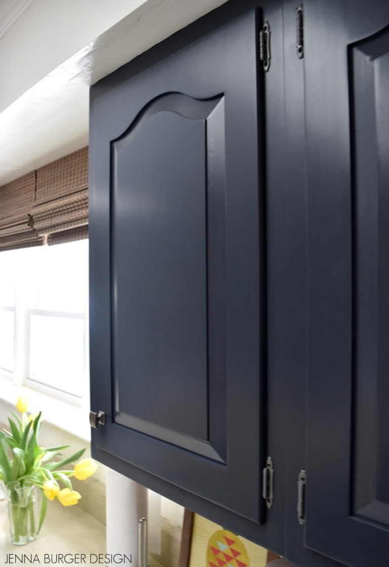
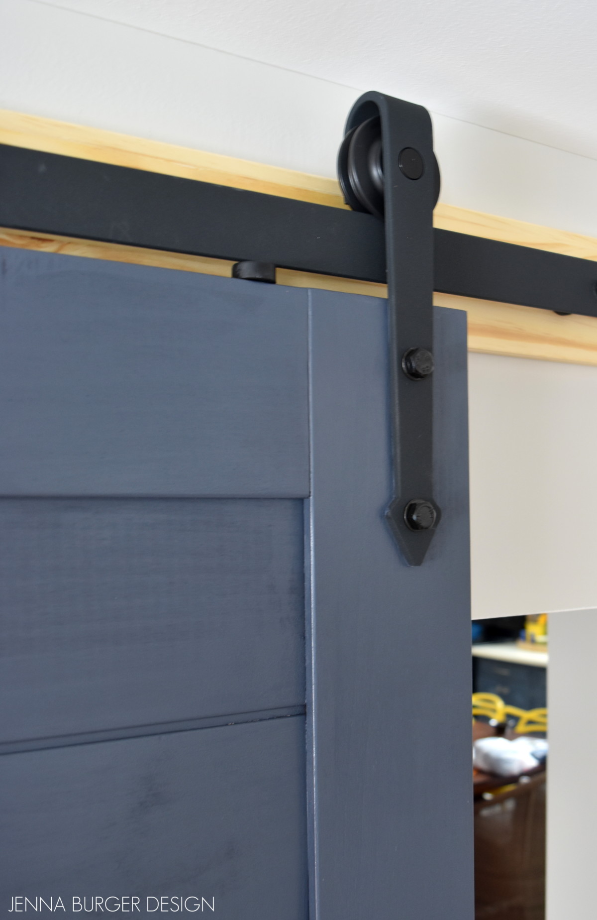
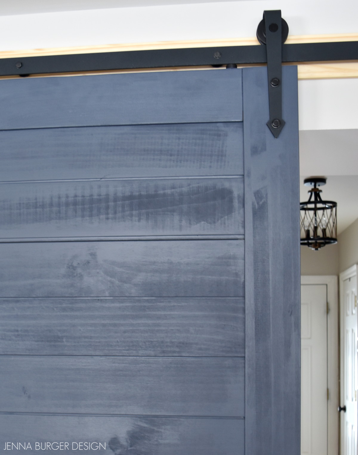
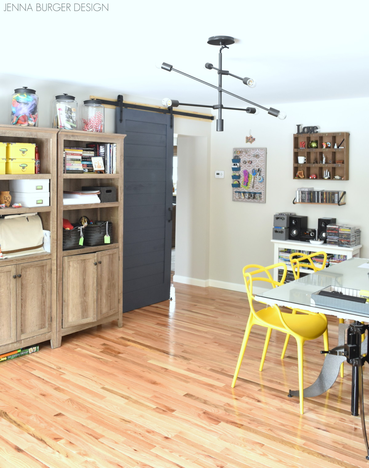
As I mentioned, at first this room seemed boring to me with the walls painted a light color – Valspar Snowy Dusk – but when the furniture + accessory layers were added, the room started to come alive.  With the light colored walls as a backdrop, the opportunity was provided to add contrasting darker elements, like the dark navy barn doors.

Creating a Cohesive Color Palette throughout the home

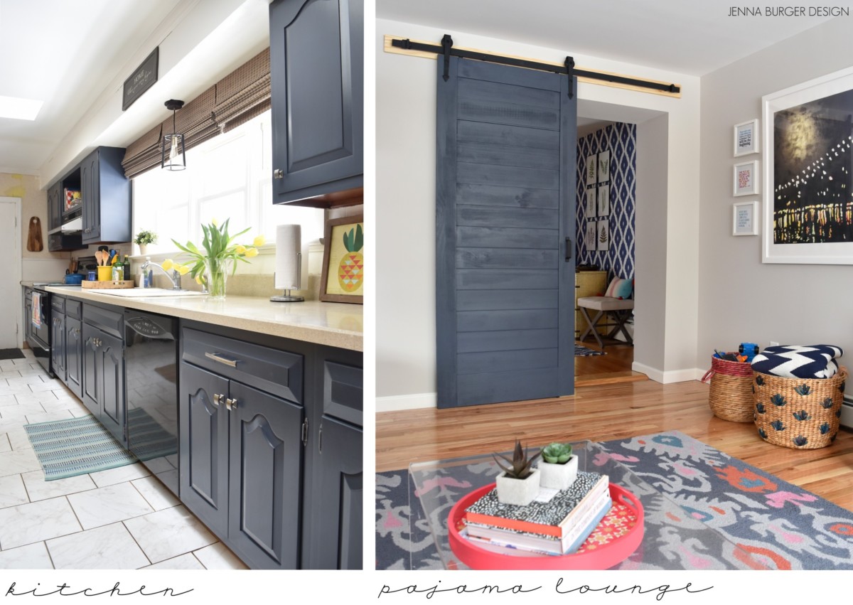
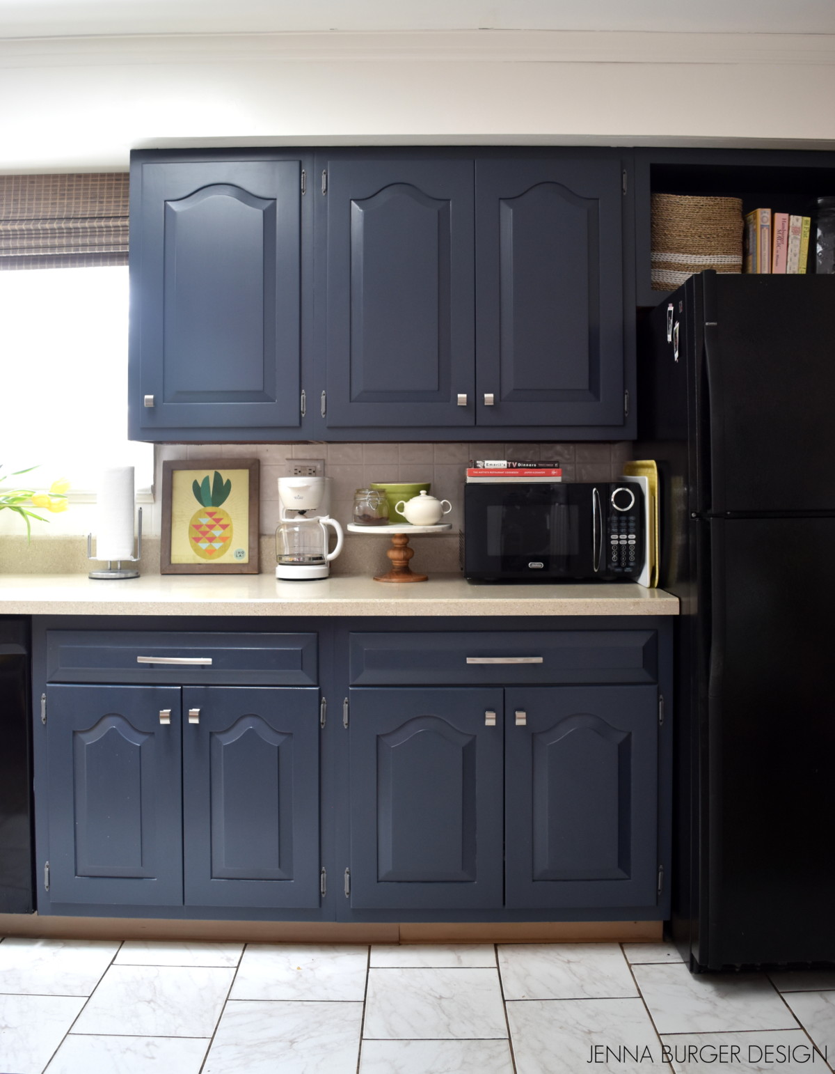
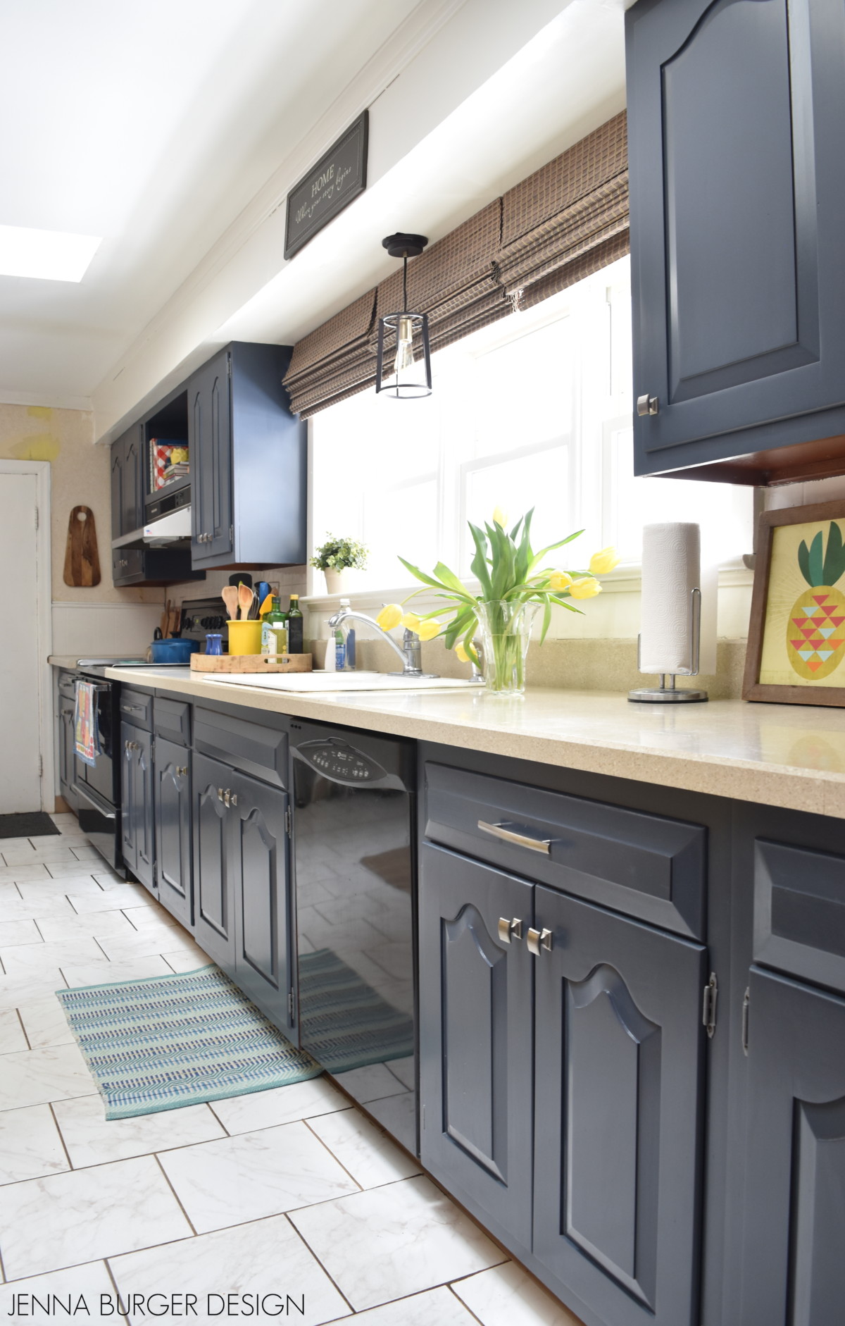
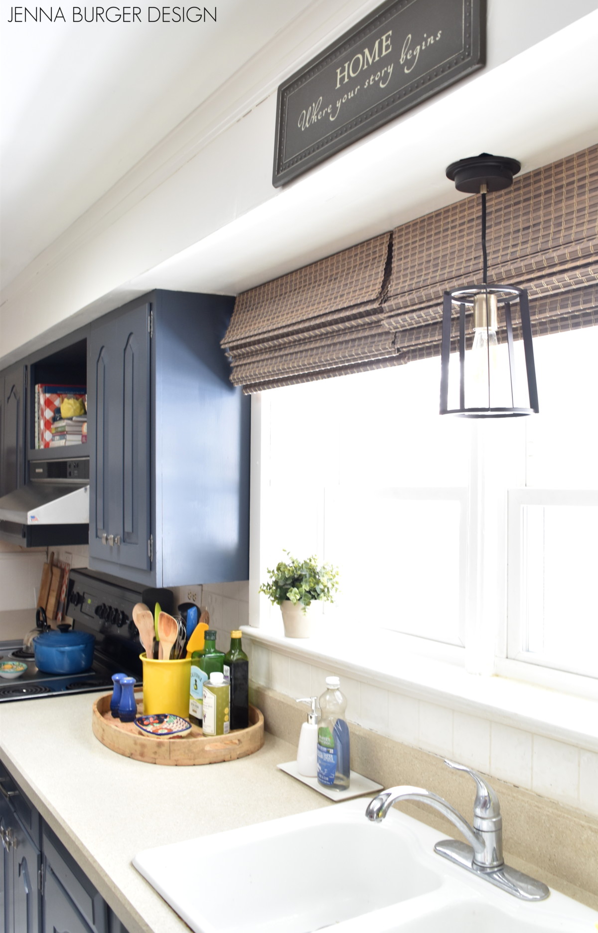
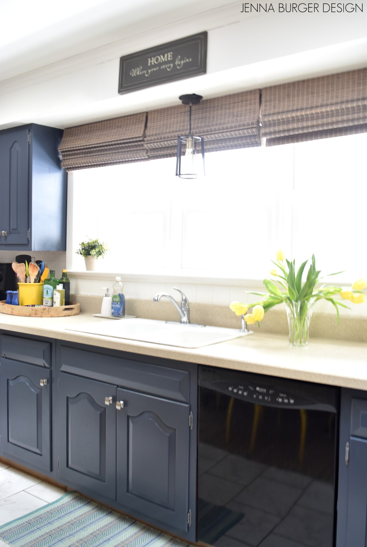
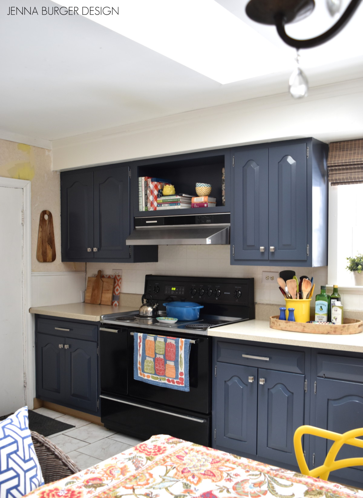
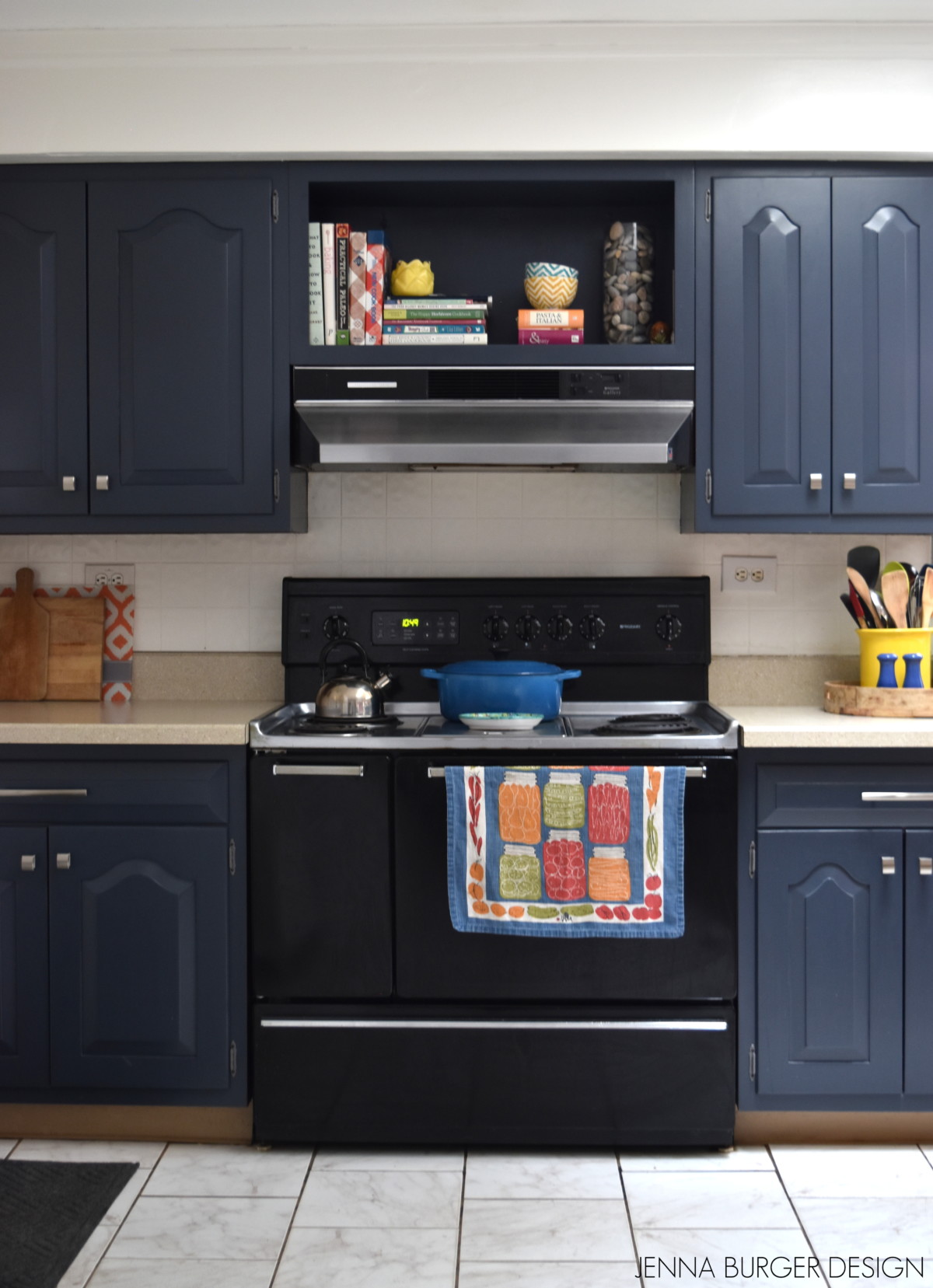
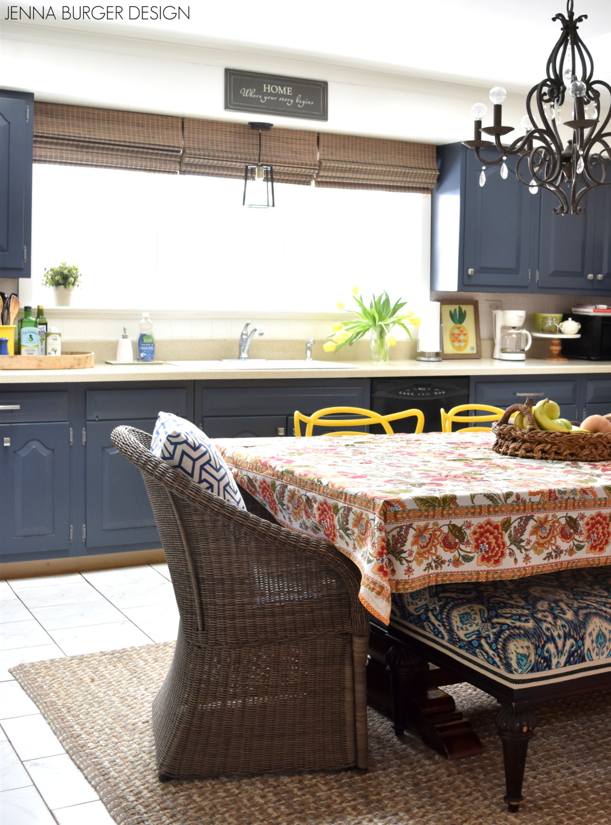
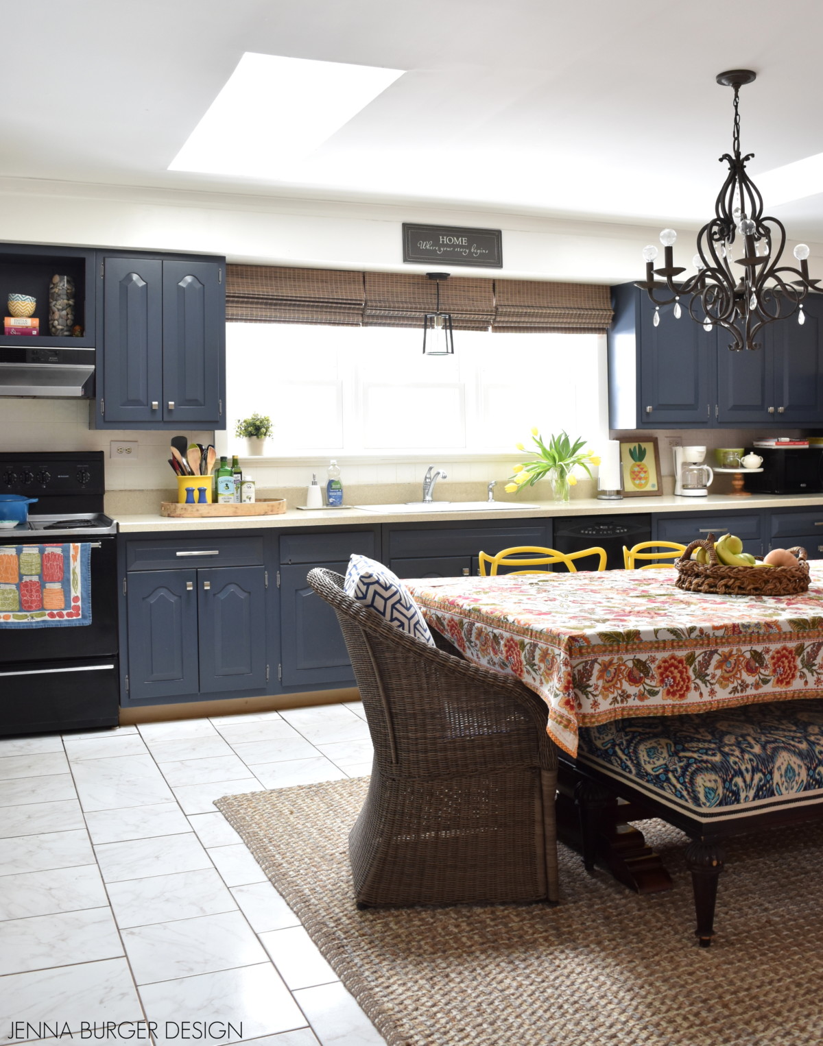
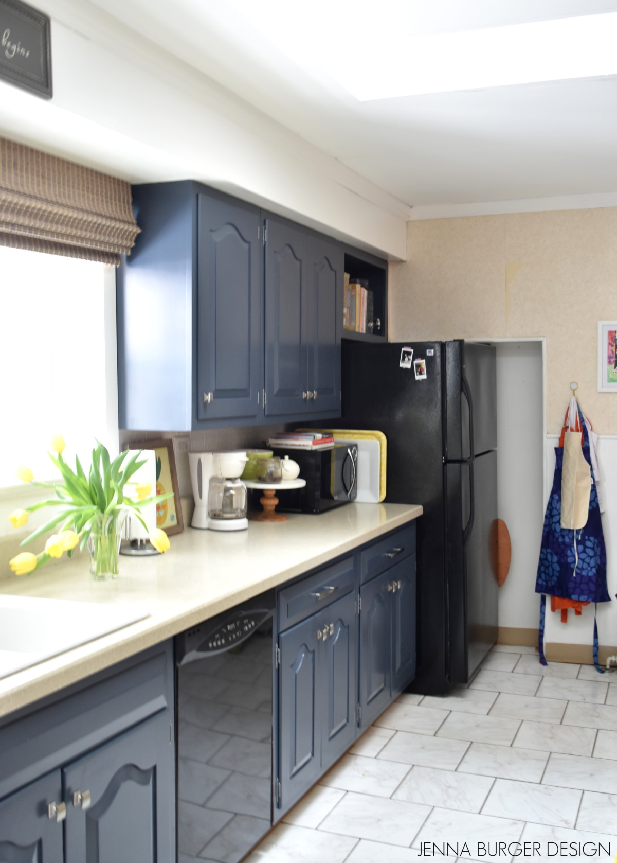
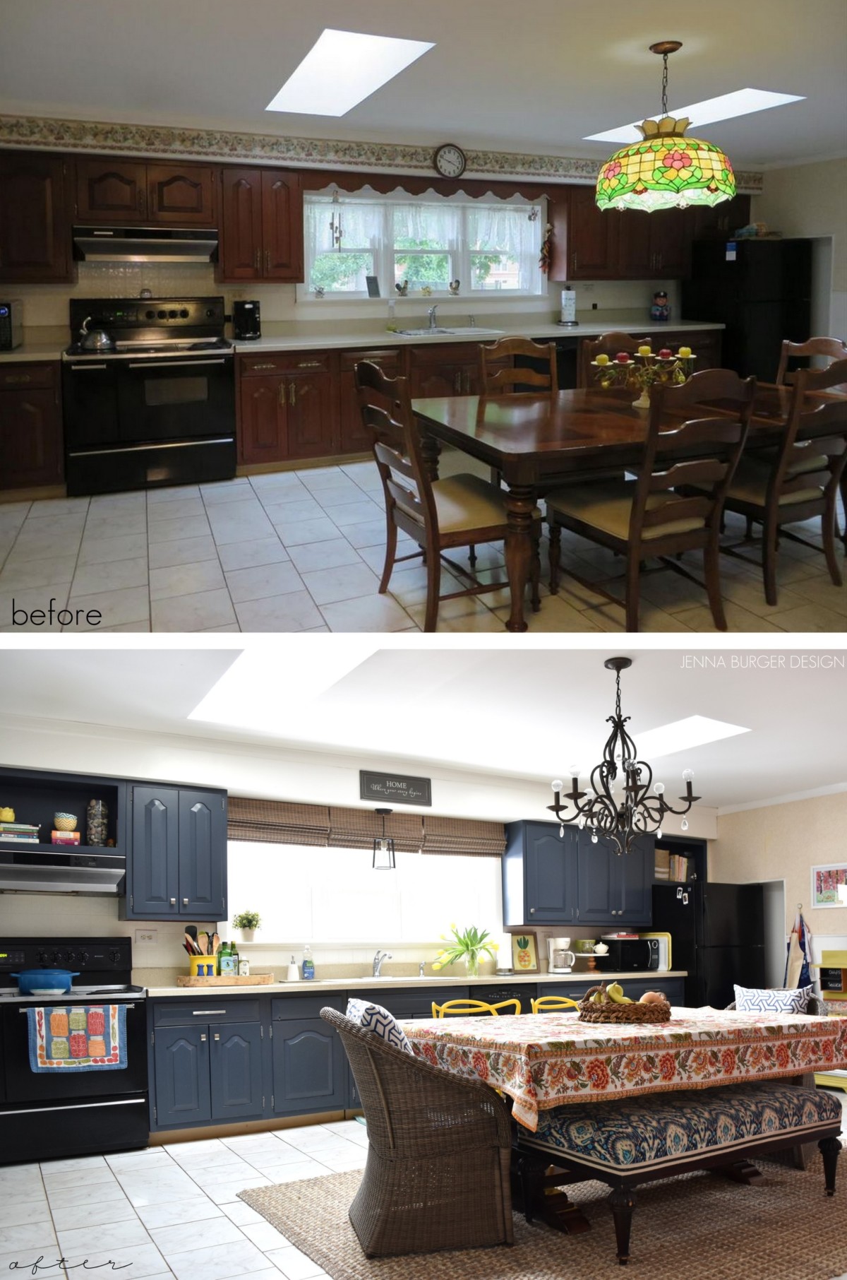
The color on the barn doors is the same as the newly painted kitchen cabinets.  Having the same color on multiple elements in different rooms, creates for a cohesive thread throughout the house.

Creating a Cohesive Color Palette throughout the home

Balance is key to creating a cohesive color palette.  Once I determined that I wanted to introduce a dramatic color, I knew the other colors in the space needed to compliment the bold yellow hue.  Choosing a light backdrop (the walls) with darker layers (the navy barn doors) + pops of color here & there throughout the room created a space that is light + bright & a space we love to lounge!

Creating a Cohesive Color Palette throughout the home


DISCLAIMER: THIS POST ON CREATING A COHESIVE COLOR PALETTE IS A COLLABORATION WITH LOWE’S. ALL OPINIONS + SELECTIONS ARE MY OWN.

Pajama Lounge REVEAL

Did the title of the post entice you to read more?!?

There’s a new phrase being tossed around in the design world… Pajama Lounge.  I first heard it on Young House Love Has a Podcast and then Apartment Therapy recently shared an article on What is a Pajama Lounge?  The space that I was referring to as our family room really is better suited to be our Pajama Lounge as it’s  just that… a space that we basically lounge around in wearing pajamas.  It’s our hang out space. The room that we gather to watch TV.  It’s the place in our home that the kids play, do homework, and create.  It’s essentially the everything room where it all happens.

Taking a step back to when we first bought our brick ranch fixer upper, the room looked nothing as it does now.  Let’s head down memory lane for a glimpse at what we started with…

The vertical paneling was torn down. The carpet was pulled up. The ceiling was removed.

New framing was added.  New sheetrocked installed. New wood flooring layed.

A few weeks later, a completely transformed room was created with a fresh palette to decorate.

The walls were painted. Furniture was brought in. Layers were added. And the once barren, dreary space came alive…

Welcome to our renovated living room, a.k.a. Our Pajama Lounge

Step inside…

I shared a glimpse of our PJ hang out room a couple weeks ago when I wrote a post on the new rolling barn doors, which there are two of, that separate this space from the rest of the house. To create a cohesive tie throughout the house, the paint color on the doors is the same as the newly painted kitchen cabinets.

The pajama lounge is a large space at about 23′ x 15′.  A space of this large size can be overwhelming to lay out  so I decided to create two zones – a TV / lounge area and a separate fun / work area.

The opening off the foyer is the TV / lounge zone.  Most of the furniture in this space is from our previous home and the set up fairly the same as it was.  The TV sits on a media stand at the far wall and is surrounded with a collage of prints + pictures from Minted.  Even though the TV – the big black box – is large, it doesn’t feel overwhelming or dominate the space because the elements around it are interesting and distract the eye.

To create the two zones, I positioned the sofa in the center of the room facing the TV.  Then behind the sofa is a large table (part of the work zone) that is a desk for creating. In the TV zone, along with the sofa are other seating options including a comfy side chair in a small geometric pattern and an armless side chair in a green suede fabric.

New window treatments flank the sides of the two large windows and the continuing pattern at each window, tie together the two zones.

Other furniture elements in this area of the room are light and airy to keep the space feeling spacious and open.  The lucite coffee table can easily be moved when all of us are lounging and the new white metal side table is attractive from all sides – front, back, and sides – so no matter the view point, it looks good.

Atop the side table which sits between the chair and sofa is a lamp with a clear glass base and white shade.  It took me a while to find the right lamp – I tried many!  I’m a lamp hoarder so thankfully I didn’t have to buy anything new.  I first tried a thin, tall lamp, but it dominated the room.  Then I tried a smaller lamp with a solid base but it wasn’t the right scale.  Finally I tried this lamp and I think because it’s clear glass it balanced the layers of color in other elements throughout the room.

Along with the large desk behind the sofa used from homework + creating, the second zone of the room is used for play.  The tall bookcases in a distressed wood finish on the far wall are a recent purchase. They are half open shelves and half closed at the bottom.  The top portion of the bookcase stores arts + crafts supplies in boxes, toys in baskets, books, files, etc.  The bottom section with the closed storage holds the kids toys.

The fun zone offers the kids a wide open area to play and in the corner is a drum set.  Because we don’t have a finished basement anymore, many of the items that used to be in the basement – toys, drums, all the other ‘stuff’, had to find a new home (or are still in boxes, haha).

In the work / fun zone of the large pajama lounge that is the second rolling door that leads to the kitchen.  This area of the space is still a work in process (as is a bit of every room in the house), but I have ideas brewing…

We love and live in this space so much.  It’s our hub.  The space is so bright + feels so inviting.  And who doesn’t love a good before & after.  Let’s take one more peek at what it once looked like and how our pajama lounge looks now…

Check out this post on how I created a cohesive color palette in the room with the colors + layers of the room I chose.

KITCHEN: Cabinet Makeover Reveal

It’s been quite the process, but I am so excited to finally share the reveal of the DIY kitchen cabinet makeover.  The steps to transforming the kitchen cabinets started when we first purchased our brick ranch fixer upper in the late Fall.

Steps included removing, prepping + sanding the cabinet doors and face frames, followed by priming + painting the doors a moody navy hue.

Here’s a peek at what the space once looked like…

This was the plan of action…

And the vision board

This is the result of the kitchen cabinet makeover…

Alot went into this do it yourself kitchen makeover, but there is still more to tackle in the space – more on that later. For the moment, let’s take a look at what has been accomplished.

Despite the dark color on the cabinets, the space feels light + bright with the other lighter hues in the room.  The window draws in beautiful natural light, along with the two skylights in the ceiling.  The space is also offset by many lighter tones including a light brown laminate countertop, white subway tile, a light colored floor, and white paneling around the room – all of which is existing.

Aside from loving this deep moody hue, one of the reasons I thought the navy color would work well was to conceal the black appliances.  They aren’t overly attractive (ie: they’re old and will eventually need replacing) so I thought a dark cabinet color would make the appliances blend in versus adding contrast as light or white cabinets would.

The kitchen space is significantly large and the cabinets run the full wall length.  From one end to the other is about 20′.  I’ve organized and reorganized the cabinet interiors a few times already to create as much function as possible while cooking. It’s amazing how many times I run back and forth to each end while making dinner – refrigerator, stove, refrigerator stove.  This set up with one row of cabinets isn’t really the most ideal kitchen triangle, but it’ll work for now.

`

When we first started the makeover, one of the cabinet parts that had to go was the valance which was connecting the upper cabinets over the windows and concealing the fluorescent light behind.  The scalloped valance was purely decorative and when removed, the space really opened up the window area. The fluorescent light was removed and in it’s place, I hung a new simple modern pendant.

The wallpaper border that was added to the bulkhead above the upper cabinets was also removed and the wall then had to get repaired and painted.

At the windows, I installed cordless roman shades in a driftwood color.  The bamboo style shades add such beautiful texture and warmth.  Being cordless it makes it so easy to lift and lower for privacy.

The cabinets and drawers adorn new stain nickel knobs and new stain nickel pulls, while the hinges were removed, cleaned up, spray painted, and reinstalled.  It’s amazing what a freshened look new hardware can bring cabinetry.

The paint color of the cabinets is: Valspar Mystified 4011-8

The cabinet above the range hood and the refrigerator are now open.  Instead of reinstalling the doors, I chose to paint the interior of the two cabinets to display cookbooks, bowls, and kitchen items. I adored the open shelving in my last kitchen, so I took the opportunity to do something similar with this space.  The bindings on the cookbooks and the colorful bowl exteriors give the space depth and a pop of interest.

The light cocoa colored counter is filled with many favorites including cutting boards that I use daily, a large yellow holder for utensils, olive oils that I use often for cooking, and of course tulips because this time of year we need a little sunshine in our lives!

This kitchen is a large space and it also duals as our dining area.  The chandelier, dining table, chairs, and bench are all items we brought with us from our previous home. I was excited that they integrated so well in this new setting.

One new addition to the dining setting is the jute rug.  The white floor isn’t ideal – it looks somewhat fake and dated in person – and there is a lot of it, so to break up the monotony, I brought in this rug which fits perfectly under the table. It’s soft on the feet and like the roman shades, it brings texture and warmth to the space.

So let’s chat about the refrigerator.  It’s placement is very quirky.  I’d love to know the backstory behind it’s positioning because for some reason, someone chose to create an alcove in the wall because the refrigerator was too wide to fit.  I’m not sure why the cabinets couldn’t have been been shortened (there’s only 20’+ of cabinets), but this was their solution.  Anyway, this is a funky part of the existing kitchen…

When we moved to this kitchen, we had to invest in a microwave.  I loved my under-the-counter microwave in our last home.  It was out of the way and rarely used, except to reheat coffee, but I had it.  About a month into living here, I was tired of daily cold coffee, so a new micro was a must.  I decided to tuck it away and position it next to the refrigerator so it wasn’t so striking and bulky on the countertop.   It’s actually ideal because it creates a small nook to store large platters and trays.

My beloved coral colored china cabinet wasn’t left behind and is also beautifully displayed in the kitchen space.  Another reason I chose the deep navy color for the cabinets is that navy and coral are a beautiful complimentary color palette. I knew they’d work well and be happy together in the same setting.

As a recap, a few before and after looks at the kitchen…

There is quite a bit more work that needs to go into fully finishing the kitchen.  Up next is removing the wallpaper, painting the walls, replacing the base mouldings, and creating a command center like in our last home.

Overall, I am thrilled with the result of the painted cabinets.  As in our last home when we DIYed the kitchen, it lasted about 5 years before we actually tackled a full-on kitchen renovation.  I don’t foresee this being the forever kitchen in this home, but for now it’s a beautiful upgrade.  Before taking on a big renovation, I am taking this time to understand how the kitchen would work and function best – it being so large and serving multiple purposes, it’s a tricky space.

Thanks for following along on this kitchen cabinet makeover!  If you’re inspired and want to try making upgrades to your kitchen, shop the look…


DISCLAIMER: THIS KITCHEN REMODEL IS A COLLABORATION WITH LOWE’S.  ALL OPINIONS + SELECTIONS ARE MY OWN.


DIY: Rolling Barn Door

I am putting the final touches on the kitchen cabinets, but in the meantime I’ve been working on a slew of other projects for the brick ranch fixer upper.  It’s been a busy couple months with moving, the holidays, and client projects, but thankfully with the recent freezing temps, we’ve been homebound most weekends which has allowed me to tackle my growing list of big and small projects around the new homestead.

One of my recent endeavours, which I am crazy in love with, are adding rolling barn doors to the family room which got the most TLC during the renovation.  If you remember back, this is how the space looked when we moved in…

The door opening, seen in the picture below, used to have a hinged door to access the room. Our plan when renovating the space, was to add a rolling barn door at this opening and the other opening from the kitchen so the spaces flowed better…

This is how the door opening with the new rolling barn door looks now…

Quite the transformation!

The rolling barn door, which was a complete kit – door + hardware – that we found at Lowe’s, has been a wonderful addition to the space.  Functionally + aesthetically, the door has added height, privacy, and a pop of color.  The deep navy color, Valspar Mystified 4011-8, on the door is the same as the kitchen cabinets that I painted.  I wanted to use this darker hue throughout the house to tie the spaces together + to give contrast to the lighter wall tone.

And check out the amazing wallpaper in the distance.  That’s the foyer…  More on that coming soon.

THE INSTALLATION

This is the rolling door kit we chose to use.  The design of the door was simple and not overly rustic + it was unfinished so any paint (or stain) color could be used.

The mister and I were a bit nervous to tackle installing the barn door hardware, but the directions were easy to navigate and the process for installation wasn’t as challenging as anticipated. Phew…

Since we had planned for the barn doors during the construction process, we had blocking added in the stud wall above the doors – yes there are two openings into the family room.  By adding blocking (extra framing) in the wall we knew there was no need to use anchors; the screws could go straight into the sheetrock with the blocking behind.

If you decide to tackle a similar project, you may need to use anchors which would add a few additional steps.

To start off, we painted the side of the door that would be facing the wall.  This was important because otherwise we wouldn’t have access to the whole side to paint once installed.

Using a combination of a brush for the corners and a roller for the flat surfaces, I painted the one side.

Once the paint was dry, we laid out all the hardware on a flat surface.

We then followed the directions to add the long track to the unfinished piece of wood which would be used to hang the door.

Then we added the 2 rolling brackets to the door.  The door had predrilled holes, which made the process effortless + easy.

There were a few additional steps to hang the door onto the track, but it was fairly straight forward.  The directions gave us multiple installation options, which took some time to review + anaylze.  The first door took about an hour from start to finish, but the second door was a breeze since we knew the steps to take.

Once the door was hung, I finished painting the exposed side.

Once the paint dried, I added the handle, and it was complete.

I was really impressed with the ease of installation + the beautiful look that the doors bring to the space.  Having the door included with the hardware also made the process so much easier.

Door open…

Door closed…

As I mentioned, there are two doors in this space.  Here’s the other…

I can’t wait to share the completed room and another fun color I brought into this space!

Shop the space…

DISCLAIMER: THIS POST IS A COLLABORATION WITH LOWE’S.  ALL OPINIONS + SELECTIONS ARE MY OWN.

Kitchen: Creative Vision Board

Before posting about the next steps of the DIY kitchen remodel for our brick ranch fixer upper, I want to share the design direction for the space. Much of the kitchen is staying the same (the floors, wall wainscotting and the layout), but with some budget-friendly upgrades like paint, hardware, and lighting, I hope to make this space feel fresh, updated, and our own.

As I shared last week, the cabinets were a deep stained cherry finish when we bought the fixer upper.  When I first set foot into the space during the open house, I had a strong feeling for what color I wanted to paint the cabinets…  Navy was screaming to me.

Yes, a deep blue hue is dark, but the space is large and the existing floor (which is remaining) is white ceramic with a light gray veining.  The space also has white wainscotting half way up the walls, which will remain.  With all these light / white colors, I felt a darker hue would work to give balance.  Another reason why navy seemed perfect is that my beloved raspberry-colored china cabinet that I found on Craiglslist was also planned for the space.  Raspberry and navy work so well together.

Once the doors + drawers were removed from the face frames to prep them for paint, I created this vision board to make sure I was on the right design path.

PAINT COLORS:
Yellow – Sherwin Williams White Citrus
Navy – Valspar Rouge Blue
Raspberry – Valspar Berry Blush
White – Valspar Ultra White

LIGHTING: Chandelier (similar), Semi-Flush light, Pendant

CABINET HARDWARE: Brushed square knob

ROMAN SHADE: Cordless woven driftwood shade

DINING TABLE: Trestle table

CHAIRS: Yellow Kartell Chairs, Wicker Chairs

JUTE RUG: Natural Jute Rug

Many of the elements in the vision board were pieces we already owned and came with us from our previous home.  Those items include the dining table, the yellow Kartel chairs, the bench with ikat fabric, the wicker dining chairs, the Caitlin Wilson pillows, and the chandelier.  New items that will be layered into the space are the cabinetry hardware, a semi-flush fixture, roman shades, a jute rug for under the dining table, and of course the beautiful new navy hue on the cabinets.

Painting the cabinets is coming up next…

DISCLAIMER: THIS KITCHEN REMODEL IS A COLLABORATION WITH LOWE’S.  ALL OPINIONS + SELECTIONS ARE MY OWN.

Living Room Progress

It’s been several weeks since I shared an update on our brick ranch fixer upper which started with a preview of the progress on the large living room.  Since then, we officially moved into our new home after 6 weeks of renovations, which included a lot of sheetrock work, a new bathroom, and a new laundry space.

The second room reveal, well I should say more progress reveal, is another living / family space. This room has much of the furniture from the blue room in our previous home + a few exciting additions.

Let’s dive in…

THE BEFORE

This is a sizable room about 15′ x 18′ with a brick fireplace, hardwood floors, a large window, and interesting architectural details like the rounded doorways.

The room still isn’t painted (despite my hanging pictures) and there is still work to be done like the fireplace (more on that in a bit), but here is what the space looks like now…

THE AFTER [PROGRESS]

The bones of the space are still here, but it’s been updated to reflect our style and personality.

I chose to position the sofa (the Cameron sofa from Crate and Barrel that we purchased 15 years ago + still love) in front of the window, which has a straight on view of the TV and an equal easy view of the fireplace.  I paired it with a metal coffee table that I actually changed a few years back with wood planks, but decided to change back with the original glass.  It feels so fresh and new in this setting.

The velvet navy chair + graphic diamond rug are new purchases – both of which I am obsessed with.  I adored the navy colored room in our last house and it worked well because so much light filtered into the space.  This current home is different and I know the walls will have to be a lighter hue (color still to be determined), so I decided to bring in the deep navy color in a different way through layers and accessories.

This chair is a dream.  It is SO luxurious.  I found it on Wayfair, but it was out of stock – bummer.  Then with some sourcing, I found it at bed, bath, and beyond, which I used a 20% coupon to purchase it with – score!

On the other side of the room is a large open wall so to add height + drama, I chose these new bookcases in white metal + light wood and paired it with a contrasting media cabinet in a black lacquer finish with hints of brown stained wood on the base.

In this new home, we were desperate for shelving as we left behind two built-ins that flanked the fireplace + the two large bookcases in another room. We have many books + accessories, a.k.a “stuff”, and need space for them ALL!

TWEAKS TO THE ROOM

> Just a couple of days ago the TV stand arrived, yet I had already hung the picture above (a line drawing of the Guggenheim Museum by Frank Lloyd Wright), which now needs to be moved up slightly so it’s not overlapping.

> Pictures need to be added to either side of the bookcases.

> I feel the rug needs to be pulled out more from the sofa so there isn’t as much wood floor exposure in front of the media cabinet.

> Paint the walls of the room a light color

> Paint / stain the brick fireplace a black / deep charcoal hue.  With the light paint on the walls (soon to be), a deep contrasting color like the black wall in our previous home will really bring beautiful depth to this room.  >>> Check our my favorite black paint colors

INSPIRATION

Photo Credit: Allison Bloom of Dehn Bloom

Wouldn’t the fireplace come alive in a dark hue?

Before I wrap up this progress tour, we have to talk about the new lucite light fixture.

It’s another new addition to the room and it’s amazing.  This lovely lucite light was love at first sight, but it took me a while to make the plunge and buy it.  I absolutely was stopped in my tracks when I initially saw it, but I thought it would be too ‘glam’ or over the top for the room.  After some thought and then seeing a similar fixture for 4x the cost, I had to get it.  Once it was installed, I just about died!

RECAP

Another room almost complete.

From this…

To this…

From this…

To this…

More room updates on our brick ranch fixer upper coming soon.