
Tag: master bathroom remodel

Serene + Sophisticated Master Bathroom Reveal

It’s been months in the making, but I am excited to share that my master bathroom renovation is complete.  I actually wrapped it up right before the new year hit, but I was awaiting a few accessory items (the finishing layers always make complete a space) + I really wanted to use the space on a daily basis before sharing my thoughts on the outcome.

Without further ado, here is our recently remodeled master bathroom…

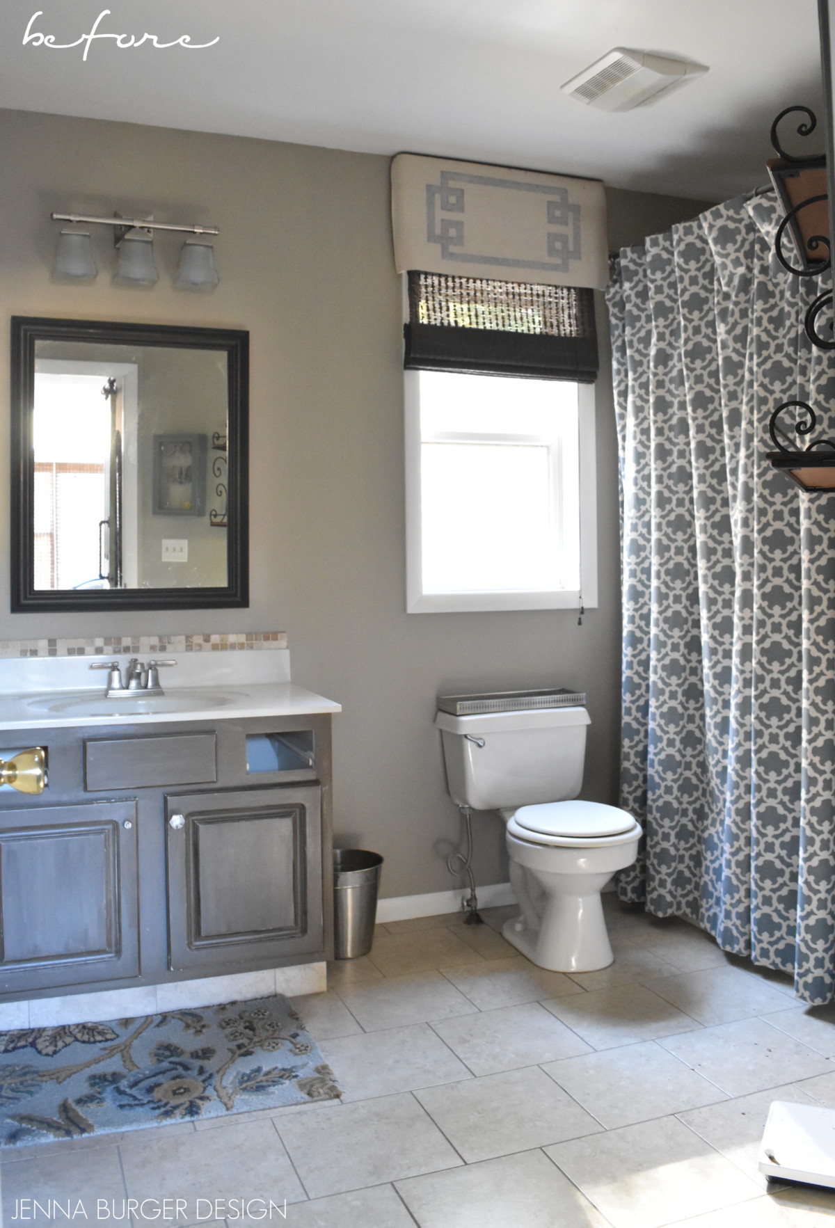
Before getting to far ahead of myself and throwing loads of pictures at you (which I can’t wait to share), let’s remember where this bathroom started when I walked into a shell-of-a-house 7 years ago…

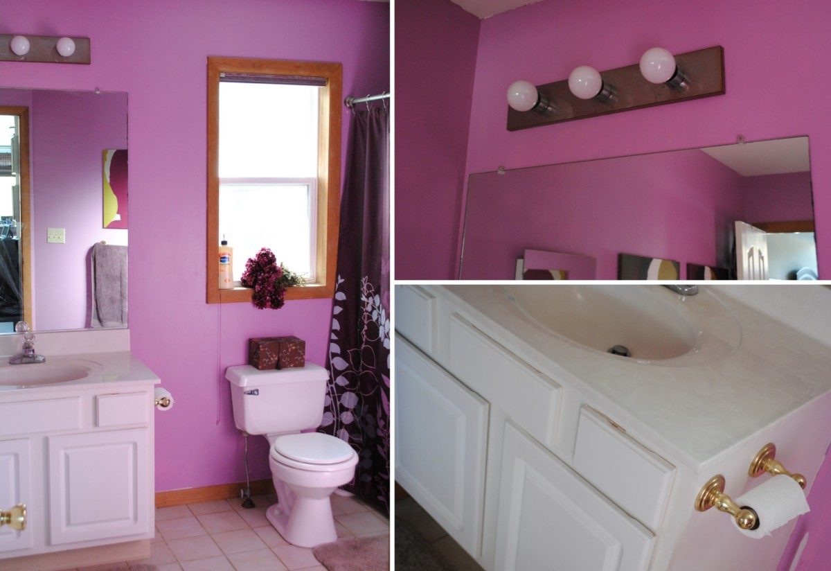
I don’t know who in their right mind would find this shade of purple to be pleasant each day, but it wasn’t for me.  If you can believe it, this space ended up being the last of all the rooms to be renovated (why did I wait so long?).

Finally in 2011, we gave the bathroom a DIY overhaul with a new floor (groutable luxury vinyl tile, tutorial here), new paint on the walls, new paint on the cabinet (faux glaze tutorial here), and new accessories (like the shower curtain made using window drapery panels, tutorial here).

DIY Master Bathroom renovation - JENNA BURGER DESIGN

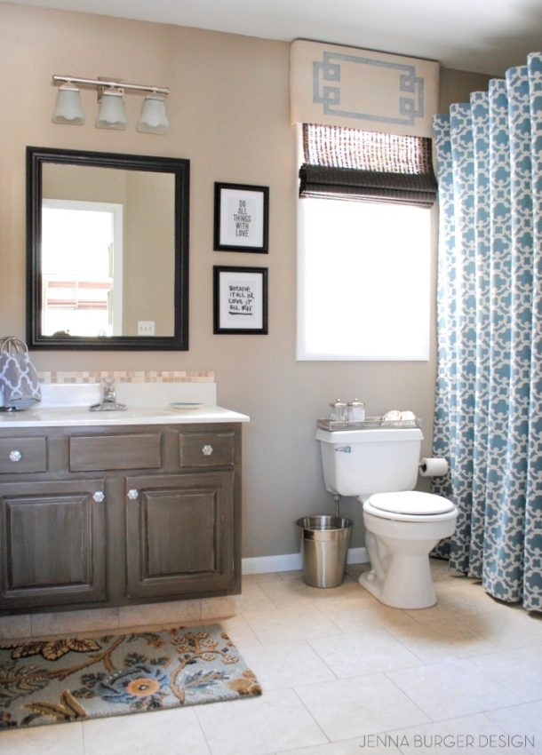
What a huge difference. We loved it.

Fast forward 6 years, and we were in want + need of a total bathroom overhaul.  I envisioned a large shower, a longer + newer vanity + tile!

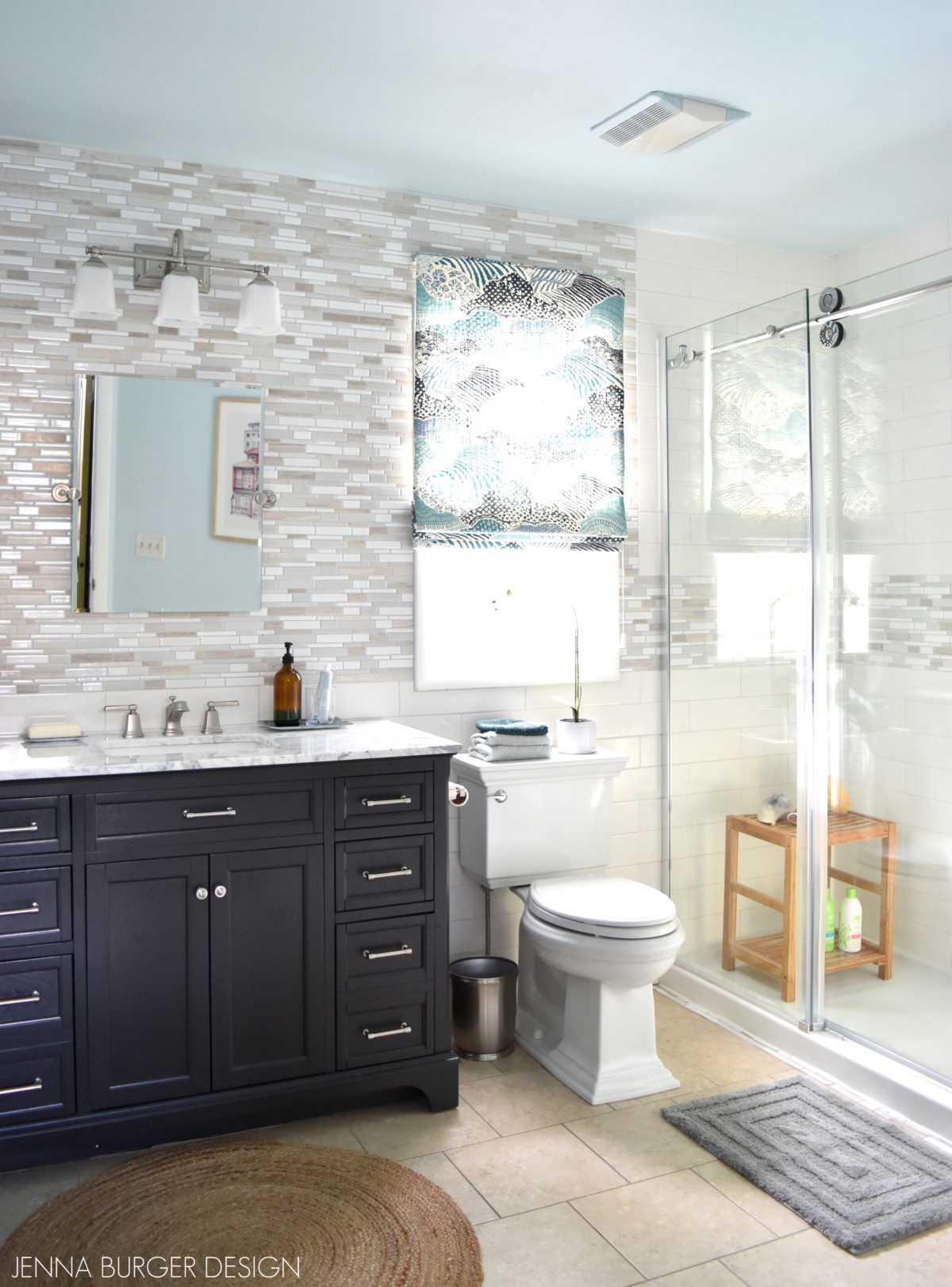
And voila, this is our new renovated bathroom

This is the vision board that I originally created…

Master Bathroom Renovation mood board - JENNA BURGER DESIGN

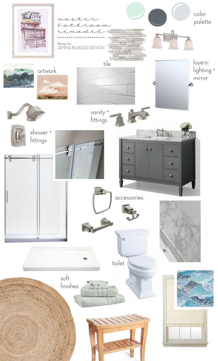
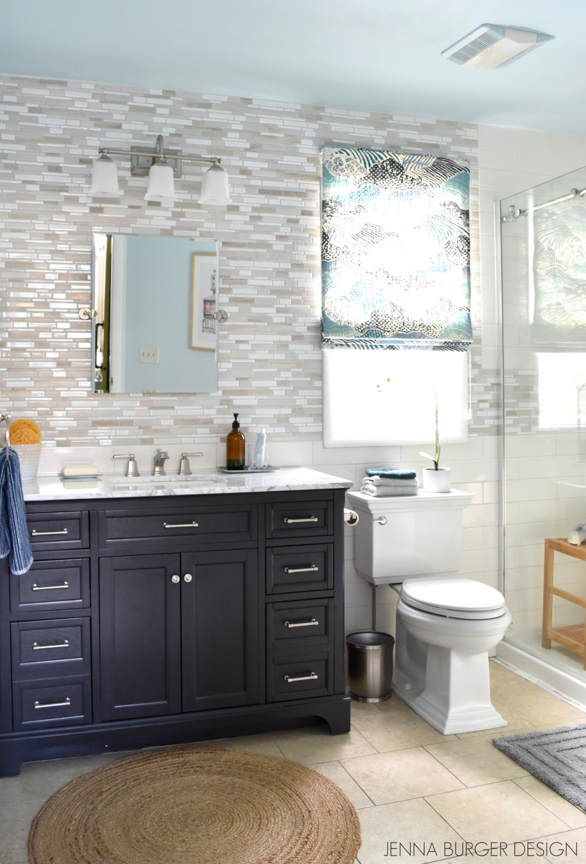
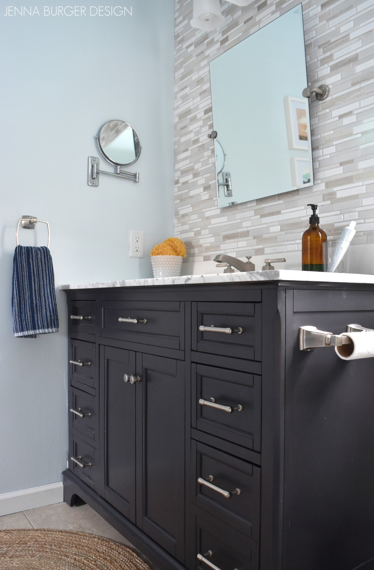
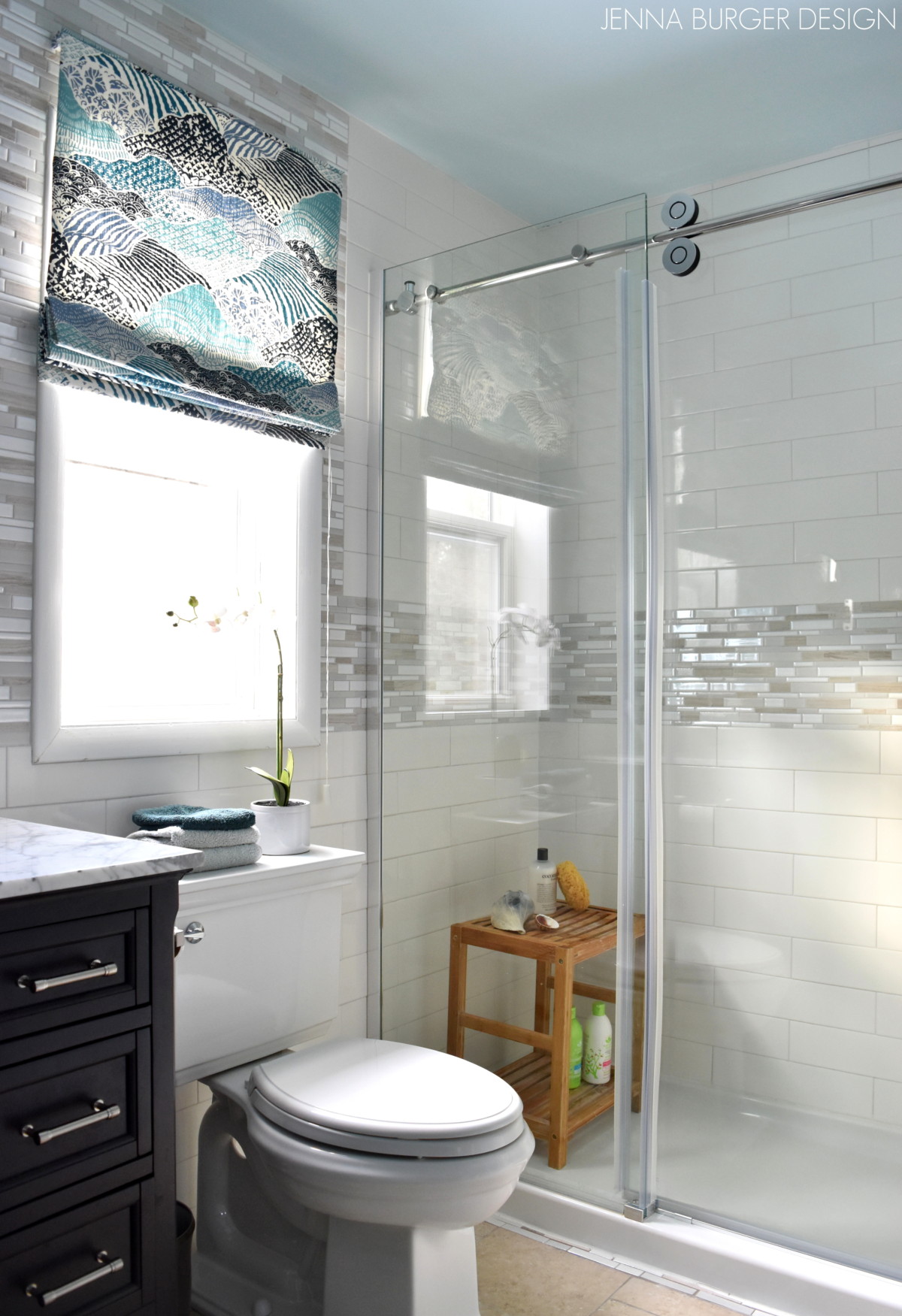
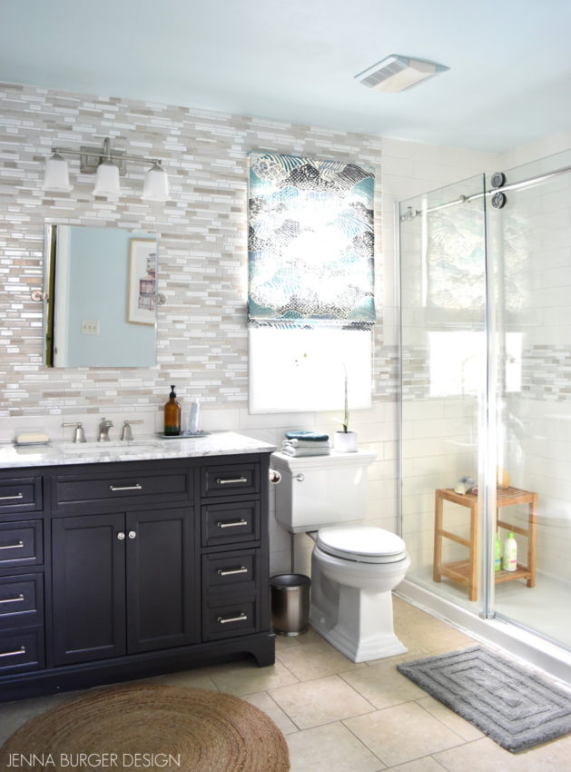
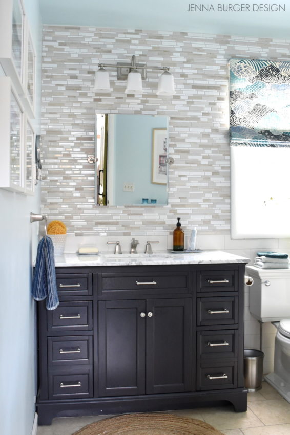
3 walls now are floor to ceiling tile and this space feels (and looks) like a high-end hotel bathroom with a serene spa feel.

If you know me, I adore color, but for this space, I stayed with lighter + brighter hues of neutrals and added contrast with a dark gray cabinet + layers of accessories in shades of blue.


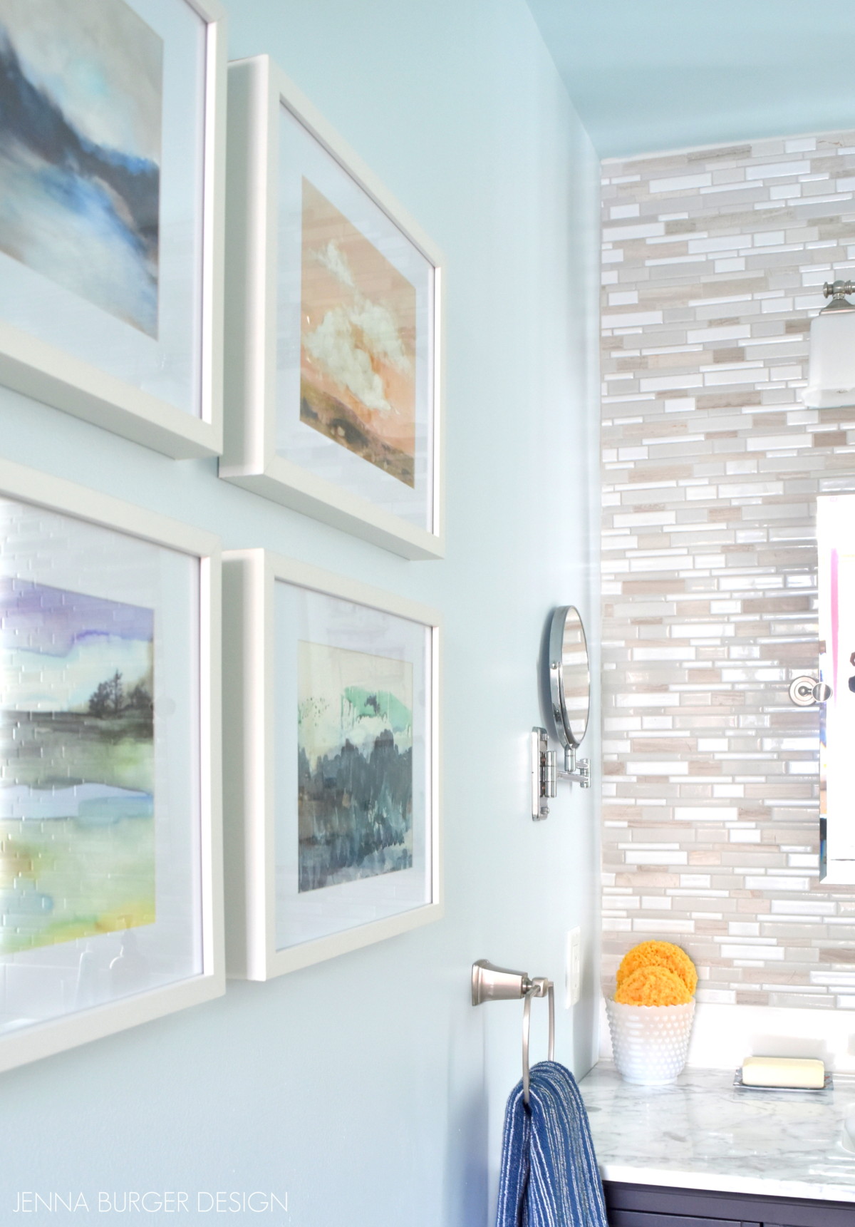
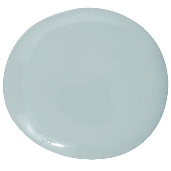
The paint color for the space was tricky…  I actually had another color chosen but because the tile above the vanity is glossy & reflective, the tile took on an ugly color.  So I went to the light section of the color wheel and choose a soft blue.  It’s called  Sunday Sky by Valspar.

Sunday Sky by Valspar 
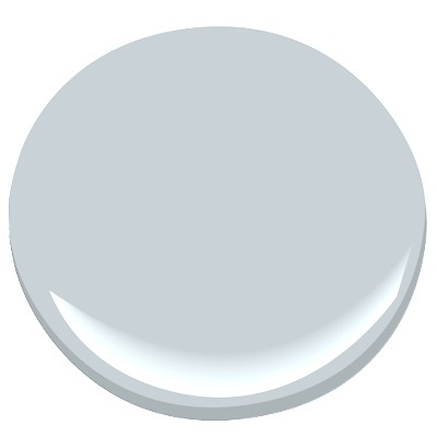
Because of the small amount of wall space, I decided to paint the ceiling a color as well and chose a slightly darker shade of blue (in the same color family as the walls).  It’s called Windblown Blue by Valspar.

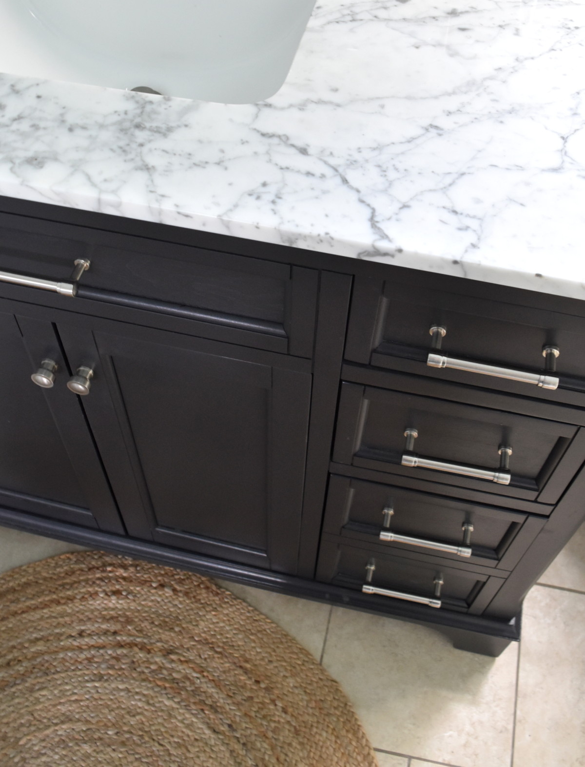
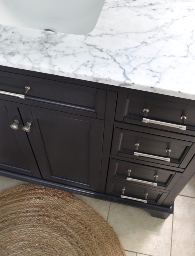
The previous vanity was only 36″, but there was plenty of space to install a longer vanity.  We were able to increase the the size to this 48″ wide vanity that has two doors in the center and 3 drawers on each side (it looks like 4 drawers, but the bottom 2 are actually one taller compartment).

The additional 12″+ has been a game changer with the amount of usable counter space.  Yes, a double sink would have been glorious, but I’ll take what I can get!

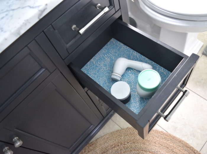
Having drawers in the bathroom has also has been a welcomed change.  There is now so much room for the smaller bathroom items, as well as taller items like hairspray and nailpolish remover.

I lined the drawers with this cute contact paper that I snagged from Target for $3.  Just a small touch that makes a big difference.

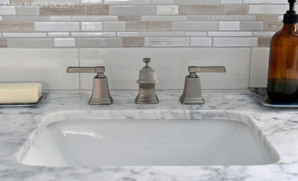
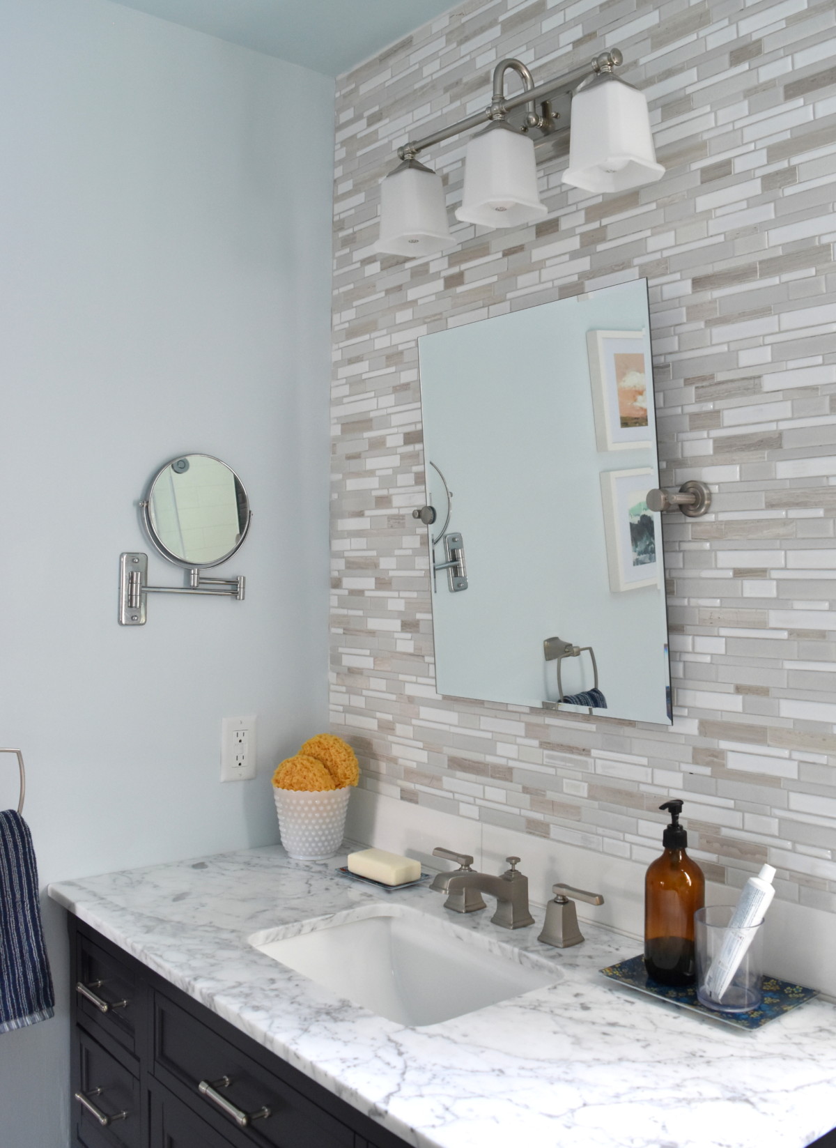
The countertop for this vanity is a beautiful carrara marble.  Never great for the kitchen, but perfect for the bathroom!   This vanity came with the marble top + undermount sink in a square shape.

A 36″ round jute rug placed in the front of the vanity has been such a nice added touch for softness and texture.

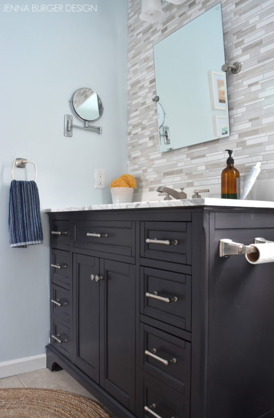
The marble countertop arrived with 3 holes to accommodate this widespread sink faucet.  When possible, I always prefer separate holes for the faucet + handles versus being together on one late.  The look is higher end and appears like it was custom cut.

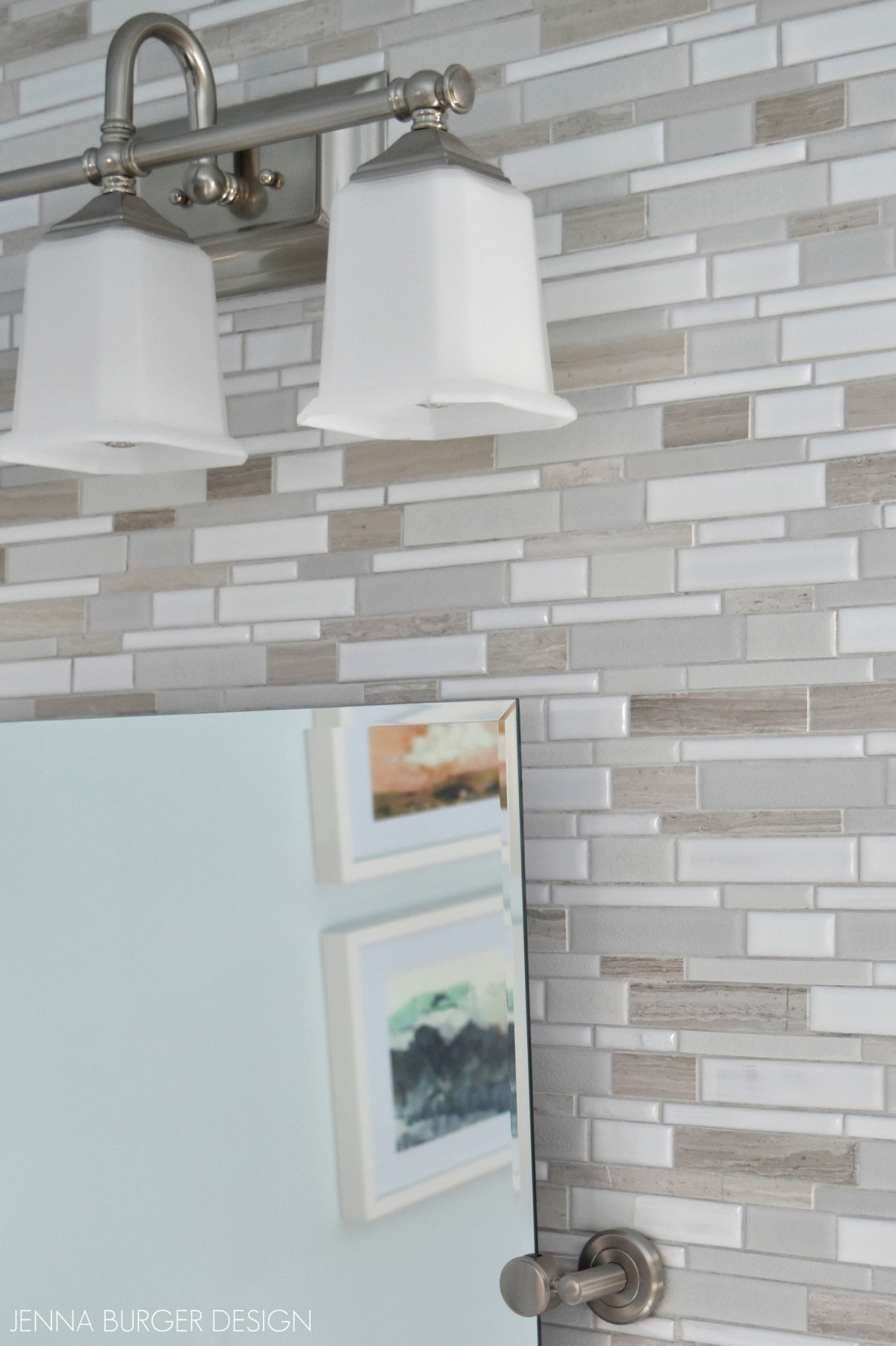
The frameless tile mirror above is a favorite of mine not only because it’s affordable at less than $100, but also because it’s a sophisticated, classic look + it can accommodate people of different heights since it tilts.

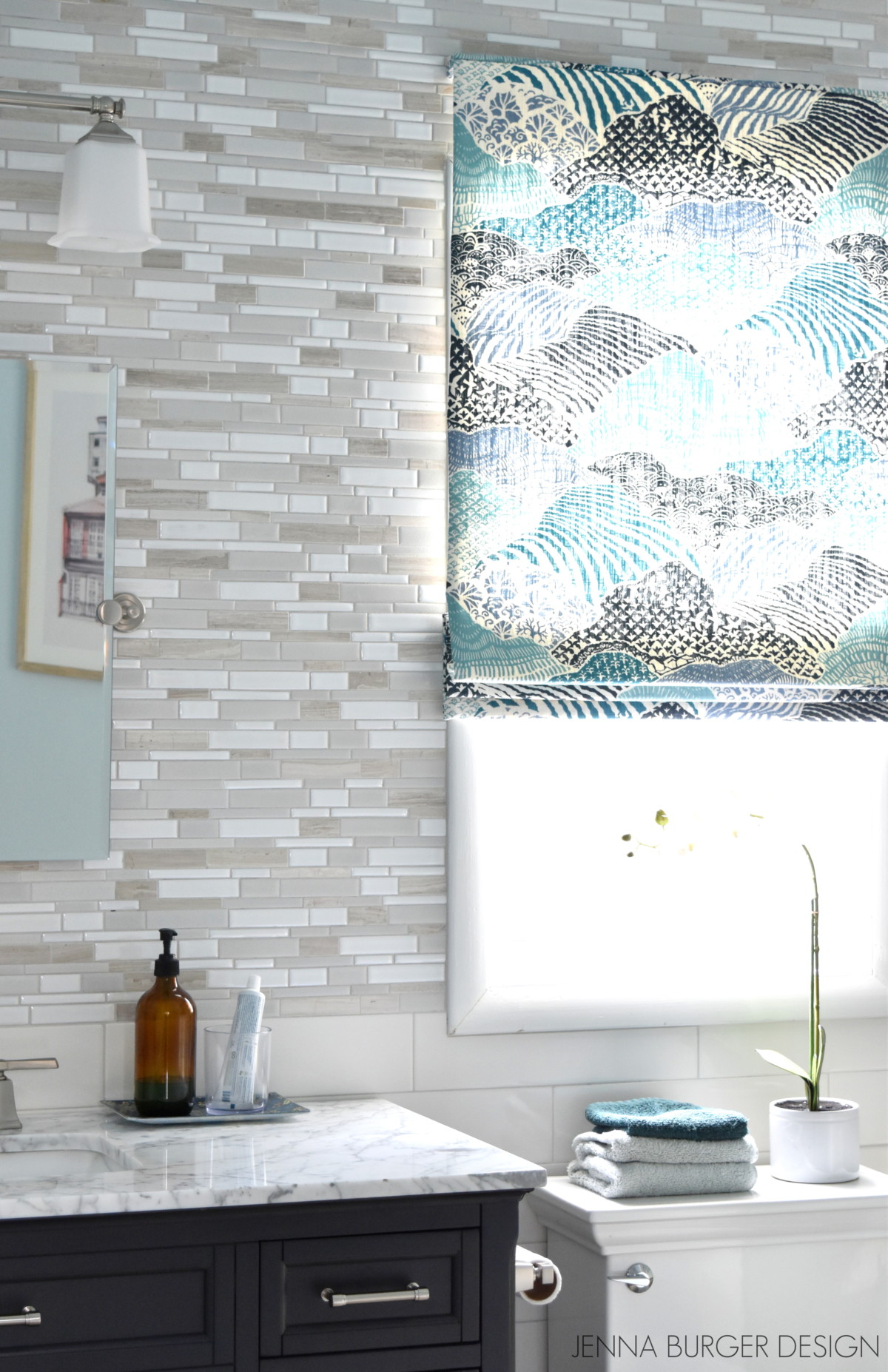
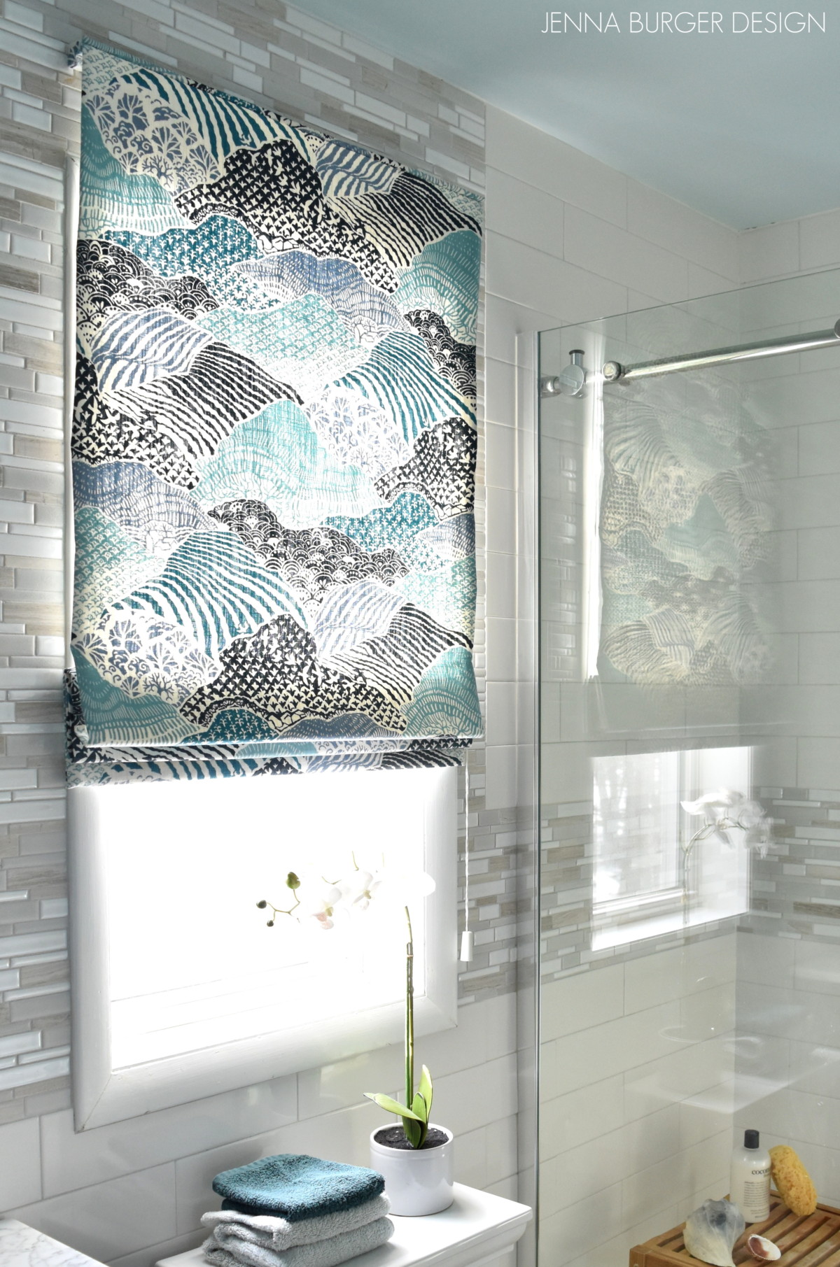
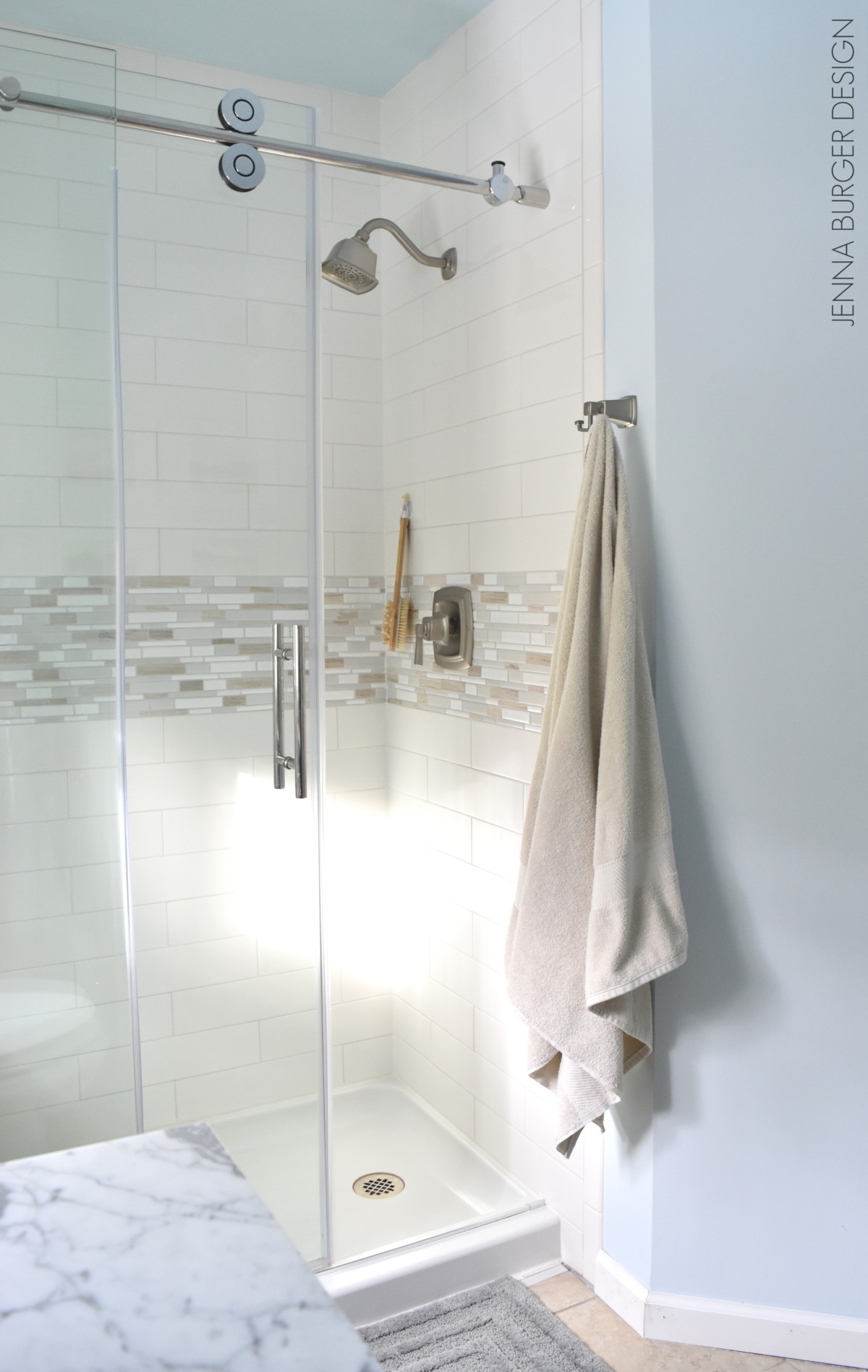
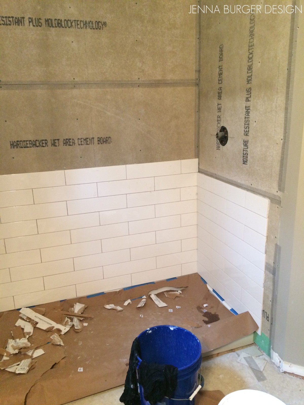
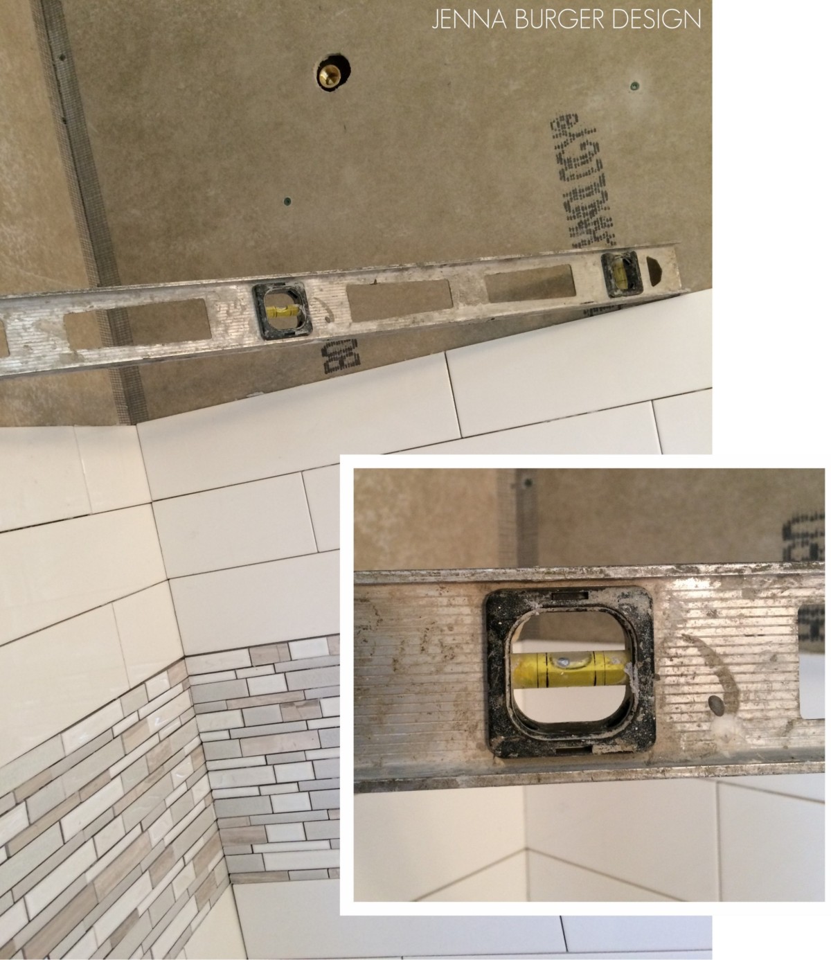
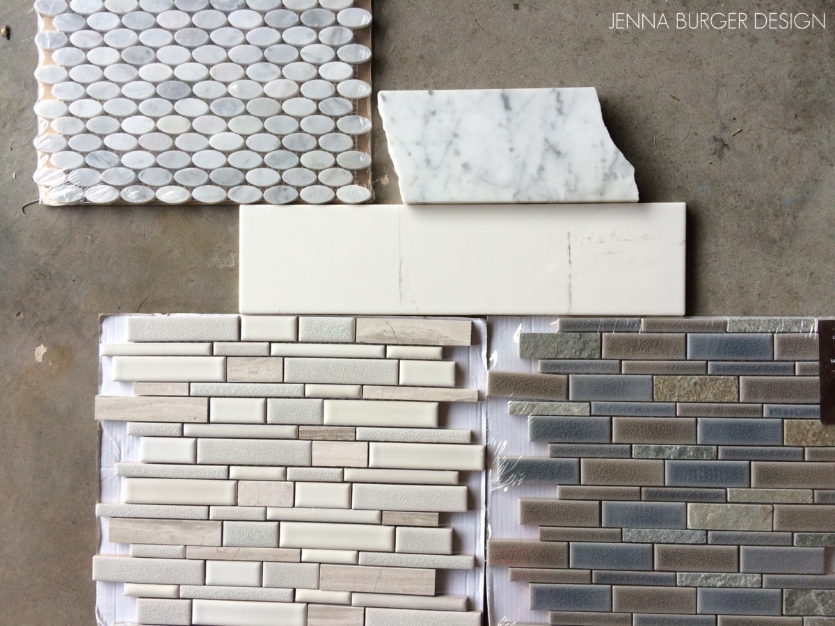
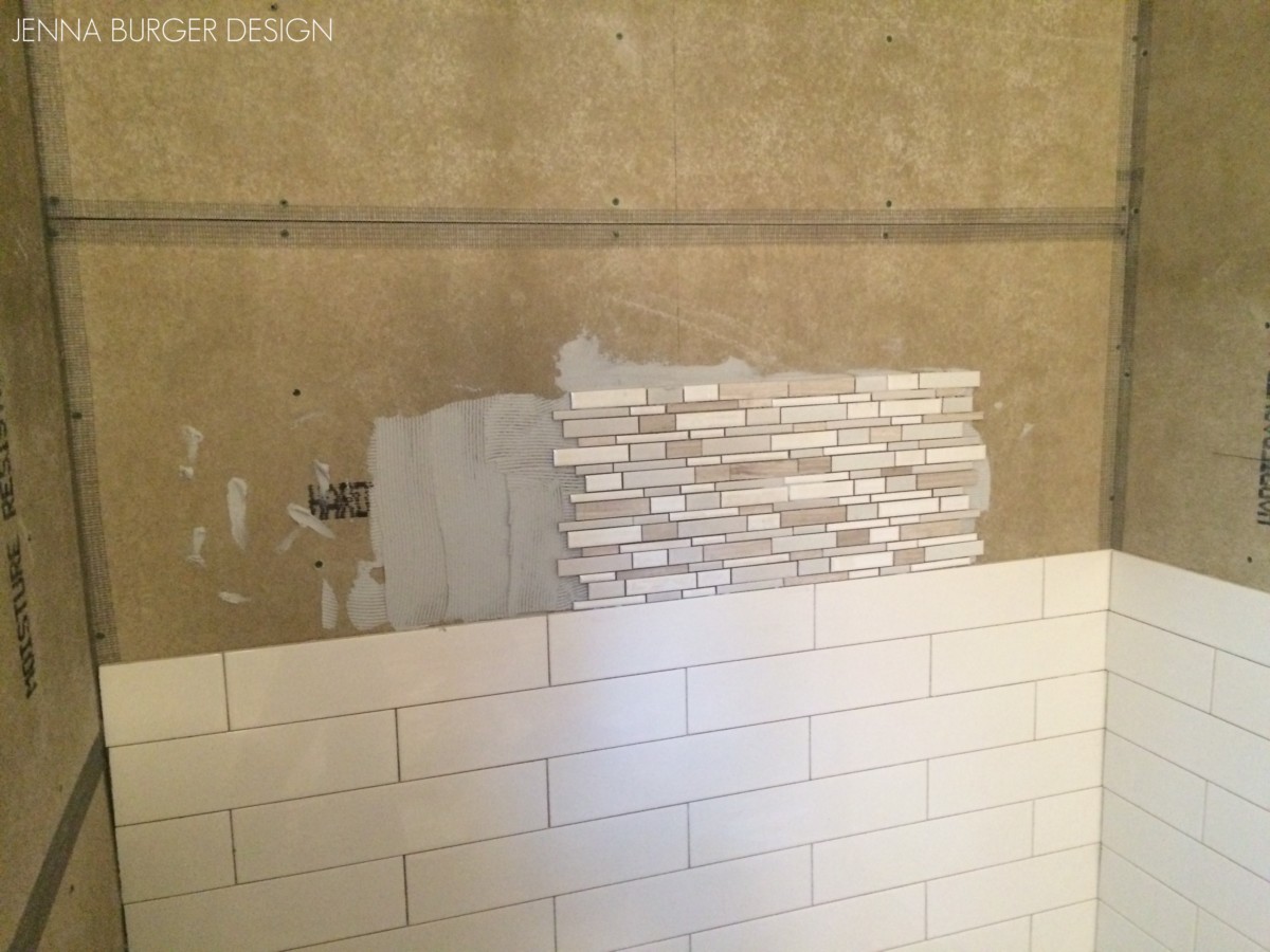
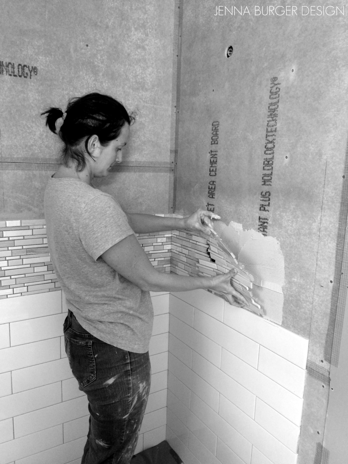
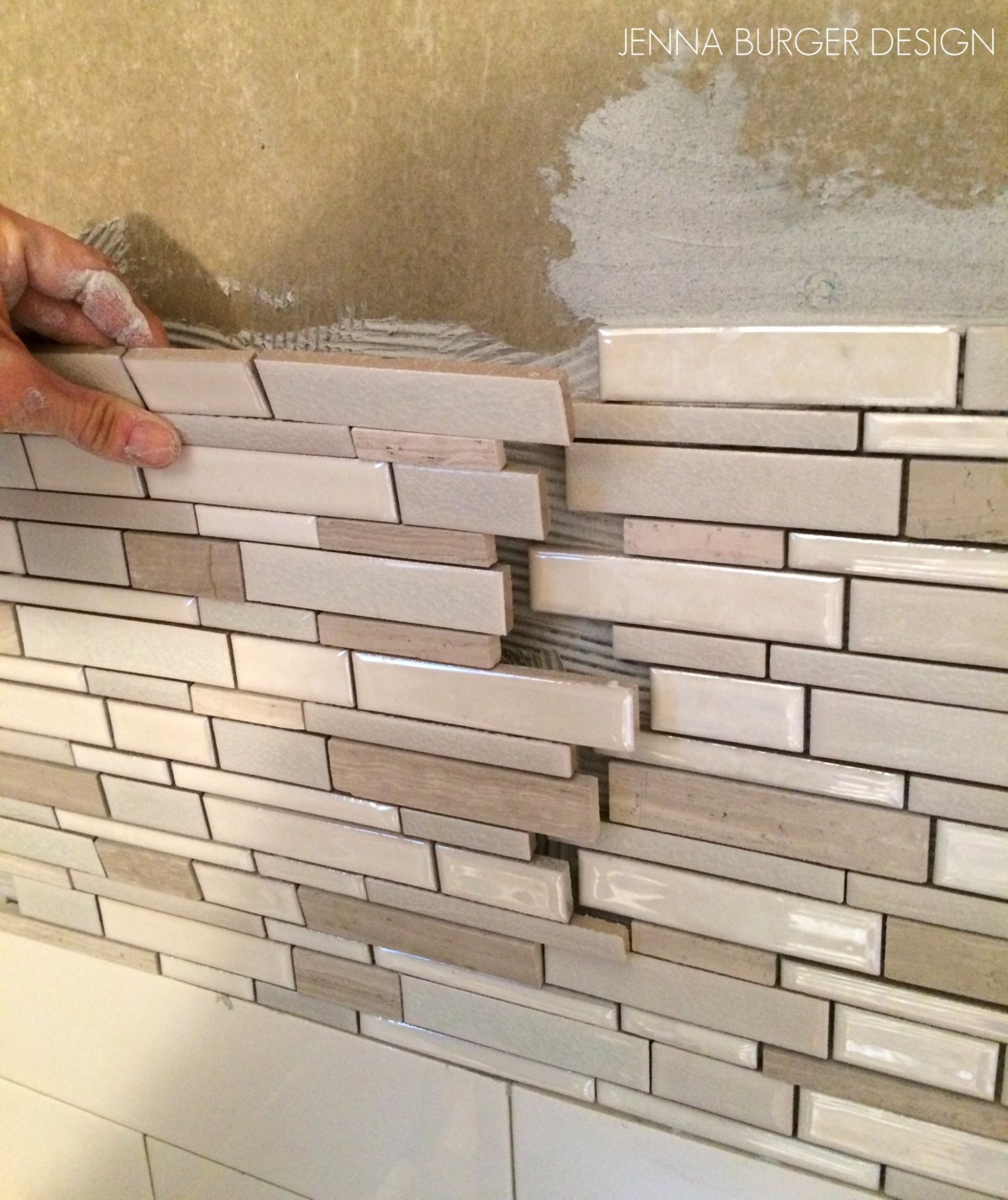
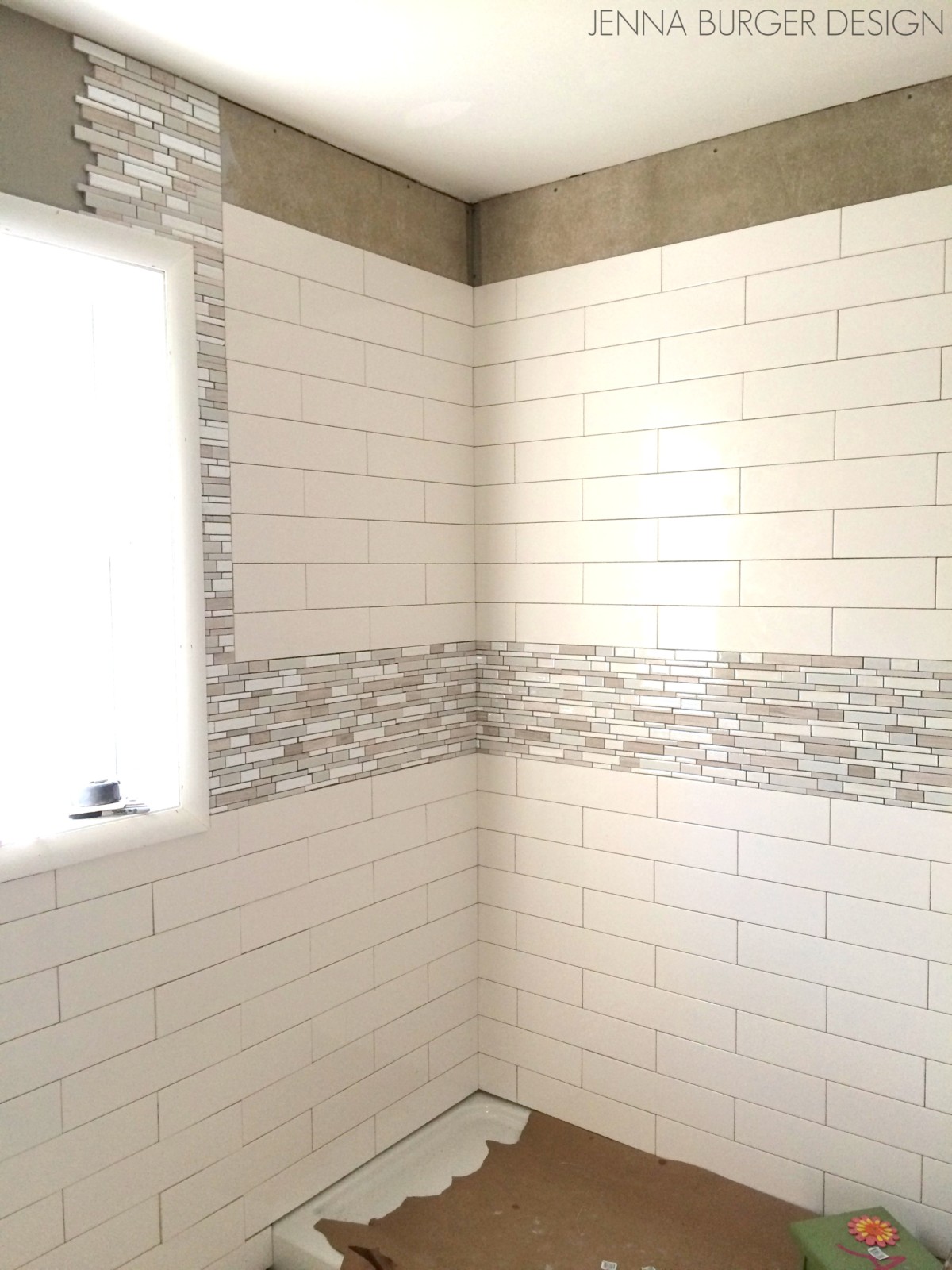
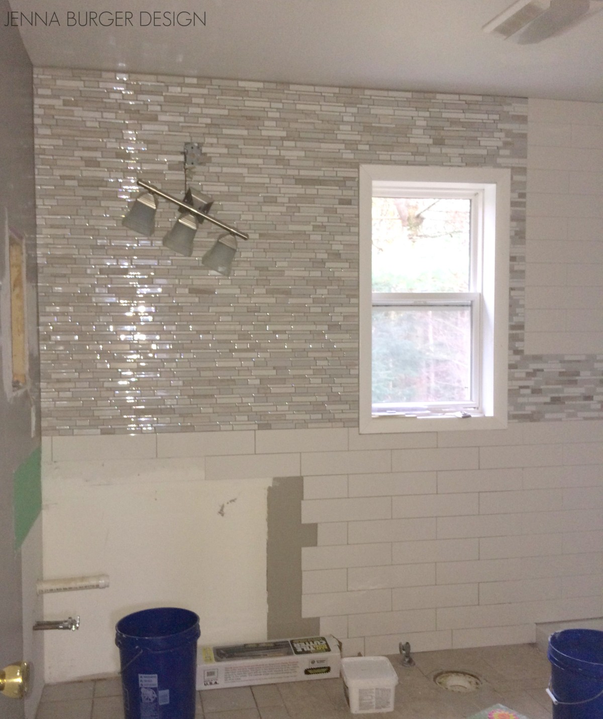
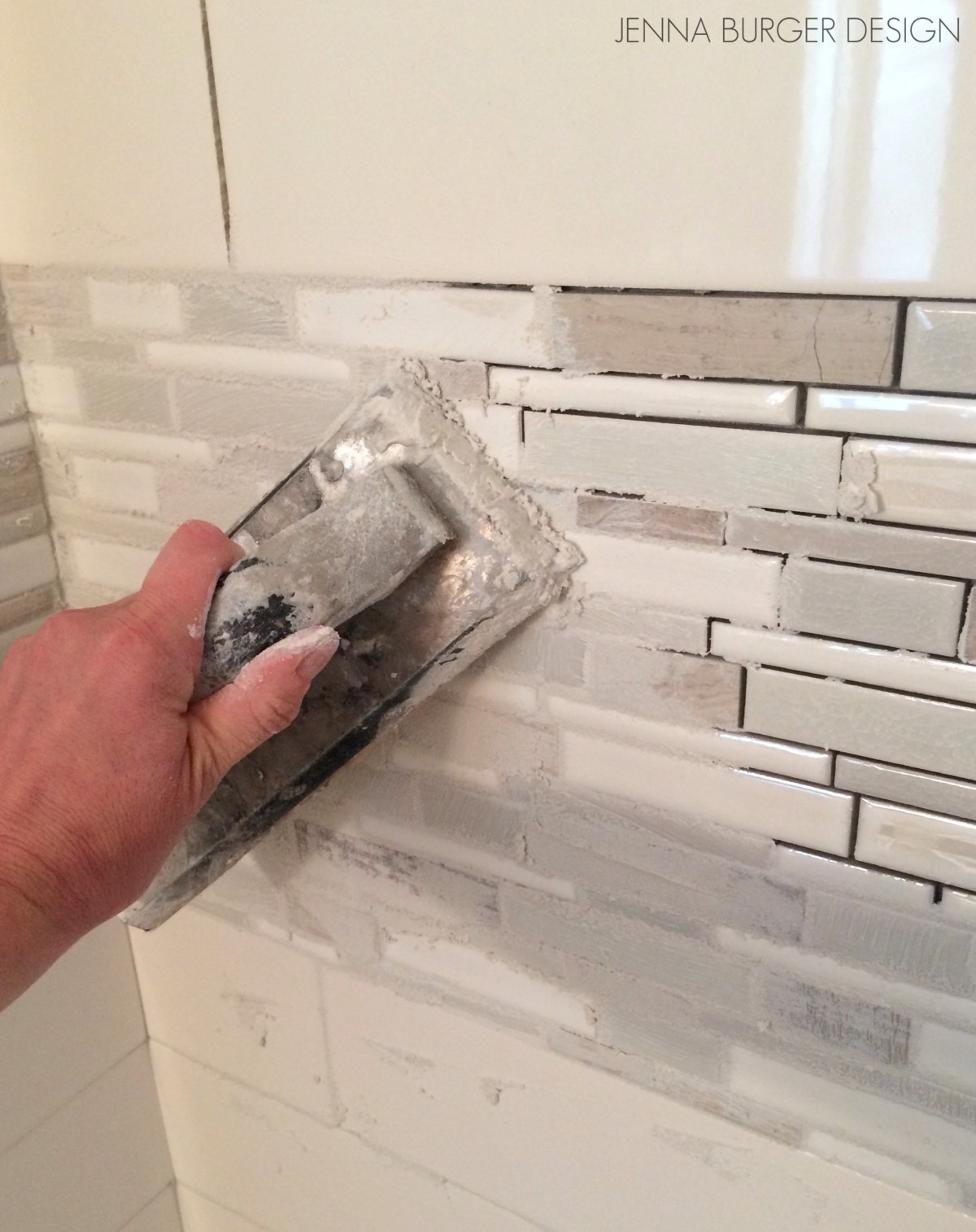
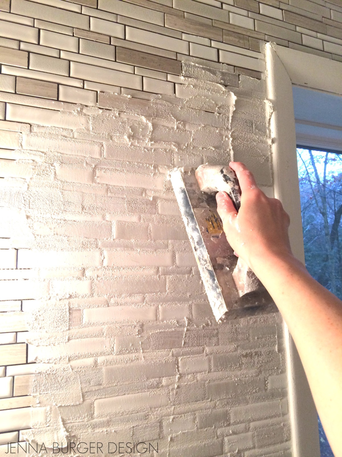
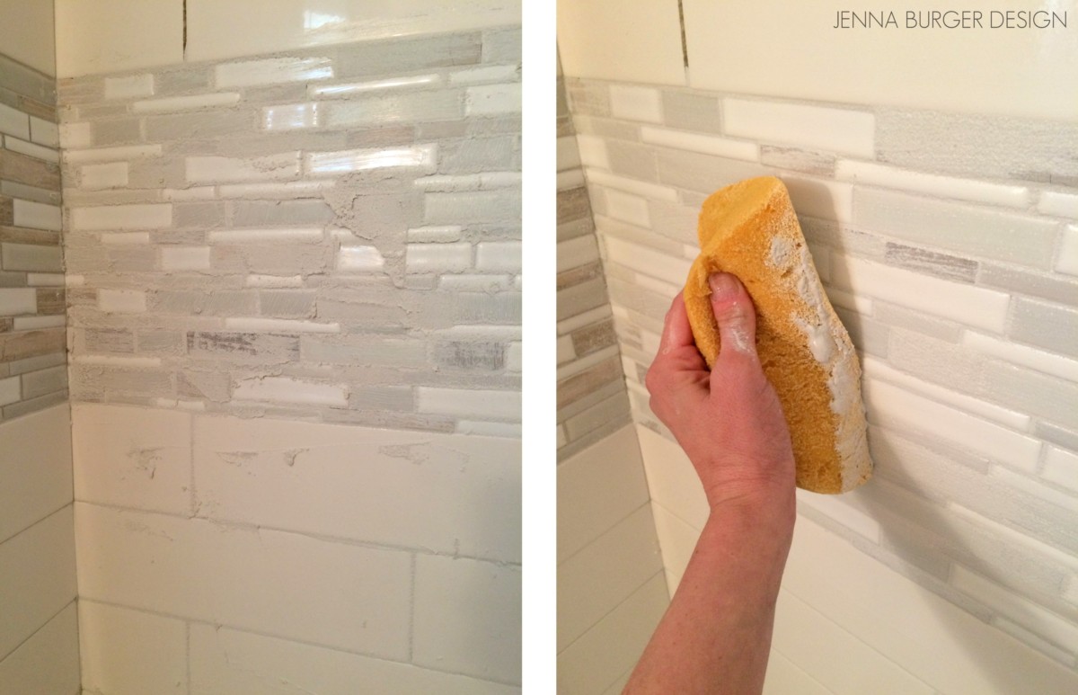
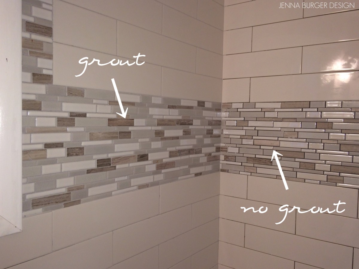
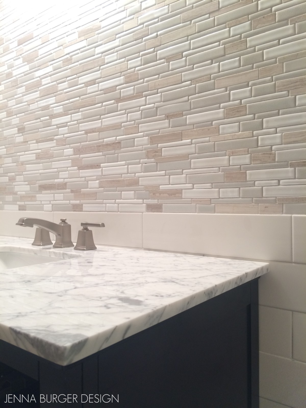
I have to talk about the tile…  The tile is what truly sets this bathroom apart and gives the space a custom, unique look!  The tile in the shower space is a 4 x 12 white subway tile and I added a 12″ high band about 3′ high above the floor, which continues to the ceiling on the wall of the vanity.

The accent mosaic tile (which comes on a 12″ x 12″ mesh sheet backing) is made of a variety of ceramic + natural stones in varying shades of neutrals.  It is such a beautiful backdrop to the vanity and is so dramatic, but not in an overwhelming way, when you enter the space.

As you make your way around the space, the window adorns a new roman shade made by my go-to-fabricator Tonic Living.  I work with them a lot on client projects and they create such gorgeous window treatments.  This fabric just truly captures everything that I wanted this bathroom to evoke.

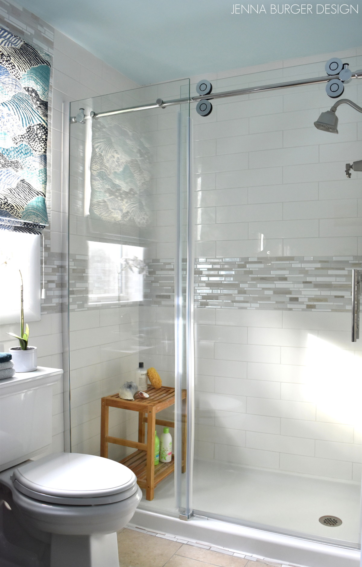
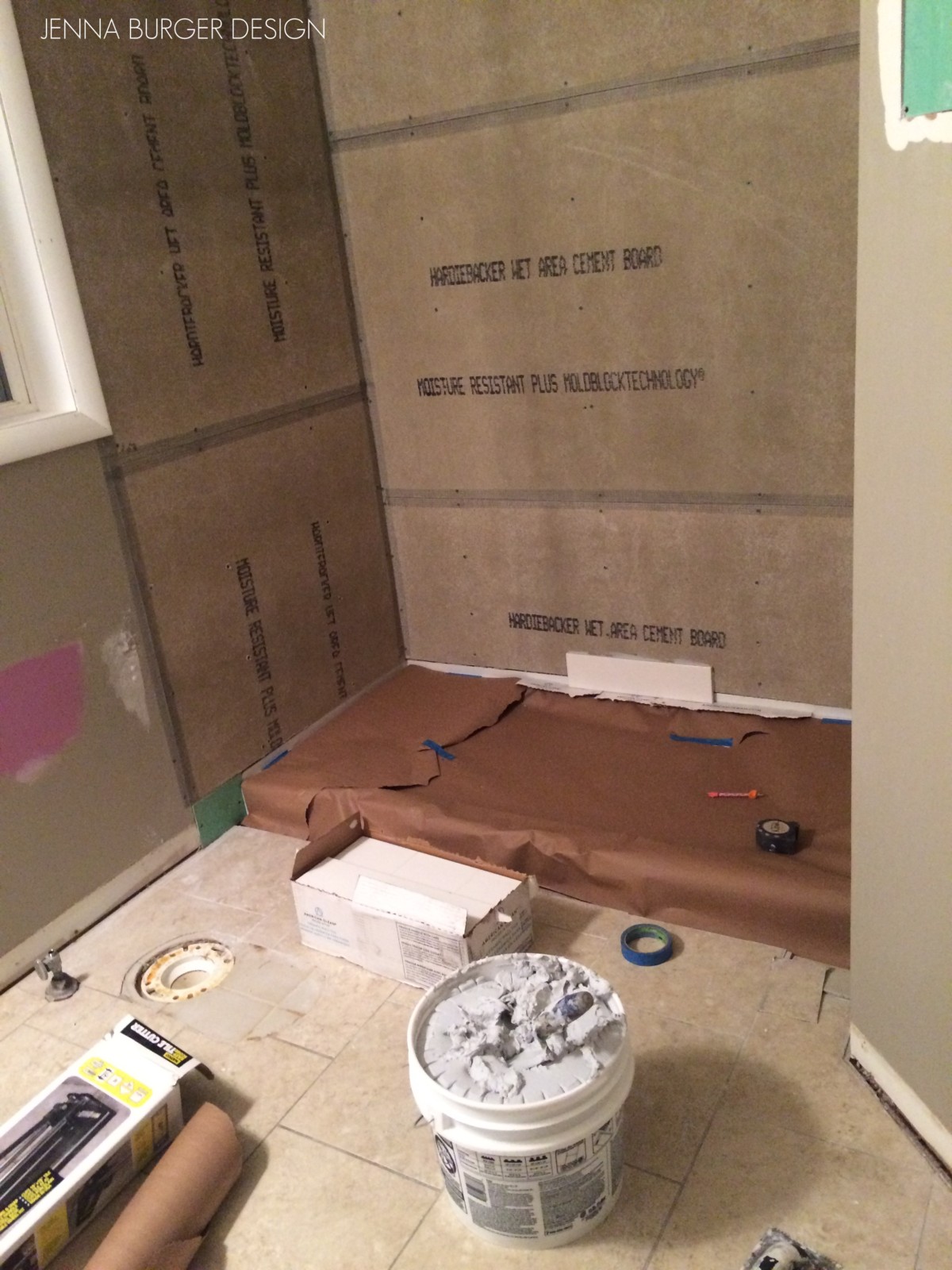
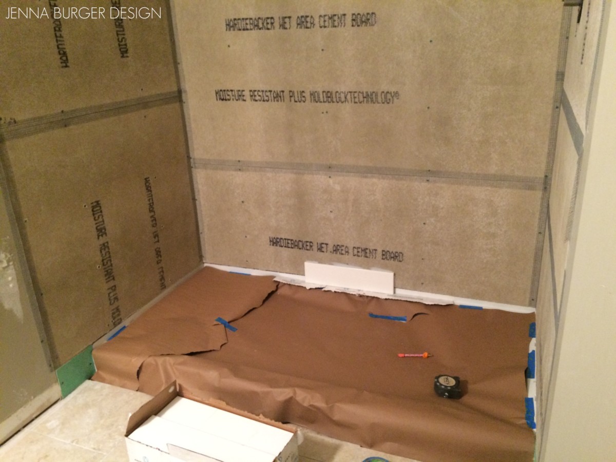
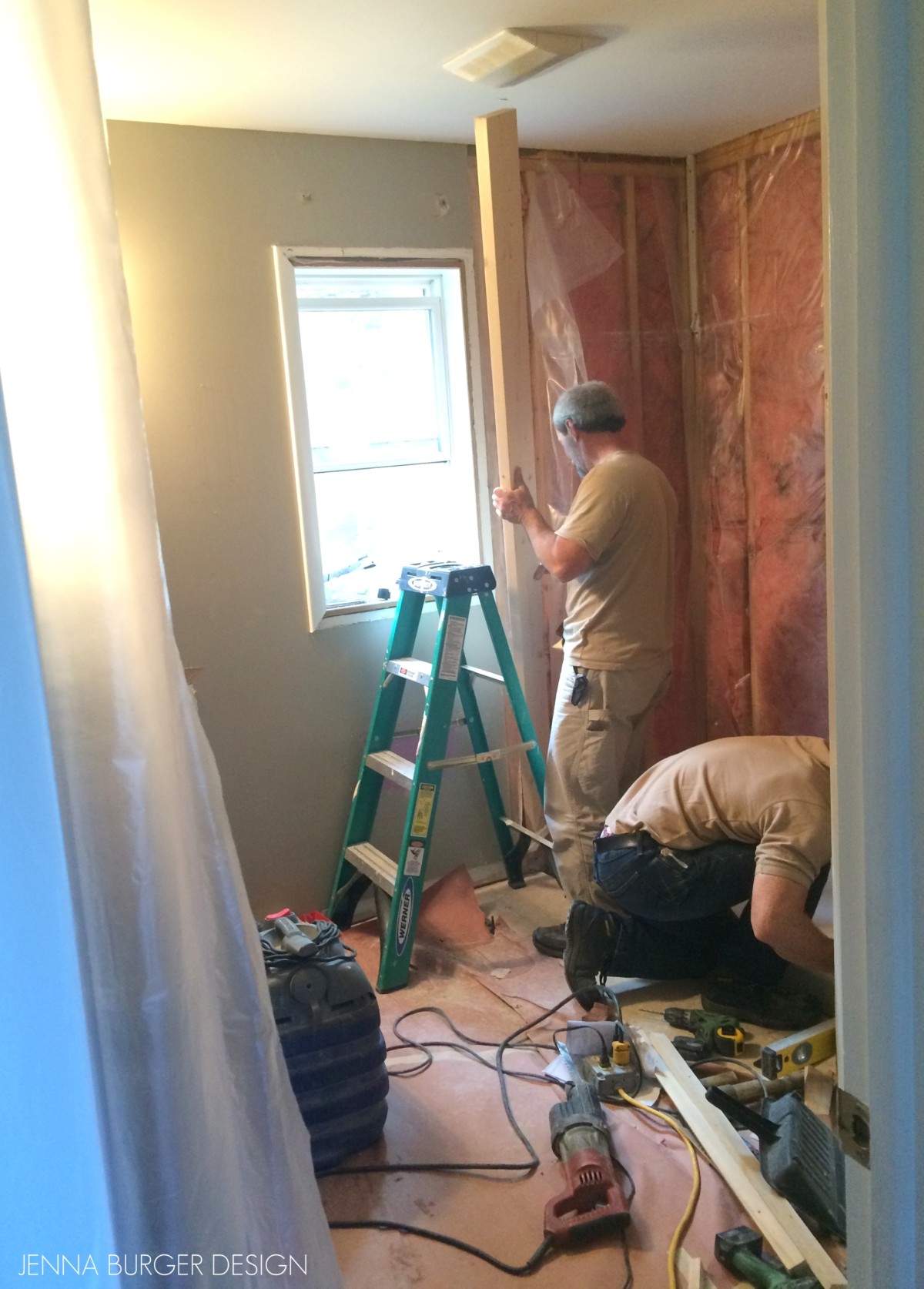
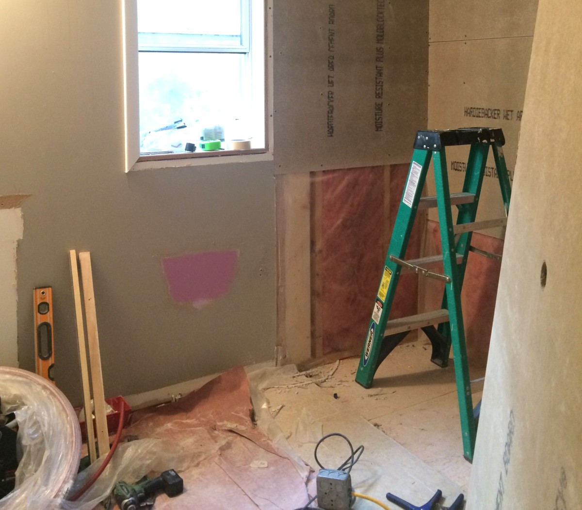
One large component of this bathroom remodel was the removal of the existing tub and creating a shower space in it’s place.

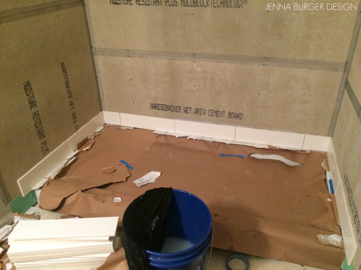
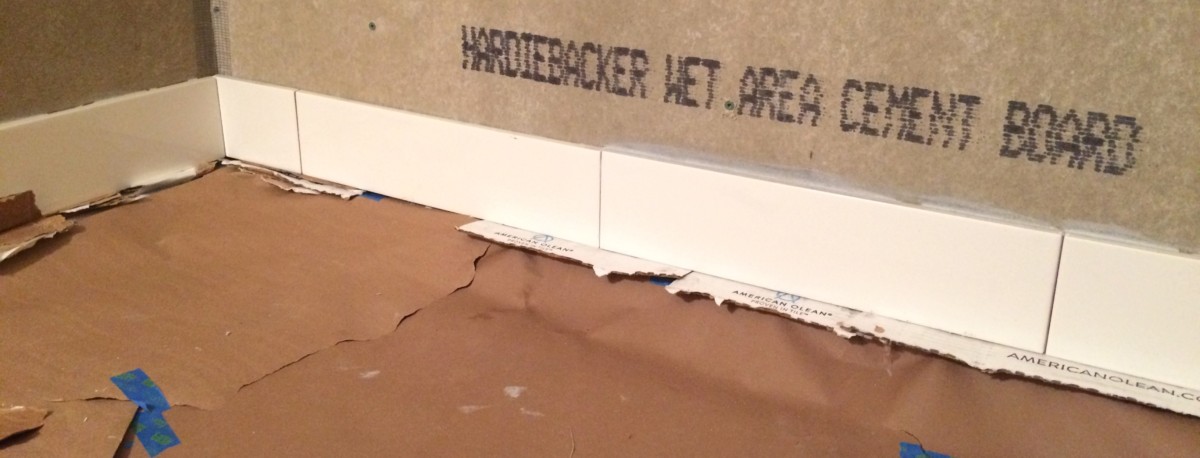
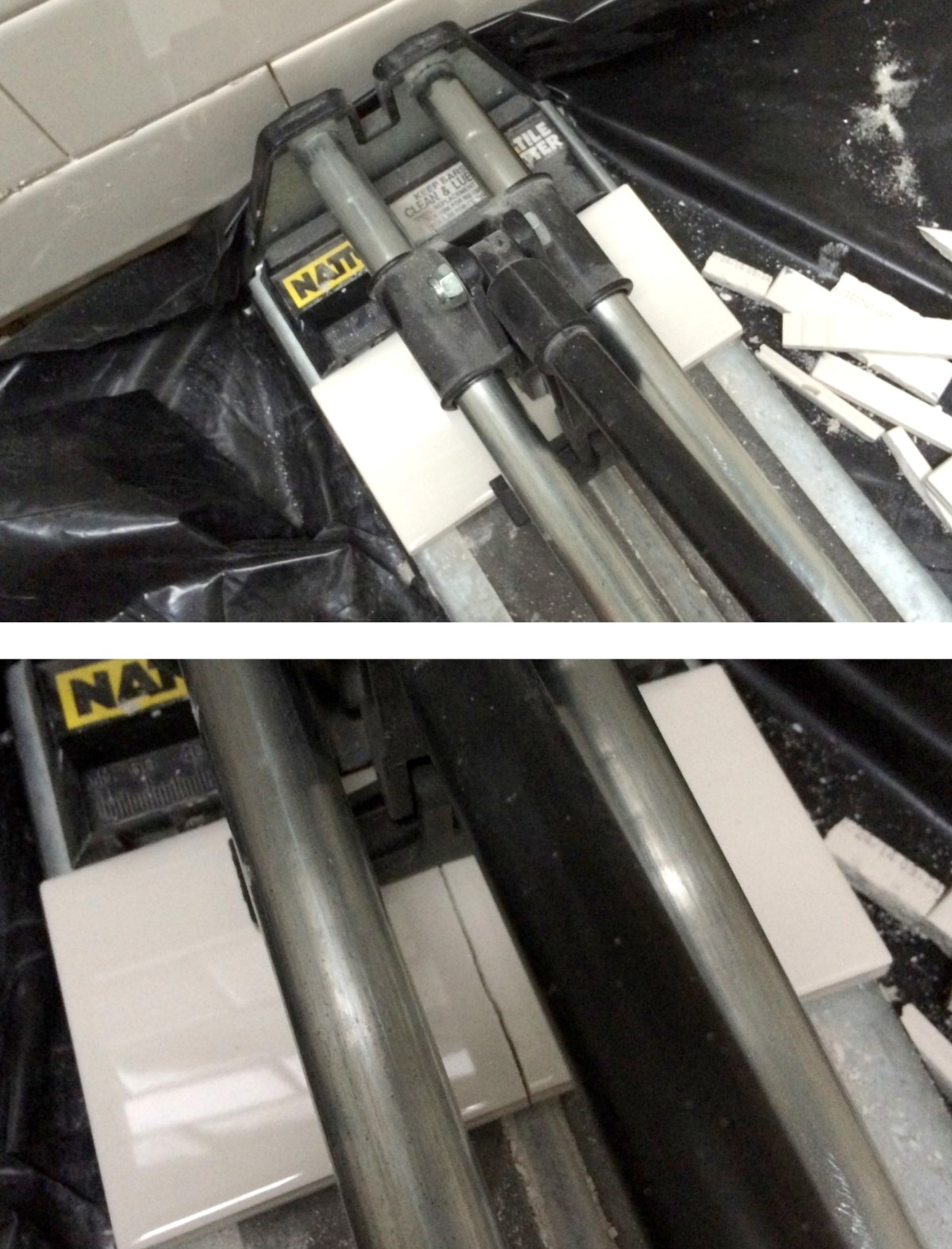
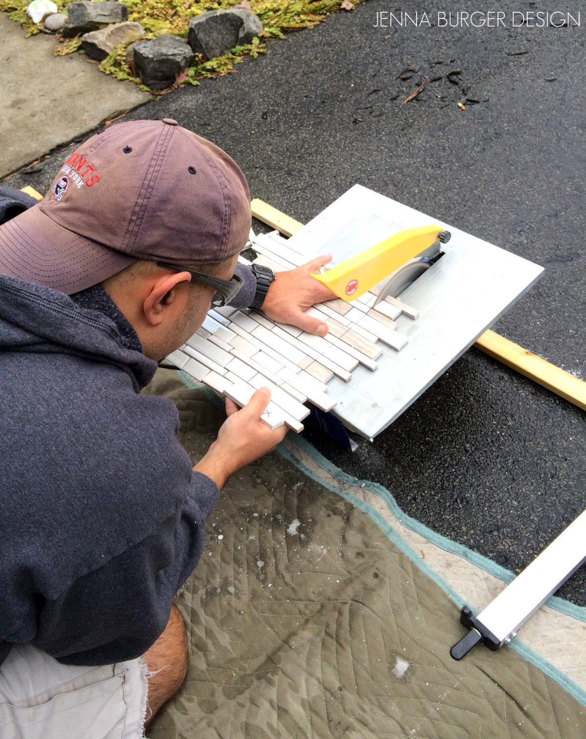
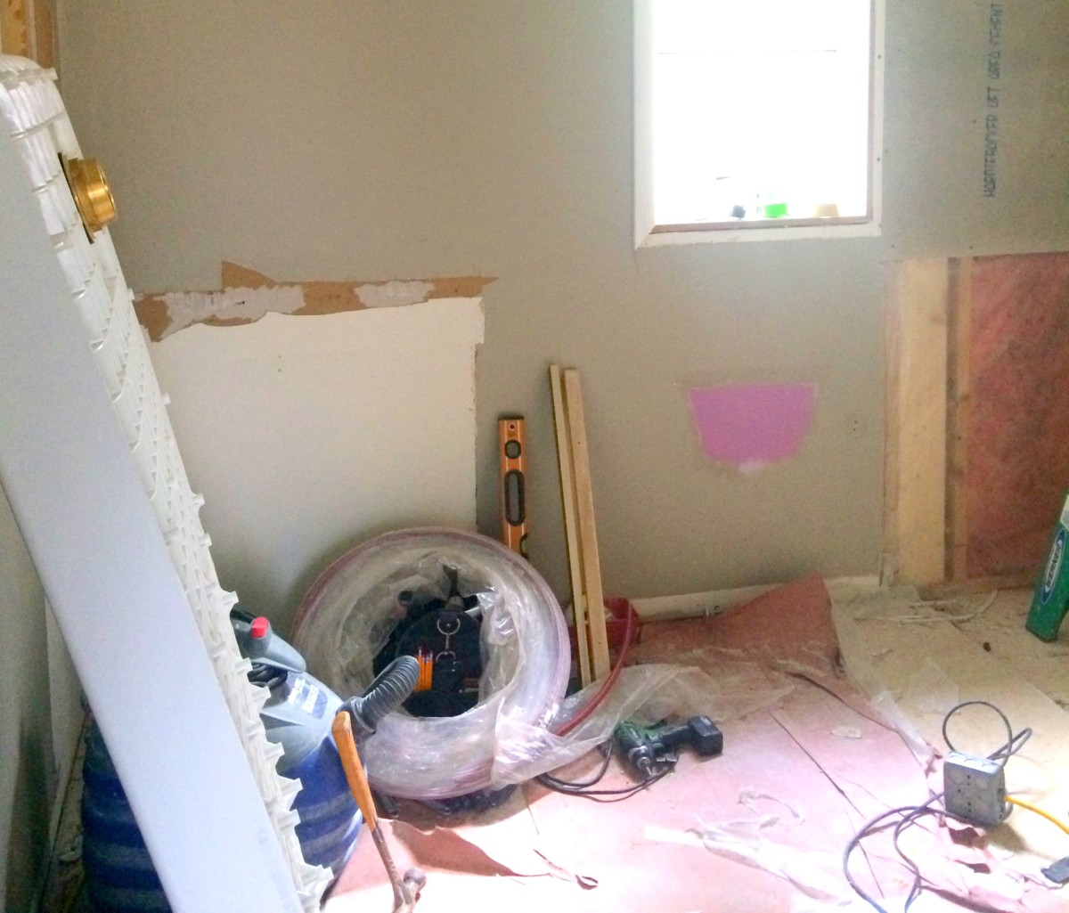
This renovation was part DIY and part highered out to a contractor.  There were areas (mainly plumbing) that was beyond our skillset to take on, so calling in a contractor was a must.  Once he removed the existing shower unit, he installed a new shower pan.  We installed the tile on the walls, and then he returned and installed the new shower enclosure.

>>> Check out more here on how the walls were tiled 

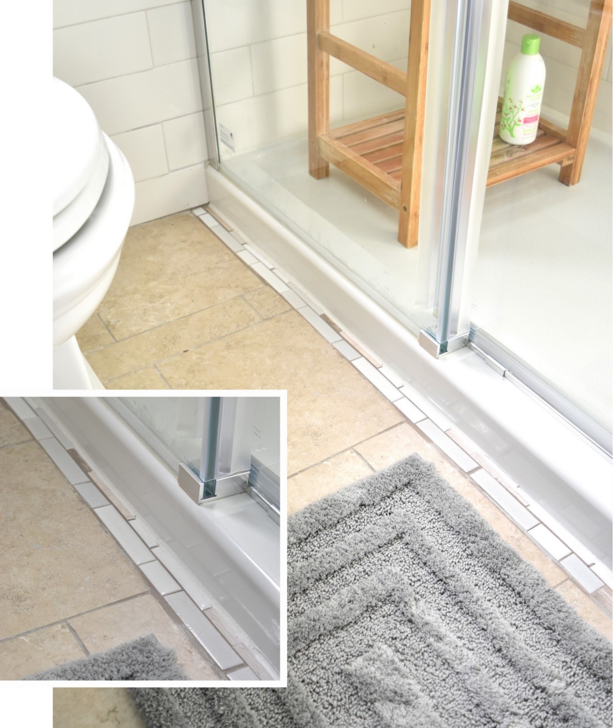
Transitioning from a tub to a shower left us with one challenge.  The shower pan was 2″ narrower than the tub so there was a gap between the floor ended and the shower pan edge.  What to do?  What to do?  Using a few extra mosaic pieces, I filled in the gap, and no one will ever know – wink, wink…

One moment it was a problem, the next a simple resolution was discovered!

I am really loving this shower door because it eliminates the difficulties of a typical swinging shower door (they swing into the shower so the placement for the shower fittings needs to be configured properly) + the design of it is so modern + minimal.

The one panel is stationery (left side in the picture above) and the panel with the handle is operable. The wheels seamlessly roll on the bar above similar to a rolling barn door.

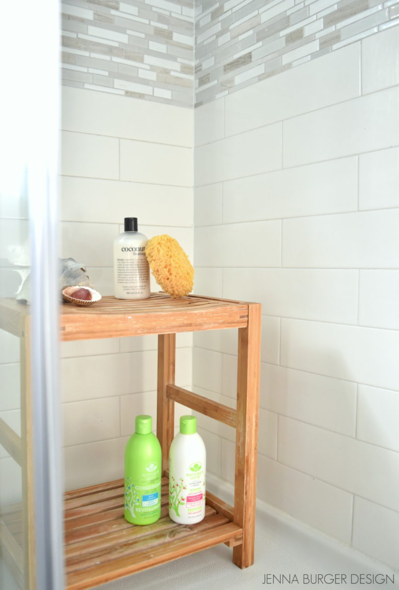
In lieu of a bench or built-in niche for shampoo (something I would have loved, but beyond my skillset + budget), I found a petite teak bench perfect for sitting and/or holding various shower necessities.

To finish off the tile where the tile meets the wall on the shower fittings side, I added a 3×6 bullnose tile in a vertical layout.  With the one side of the tile being curved, it transitions beautifully into the wall.


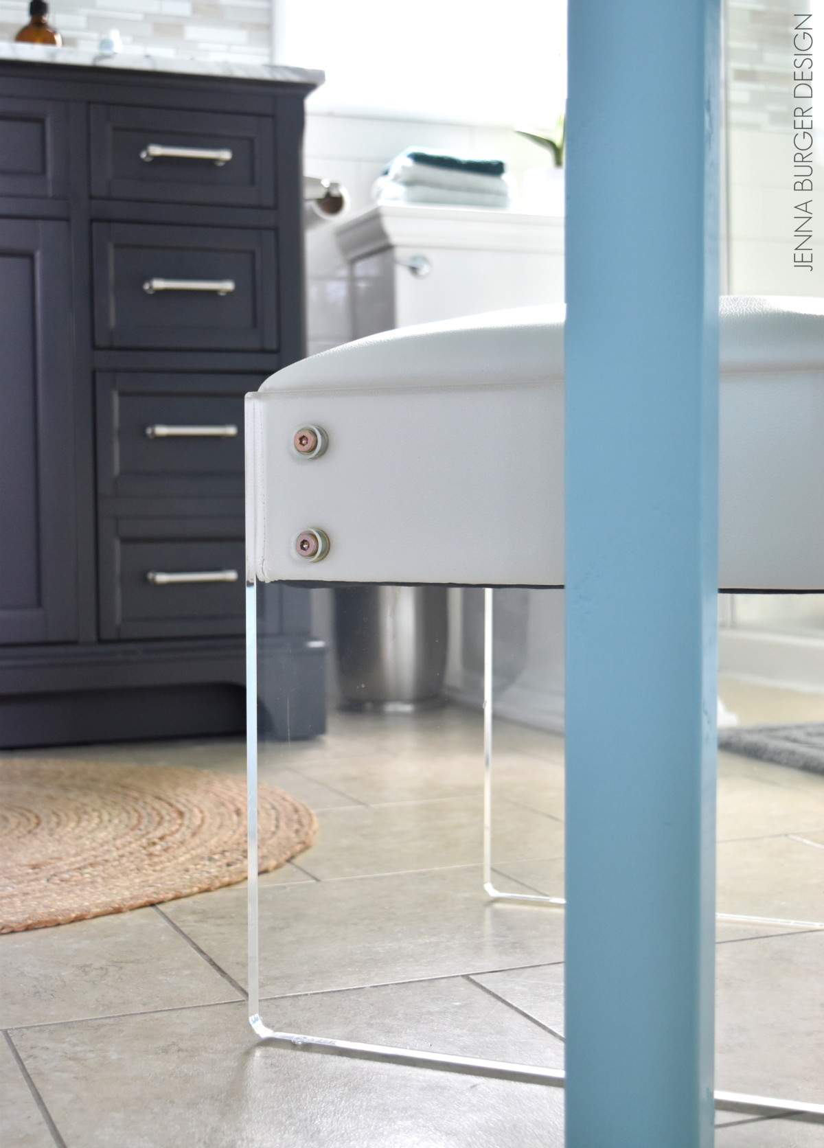
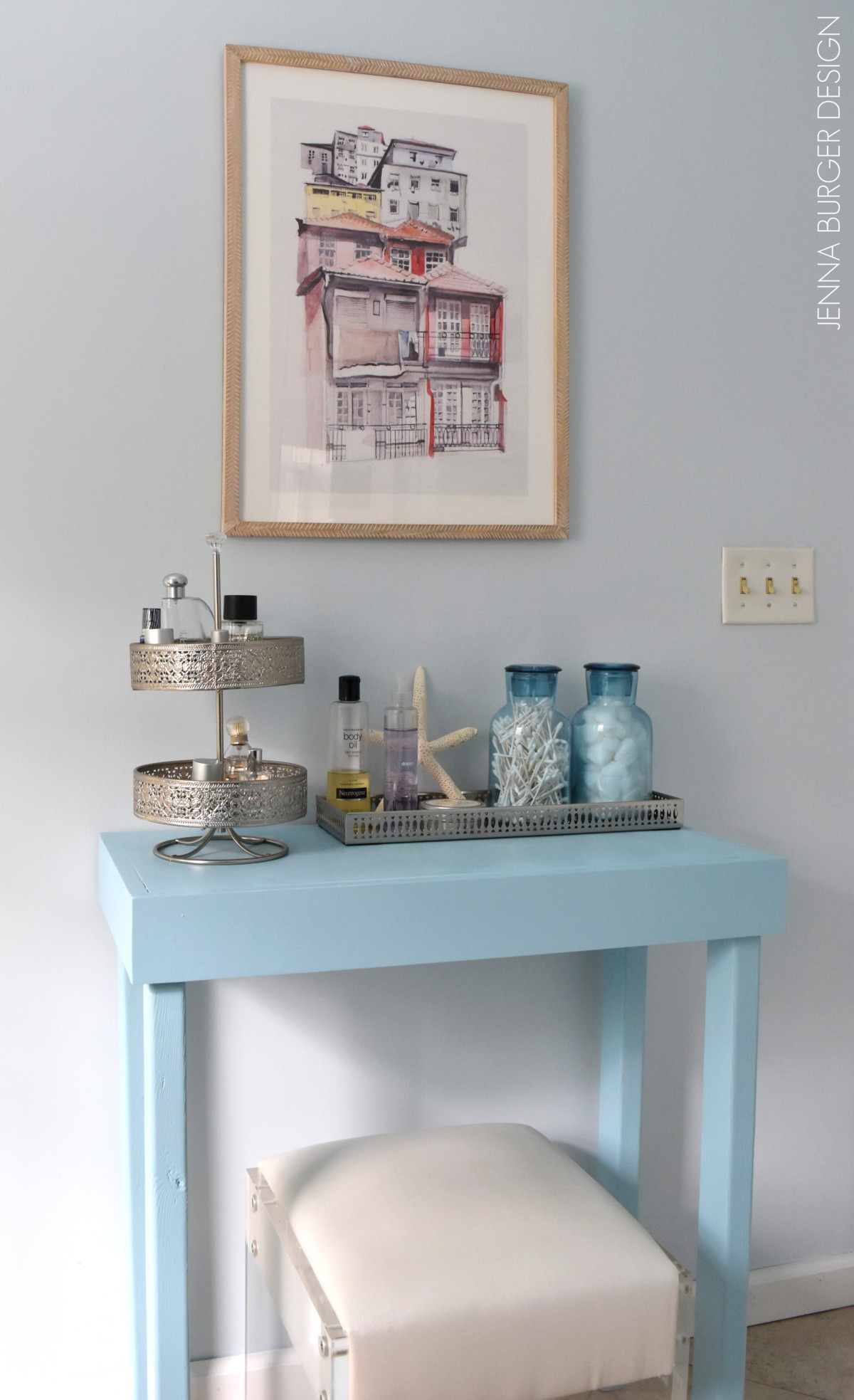
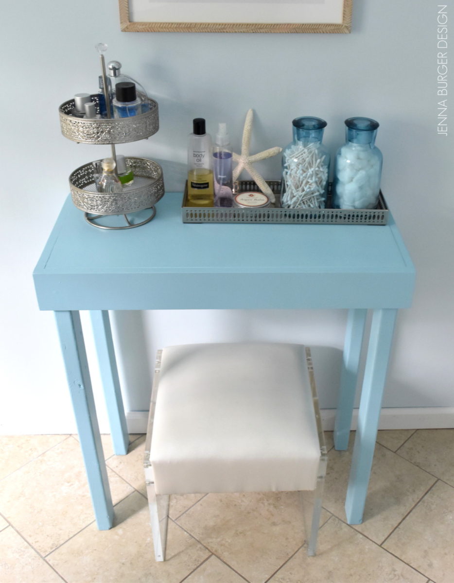
The layout of this space is somewhat tricky because there is an angled wall that is too large to leave bare, but too small to add a piece of furniture that is oversized. When I was scouring for accessories, I knew what I wanted, but couldn’t find anything that was just right + within my budget.  In the end, I found this gorgeous lucite + leather (white) stool.  I just couldn’t leave it.

I knew I had to pair it with a simple + minimal vanity.  Shopping came to a halt because I decided to build the simple vanity that I envisioned.

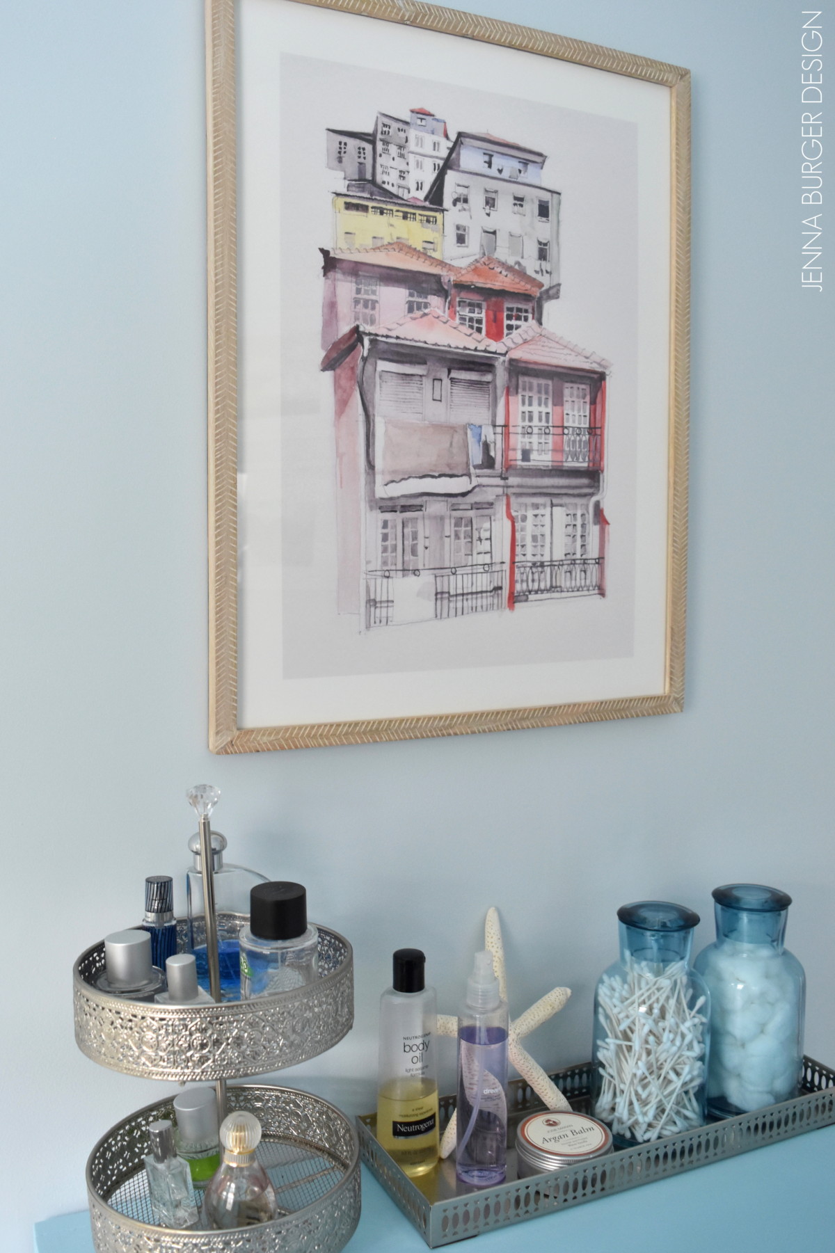
I used 2 x 3 for the 4 legs + 1 x 4 for the apron surround + 1/4″ thick plywood for the top, then painted it a color similar to the ceiling.  It’s the perfect size + scale for the space and is the ideal spot for perfumes, cotton balls, q tips, etc…

All the beautiful artwork in the bathroom is from Minted.com.  They are a fabulous source for fine art + limited edition prints at an affordable price.

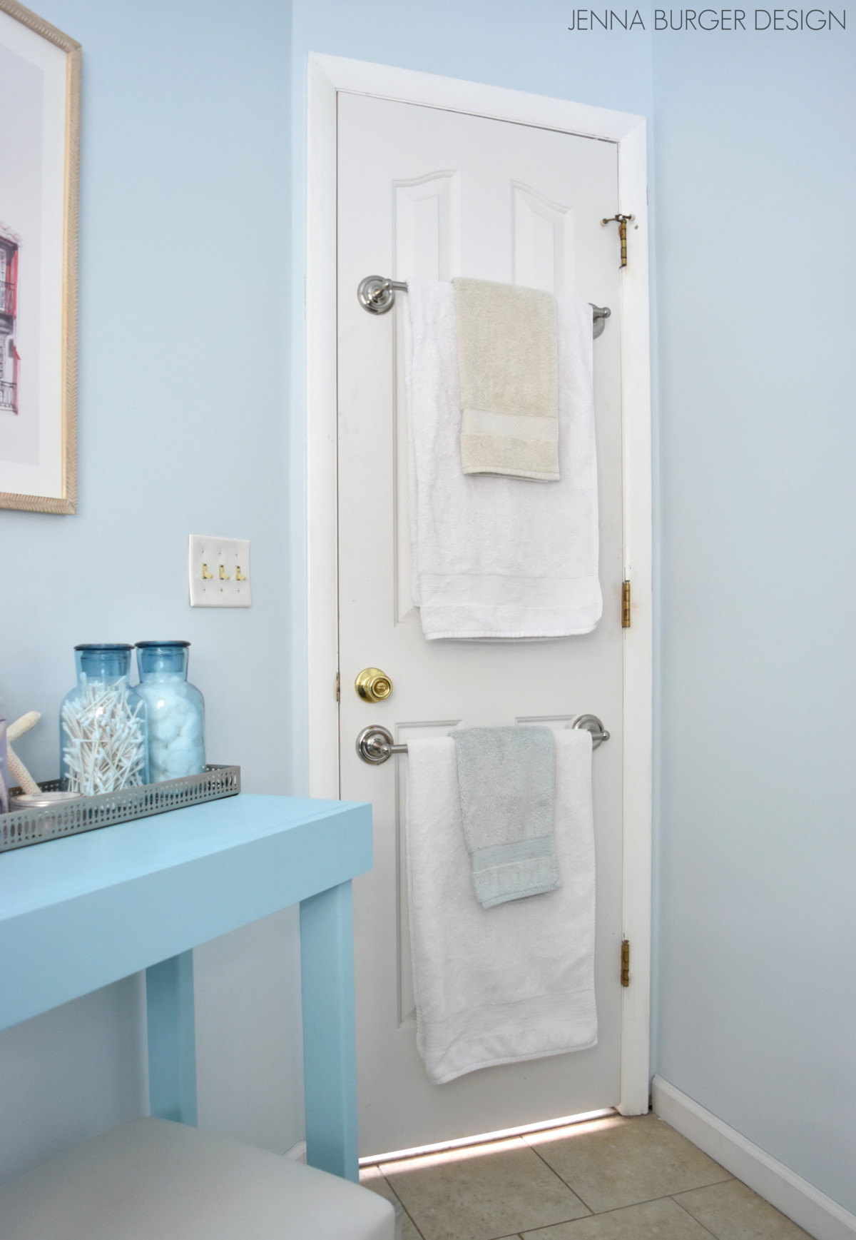
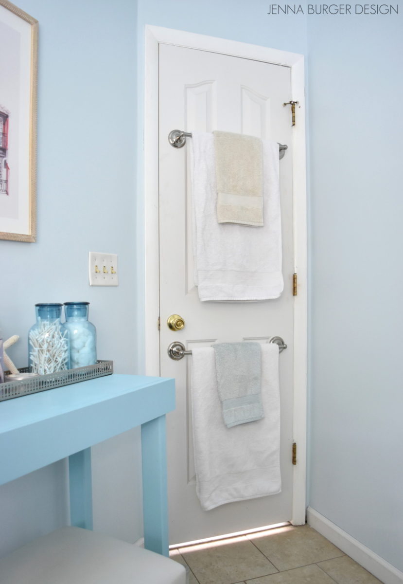
One of the most frequent inquiries I get on the blog is about the towel bars mounted on the back of the door.  The bathroom space is decent, but there is no perfect place for towel bars, so the existing back-of-the-door-towel-bars remained.

>>> Check out this post on How-To Hang a Towel Bar on a Hollow Core Door

Like all renovations, this project came with it’s hurdles + challenges, but nothing that couldn’t be overcome with thinking outside the box and a bit of patience.  As with all projects, there is a first for everything and with each completed endeavour, I take away something new, which builds my skillset + confidence.  At the same time, I know when to turn to others and call in the pros.

If you want to see more on this bathroom remodel, check out this previous posts:

Master Bathroom Renovation: Plan + Mood Board

Master Bathroom Renovation: Demo!

Master Bathroom Renovation: Tile + Grout

Now through March 23, Lowe’s is having a kitchen + bath event with deals up to 40% off. Work with a Lowe’s project specialist to design you dream space…  It’s the perfect opportunity for a refresh!

DISCLAIMER: THIS BATHROOM RENOVATION IS A COLLABORATION WITH LOWE’S. ALL OPINIONS + SELECTIONS ARE MY OWN.

Master Bathroom Renovation: Tile + Grout

It’s been a few weeks and lots of progress has been made on the master bathroom renovation!

Last I left off, I shared details on the demo (which we hired a contractor to do) + the steps to prep the space for tile.  Once that part of the job was complete, it was my turn to step in.  Thankfully I’ve tiled before so there wasn’t too much of a learning curve, but I knew tiling 3 large walls from floor to ceiling would be time consuming…

And it was!  BUT… it’s so worth it.  Check out where I left you last time…

…And what the bathroom looks like now…

Woah! Big Difference!!

Once the tub was removed removal and the new shower pan + cement board walls were installed, it was time to tile!   To start, I chose the center point of the shower space – the back wall – and worked my way out and around the room using a 4″ x 12″ tile.  I marked out a level line at the base of the tile so the tile would be as plumb as possible.

It’s important for the first row to be about 1/8 – 1/4″ above the shower (same for a tub deck) – I used shims so the tile would not slide down.  Instead of filling the 1/8″ gap with typical grout (which could crack), I used an expandable caulk once the tile was completely installed.

I continued my way around the base of the shower pan and installed the tile on the plumb line. At that point I stopped for the evening (yes, most all of the tiling was installed at night when the kiddos were in bed) to let the first row of tile set.

HELPFUL HINT: Subway tile is the only tile that has a slight bevel, so there is no need to add a spacing/ joint between tiles. If you added a joint (using a spacer), the joints would be very large.  The ‘pro’ for using subway tile is they stack one on top of the other.  The ‘con’ for using subway tile is you have no wiggle room.  If a tile is off (when using spacers), you can cheat on the next tile or the next row, but not with subway since every tile butts next to each other.

The next evening I was back to work installing one tile at a time… row by row as I made my way around the shower.

Master Bathroom Renovation: DEMO!

Hi All!

Last I left you, I mentioned we were about to undergo a major renovation of the master bathroom. It was a space that got a DIY makeover a few years back, but with wear + tear it was time for an overhaul.

As much as I adore color, I could only image this new bathroom to be soft + serene and clean + calm. The overall aesthetic will be based more on texture rather than color. Plus layers will add an important element to give the overall space contract + depth.

Just to share a reminder of the ‘before’ space…

Master Bathroom 'BEFORE' the renovation, JENNA BURGER DESIGN

The morning of demo day, I snapped the picture above of the bathroom, and in no time the contractors got to work…

Demo Day for the Master Bathroom renovation, JENNA BURGER DESIGN

From the tub to the vanity to the toilet, everything was ripped out!

As I mentioned in my last post, this renovation is a dual endeavour.  Due lack of time + components outside our skill set, we are taking on some areas of the renovation, while other areas will be performed by a contractor.  As I previously said, I don’t want to be without a bathroom for months AND I want to stay sane (somewhat).

The contractors are tackling the major areas including demo + installing the main components – shower pan + fittings, toilet, vanity + faucet.

DAY ONE

On the first day, the three-man crew removed the existing pre-fab tub, the sheetrock above the tub, the toilet, and the vanity.  It’s a small space, but by lunch time, the space was cleared out…

Instead of installing a new tub, we decided to use the 30″ x 60″ outcove for a shower.  After the tub + sheetrock was removed, the space was ready for the new shower pan.  For the new tile to adhere to, hardiboard (also known as cement board or backerboard) was installed.

Sheetrock is still a great product for the walls and ceiling of a bathroom, just not in the tub/shower area. Cement board is made with actual cement + a firberglass mesh exterior, so it’s waterproof and won’t deteriorate over time when/if it comes in contact with water.

Additionally, the new vanity that I chose is 48″ whereas the existing is 36″… I’m gaining 12″ of counterspace – I’m over the moon! Because of this change, the electrical wiring for the light needs to be moved so it will be centered on the new 48″ space.

By days end, this was the result…

Demo Day for the Master Bathroom renovation, JENNA BURGER DESIGN

Demo Day for the Master Bathroom renovation, JENNA BURGER DESIGN

Check out the purple wall color that was behind the toilet…  it was from before we renovated the last bathroom…  Gosh that color is ghastly and I was hoping to never see it again, ha.

DAY TWO

On the second day of renovation, the new shower pan was installed and the remainder of the space got prepped for tile.  After another day’s work, it was my turn to step in to install the tile.

Here’s a peak of how the finished cement board looks upon installation with the new shower pan…

It’s ready for me to tile!

Installing the tile for a master bathroom renovation, JENNA BURGER DESIGN

More details of the master bathroom renovation coming soon.

I gotta get back to tiling…

Oh, and I’m still deciding on the accent tile.  Any suggestions?  What do you like best??

Accent Tile Options

DISCLAIMER: THIS BATHROOM RENOVATION IS A COLLABORATION WITH LOWE’S. ALL OPINIONS + SELECTIONS ARE MY OWN.

Master Bathroom Makeover: Part 1

If you follow SAS Interiors on Facebook and Twitter (if you don’t, please do), you may have saw a few postings that I wrote mentioning that I finally decided to give my master bathroom a makeover.  And when I say finally, I mean FINALLY!  This is the only room in the entire house that hasn’t been touched since we moved in and it’s horrendous…  Until NOW.

Over the weekend, we (meaning the mister and I) finally took the plunge and gave this much-needed space a revamp.  I really wish that I could say in two days we finished the entire space, but that would be a big-white-lie. Bummer!  I went into this thinking it would be easy-peasy – we’ll paint, hang a few pictures, and we’ll be done.  HAHA – NOT! (I never allow for enough time – big no no)

The before space was a bright pink/purple color (why would anyone have chosen that color?).  When I first thought about this space, I envisioned 3 S’s – soft, serene, and spa-like.  Since the bathroom adjoins to the bedroom, I really wanted the two spaces to flow from one to another, so many elements in the new bathroom are an extension of the bedroom.  Here’s a peak at some of the selections for the new space.

The backdrop, similar to the bedroom, is a soft gray / taupe color with an accent color of dusty blue, which will be seen in the shower curtain (actually not a real shower curtain, but instead two window panels) and accessories. Again, because I envisioned the space being an extension of the bedroom, I felt it important that they “read” as one.  The accent color in the bedroom is orange, so the blue for this space is a perfect compliment.

I’m truly looking forward to this space being complete, especially since it was one of my Home Goals for 2012.  Actually, when I shared the before picture in my post about my home goals for this year, one reader wrote:

If you need help on your bathroom, I am sure all your readers would be willing…I know you did the best you could with what you had, but wow! I think I would have made that the first to redo when I moved in….not trying to be mean, or anything, but who would pick those colors????? All I can say is wow…  – Cindy

Well Cindy is so right!  Have you seen the before? I feel scared just showing it to you.

There are alot of reasons that this space got neglected, but the main issue was our indecisiveness to do a complete overhaul with a full tearout or a DIY bathroom with new paint and updates.  In the end, because of other priorities at the moment, we decided on a do-it-yourself revamp.  It simply makes the most sense for us!

On the list is:

  • New paint for the walls (gray / taupe)
  • New paint on the mouldings (white)
  • New floor (groutable vinyl – similar to my mom’s floor)
  • New paint for the cabinet
  • New hardware
  • New mirror
  • New light fixture
  • New accessories
  • New window treatment

So basically it’s all new, except for the plumbing fixtures.

And the reason why this space wasn’t complete by the end of Day 2?  Take a look at these snags…

1. The existing towel bar was attached to the wall with HUGE anchors… a full sized person could have hung from them. When the Mister took them out (which he had to yank them from the wall), a huge hole was left!  UGH.

2. Next frustrating snag? The light fixture had no junction box.  Really??  How is that possible?

3. And the most time consuming part was all the spackling – the walls were a mess!

Well no more complaining about this UGLY space.  It’s now in the process of being transformed.  Tonight’s task?  A new floor!  Wish me luck 😉

Have have remodeled a space in your home recently?  Have you made any updates to a bathroom in your home?