Vibrant Wallpaper in the Foyer
As the cold days have continued (it’s still feels like winter even though it’s been officially spring for almost a month), we’ve slowly been making changes to our new-to-us brick ranch fixer upper. I actually can confidently say that we’ve been making our envisioned updates faster than I’ve had time to share on the blog… life has admittedly been full.
Right after Christmas – the day after to be exact – I took the plunge into updating the foyer with a vibrant new wallpaper.
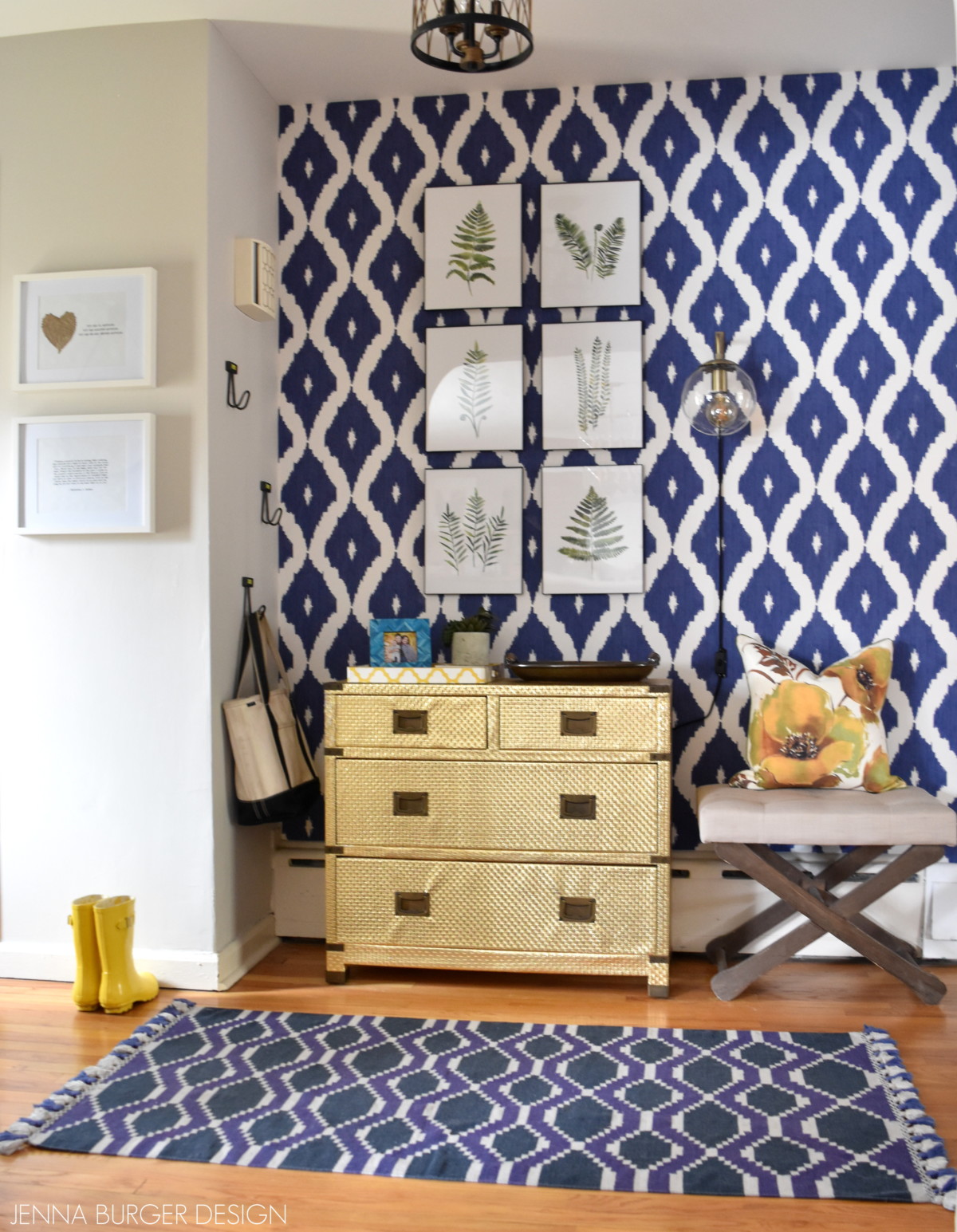
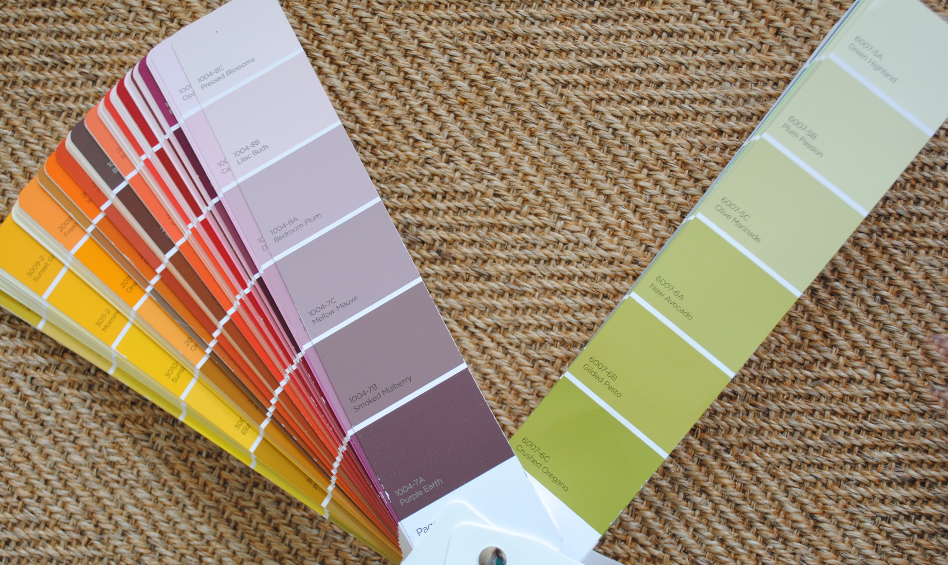
I am wallpaper obsessed and would love to adorn every wall with a colorful pattern. Thankfully in reality, I know where to draw the line and I know how to balance a dramatic wallpaper with a more subtle surrounding.
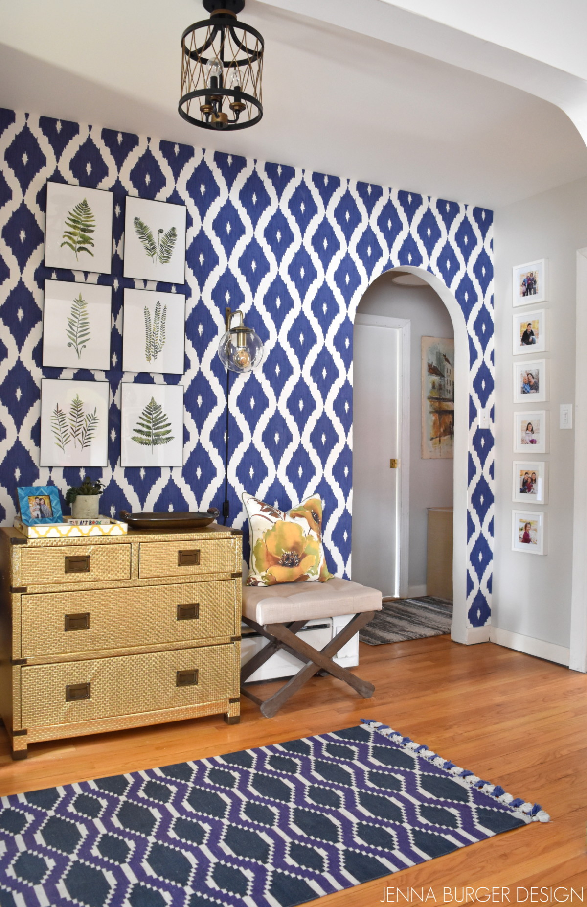
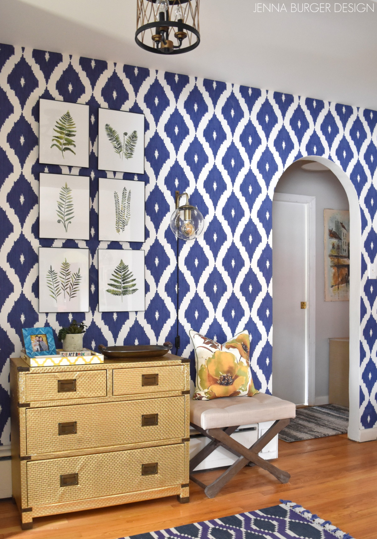
For the foyer space, a vibrant + colorful paper on all walls would have been overload. Instead I chose to use this blue & white Ikat patterned wallpaper by Graham and Brown on one wall and then balance the deep hue with a light neutral, Valspar Snowy Dusk, on the remaining walls.
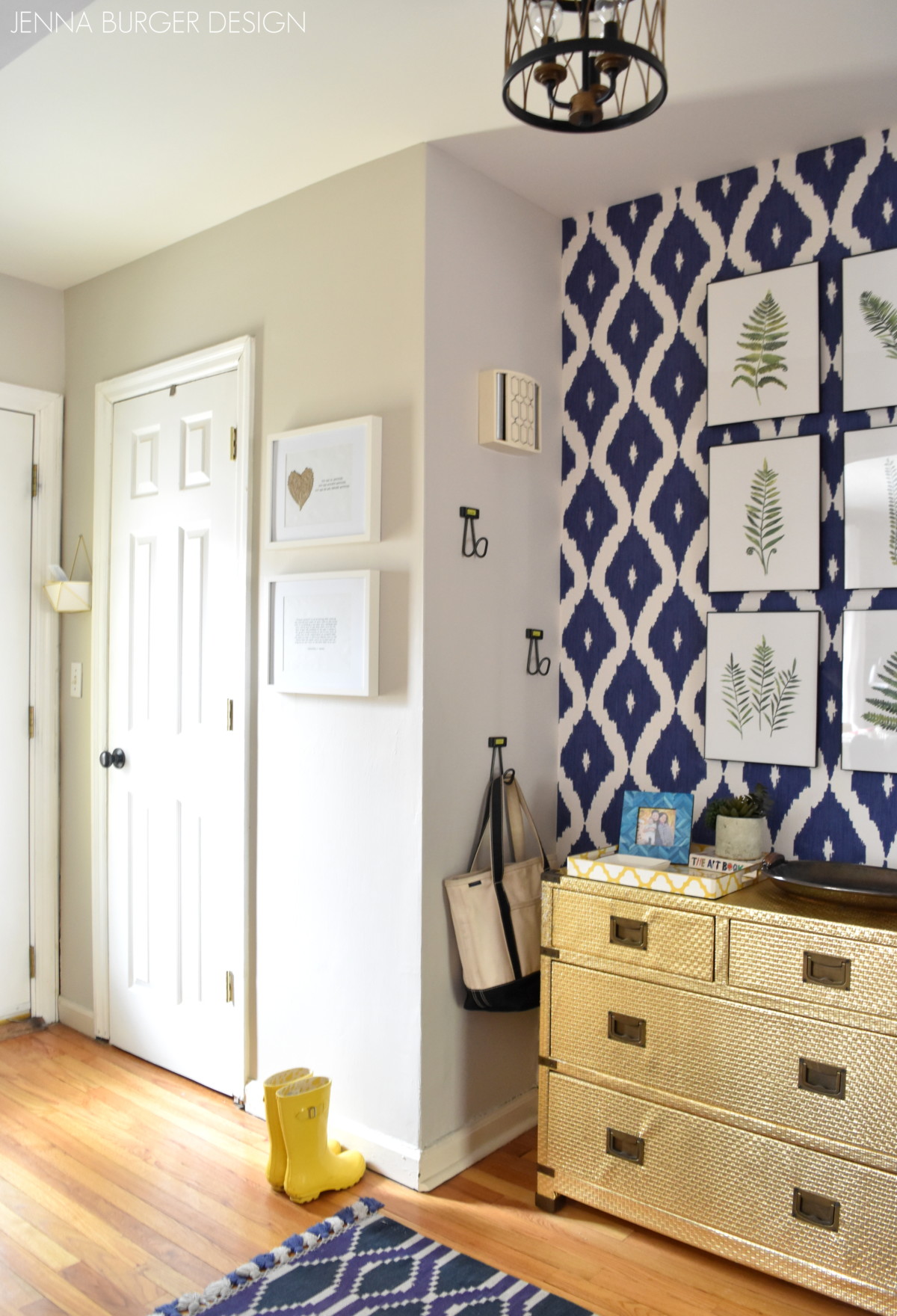
The result is so pretty. Most of the elements in the space were seen in the foyer of our previous home – the gold dresser, the fern art prints, the ottoman, and the rug.
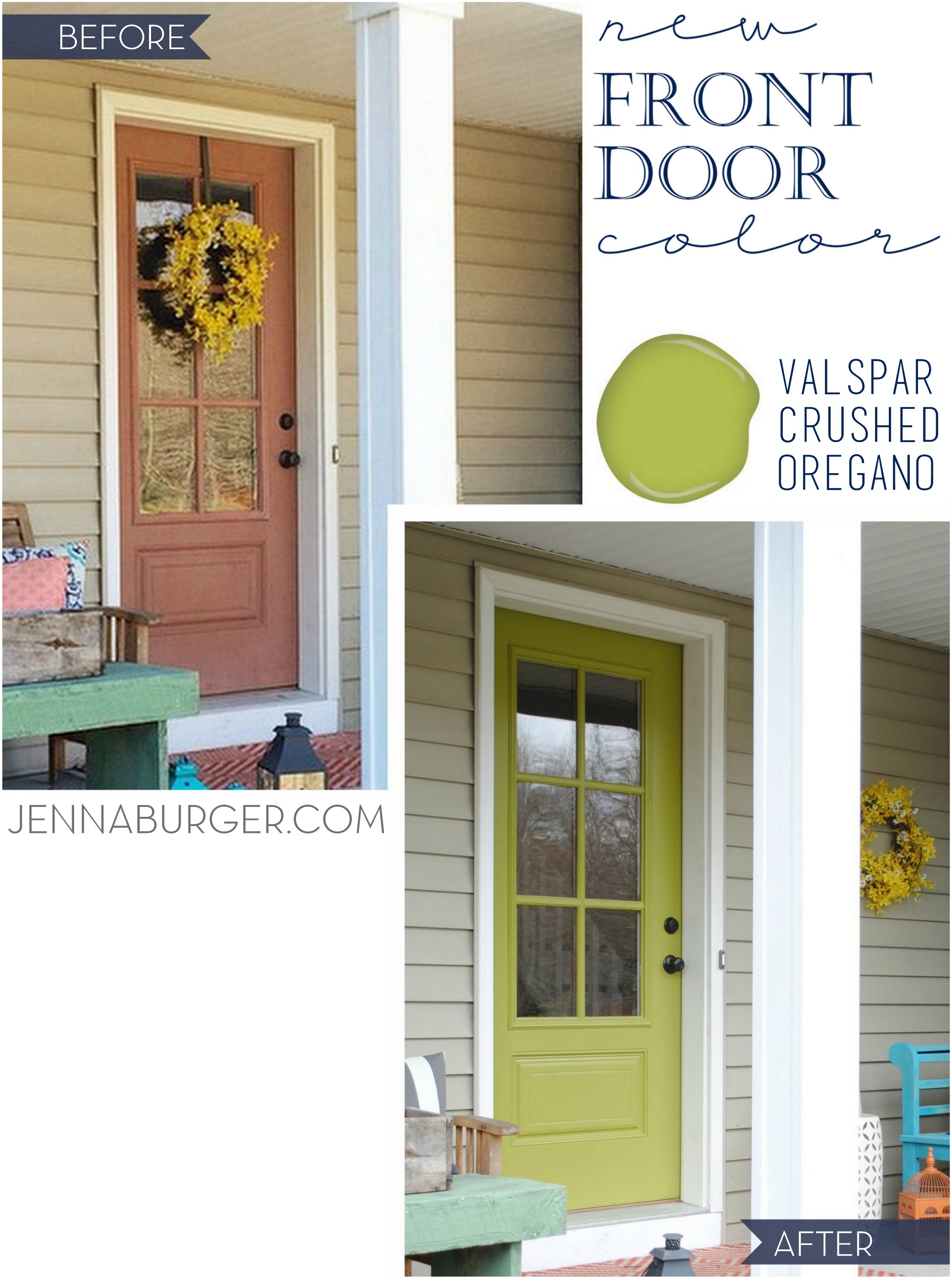
As always to appreciate the ‘after’, you have to take a look at the ‘before’…
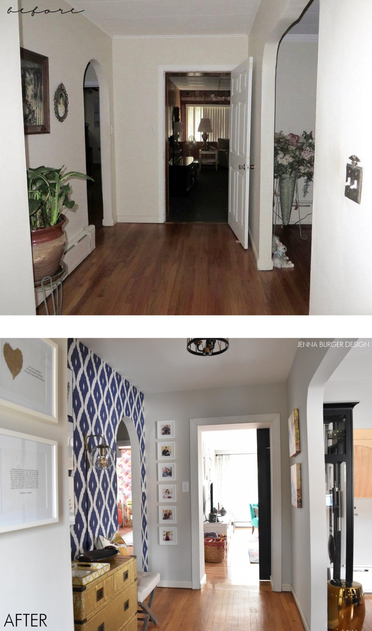
Once we moved in, the space was a black canvas. I knew I wanted to add in a pop of color, but I didn’t want to overpower the space. I chose to use one wall – the side wall of the entry space – to add the wallpaper.
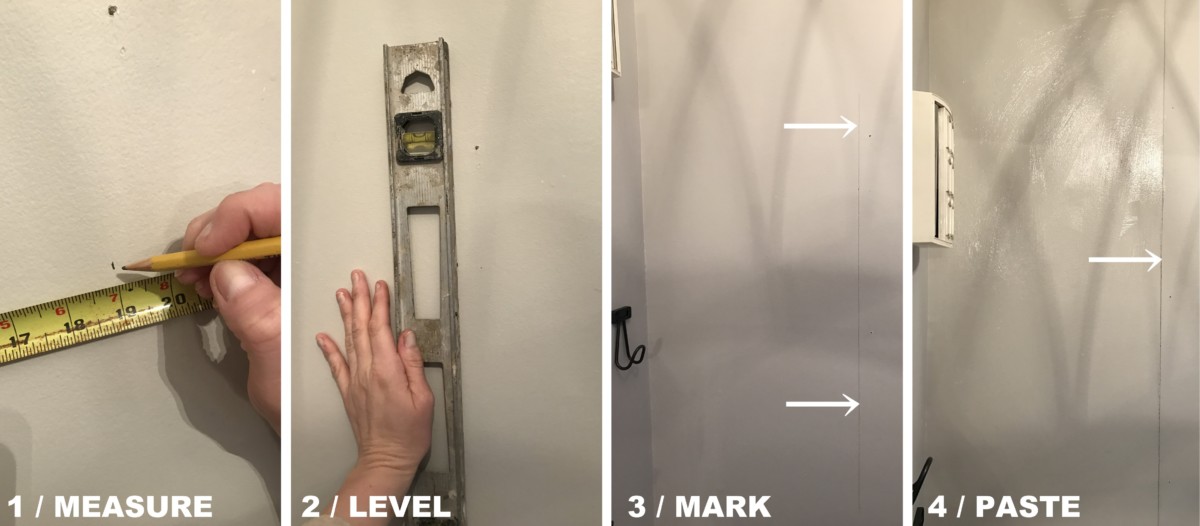
I’ve shared tutorials here and here for how to wallpaper a wall, but I’ll share another quick rundown…
1 / starting from the center of the edge of the wall (depending on the design), measure the wall to mark the width of the wallpaper
2 / line up a level on the on the measurement
3 / mark a level line with pencil – this will be the edge for the paper to align to
4 / this paper required to use wallpaper paste, so using a paint brush, I ‘painted’ the paste onto the wall, then applied the paper
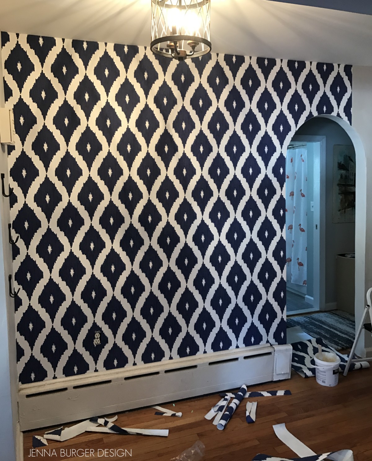
First line of paper went up easily…
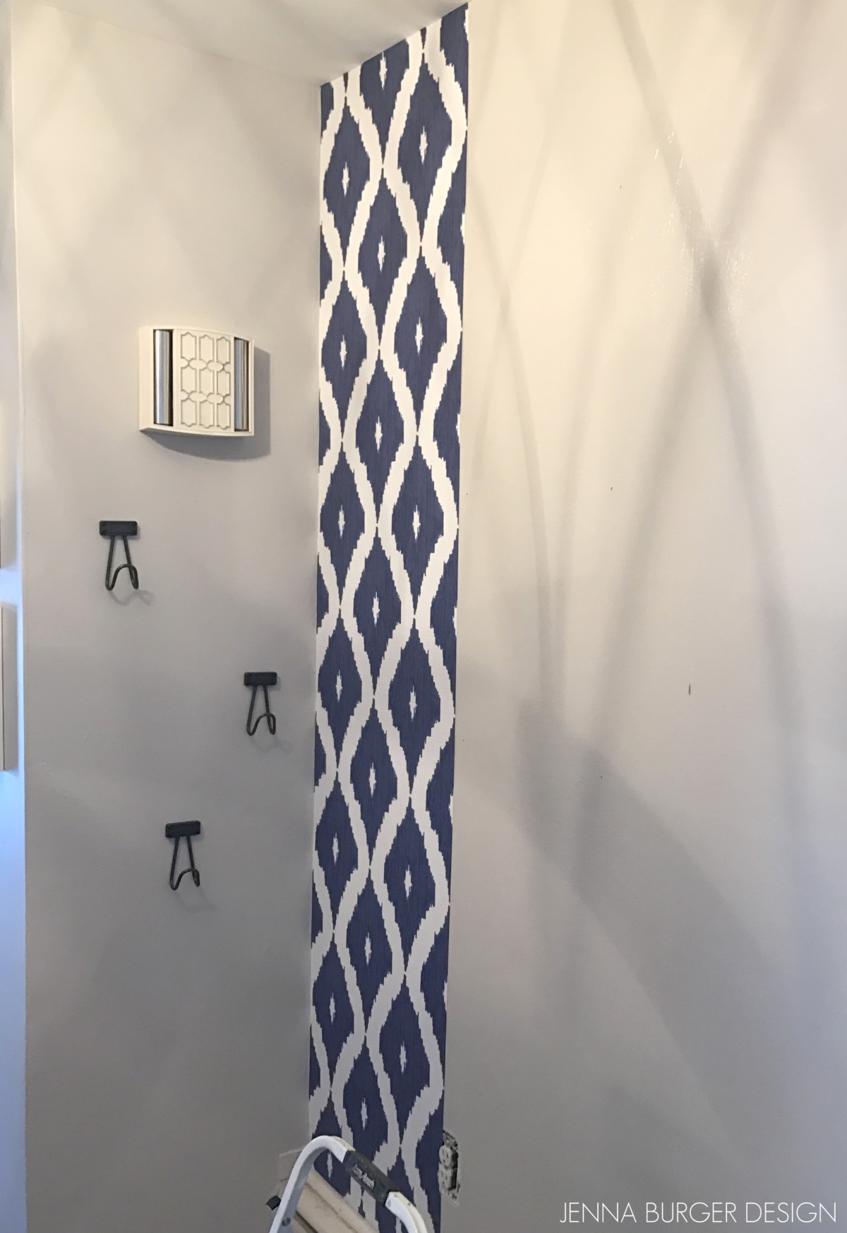
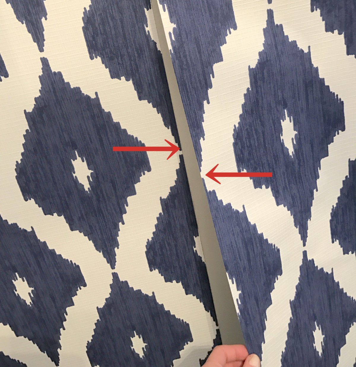
The most important part of installing wallpaper is to line the edges up with the next panel. The edges can’t overlap but have to join side by side without a gap.
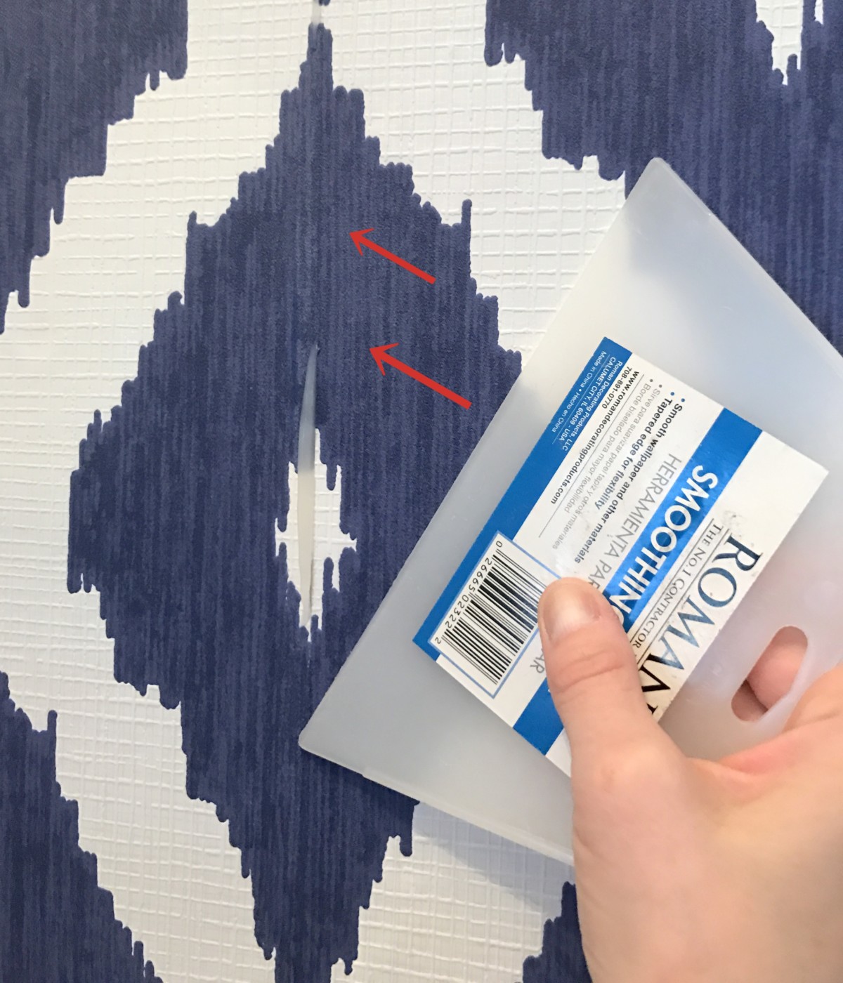
Once the paper is positioned, then using a wallpaper smoothing tool, lightly glide over the paper towards the seam / edge to smooth any air bubbles. Then wipe away any excess glue with a damp cloth.
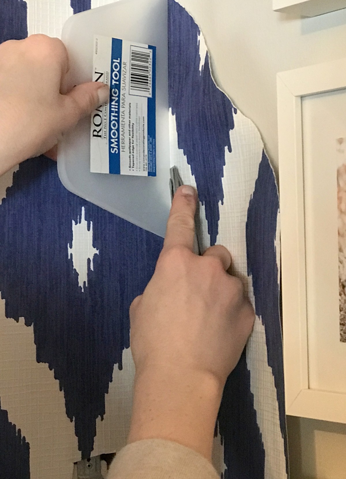
At the wall corners, ceiling, and base use a sharp blade + the smoothing tool to carefully cut the extra wallpaper.
This one wall took about 2 hours to wallpaper start to finish.
From how it looks before to now, the difference is quite dramatic…
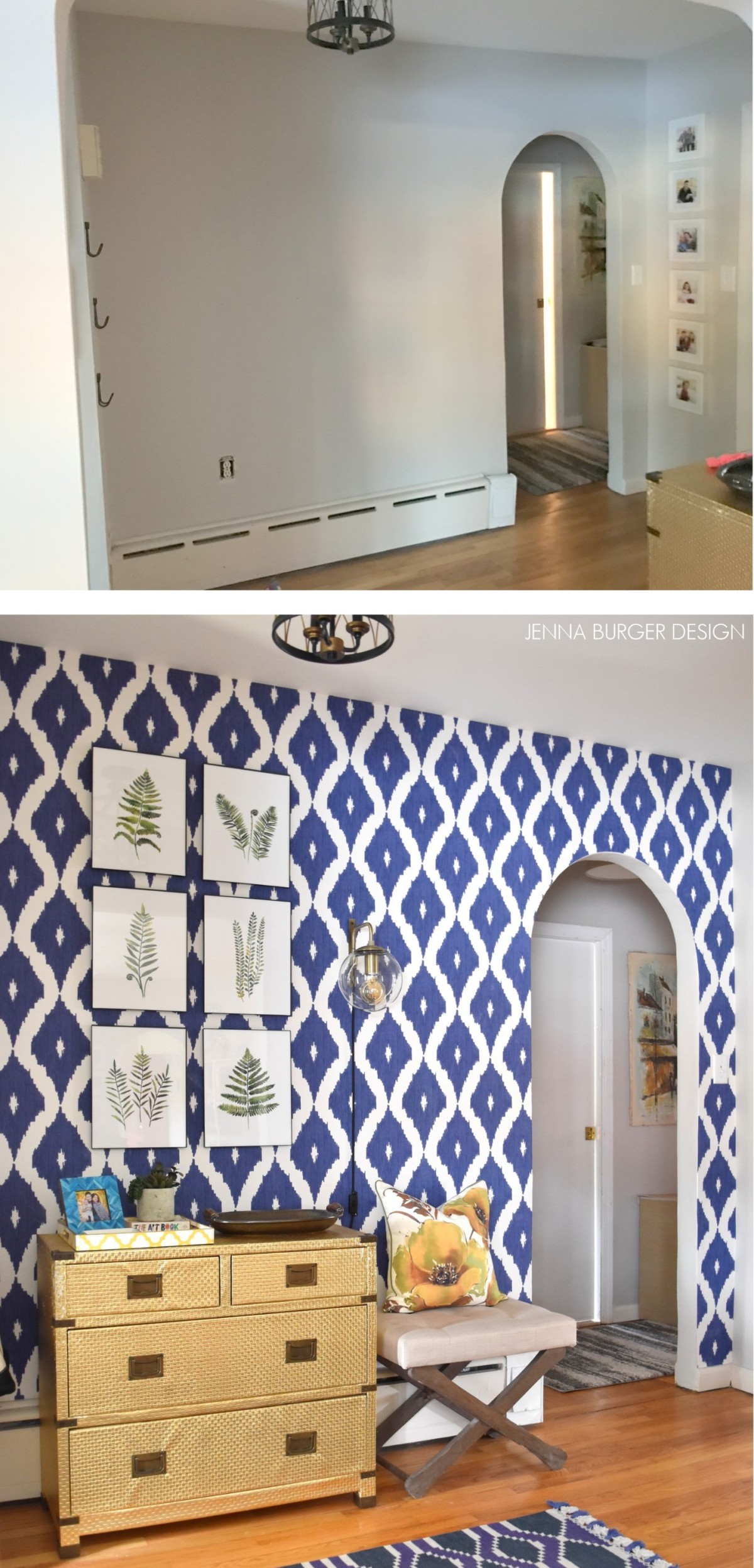
The foyer space is so striking and inviting now with the bold wallpaper backdrop.
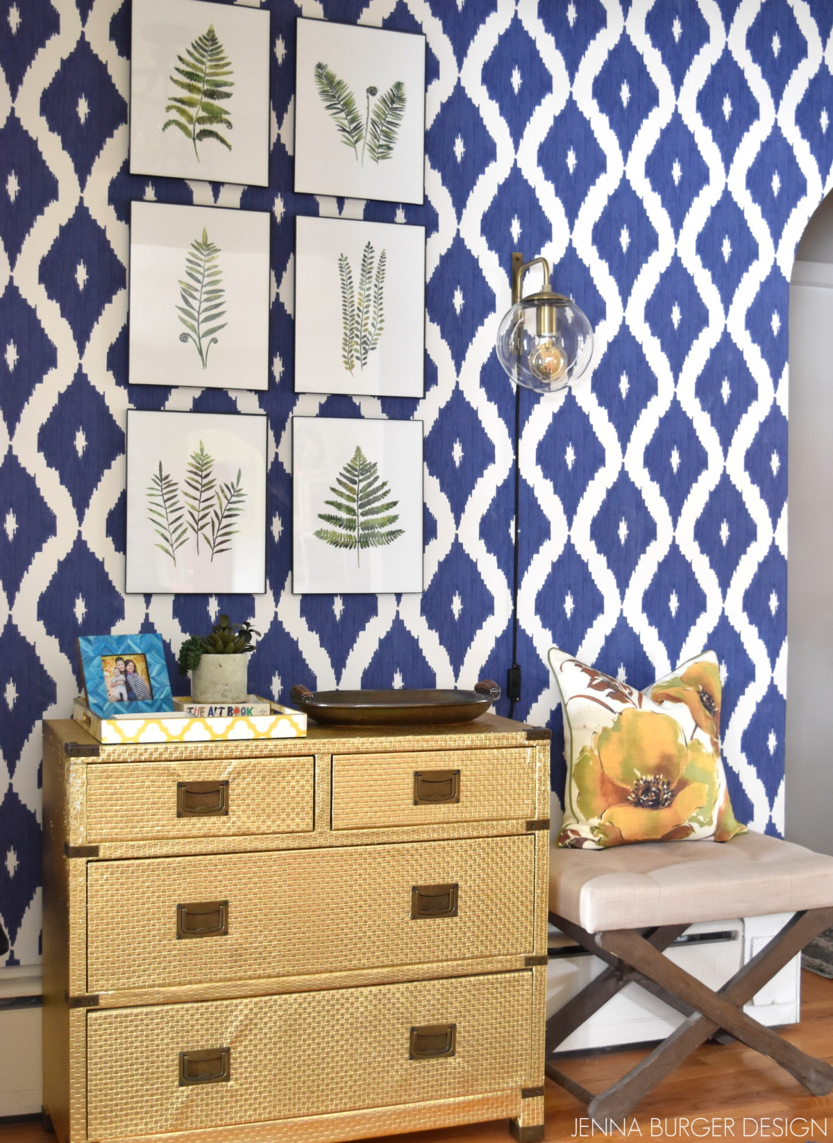
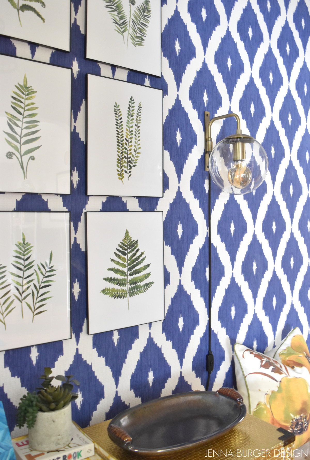
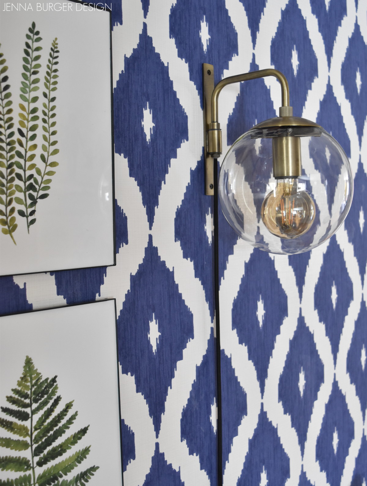
Even though there is a new pendant ceiling light in the space, I added a plug-in wall sconce that has brought beautiful ambient light. It was a great find from World Market for less than $60! I adore the pretty, soft glow in the evening hours.
The 6 fern framed pieces are watercolors. Years ago I framed dried ferns, but over time they started to brown, so I found these watercolor prints through Etsy (wonderful shop by the way) and made the plunge to purchase them. I love how they look so real and bring an organic vibe to the space.
The gold dresser has been around for 5+ years (sorry, can’t find the source) and the bench adjacent to it was from One Kings Lane (again, no source but it’s a typical x-leg bench stool). The pretty pillow was a recent markdown, red sticker sale item I picked up from Home Goods. The yellow + apple green hues perfectly paired with the other elements and colors throughout the house.
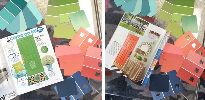
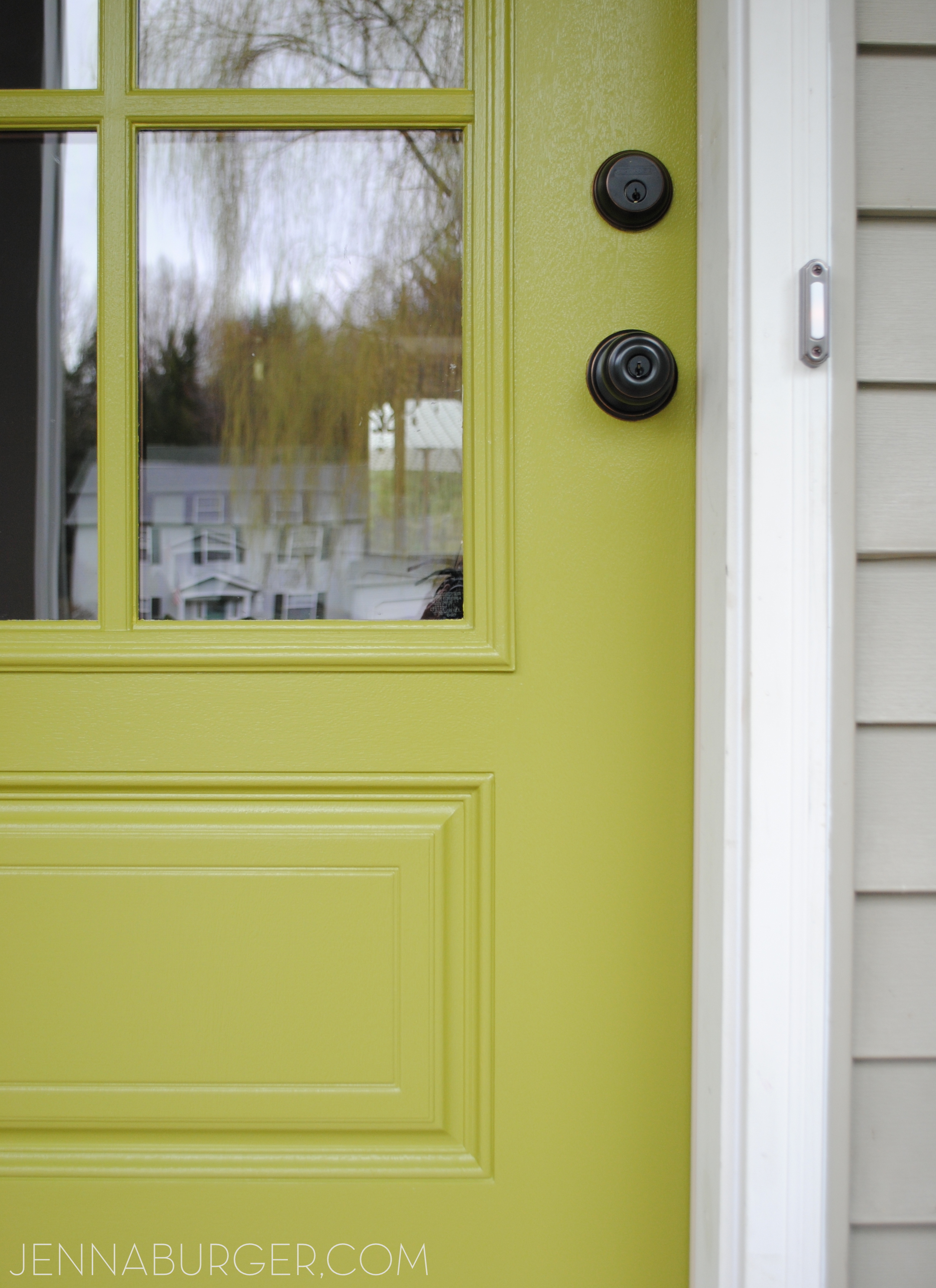
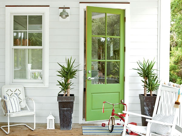
We also have a new color on the front door… we went from apple green in our previous home to a vibrant, bold yellow.
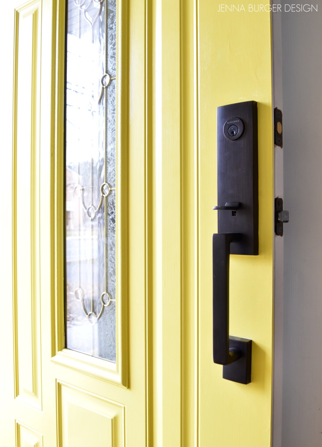
The color is Valspar Lemon Curd and is a true yellow hue. If you haven’t checked out our recently renovated Pajama Lounge, the rich + bold color is also used cohesively throughout the space as well.
A new black lockset also adorns the door and brings an updated modern look to the mid-century house.
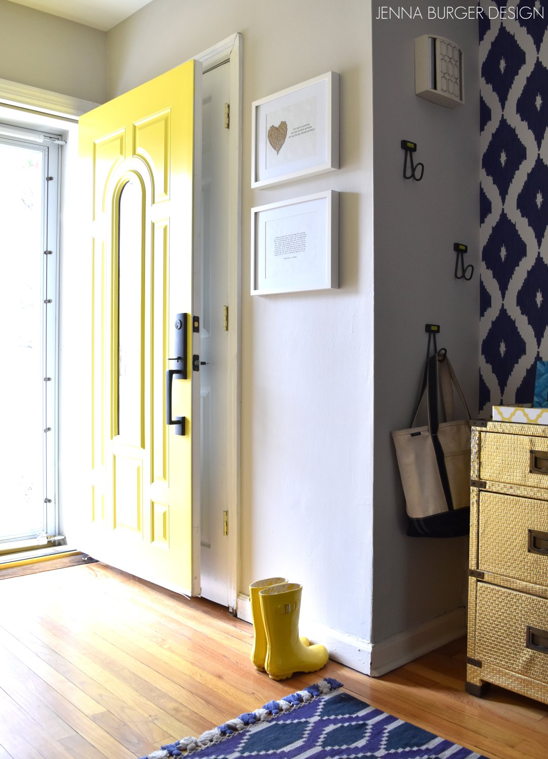
From the moment you step on the porch and set foot inside, the goal we set for ourselves and for those that visit is to feel greeted with a colorful, vibrant space balanced with warmth and an inviting ambiance. Do you think we achieved that?
Thanks for visiting and please return soon for more room renos + DIY projects!
DISCLAIMER: THIS POST ON CREATING A COHESIVE COLOR PALETTE IS A COLLABORATION WITH LOWE’S. ALL OPINIONS + SELECTIONS ARE MY OWN.