Tag: SAS Interiors

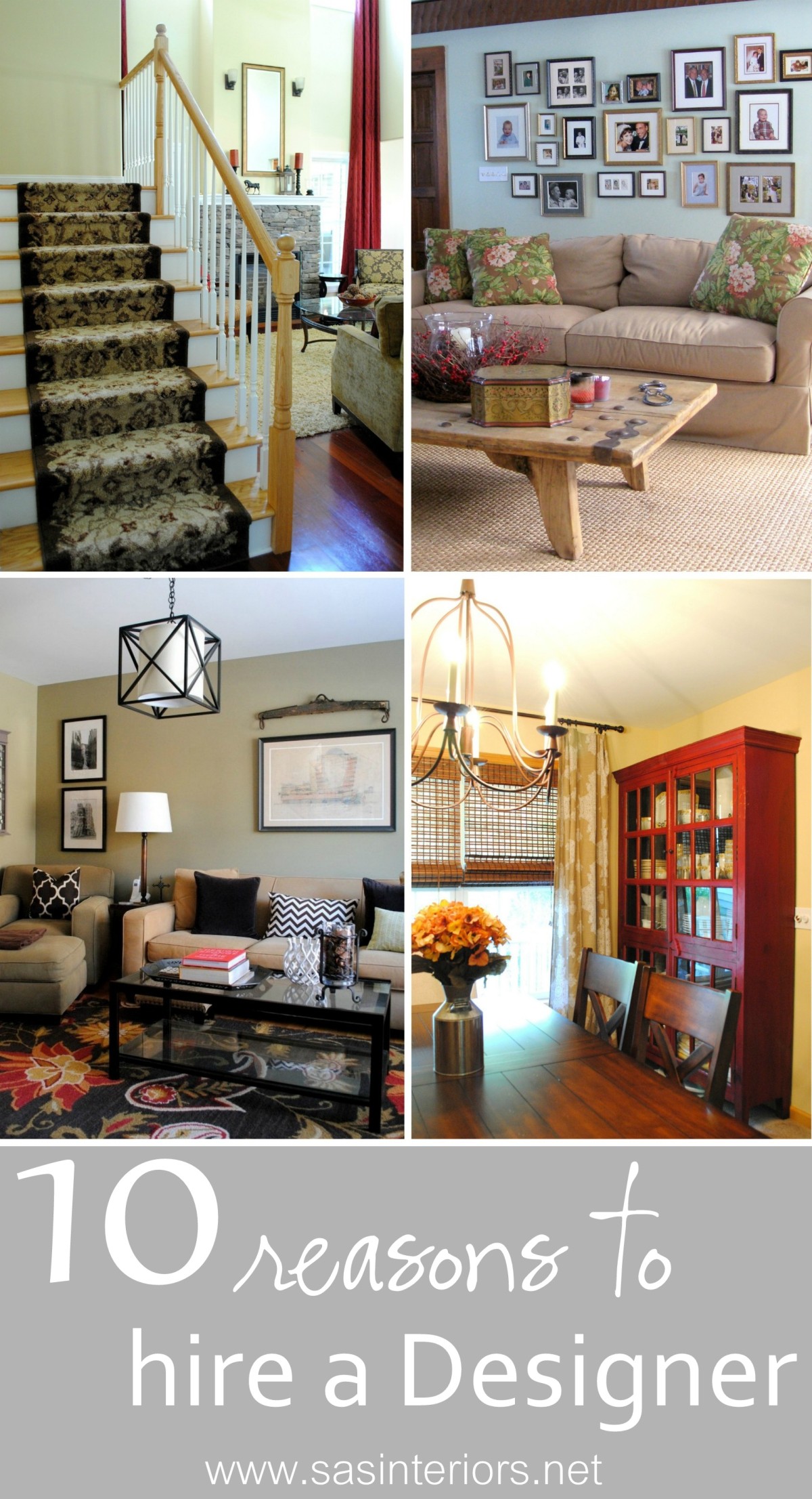
10 Reasons to Hire an Interior Designer

It’s been a little crazy around here lately and one of the reasons is because I just wrapped up three design jobs this week.  It’s always so gratifying when a project is complete and the vision that I originally had for a space comes to fruition.  As I finished up the final details of these latest projects, each client said (in a different way, of course) how I made them think outside the box and how the space wouldn’t be what it is without my assistance.  That surely brought a smile to my face 🙂

Many think, that an Interior Designer is only for the stars or the uber-wealthy.  So not true!  For many years I worked in the high-end design field, but honestly, I’d much rather assist the everyday person with making their vision a reality.  That being said, I am so thankful for what I learned when practicing high-end design because  I now know how to get that pricey look at a fraction of the cost!

As these projects are wrapping up and it’s fresh on my mind, I thought I would share a few reasons why hiring an Interior Designer is a must for anyone, with any budget!

WHY HIRE A DESIGNER!

1. Designers can save you money.  When making interior selections and decisions for one room or your entire home, it can be overwhelming and it’s possible that you’ll make purchases or choices on items that are either not worth the cost or won’t “live” for long.  With a Designers (like me) assistance, direction, and know-how, they can steer you in the right direction so the entire space can come together as a whole.  Let me ask you this – How many times have you purchased 2,3, or 4 different gallons of paint to repaint a room and you still weren’t satisfied?  Maybe once or twice??  Be honest…  With a Designers perspective, big bucks can be saved, along with the countless wasted hours.  That leads me to my next reason on why to hire a Designer…

2. Designers can save you time.  Think about all the time (and gas) wasted by buying items, not being happy with them once at home, and then returning them.  Has that happened to you once or twice?  When I work with clients, many never step foot into a store or showroom (unless they want to), because I bring samples, images, and pieces to their home.  Not bad, right?!  I’m sure the last place you want to be on a beautiful Saturday afternoon is a furniture store with 3 crying kids. I won’t even get to the point on how much time a Designer can save you with all those gallons of wrong paint.

3. Designers think outside the box and give a fresh perspective.  The mind of a Designer is simply made up differently.  We can see things that others may not and we think outside the box to provide fresh ideas and a unique perspective for a space.

4. Designers create and work within a budget. (most of the time) A good and experienced Designer will work within your budgetary means (and/or tell you up front if your scope is/isn’t possible within your budget) and make a plan before anything is purchased.

5. Designers listen.  When working with a Designer, the designs are exclusively for you and your project. I listen to my clients needs and wants to direct / assist them so the result is a space that reflects their personality and style.

6. Designers push you.  Not literally (well, some may, hehe) of course.  Designers are trained to know scale, proportion, color, size, texture, etc. so that a space is unique and personal, and not directly taken out of a catalog.  I like to introduce elements into a space that my clients wouldn’t have chosen without me.  Sometimes pushing the limits truly makes for an amazing result.

7. Space Planning.  Determining the best furniture layout for a space is critical in how the room functions and how it reads aesthetically.  When I meet with a client, we discuss the pieces that they want to repurpose or eliminate, and what needs to be added. Planning the space is HUGE (and my favorite part)!

8. Project Management.  Whether a homeowner desires a few new accessories or an entire kitchen renovation, alot of time and effort is needed for project management and coordination.

9. Designers have passion.  I live and breathe design.  From my blog to my business, design is what I know and what I do, day in and day out.  It’s not just my job, but a hobby and career that I’m truly passionate about, which is reflected in every one of my creations.

10. We have contacts. Designers have access to trade only resources that are not often available in retail stores and are often deeply discounted from retail costs.  Additionally, being in the design / building field, Designers often have formed relationships with kitchen consultants, millworkers, plumbers, electricians, etc.  We can get the right people for the job!

I hope you learned a little something, especially that working with a Designer is attainable for anyone with any space and any budget!  If you are in the market for a Designer or if reading this post peeked your need to finish up the space you’ve been working on for the last year, you can gladly take a look at the Design Services that I offer by clicking here.  I also offer E-Decorating services and can gladly assist you with a project if you live in the US.

Have you ever worked with an Interior Designer?  Have you ever thought of working with a Designer but didn’t think it was possible? I’d love to hear your thoughts!

Painted Two-Toned Desk + Tips on Painting Furniture

I’m just about finished with the updates for my son’s bedroom makeover.  It hasn’t been a huge overhaul, but with rearranging the furniture, adding colorful stripes on the wall, and hanging new DIY pallet shelves, this space has received a welcome refresher.  In the midst of moving around the beds and dresser, I realized  my little man is at the age where he really needs a desk to work at and hold all his creative supplies.

If you remember back quite a long time ago, I purchased a beauty of a desk off Craigslist.  It lived in my family room ever since (over 6 months), but wasn’t “right”.  Then pufff… I had an idea – it would be perfect for my son’s room.


And this is the evolution of the Craigslist Desk…

It started off as a stained executive desk typical of the 1940s and is in really great condition.  The only thing it needed was a little makeover to update it and bring it back to life to mesh with today’s decor style.

In knowing that the desk would live in my son’s room, I wanted to do it right.  With my lack of patience, I sometimes skip steps or rush, but with this desk makeover I took my time so the result would be something he could live with for many years.

Supplies: Onto the makeover – here’s my arsenal of supplies…

1. Fill Holes & Sand: I started off removing the hardware, which I decided to replace with simple knobs.  Then I filled all of the scratches, holes, and nicks with wood filler.   And the last step before painting was to sand the overall desk surface with my orbital sander using a 120 grit sandpaper (medium coarse), then a 220 grit sandpaper (very fine coarse).

2. When the sanding was complete, I cleaned off the entire surface with a damp rag before I started priming.

3. Primer: Once the desk was completely dust-free, I added one coat of primer with my favorite Kilz Primer which blocks the stain and allows for a well-prepared surface to paint.

4. Secret Agent: With every painting job, I always add my favorite “formula” to eliminate brushstrokes – Floetrol.  It always works like a charm to achieve a clean, brushstroke-free surface! (And I wasn’t even paid to say that – I truly just love it 😉

Desk Colors:

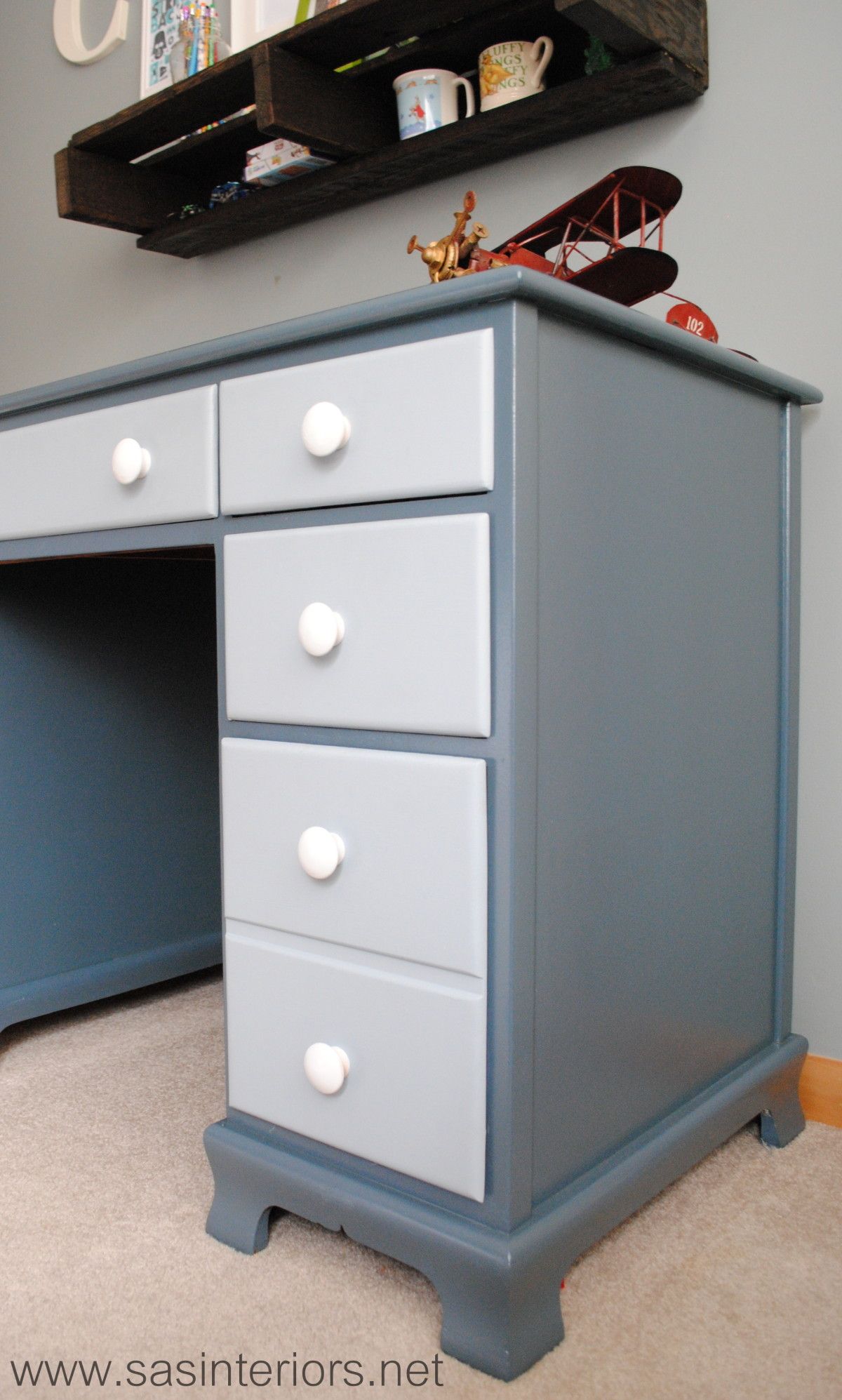
  • Desk Top & Frame – Dutch Boy High Seas
  • Drawer Fronts – Dutch Boy Hurricane Cliffs

5. Paint: After the one coat of primer, I added the first coat of paint, which I used both a brush and roller.  On the top and flat surfaces of the desk, I used a 5″ wide small roller and for the difficult crevices and edges, I used my favorite 1.5″ wide Purdy brush.  *Sometimes, I used the brush first and went over it with the roller.  The roller makes for a smooth surface to avoid brushstrokes.

6. Then onto painting the drawers.  I wanted this desk to be a little playful and not just one color, so I decided to use a lighter color blue on the drawer fronts.

7. Polyurethane: The last painting step was to add a coat of polyurethane – truly the most important part in finishing any piece of furniture!  I usually use water-based clear satin polyurethane, but since I knew this desk would be getting lots of use in the years to come, I decided to use an oil-based polyurethane, which really is more durable (hands-down).

8. Hardware: Once the painting was complete, I drilled one hole in each drawer front for the new knobs, which were originally natural that I spray painted white.  The knobs went in and the desk was complete.

To add a little unexpected fun to the desk, I added a drawer liner that has a geometric pattern with green, blue, and turquoise colors.  My son was quite surprised when he opened the drawers to find this hidden treasure!

And once again here is the before and after…

And these are just a few important tips to remember when painting furniture:

 Do you like painting furniture? Have you painted anything lately?

Spring Mantel with Shades of Turquoise

Last week here in Upstate NY, the weather was amazing and I soaked up every bit of sun I could get. Now it’s a little chillier, but Spring and Summer will be here before ya know it! In the midst of the gorgeous weather, I took some time to put together my new Spring Mantel.

Over the past few months, I have been introducing more cooler colors than the warmer colors that I’ve lived with for many years. So my latest mantel creation has a whole lotta turquoise, which is a beautiful and dynamic compliment to the burnt orange focal wall.

Here it is… What do you think?

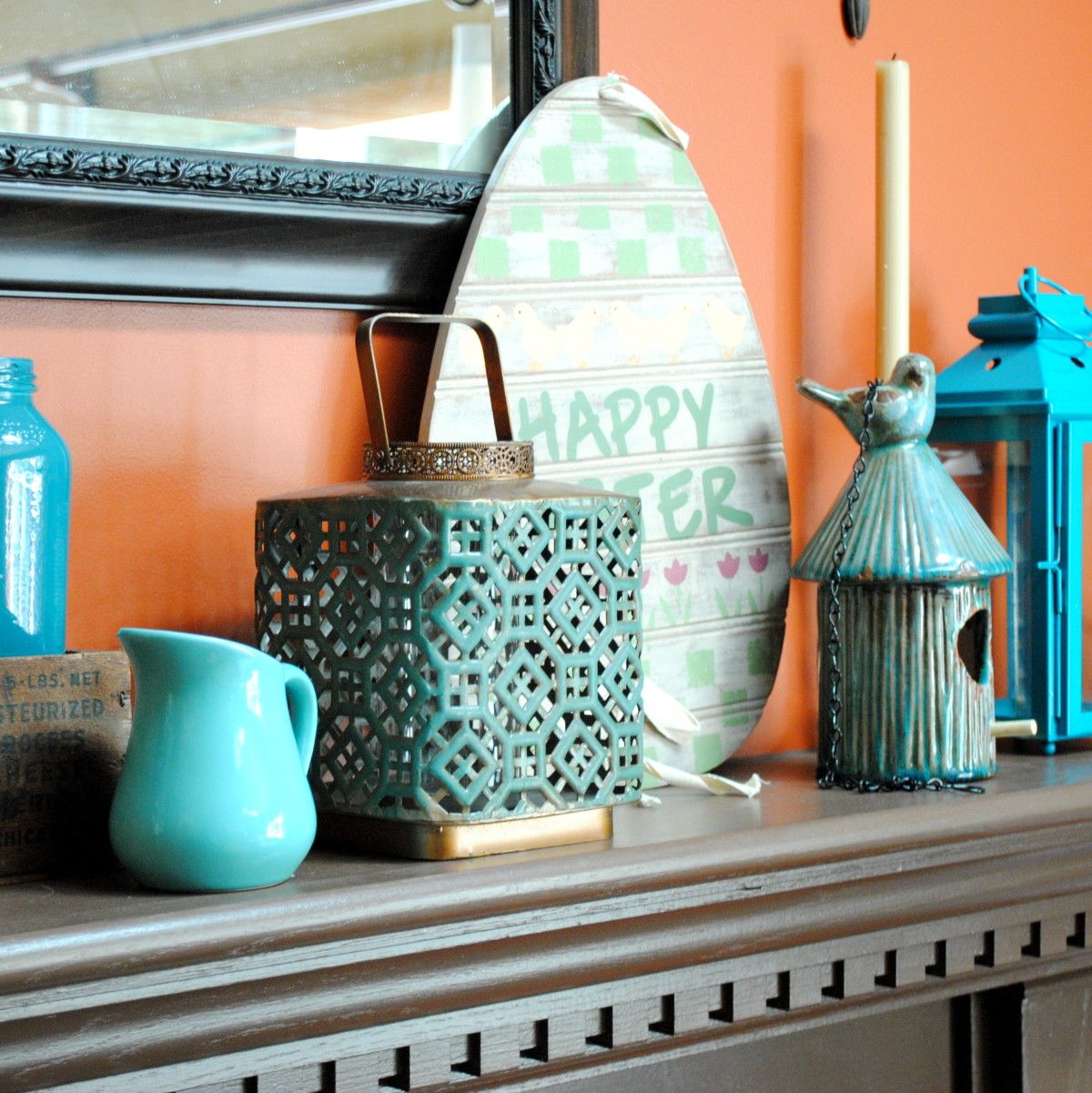
Turquoise is absolutely one of my favorite colors and from my past post, Totally Turquoise, many of you love it just as much!  It was kind of risky to have the mantel be dominant in one color and when planning it out in my head, I wasn’t sure if it was going to work.  I think by including a variety of different turquoise shades, the overall composition has alot of depth and intrigue, especially with the backdrop of the burnt orange wall.  Other textures and muted colors of browns were also added within to break up the monotony.

Here’s an in depth look …

Many of the pieces that make up my new Spring Mantel have been repurposed from around my home or picked up at local stores for very little.  The turquoise glass vase on the left is something new I bought a few weeks ago at TJ Maxx.  I had already had this turquoise-mantel-idea in my head and thought this would make a perfect addition – it was taller and I knew it’d make a great ‘anchor’ piece!  The glass mason jars which I found at an estate sale last year have been showcased on my mantel before and are filled with lentils and a votive candle. To the right is a tall glass jar filled with rocks from last years vacation to the beach.  I love displaying memories and these rocks are a beautiful and quiet shade of blue…  a perfect compliment to the other bold and vibrant colors.

One of my favorite upcycling things-to-do is paint old, used glass jars – tomato sauce jars, apple sauce jars, jelly jars, any jar will do! It’s so easy and unexpected.  In the Blue Label wood box stand two sauce jars that I added a little color to (it’s actually the leftover paint from my kids bathroom cabinet).  My mantels are always about layering, so in front of the wood box is a cute little turquoise pitcher and to the right is a lantern, both of which I purchased at Homegoods.

Of course, I had to add a touch of Easter decor within my Spring mantel.  I love this egg shaped Happy Easter sign that I’ve had for years (forget where I got it), but in a few weeks once the Holiday is over, it’ll be swapped out with a new Spring sign (not sure yet what it’ll be).

Continuing to the other side of the mantel, I added a sweet distressed turquoise ceramic bird feeder.  Originally intended for my daughter’s room, its so cute and fit perfectly amongst the like colors. To “anchor” the other end, I finished the mantel with two different sized bold turquoise lanterns that I purchased from Target.  They have some awesome colors this season like lime green, hot pink, and of course turquoise.

I also whipped up some fun new pillows with accents of turquoise.

Isn’t that owl fabric so cute?!  Love it with the brown and white chevron.

And this is how the entire room looks all pulled together for Spring.  It’s so different from last year’s quieter, frappe colors.

I think this is my favorite mantel design yet!  What do you think?

Do you love turquoise just as much as I do? 

Dried Hydrangea Wreath

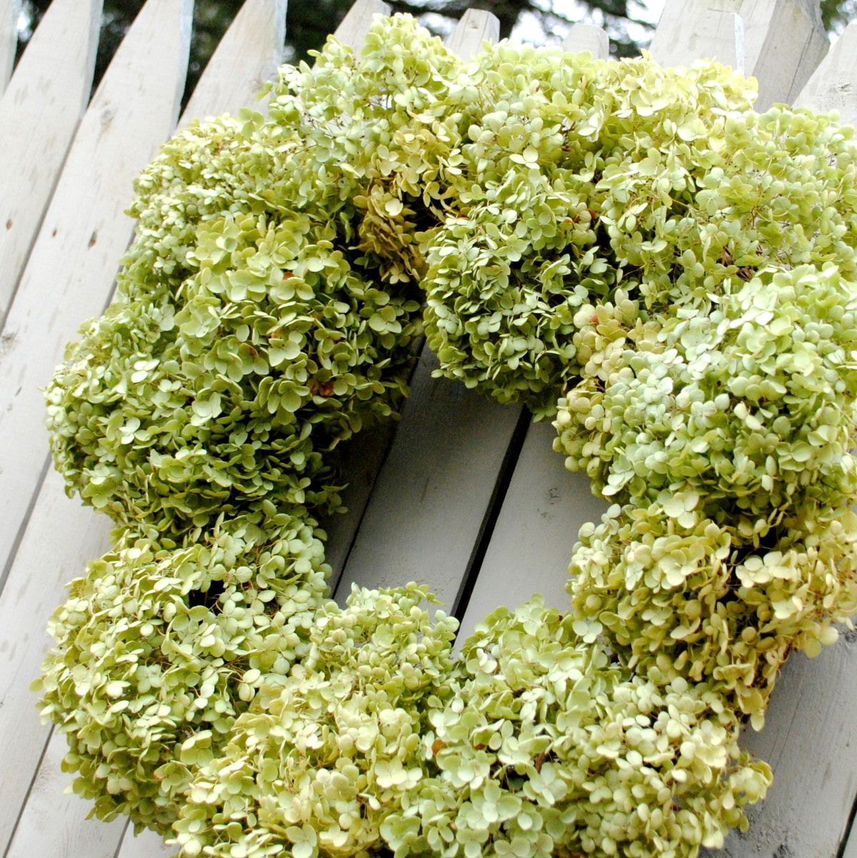
It’s officially Spring! This is definitely a favorite time of year for me when the days are longer and the temps are warmer.  The winter was pretty non-existent in Upstate NY this year, so thankfully a lot of projects that were on the backburner till Spring, already got finished. Over the weekend when the weather was in the 60s and sunny, we started tackling our first outdoor project of the year, but I stepped away from the cutting and hammering for a moment to make this beautiful Dried Hydrangea Wreath.

I had anticipated making this wreath in the Fall and cut off a bunch of hydrangea flowers from my mom’s garden before the first freeze last year.  Unfortunately, I never got around to it, so the hydrangeas sat in my garage since then, but I knew they’d make a beautiful Spring wreath when the time came.

I started off with a grapevine (or twig) wreath that I purchased for $2.88 at AC Moore.  That was the only part of this project that I had to purchase, so essentially it cost me less than $3 to make – no $40 wreath for this girl!

The key to making a full, yet balanced dried hydrangea wreath is to start with the larger flowerheads as the base around the wreath, and then add in smaller flowerheads.

Starting with larger hydrangea flowerheads, I gently threaded the stems through the grapevine wreath.

I then added the medium sized flowerheads and filled in the areas around.

I finished the wreath by adding the smallest flowerheads to any of the open gaps.  The smallest size is really the most important because it really completes the fullness of the wreath.

Note: As you’re threading the stems through the wreath, you may need to secure them with floral wire.  I didn’t need much since the stems were long enough and were tucked fairly tight between the twigs of the grapevine wreath.

Once all of the dried hydrangea flowerheads were added to the wreath, I trimmed the stems in the back of the wreath with a scissor.

And it was complete.  The entire wreath cost less than $3 and took me about 15 minutes to create – simple and inexpensive!  How much better can you get?!  And here’s the result…

I want to mention that the hydrangea leaves are fragile, so it’s important to create this wreath with a gentle hand.  This wreath is also not great for a high traffic place or door (ie: front door).  I’ve got the perfect spot for it though… stay tuned!

Have you made a new wreath for the Spring?

I link my projects to some of these parties: Skip to My Lou, Dittle Dattle, Between Naps on the Porch, Today’s Creative Blog, Stories of A to Z, All Things Heart & Home, Savvy Southern Style, House of Hepworths, Finding Fabulous, Creation Corner, The Shabby Nest, Tatertots and Jello, Thrifty Decor Chick, Tip Junkie

How To Glaze a Cabinet Using Stain

I’ve glazed, antiqued, and distressed furniture for a few projects that I’ve featured in the past, but during the makeover of my master bathroom, I tried a completely new and different way of glazing.  Instead of using my water/paint technique, this time I used stain.

As I mentioned in the master bathroom reveal, I had envisioned a slightly darker cabinet with a light colored glaze.  I had anticipated painting the cabinets, then instead of using my watered-down-brown-paint technique like I’ve done in the past for my cabinet and chair, I thought it would be interesting to try a watered down white paint technique.  In my head it was the perfect idea, but unfortunately it didn’t work – URGH!  I was knee deep already into the project, so I needed to come up with some sort of resolution to turn it around. But how? (that was the million dollar question brewing in my head)

I had remembered that I read a post that Kristi wrote on How to Paint and Glaze a cabinet, in which she used stain to age the piece of furniture.  So I went with it… how much harm could stain over paint do? (it can do alot, but what the heck, I gave it a try)…

So let me step back and share the play-by-play.

I started off by removing the attached toilet paper holder and sanding the entire cabinet with my electrical sander (I also manually sanded the crevices). Plus, I taped the freshly painted walls with painters tape.

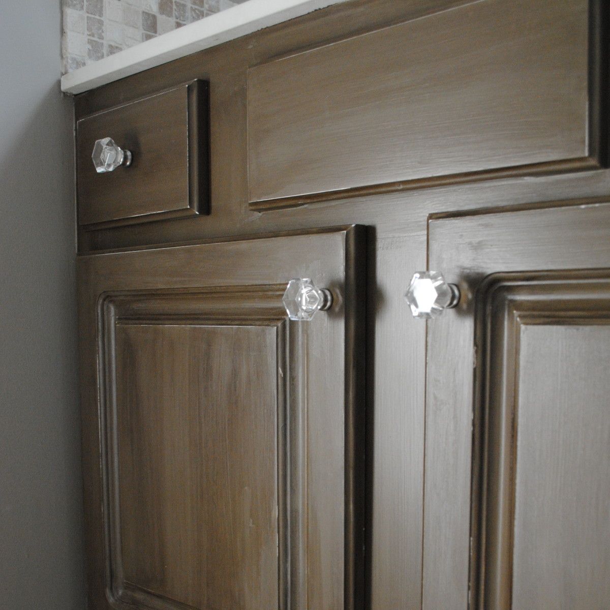
I then primed the cabinets using the one-and-only Kilz Primer, and followed it by painting them a darker taupe color, BM Texas Tan, using my awesome Purdy Brush 😉

Ok, here comes the fail part {tears and frustration} well not really… just annoyance that it didn’t work as desired.

So after removing the white mixture (and some of the base coat too), which I thankfully only tried on a small area of the cabinet, that idea was ditched.  I repainted those areas and started with the stain.

Glaze is meant to be imperfect and give the look of age.  More or less stain can be used depending on the degree of “age” you desire.  If you’re looking for a really antiqued look, you can add “wear” marks to the edges using sandpaper and natural looking dents by using a hammer or chisel.  Also to add more definition to the overall look, add extra glaze in the crevices of the cabinet or piece of furniture.  You can use a smaller brush to get into the indented areas or brush on a second coat of stain in the crevices, and follow it up by gently wiping away so more stain remains.

After completing the entire cabinet, take a look at the result:

Once the entire piece was “stained”, I went back and added some slight distressing.  Not as much as the glazed turquoise chair, but just a little to add some faux “aging”.  And of course to top it all off, I added two coats of polyurethane.  And voila.  The cabinet that I never envisioned creating turned out pretty good, wouldn’t ya say?!

Looking for more tips and tricks on how to age, antique, or distress furniture, check out this post I wrote: 5 Tutorials on How To Distress Furniture

Have you ever had a project FAIL that you turned around to create something you love? How have you added “age” to your furniture transformations?

I link my projects to some of these parties: Skip to My Lou, Dittle Dattle, Between Naps on the Porch, Today’s Creative Blog, Stories of A to Z, All Things Heart & Home, Savvy Southern Style, House of Hepworths, Finding Fabulous, Creation Corner, The Shabby Nest, Tatertots and Jello, Thrifty Decor Chick, Tip Junkie

Master Bathroom Makeover: Part 1

If you follow SAS Interiors on Facebook and Twitter (if you don’t, please do), you may have saw a few postings that I wrote mentioning that I finally decided to give my master bathroom a makeover.  And when I say finally, I mean FINALLY!  This is the only room in the entire house that hasn’t been touched since we moved in and it’s horrendous…  Until NOW.

Over the weekend, we (meaning the mister and I) finally took the plunge and gave this much-needed space a revamp.  I really wish that I could say in two days we finished the entire space, but that would be a big-white-lie. Bummer!  I went into this thinking it would be easy-peasy – we’ll paint, hang a few pictures, and we’ll be done.  HAHA – NOT! (I never allow for enough time – big no no)

The before space was a bright pink/purple color (why would anyone have chosen that color?).  When I first thought about this space, I envisioned 3 S’s – soft, serene, and spa-like.  Since the bathroom adjoins to the bedroom, I really wanted the two spaces to flow from one to another, so many elements in the new bathroom are an extension of the bedroom.  Here’s a peak at some of the selections for the new space.

The backdrop, similar to the bedroom, is a soft gray / taupe color with an accent color of dusty blue, which will be seen in the shower curtain (actually not a real shower curtain, but instead two window panels) and accessories. Again, because I envisioned the space being an extension of the bedroom, I felt it important that they “read” as one.  The accent color in the bedroom is orange, so the blue for this space is a perfect compliment.

I’m truly looking forward to this space being complete, especially since it was one of my Home Goals for 2012.  Actually, when I shared the before picture in my post about my home goals for this year, one reader wrote:

If you need help on your bathroom, I am sure all your readers would be willing…I know you did the best you could with what you had, but wow! I think I would have made that the first to redo when I moved in….not trying to be mean, or anything, but who would pick those colors????? All I can say is wow…  – Cindy

Well Cindy is so right!  Have you seen the before? I feel scared just showing it to you.

There are alot of reasons that this space got neglected, but the main issue was our indecisiveness to do a complete overhaul with a full tearout or a DIY bathroom with new paint and updates.  In the end, because of other priorities at the moment, we decided on a do-it-yourself revamp.  It simply makes the most sense for us!

On the list is:

  • New paint for the walls (gray / taupe)
  • New paint on the mouldings (white)
  • New floor (groutable vinyl – similar to my mom’s floor)
  • New paint for the cabinet
  • New hardware
  • New mirror
  • New light fixture
  • New accessories
  • New window treatment

So basically it’s all new, except for the plumbing fixtures.

And the reason why this space wasn’t complete by the end of Day 2?  Take a look at these snags…

1. The existing towel bar was attached to the wall with HUGE anchors… a full sized person could have hung from them. When the Mister took them out (which he had to yank them from the wall), a huge hole was left!  UGH.

2. Next frustrating snag? The light fixture had no junction box.  Really??  How is that possible?

3. And the most time consuming part was all the spackling – the walls were a mess!

Well no more complaining about this UGLY space.  It’s now in the process of being transformed.  Tonight’s task?  A new floor!  Wish me luck 😉

Have have remodeled a space in your home recently?  Have you made any updates to a bathroom in your home?

How To Achieve a Well Styled Bookcase

There is truly nothing like a well styled bookcase filled with books, accessories, collectibles, and photos that add warmth, intrigue, and uniqueness to a space.  I’ve been doing some styling lately for a few clients, and it’s been so enjoyable to start with a blank slate and build from the ground up by adding different elements and layers to create an engaging and interesting composition.

Whether built-in or freestanding, bookshelves can represent and showcase you and your families passions, interests, and hobbies.  They can make a bare wall go from blah-to-beautiful and make an overall space feel larger and taller.  No matter your budget, a well-styled bookcase can be achieved using random accessories from around your home, discount store finds, collectibles, and do-it-yourself creations.

The key to the overall look is how to pull the accessories together to create an aesthetically pleasing result, yet not add too much so it looks cluttered and not add too little so it appears bare.

So how do you achieve a well styled bookcase?
And how do you create an aesthetically pleasing result?

Let’s take a tour of some amazingly well styled bookcases and dissect ~

This is one of the BEST styled bookcases that I’ve ever seen – by Jennifer of Dimples and Tangles.  It has the perfect balance of books, accessories, collectibles, and pictures. The overall setting is engaging, intriguing, and has just the RIGHT amount – not too much, but not too little.

The key to good balance is layering from front to back and adding elements at varying heights. For instance, let’s take the bottom shelf…  The tray is propped up and leaning on the back of the bookcase.  Layered in front of it, is a horizontal pile of books with a filled bowl on top.  An appropriate balance of books and accessories has been achieved and the differing elements are of varying sizes.

The other interesting part of this bookcase is that two of the shelves on the right side were removed, which allowed for taller accessories to be added.  A tray has been turned into art by adding the ‘&’ symbol and hung at the back of the bookcase.  Layered in front is a slightly turned birdcage, a photo, and a small accessory.  Then behind that is a small pile of books with a slender, yet tall lamp – all creating a balanced composition.

In all, this small space has so much interest! Let’s pick apart another example ~This bookcase styled by Cassie of Hi Sugarplum is another awesome example of how to achieve a well styled bookcase.  Instead of leaving the backs of the bookcase white, a fabric back with a small geometric patten was added, which gives an unexpected and unique pop.  Using the same layering technique that I mentioned before, Cassie has a good balance between books, accessories, and pictures.  There’s not too much or too little of any element.  By adding framed art to the bookcase surround, another layer has been added giving the overall bookcase even more depth than before!

Want to take a look at another example?

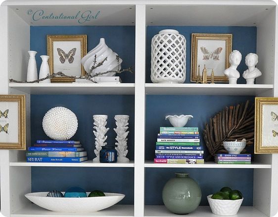
Another great example of a well styled bookcase is the wall-to-wall built-in by Kate of Centsational Girl.  After building this bookcase using 4 Ikea Billy bookcases, Kate used her amazing talents to accessorize the entire wall – WOW, what a task!

Instead of wallpapering the bookcase back like Cassie, Kate decided to paint them which allowed for books and accessories (ie: the white vases) to “speak”. Using a combination of horizontal and vertical layed books, Kate layered them with ceramic bowls, vases, diy creations, and personal momentos.  She also added framed art to the backs AND the fronts of the bookcase, which like Cassie’s composition, made the bookcase appear even deeper.

I think you get the picture by now, but here’s a quick recap on the key elements to achieve a well styled bookcase!

  1. Layer – Add elements to the back of the bookcase and continue it to the bookcase frame.
  2. Add Varying Heights – Incorporate elements with varying heights.  Display smaller accessories in front and graduate to taller and larger pieces behind.
  3. Mix it up – Display a mixture of books, accessories, collectibles, DIY creations, and photos
  4. Books Become Art – Books are beautiful.  From their color to their typography, books are truly art, so let them tell a story.  Display them horizontally and vertically, by color, or by subject.

Here are a few more of my favorite well styled bookcases.

White walls and a white bookcase, allow books and accessories to pop – via BHG

The dark painted bookcase back allows for the books and accessories to “have a voice” – via YHL

Even if you have alot of books, alternate their position between laying horizontal and vertical, then add accessories throughout – via The Art of Doing Stuff

A good balance between books, accessories, and photos is key to achieving a well styled bookcase – via Cottage and Vine

This bookcase has a good mixture of accessories at varying heights – via I Suwannee

Books become art!  This well styled bookcase has some leaning books against a high pile behind to show their beautiful covers.  Accessories are added to give scale and break up the monotony – via Lonny Mag

I’ve always loved this bookcase composition and shared it in a previous about creating a dazzling display. This white bookcase was dressed up with the addition of grasscloth wallpaper at the bookcase back.  It adds an unexpected touch to a typical built-in – via Cottage and Vine

The beauty of this bookcase display is the common thread of color in the books and the accessories.  The hues of gold, white, and varying shades of blue create a cohesive composition – via HGTV

This backless bookcase allows for the vibrant wall color to pop through the color coordinated books – via Style at Home

Creating a well styled bookcase can be tricky and a challenge for some, but with practice and patience a beautiful display can be achieved.  If you have no idea where to begin- no problem!  I love styling bookcases, fireplace mantels, tops of cabinetry, and truly any place in the home.  Read more about my Interior Design Services and Contact ME – I’ll be glad to help no matter where you live.

What do you display on your bookshelves?  Do you find it difficult to know where to begin and what to display?

DIY: How to Install Groutable Vinyl Floor Tile

Did you know that you can grout peel-and-stick vinyl tiles to look JUST LIKE ceramic tile?
You CAN and here’s how…

One of the presents for my parents for Christmas was to install a new floor in their foyer.  I know a little strange for a present, but it’s what they wanted and needed, so I delivered.  They had looked into having this 40 square foot space retiled using ceramic, but with estimates by professionals for over $1000, it wasn’t how they wanted to spend their money.  In doing some research and hunting around for floor options for my own foyer (which I intend to redo soon),  I found some really nice looking vinyl tile (yes the “peel and stick” kind) that you can actually grout to achieve a VERY similar look to ceramic tile, but at a fraction of the cost.

Duration of Project: 4 hours for a 40 square foot space
Project Difficulty: Easy to Medium – It wasn’t a difficult project and you really don’t need to have prior skills, but it is tiring being on your knees for an extensive period of time.
How Many People Needed: 1 – I completed this project by myself, but a helper on any project is better.

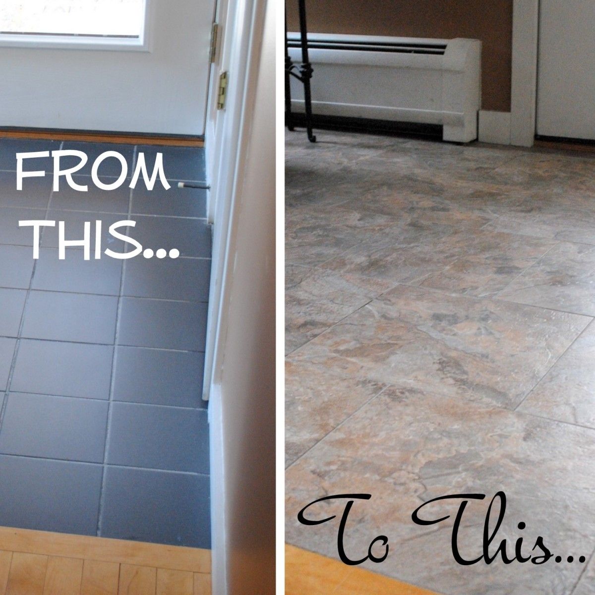
The “before” tile in their mudroom was a 6 x 6 black ceramic.  The condition of the existing floor was very good, so I did not feel that there was a need to remove it and instead installed the new vinyl tile directly on top.  (If your floor is uneven, I would recommend removing it and starting with a new subfloor.)

After a good cleaning (by my mom – I can’t take the credit on this one), I was ready to get started.

I first began by doing a dry lay of how the floor would look.  With the two layout possibilities – straight or brick – we decided on a brick layout, which looked best in the space.

In the past, when reading instructions on how-to-lay-tile, the rule of thumb was to start in the center of the room – well I disagree. I think it really depends on the space and your desired layout.  Yes, it may be good to start in the center of a room if the space is square or rectangular, but many spaces aren’t.  I think it’s best to lay out the tile how you feel it will be best suited for the space.  For this foyer, I decided to start in the corner, where the tile and wood meet, so you would see a full tile (not cut) at the transition.

Laying the Vinyl Tile

1. Start by peeling off part of the backing from the tile.

2. Lay it on the floor in the designated spot.

3. Once the edge is in place and stuck down on the surface, peel off the remainder of the paper backing.

4. Using spacers (I used 1/8″ spacers), start installing your next vinyl floor tile.

5. Unlike ceramic tile, it’s important that the peel-and-stick vinyl adheres to the surface below, so either walk on it ALOT or use a floor roller (a rolling pin could work too). Like my socks??

There is going to come a point where you’ll need to make some cuts to fit the vinyl flooring. Unlike the dreaded cuts with ceramic tile, cutting groutable vinyl tiles is fairly easy.

Cutting Vinyl Flooring

1. Using a pencil and ruler, determine where your cut is going to be and draw a line.

2. Then score the vinyl tile 2-3 times with a sharp construction blade or sheetrock knife (YOU DO NOT NEED TO PENETRATE THROUGH THE TILE – Keep Reading)

3. After scoring the vinyl tile, it should snap with ease and your straight cut piece will be read to lay.

Once the floor is complete, you are ready to grout IMMEDIATELY!  This is one of the best parts about using groutable vinyl tile!

One more step before grouting…

4. As not to ruin the baseboard or the wall with grout, tape it off using painters tape.  After the grout has been applied to the floor, you will peel it off BEFORE IT DRIES.

Now it’s time to GROUT!

How to Grout Vinyl Tile

Is grouting vinyl tile different than grouting ceramic tile?  NOPE, it’s exactly the same, except you should use grout made for vinyl tile.  I used pre-mixed grout made by Precision Components which I found in Home Depot in the same section as the groutable vinyl tiles.  This premixed sanded acrylic grout has “good flexural strength and adhesion” and is recommended to use over traditional cement grouts. *THIS IS VERY IMPORTANT*

5. Working in small sections, you can either use my ziploc technique, used for my backsplash tile project and my fireplace tile project, or…

… you can use the traditional tile float.

Either way will work.  Whichever method you choose, you will apply the grout, then using a tile sponge (one side has a sponge, the other side is abrasive), wipe the grout and haze away.  You will need to continue wiping the haze away a few more times over the following 24 hours.

Always start in the corner of the space, so you can work your way out of the room.  And always work in small sections at a time.

And then you’re groutable vinyl tile surface is complete!  Just as with ceramic tile, don’t walk on the surface for at least 24 hours so the grout has enough time to dry.

Here is a closeup…

What a difference.  Take another look at the before and after…

I thought it would be helpful to share some Pros and Cons to groutable vinyl tile, and how it compares to ceramic tile. And please feel free to email me with any questions.

Groutable Vinyl Tile PROS and CONS

Affordable – This 40 sq. ft. space was fairly inexpensive.  The tiles which I purchased from Lowe’s were $1.08 and the premixed grout (which I only used half of) cost $7.  The total cost of the entire project was about $65.  Ceramic tile is available in a range of prices, but usually starts at $2 per sq. ft. , so the savings right there is 50%.

No Experience Required – Yes, I have tiled before, but I do not feel that this project was difficult at all.  I think a person with little experience can complete this project with ease.  Measuring and cutting is really the most difficult part of the project, so take your time and measure correctly!  Installing ceramic tile is not difficult, but it is tricky and experience is helpful.  Cutting ceramic tile can often be difficult and time consuming.  For prior ceramic tile projects, I’ve used tile snips, a tile cutter, and a wet saw.  A wet saw is the best for cutting ceramic tile, but it’s not easy – I’ve made alot of mistakes.  In my estimation, ceramic tile would take about double the time for installation compared to installing groutable vinyl tile.

Grout Right Away – Immediately after you install the groutable vinyl tiles, you can start the grouting process.  This makes the entire process possible to complete in one day.  With ceramic tile, after you finish laying it, you have to let the adhesive dry for 24 hours before grouting, which results in a 2 day project, so essential ceramic tile takes double the time.

Availibility and Selection – I purchased this groutable vinyl tile at Lowe’s, but other home improvement stores also offer similar products.  The selection is not as vast as ceramic tile (which is a con), but I was surprised by the wide range of colors and textures.  When I was at the store making my purchase, I was told by a sales rep that any peel-and-stick vinyl tile is groutable, except for the styles that have the faux grout look around the edge.  I don’t know if this is true or not, but it’s what I was told.

Since groutable vinyl tile takes no experience, is half the cost, and takes half the time, what will use for your next tile project?

Thankfully my parents are very pleased!  Now I can’t wait to get started on my foyer floor, except it’s about 4x the size and will take alot more time and manpower. If you want to take a look at the layout, you can see and read about it {here}.

What DIY projects do you have planned for 2012?

I link my projects to some of these parties: Skip to My Lou, Dittle Dattle, Between Naps on the Porch, Today’s Creative Blog, Stories of A to Z, All Things Heart & Home, Savvy Southern Style, House of Hepworths, Finding Fabulous, Creation Corner, The Shabby Nest, Tatertots and Jello, Thrifty Decor Chick, Under the Table & Dreaming

Roadside Restoration: Distressed Turquoise Chair

I’ve got a few design clients that I am working on projects for right now, and one happens to be a good friend of mine.  Her style is traditional-eclectic and it has been enjoyable to introduce some unique elements into her space.  The latest part of her home that we’ve been transforming is her master bedroom.  Upon choosing a sunshine yellow for the walls and a floral patterned rug with bursts of color, I made the suggestion of introducing elements of turquoise!  A chair was a must for the space, and with my radar-alert always turned on, I actually found one on the side of the road.  Remember when I shared this picture on my facebook page?  Yes, that’s the chair on top of all of my groceries – I couldn’t leave it behind.

Once I got the go-ahead, I started to transform the chair.  I knew exactly what I wanted to do… Distress Turquoise. {beauty}!

The chair was obviously headed for the junkyard, so it was in desperate need for a makeover once I got my hands on it!  Here’s how it looked before .

I started off by removing the seat…

Sanded all the surfaces with my orbital sander…

And was ready to start spray painting.  For this chair makeover, I decided on Valspar Tropical Oasis.  I’ve been wanting to use this color for SO LONG and was thrilled to finally get the opportunity.

Spray painting can sometimes be tricky!  If you need some tips, check out {this post}.

Once the spray paint was completely dried (about one day later), I was able to begin the distressing.   I used the same steps as I did to create my foyer cabinet, but here’s a recap:

  1. I diluted brown paint with 1 part water, 1 part paint.  Using my Purdy brush, I lightly brushed on the water-paint mixture.
  2. Brush on the water-paint mixture in sections – I started with the chair legs, then moved onto the seat back.  Don’t get too far ahead of yourself.
  3. Using a clean, lint-free rag, wipe away the paint.  Depending on how much distressing you want, you can vary your degrees of wiping pressure.  (wipe alot for less distressing and wipe alittle for more distressing)
  4. And you’re done.  Now move on to the next section, until the entire piece of furniture is completely distressed.

I call the distressed overlay “glaze”, but it’s not really glaze, but instead this water-paint mixture that I created. This is a step by step of me applying the water-paint mixture to the chair back and then “wiping” it off with the rag.  The “glaze” is fairly forgiving.  Again, the more you wipe, the less distressed the result.

To add a bit more distress to this chair, I also lightly sanded some of the edges with medium grit sandpaper.  This just added to the “aged” aesthetic.

Once the edges were slightly sanded and the “glaze” was dried, which didn’t take a long time, I applied 2 coats of polyurethane to seal the chair.  (don’t forget this step – it’s important)

It wasn’t complete yet, since there was nothing to sit on and I wouldn’t dare put that old yellow crushed-velvet-like fabric back on.  I searched and searched and found this fabric that I thought would be perfect for the buttercup yellow room!

I removed the old seat fabric (there was actually three layers of old fabric) and was left with this…

And then it was time to add my newly chosen pretty fabric!  I flipped over the seat…

Using a staple gun, I attached the fabric to the underside of the seat.

Recovering a seat is really easy and can make a huge difference in updating the look.  The corners though can sometimes be tricky, so here’s an easy step-by-step pictorial of how I created them.

The completed seat…

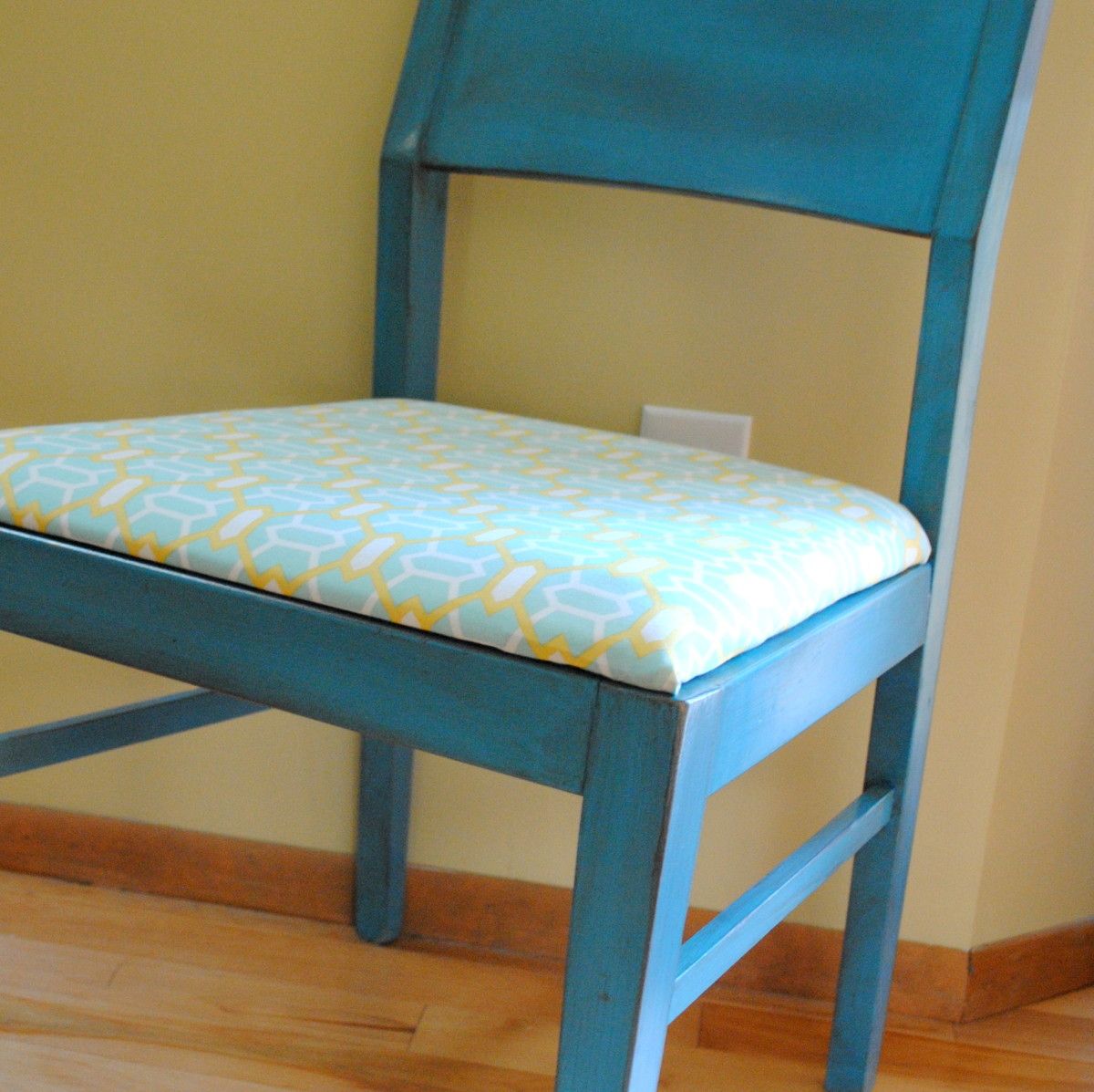
And the finished chair…

I was so happy with the outcome of this chair and the color is exactly what I had envisioned.  I just wish…

… it could be mine!  Doesn’t it look so pretty in this spot?!  Unfortunately though, I delivered it to my friend and it now sits perfectly in her bedroom 🙂

Don’t you just love turquoise?  It really is one of my favorite colors.  When I ordered the fabric for this chair, I also ordered a few other fabrics to make new pillows for my living room and guess what color they have in them??  Yes…you guess – turquoise!  I’ll share more soon!!

I link my projects to some of these parties: Skip to My Lou, Dittle Dattle, Between Naps on the Porch, Today’s Creative Blog, Stories of A to Z, All Things Heart & Home, Savvy Southern Style, House of Hepworths, Finding Fabulous, Creation Corner, The Shabby Nest, Tatertots and Jello, Thrifty Decor Chick, Under the Table & Dreaming

DIY: Drop Cloth Table Runner

Lately I’ve been a wee-bit obsessed with drop cloths…not the ugly blue kind, but the pretty and fabulous heavy beige version.  I’ve basically gone drop cloth MAD – – everything in my house is being transformed with drop cloths.  (I may need drop cloth therapy in a few weeks, but for now, I’m okay…ha!)

After making a few pillows (which I’ll share soon), I ventured into making a runner for my dining room table using, non-other than, a drop cloth and a fun chevron accent fabric (you know I love chevron).  I’ve never quite found a table runner that is the ‘perfect’ size, until now because – – I made it myself!

Here’s a sneak peak of how it looks ~

This is where it all began…

My $16 drop cloth purchase! For that, I got a 6′ x 9′ piece AND a 4′ x 10′ piece…WOW!

Project Supplies:

Drop Cloth
Accent Fabric
Thread – white of clear
Thread – contrasting color
Iron

And here are the steps to create the table runner:

Measure the length of your table to determine your desired width and length that you’d like to make the runner.

My overall table length is 76” long.  I wanted to see 2” of the table on each side, so I determined the finished dimension to be 72” long.   For the width, I wanted the finished dimension to be 14”.

Ok, now onto cutting the fabric…

1. From my above dimensions, I cut (2) 73” x 15” pieces of drop cloth.  This allows for a ½â€ seam all around.

*Again, the above dimensions will be modified to fit your table *

2. Using a rotary cutter or scissor, cut (2) 7” x 15” pieces from your accent fabric.

3. Taking your accent fabric, turn under and iron ½â€ on the two long sides.

4. Position the accent fabric on the “right” side of your drop cloth panel and pin 2-1/2” from the edge.

5. Using your contrasting thread, top stitch the panel onto the drop cloth.

6. Repeat steps  3-5 on the opposite end of the same drop cloth panel.

7. Taking both drop cloth panels, pin the two “right” sides together.  Sew all the way around, except leave an opening of 10-12” on ONE of the shorter ends.

8. Trim the corners.

9. Using the hole you left, pull the right side through. Then iron it flat.

10. Iron the opening as well, so it lays flat.

11. Using your contrasting thread and ½â€ seam, top stitch around the entire edge (this will close the opening). Iron again.

And it’s COMPLETE!

You now have a beautiful table runner that is the PERFECT shape and size!

Like the vases and flowers on the table?  Here are the details!

Drop Cloth is very durable and REALLY affordable, but any fabric can be used for this stylish table runner project.  If you choose a fabric that is lighter weight, you will want to add an inner lining for more support.

Have you ever made anything using drop cloth?  It really is my new favorite material!

You’ll find this  tutorial at Stories of A to Z-Tutorials & Tips Tuesday